|
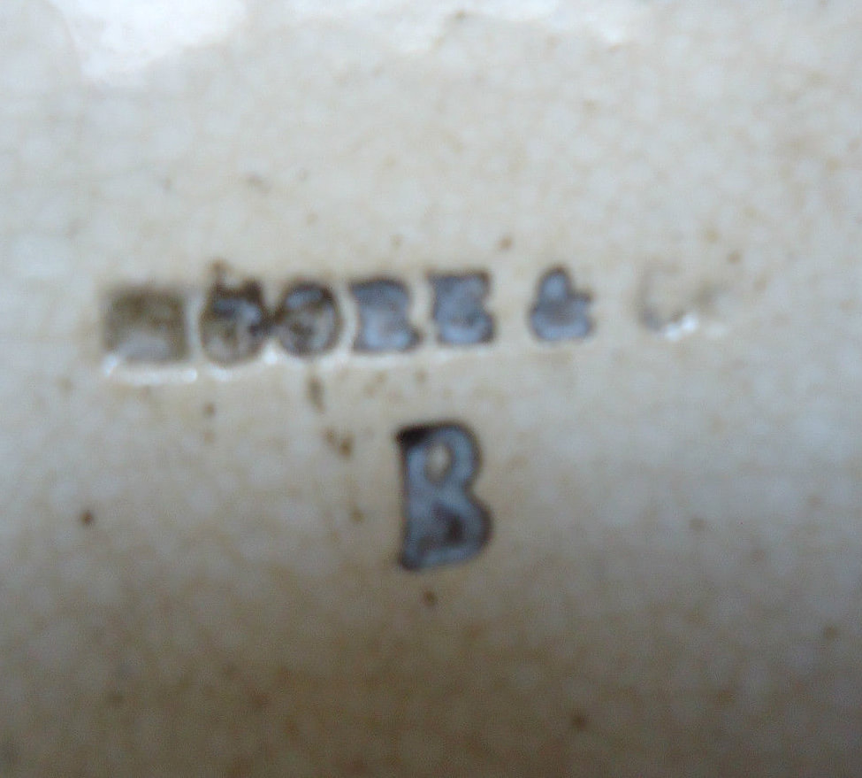
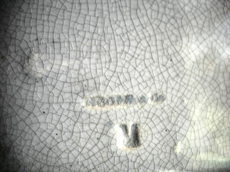
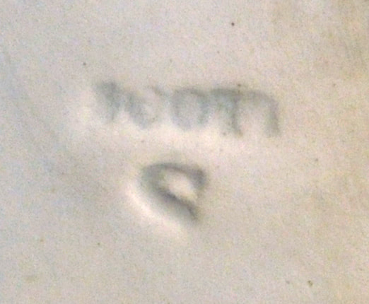
2/18/2022 1 Comment Bensham PotteryHuge thanks to Dave Turpin and Richard Maskell for getting in touch. Dave provided information about his 3 times great grandfather, John Turpin [1799-1864], and references a document of 1851 detailing John Turpin's bankruptcy, which describes him as 'also carrying on business in my own name, as an Earthenware Manufacturer, at Bensham Pottery, at Bensham, in Gateshead aforesaid' (please see Dave's comment on my previous post for the full extract). Richard e-mailed me last week with images of another rare Turpin-impressed item. It is a small willow pattern plate and, interestingly, it has a letter B in the centre of the mark. 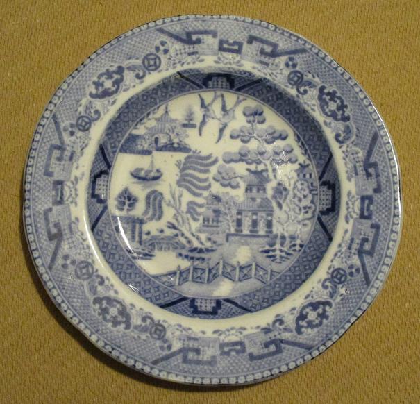 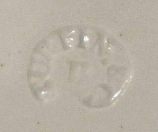 Richard points out that 'on Staffordshire pieces an extra letter in a mark usually stands for the initial letter of the town the pottery is situated in : T = Tunstall, B = Burslem etc.' He has raised the possibility that the B, in this case, stands for Bentham. I am aware of impressed makers' marks with letters or numbers whose significance is less clear. For instance, Moore items are found with an impressed 'B' and and impressed 'M' (see left and centre below). Scott's items appear with a letter 'S', which could stand for 'Southwick', but it is possible that there are Scott marks with other letters. But in Turpin's case, the letter 'B' appears to have been used with some consistency. So it does seem entirely possible that the 'B' signifies Bentham – a factory that has hitherto eluded the reference books on North East pottery.  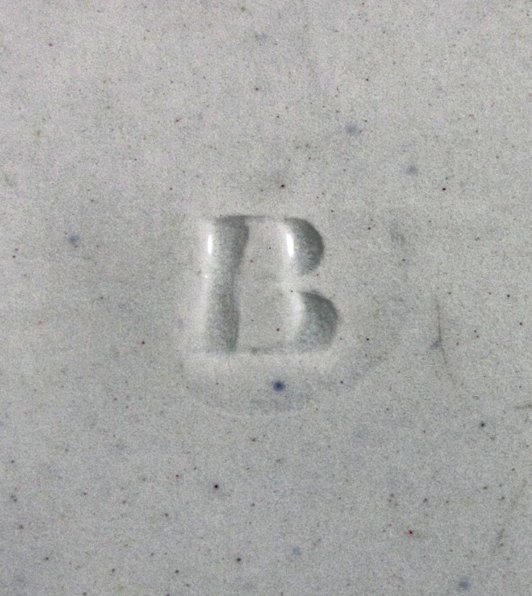  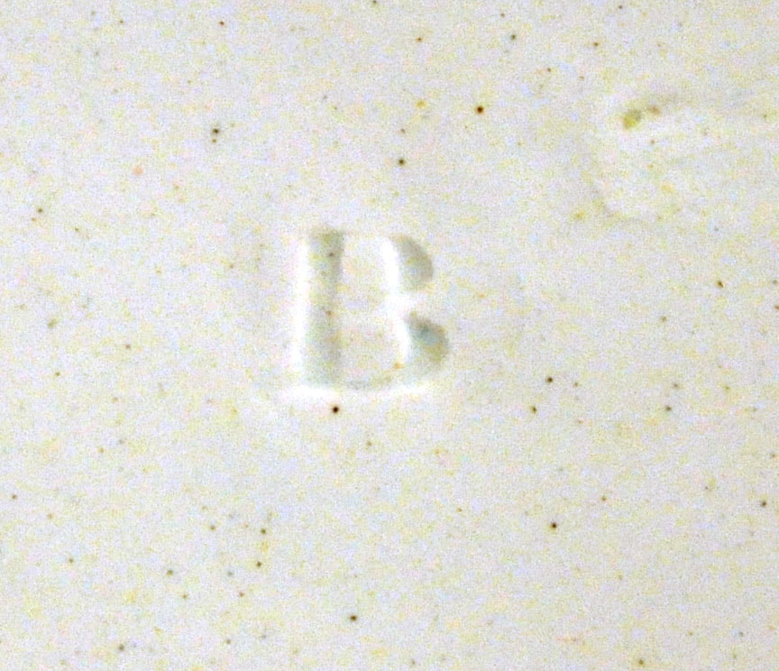
1 Comment
8/1/2020 1 Comment Turpin & Co, Ouseburn PotteryEvery now and then a relatively humble item crops up that sheds a light on the wares of a little known pottery. Turpin & Co's partnership at the Ouseburn Pottery barely gets one line in Bell's (excellent) book on Tyneside Pottery. The entry reads 'Mentioned in a directory of 1841'. I bought the child's plate below on eBay recently, and it has a wonderful impressed mark, TURPIN & Co. 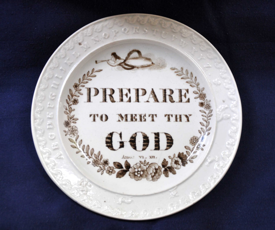 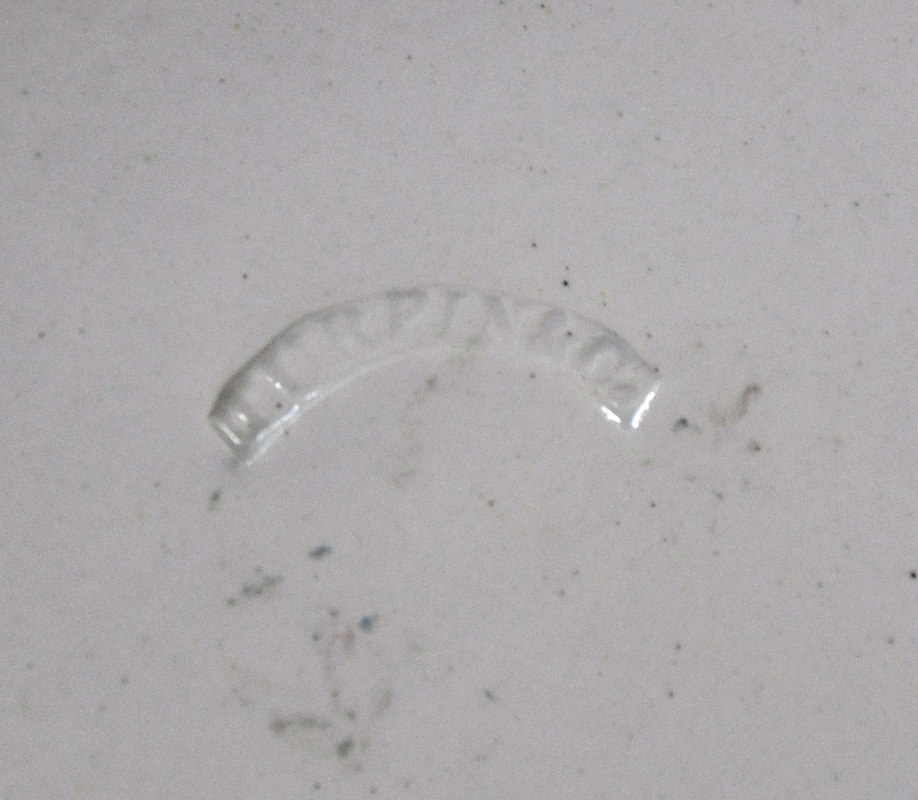 I recognised the transfer as one that I had previously attributed to Thomas Fell. In fact, the copper transfer plate did end up at Fell's St Peter's Pottery – there are plaques with impressed marks associated with Fell, likely from c1850 onwards (see below three typical Fell plaques with the transfer). However, the child's plate shows the transfer plate had an earlier life at the Ouseburn Pottery. 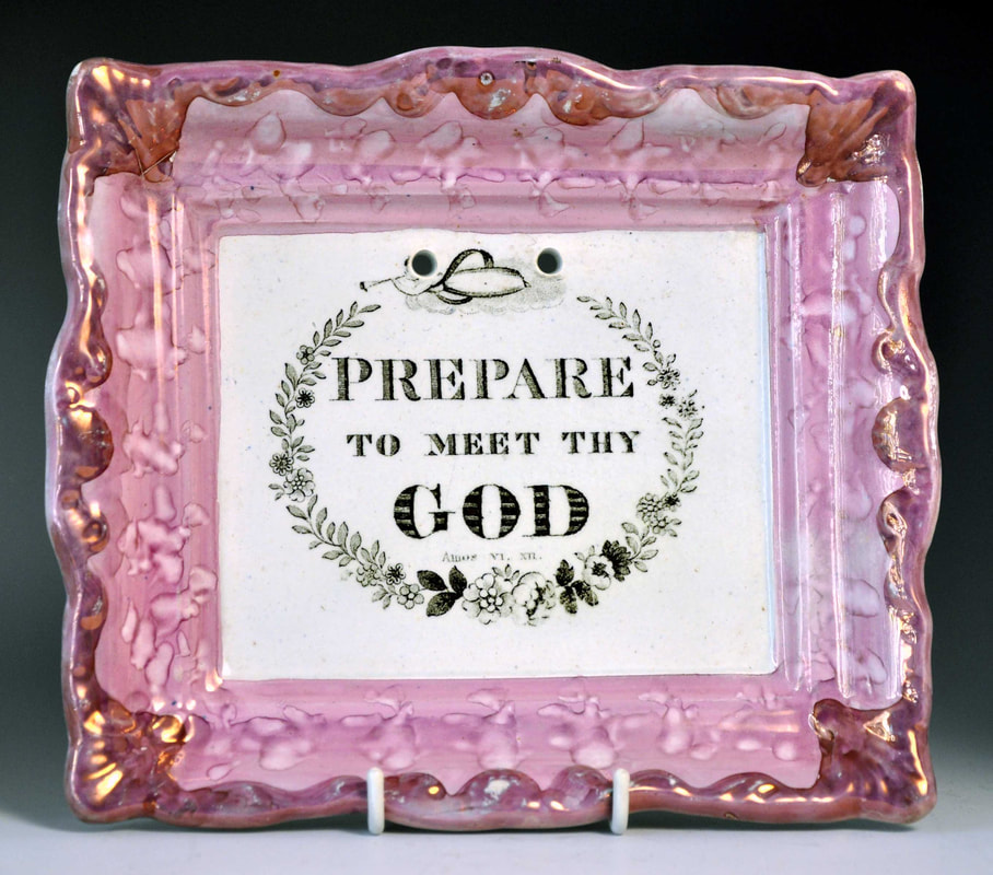 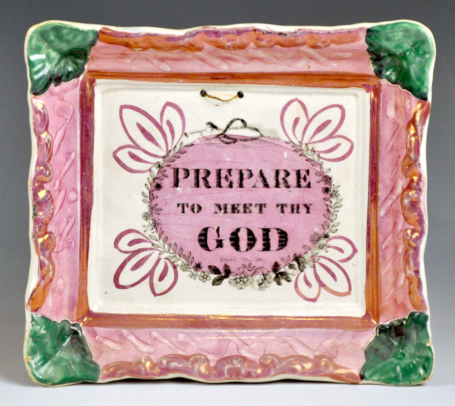 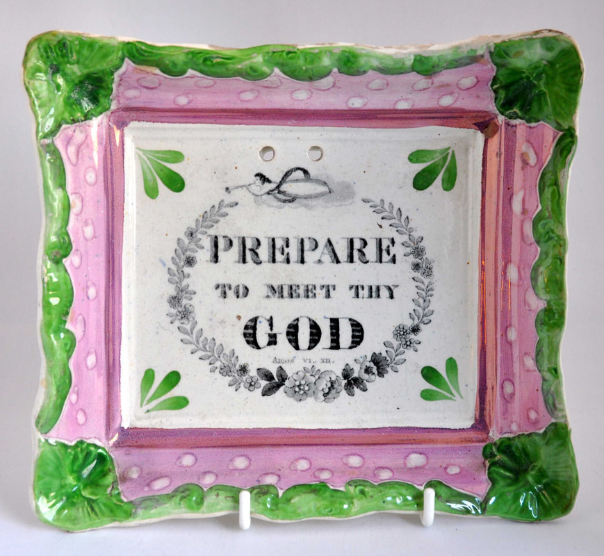
The black speck also appears on red-bordered plaques, contemporary with the child's plate. I think these plaques can now reliably be attributed to Turpin & Co. 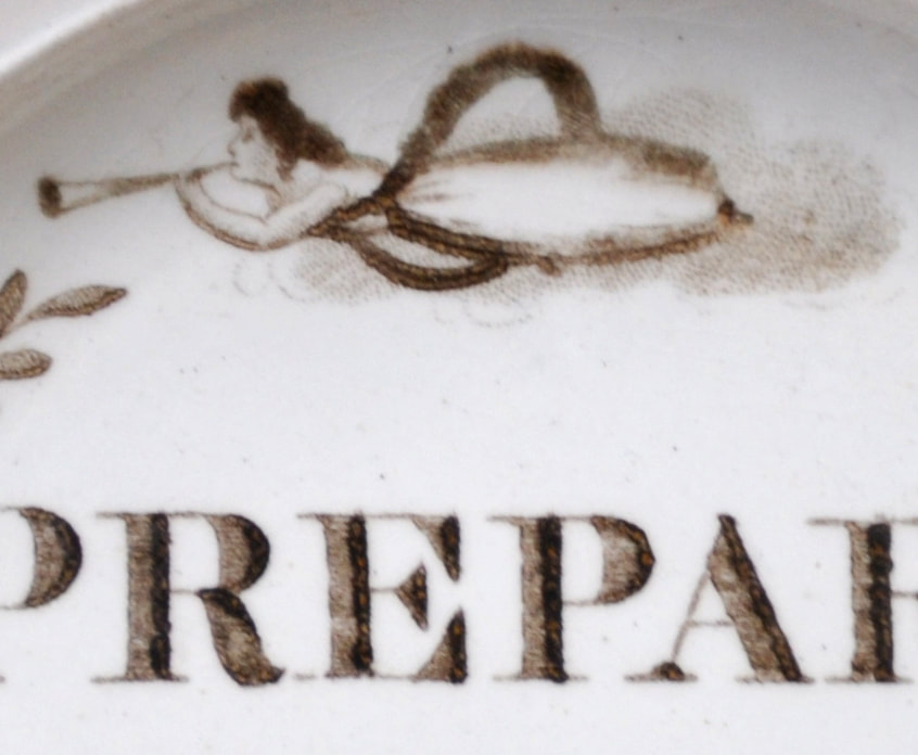 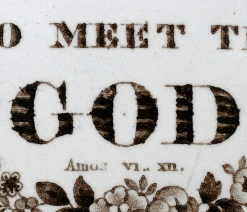 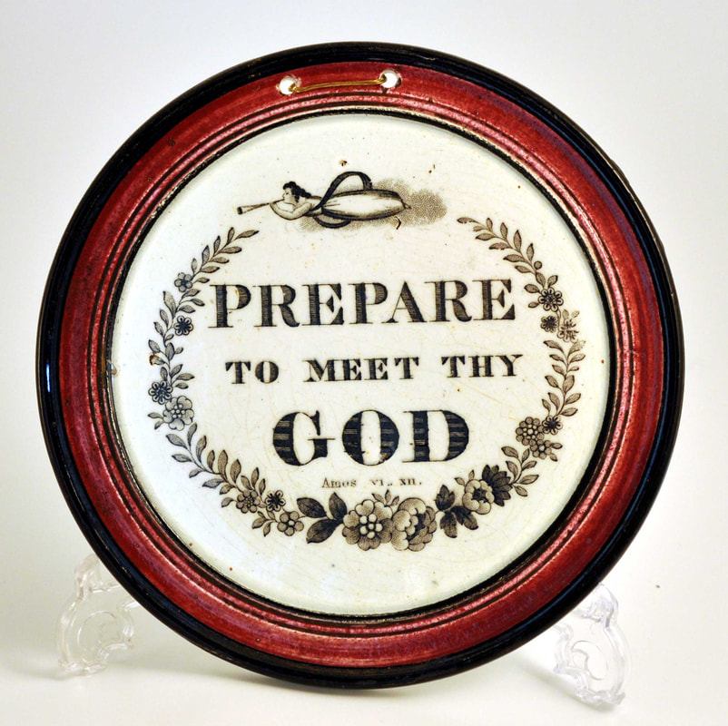 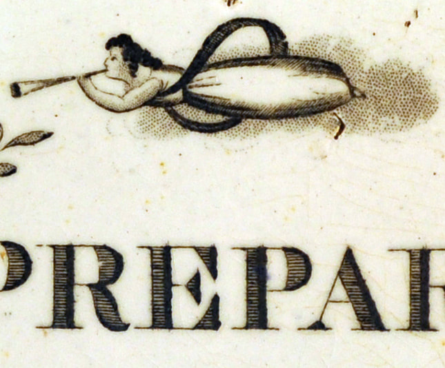 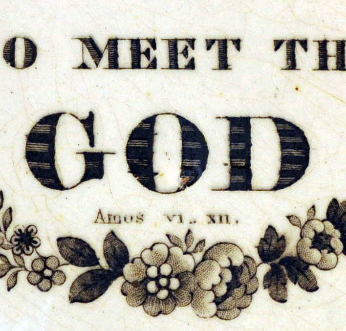 This opens the doors to a whole raft of reattributions for plaques from around 1840. It appears that Turpin & Co were busy! 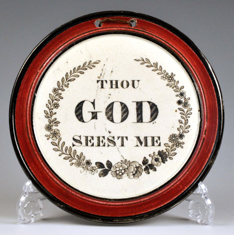 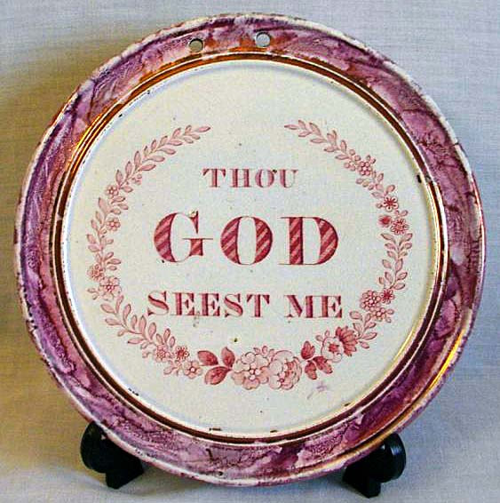 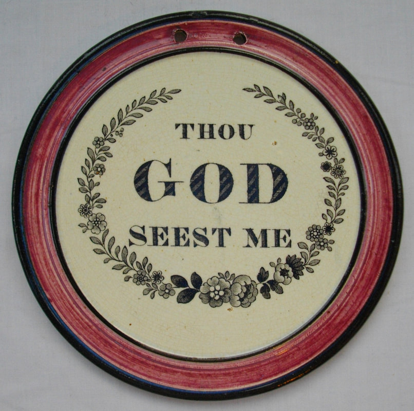   The next groups of plaques are attributed to Turpin & Co on the basis of the similarity of decoration and mould to the plaques above. There are two associated impressed marks: a letter 'B' and what I've called a 'segmented circle' impress. 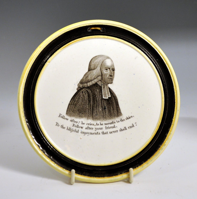 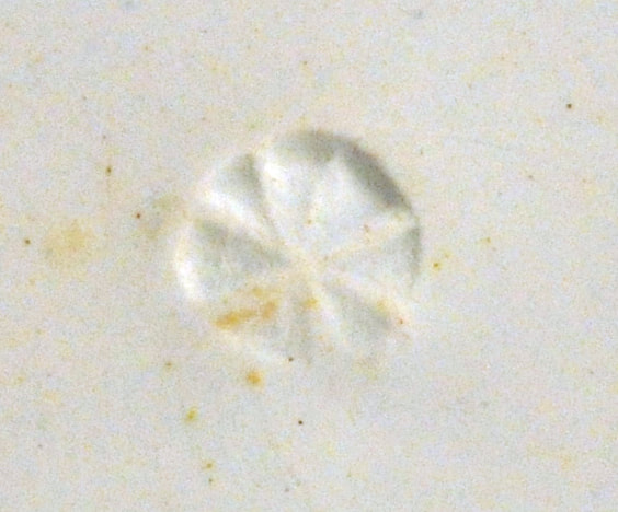     And finally, a hand-painted plaque which also has the 'segmented circle' impress. 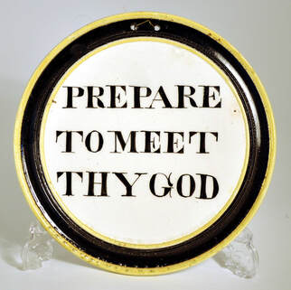 When did the transfer plate move to Fell?Where does Turpin end and Fell begin? The plaque series below has the same set of transfers, with the flaw on the Prepare plaque as described above. However, the Thou God plaques have an all-seeing eye above the verse. This was squeezed in by an engraver at a later date. We can't be sure when that was, but it proves that these plaques were made later than those above. And what better time to have a transfer plate re-engraved than when it has just been acquired for use by another pottery? 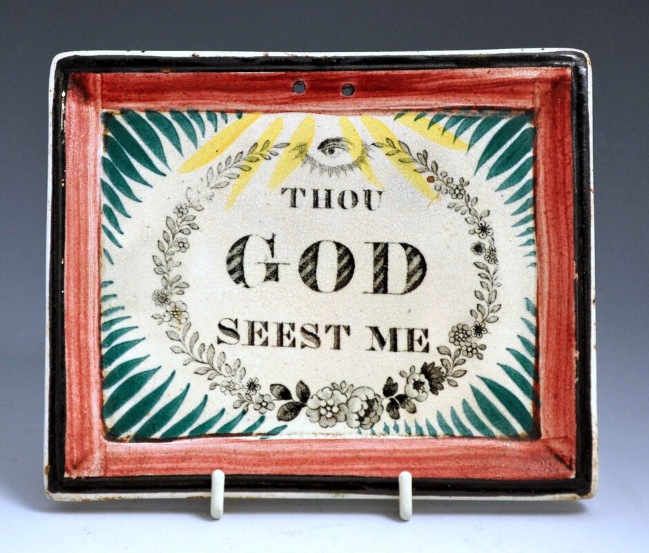 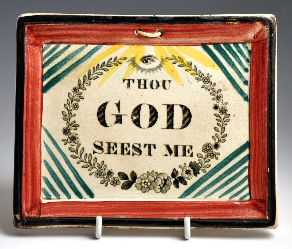 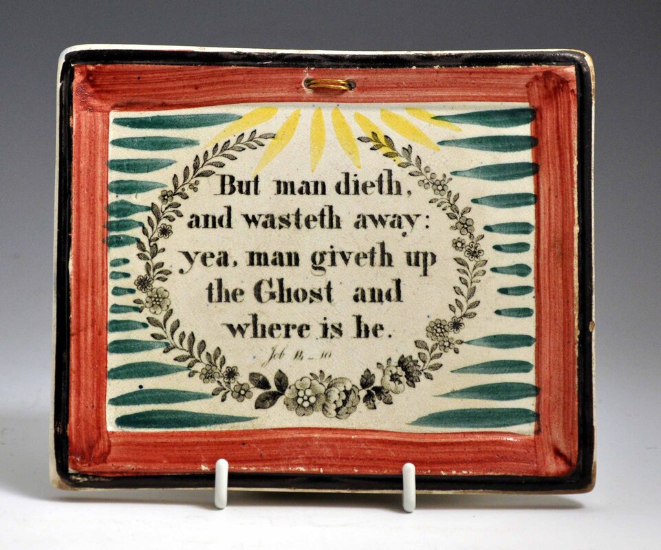 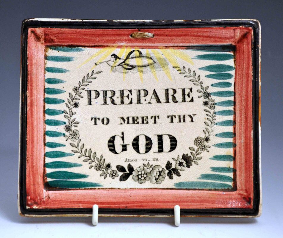 Presumably at the same time the all-seeing eye was added to the Thou God transfer, the engraver also touched up the Prepare (both were likely on the same copper plate). Compare the two plaques below. Whereas the folds on the angel's skirt have all-but disappeared on the second imprint, the clouds beneath the angel have been enhanced. 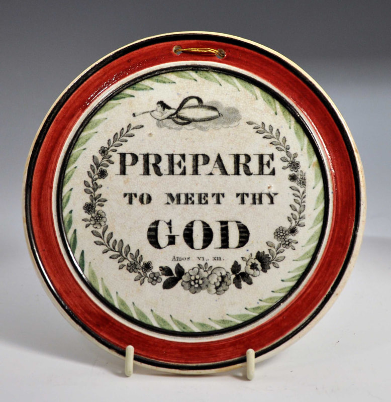 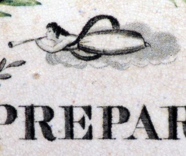 The plaque below has cut-out portions of the Prepare transfer with enhanced clouds. The yellow decoration and green stripes suggest it is contemporary with those above, and it has features usually associated with Fell. Note that the hanging holes are pierced through the central portion of the plaque, and not the border. The date of 1822, of course, was not when the plaque was made. It could have been a present for first communion, or more likely a 21st birthday present. A date of 1843 seems credible. This would put it just after Bell's date of 1841 for the Turpin & Co partnership. 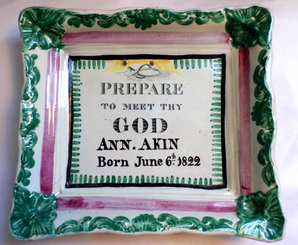 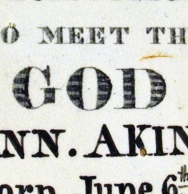 If there are any collectors of nursery plates reading this, I would love to hear from you if you have any plates with the same distinctive alphabet border or plates marked Turpin & Co. P.S. Fordy and PattersonThanks to Ian Sharp who has noted the similarity of border of the child's plate to one from Fordy & Patterson's partnership at the nearby Sheriff Hill Pottery. Bell's entry suggests this partnership operated in the early 1830s.  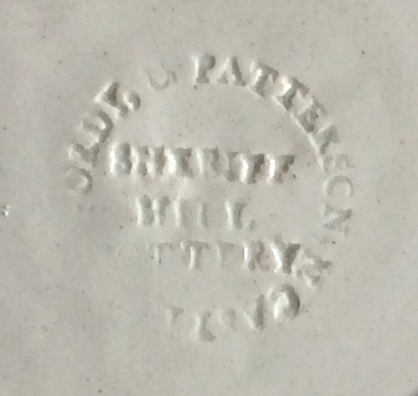 Like many people, I've had a few more hours for reading over the last couple of months, and have finally got around to polishing off Moby Dick. I now know more about the whaling industry in the 19th century than I ever imagined was possible. 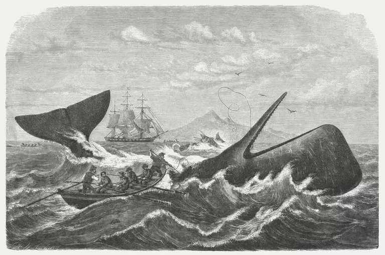 I also learned a little more about the importance of the Mate sounding the pump, morning noon and night. In Chapter 54, Melville's narrator, Ishmael, describes the fate of a ship, the Town-Ho, which had sprung a leak. "It was not more than a day or two at the furthest after pointing her prow for an island haven, that the Town-Ho's leak seemed again increasing, but only so as to require an hour or more at the pumps every day. You must know that in a settled and civilized ocean like our Atlantic, for example, some skippers think little of pumping their whole way across it; though of a still, sleepy night, should the officer on deck happen to forget his duty in that respect, the probability would be that he and his shipmates would never again remember it, on account of all hands gently subsiding to the bottom. Nor in the solitary and savage seas far from you to the westward, gentlemen, is it altogether unusual for ships to keep clanging at their pump-handles in full chorus even for a voyage of considerable length; that is, if it lie along a tolerably accessible coast, or if any other reasonable retreat is afforded them. It is only when a leaky vessel is in some very out of the way part of those waters, some really landless latitude, that her captain begins to feel a little anxious." And because I'm from Hull here's a plaque with the Truelove 'the last of Hull's whalers'. The US ship was captured in the American War of Independence and refitted as a whaler, killing over 500 whales on over 80 voyages to the Arctic. 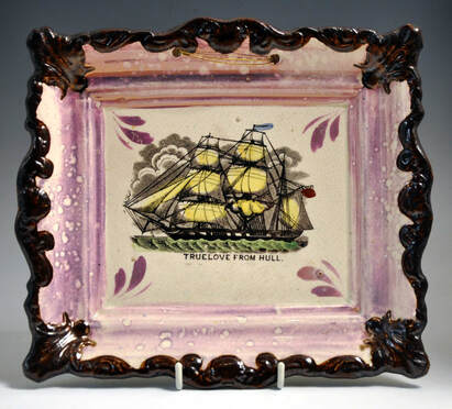 9/16/2018 0 Comments Catching upFor the last couple of years I've been working on a new website cataloguing the transfers found on jugs, mugs and bowls, and other lustre-decorated items. But that's not to say I've completed cataloguing plaques. I'm constantly surprised by what turns up. Here are a few highlights. 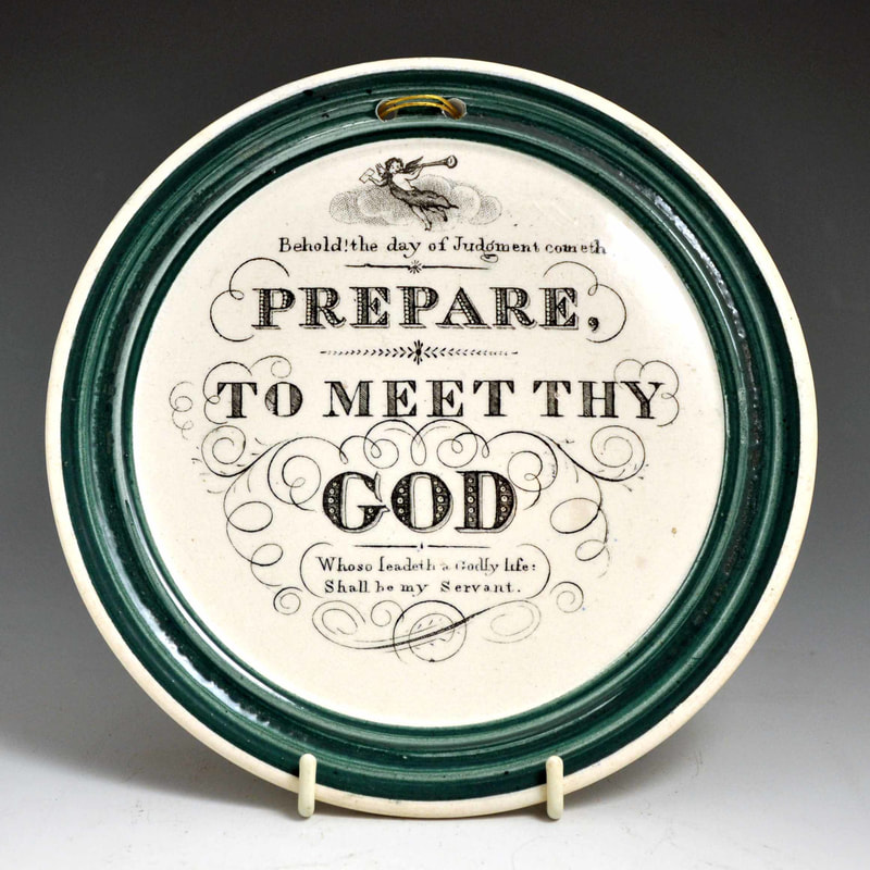 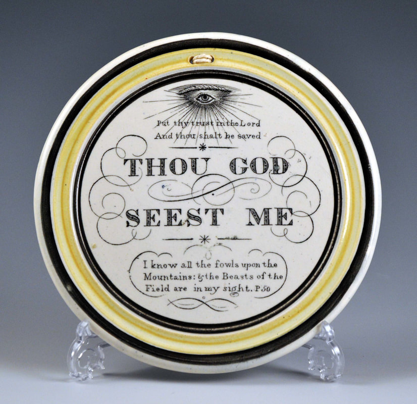 The green-bordered plaque on the left above is a rare and wonderful example of the most common verse, Prepare to Meet My God. Under it is the text 'Whoso leadeth a Godly life; Shall be my Servant'. It pairs with a Thou God transfer, which I have tentatively attributed to Maling. But although I have seen three or four versions of the Thou God, I had never seen a Prepare, until this one came up. 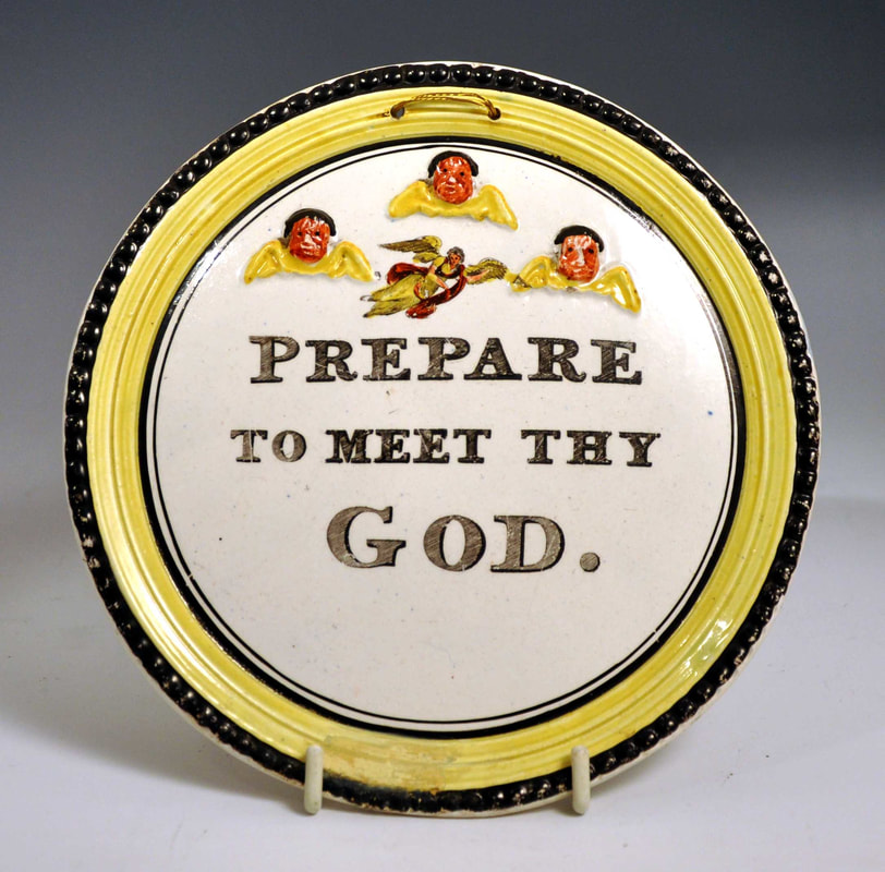 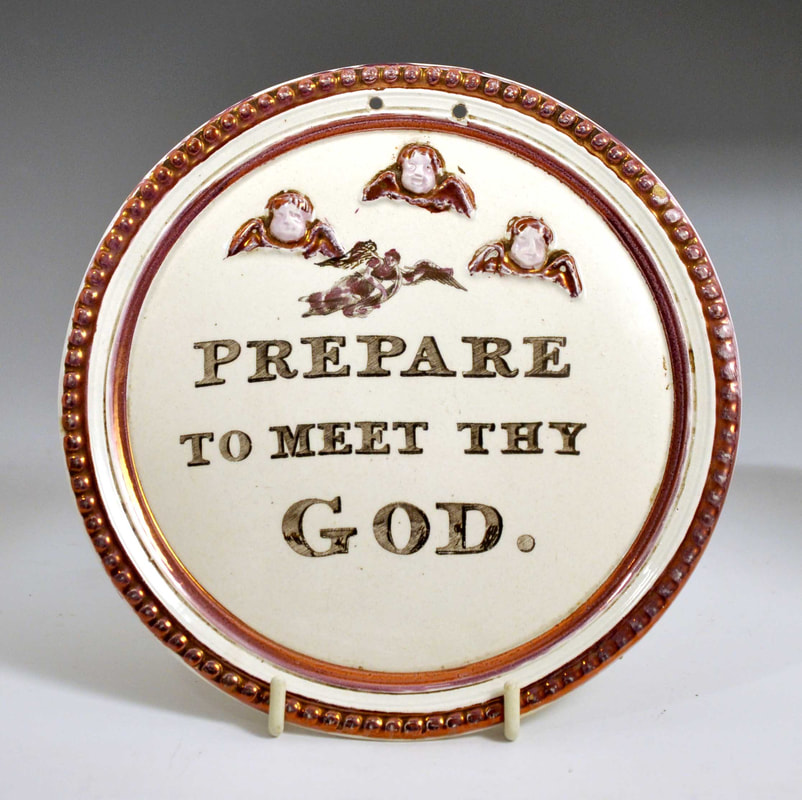 I've always loved these plaques with three relief angels, from an as yet unidentified pottery. I knew that versions with the transfer-printed 'Prepare' verse existed, but had never seen one in the flesh. Recently two came up in fast succession. 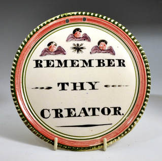 Staying with the angel plaques, here's a previously unrecorded verse. Ecclesiastes 12:1 'Remember now thy Creator in the days of thy youth'. 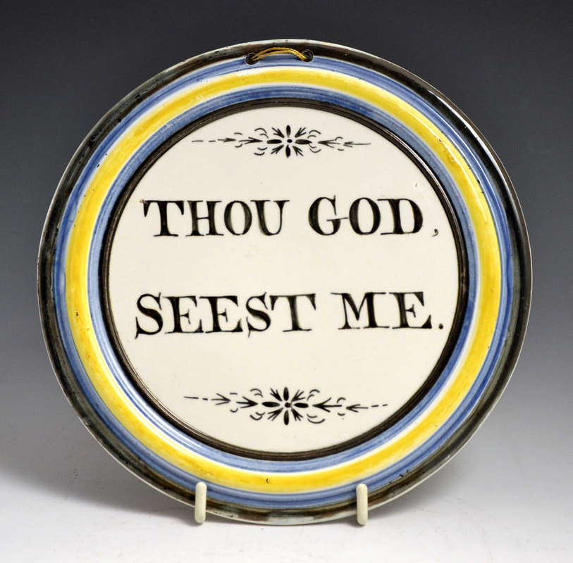  Above left is another hand-painted verse with distinctive decoration, and unusual black, blue and yellow borders. Above right, a hand-painted plaque attributed to Thomas Fell, St Peter's Pottery, Newcastle.   Above are two very pretty variants of the Sheriff Hill verse plaques. They have blue hand-painted flowers above the verses. 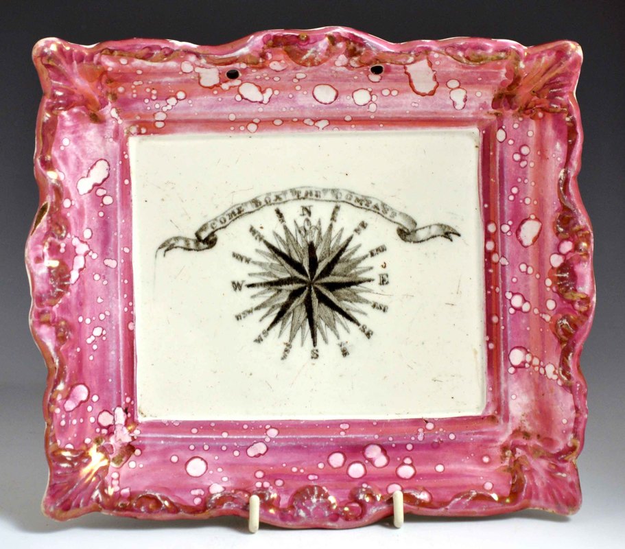 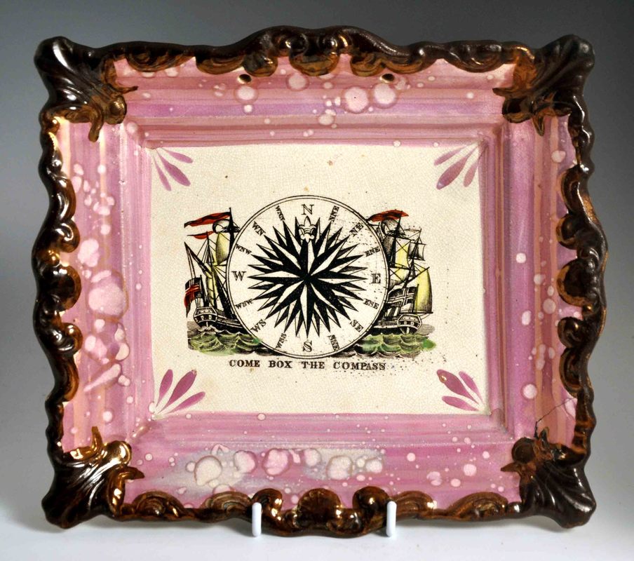 The two plaques above have 'Come box the compass' transfers. Although these are often recorded on jugs and bowls, I'd never seen them on a plaque before. The above left transfer appears on Maling wares. The above right appears on late Moore's items (c1870). 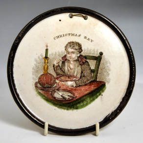 Above is a rare Staffordshire plaque attributed to T & B Godwin, New Wharf Pottery. This 'Christmas Day' transfer more often appears on children's plates. 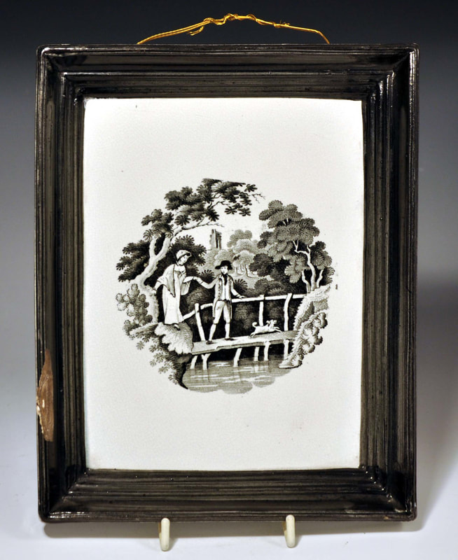 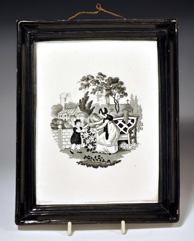 Above are two more Staffordshire plaques: left, a boy walking a girl over a bridge; right, a mother and child. Finally, my favourite new acquisition: a hand-painted Scott's plaque from c1840, with the text 'Mate sound the Pump, morning, noon and Night'. 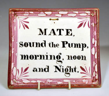 So even after nearly 20 years of collecting plaques, there are new things to discover. Don't forget to check the Sunderland Pottery Transfers site I've been working on.
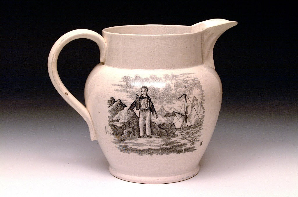
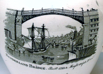
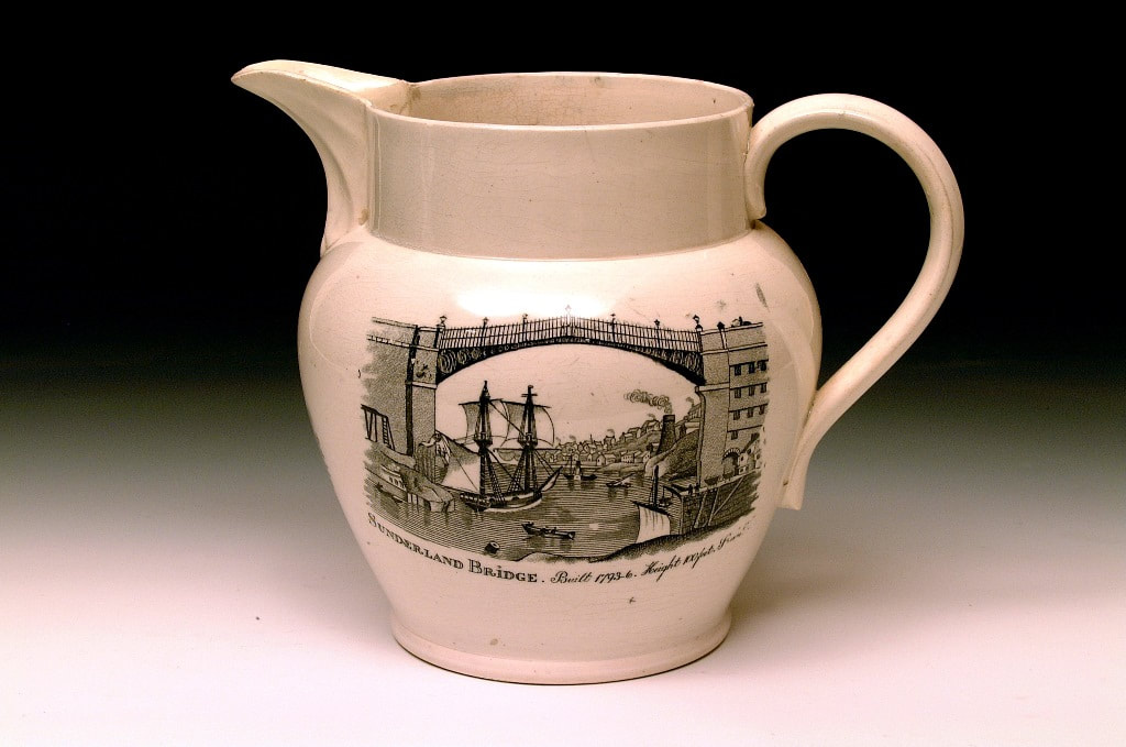
The jug below is attributed to Seaham Pottery, and has very different decoration to the items I've written about so far. 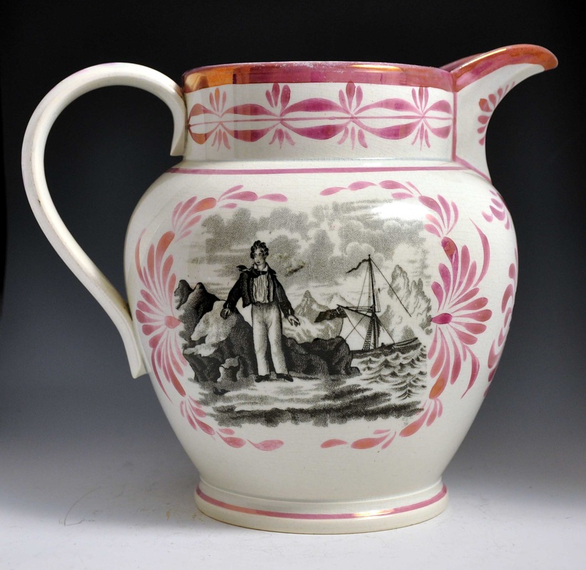 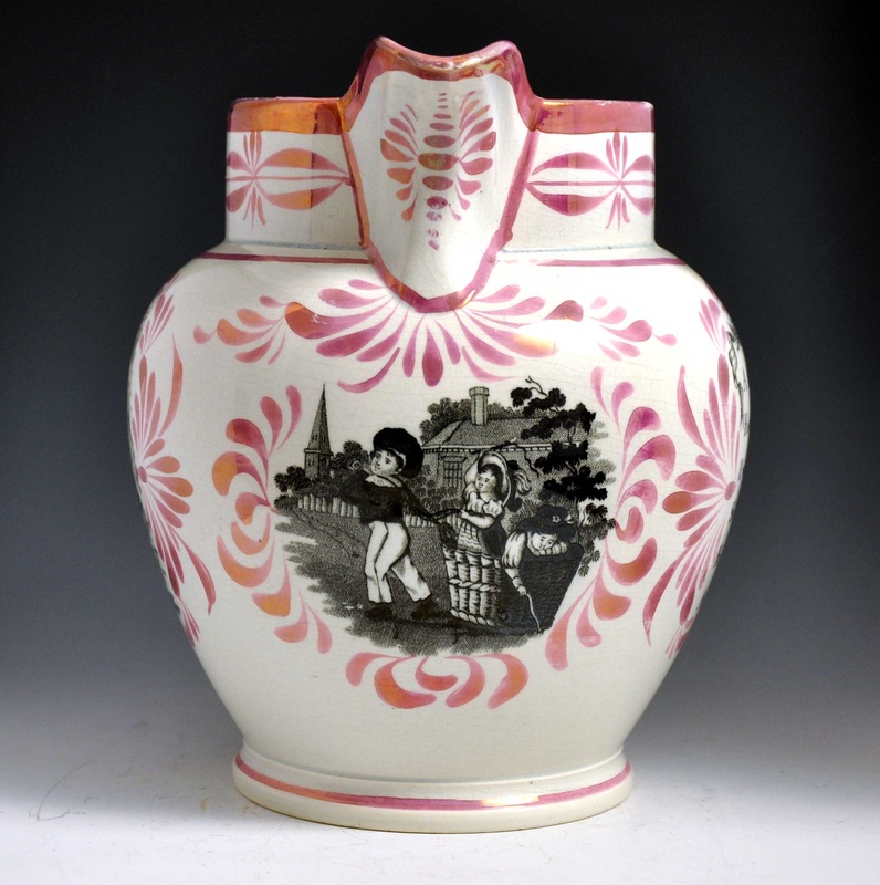 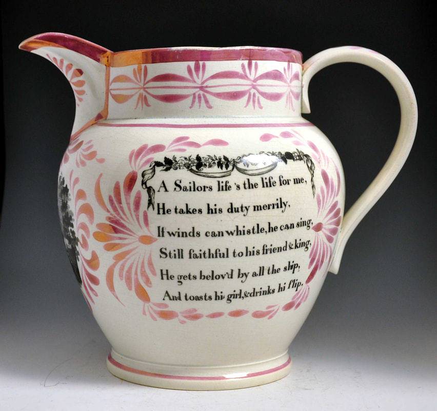 It is attributed to Seaham on the basis of a similar jug, in the Sunderland Museum displays, with the inscription 'Margaret Davison', 'Seaham Harbour' and the date 'July 1829'. That's not quite the end of the story though, because the Seaham Pottery wasn't built until 1836. So: either the jug was made at another pottery in 1829 before the Seaham Pottery was built; or the jug was made by Seaham Pottery at a later date for Margaret, perhaps as a birthday gift. 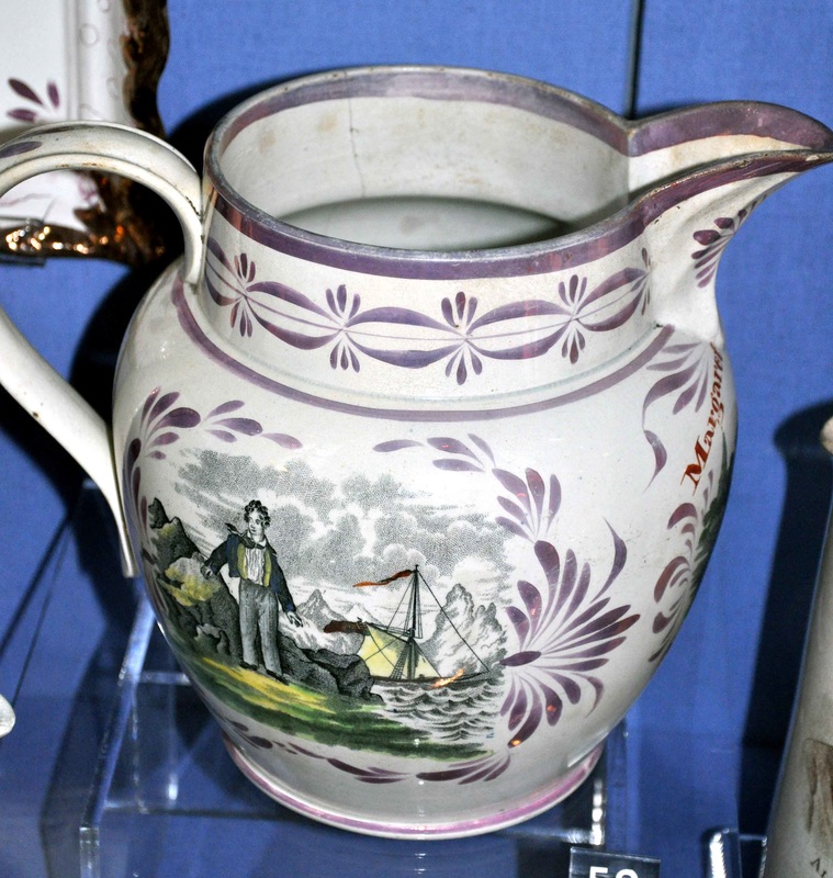 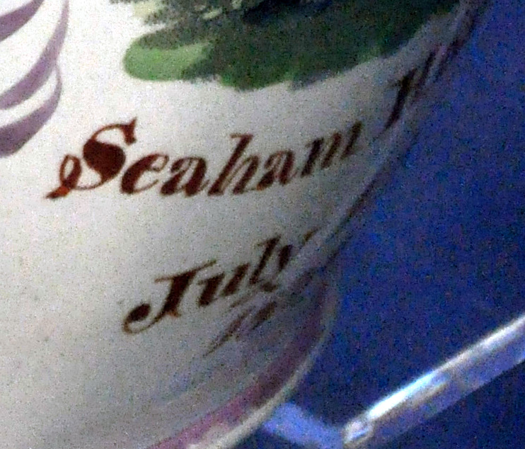 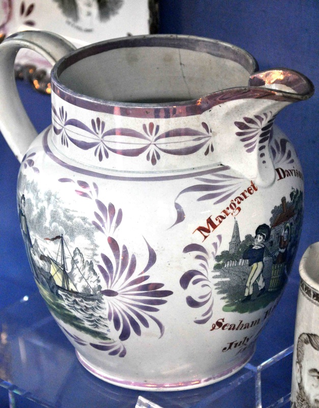 The Byron transfer is after a painting of the poet, with his servant Robert Rushton, by George Sanders (1774–1846) in the Royal Collection. There's a copy of the painting at Newstead Abbey, Lord Byron's home. (As discussed before, Byron was married in Seaham in 1815, so has a local connection.) Please see Ian Holmes' site for two mugs with the transfer.  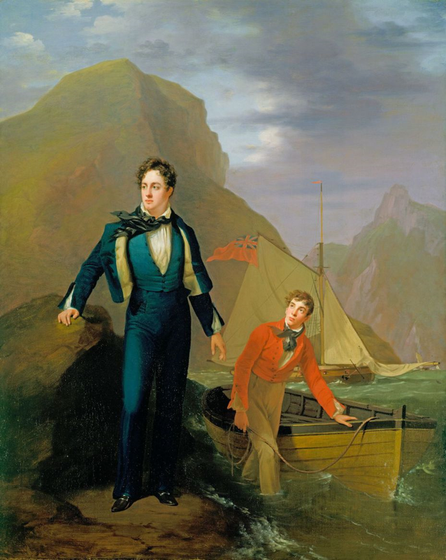 The Byron transfer is also found on items with a distinctive view of the Sunderland Bridge. In Baker it is listed as view number 5, with a note about the paddle steamer in the background. The jug above is undecorated, and was likely sold as a factory second. Often these undecorated items have firing cracks or flaws. The items below are more typical with the elaborate lustre decoration associated with these Seaham-attributed jugs. 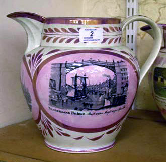    If you have a similarly decorated item, please get in touch. If we could find another with a dated inscription, we might get a step closer to proving these items were made at Seaham Pottery after 1836. P.S. Norman Lowe has done some digging in the census records and made some interesting discoveries.
Taking all of that into account, it seems possible, perhaps even probable, that the jug was given to Margaret on her 21st birthday in 1850. William Davison is recorded as being a dock pilot born in Monkwearmouth in 1826. Aged 24 in 1850, he would have worked as a seaman, going out to meet incoming ships and navigating them into the harbour. So perhaps neither William nor Margaret had much interest in the poetry of Byron. For them, the untitled image would have been of young William standing on the shore. At this stage in their relationship, the other transfers on the jug, regarding the sailor's life, and young children playing, would also have had personal poignancy. 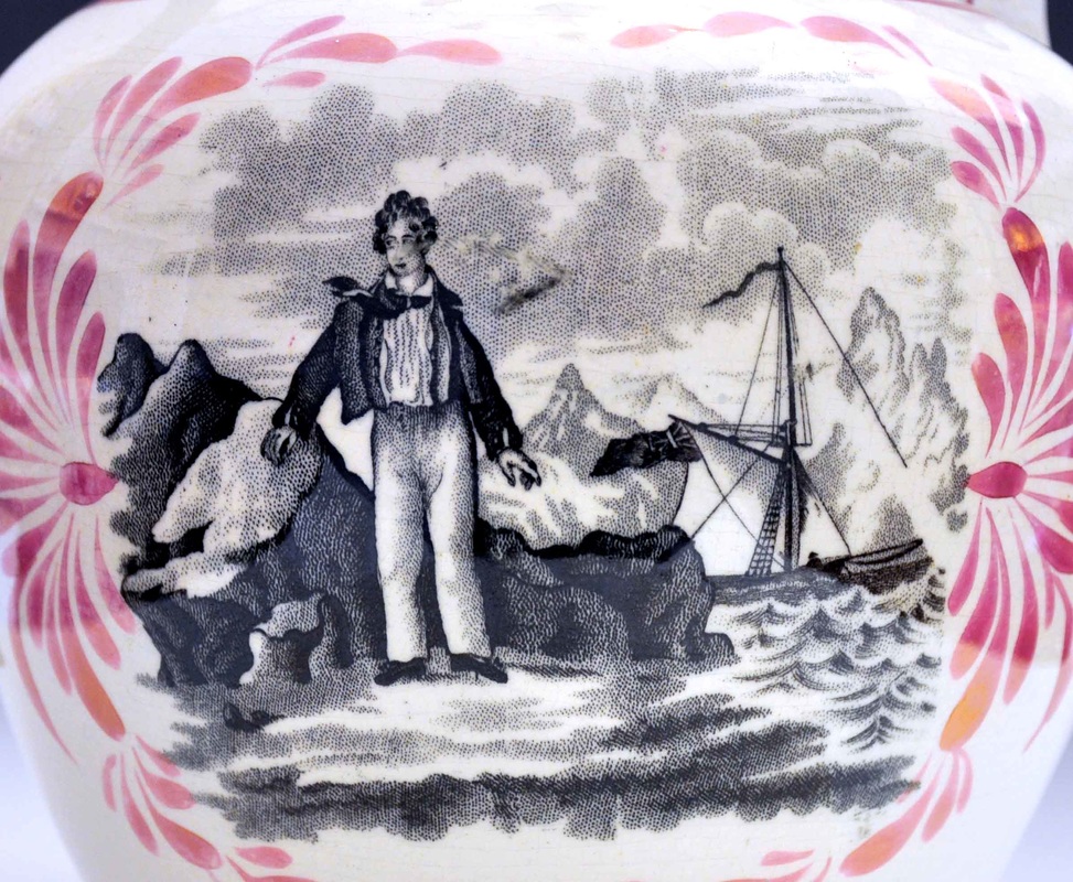 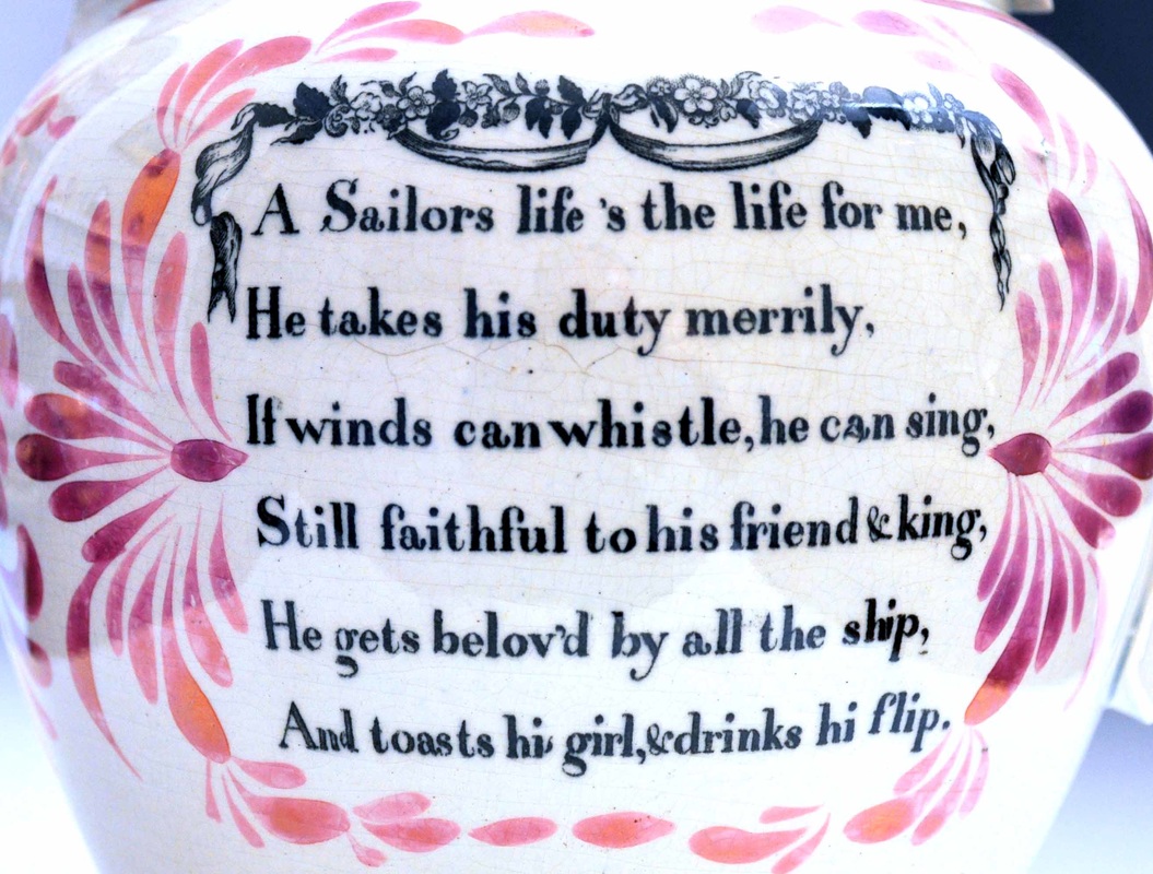 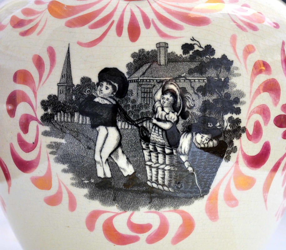 All this considered, the Seaham attribution now seems more secure. The jug would have been made around the time the pottery changed hands. Walker sold the premises at an auction on December 11th, 1850. R.C. Wilson then ran the pottery from 1850 to 1852. So my money is on the jug being made at the end of Walker's ownership.
11/18/2016 1 Comment The Seaham frogThanks, once again, to Norman Lowe for getting in touch regarding my recent posts. In my last post I wrote about two frog mugs, with variations of the Sailor's Return transfer. Both have been attributed to Seaham. However, the one below right, from the Sunderland Museum collection, has lustre decoration similar to marked items from Thomas Ainsworth's Stockton Pottery. As you are probably bored of hearing by now, the transfer on the left mug below, also appears on a plaque with the inscription 'A Present for E. Towning'.  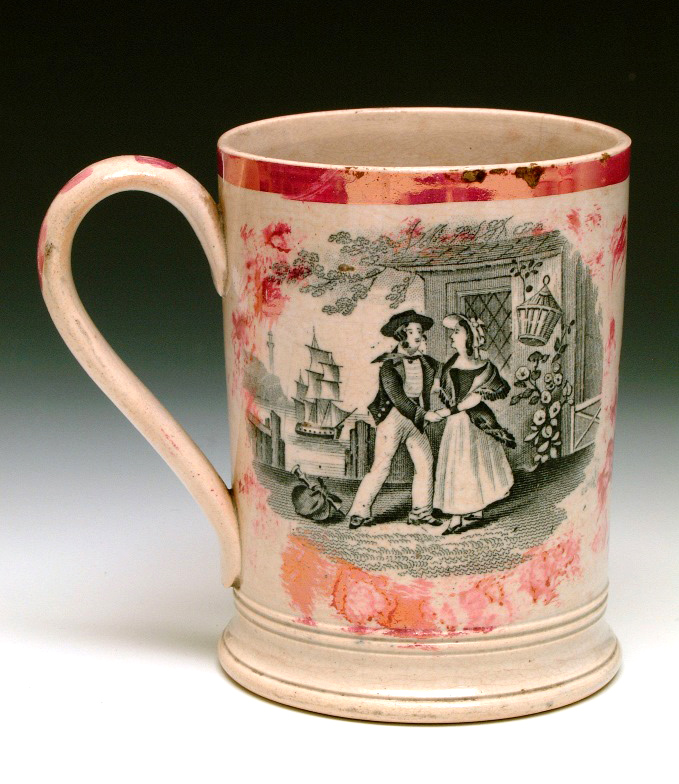 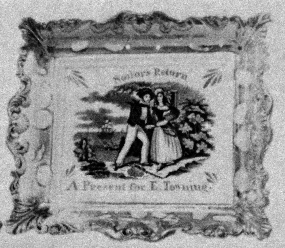  Norman did some digging in the census records and writes 'Interestingly there was an Elizabeth Towning born 1860 in Stockton!' So is it possible that the items above were all made in Stockton, and not Seaham, after all? The Stockton Pottery was founded in the 1840s and closed in 1901, so was certainly turning out wares in 1860. Moore's Pottery was mass-producing similar larger-sized rectangular plaques in the 1860s, so the style of mould might fit the date. However, I think 1860 is too late for the plaques above. Take a look at the first three plaques below. The Seaham Pottery was producing identical large and similarly decorated religious verse plaques at the time the E. Towning plaques were made. We know that by 1850 the pottery had ceased making these plaques (the religious ones at least), and the copper transfer plate had found its way to John Carr's Low Lights Pottery in North Shields. The final plaque below, although unmarked, has Carr in it's DNA. The lustre decoration and distinctive red inscription, combined with the smaller mould, scream Carr (marked examples exist). What's more, the plaque is dated July 1st, 1850.    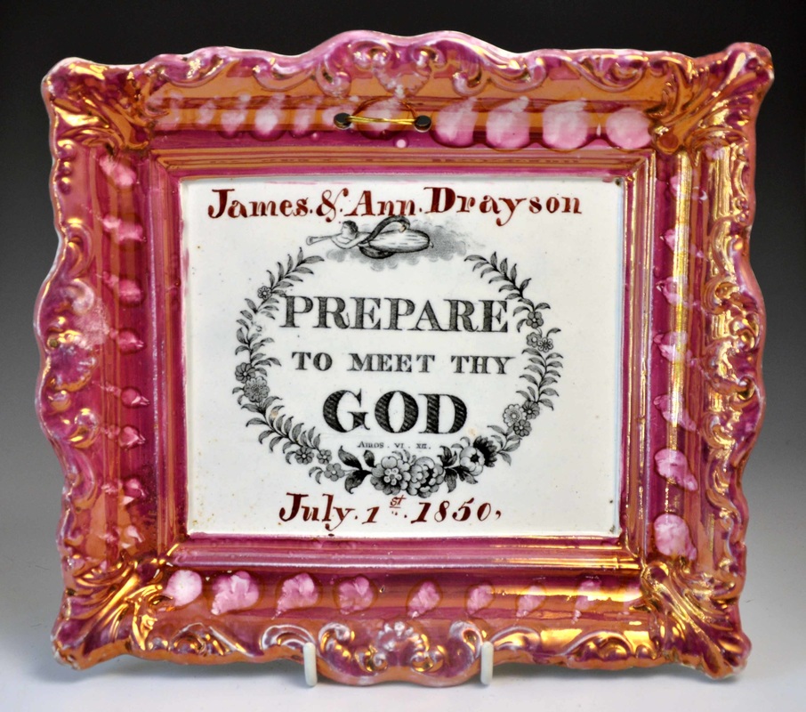 The quality of the later examples of the Carr verse plaques is poor, with the transfer imprints looking faint and worn, so we can be sure that the 'Seaham' plaques came first, and pre-date July 1st, 1850. So the E. Towning born in Stockton in 1860 is highly unlikely to be the person celebrated on the plaques. Norman has, however, come up trumps in finding a link between the Sailor's Return transfer, and the large dated (1847) Seaham jug in the Sunderland Museum (below left). He owns a frog mug (below right) with the same Mariners' Compass transfer as the signed jug. Note the two blemishes circled in the final detail below, which appear on both the jug and the mug.   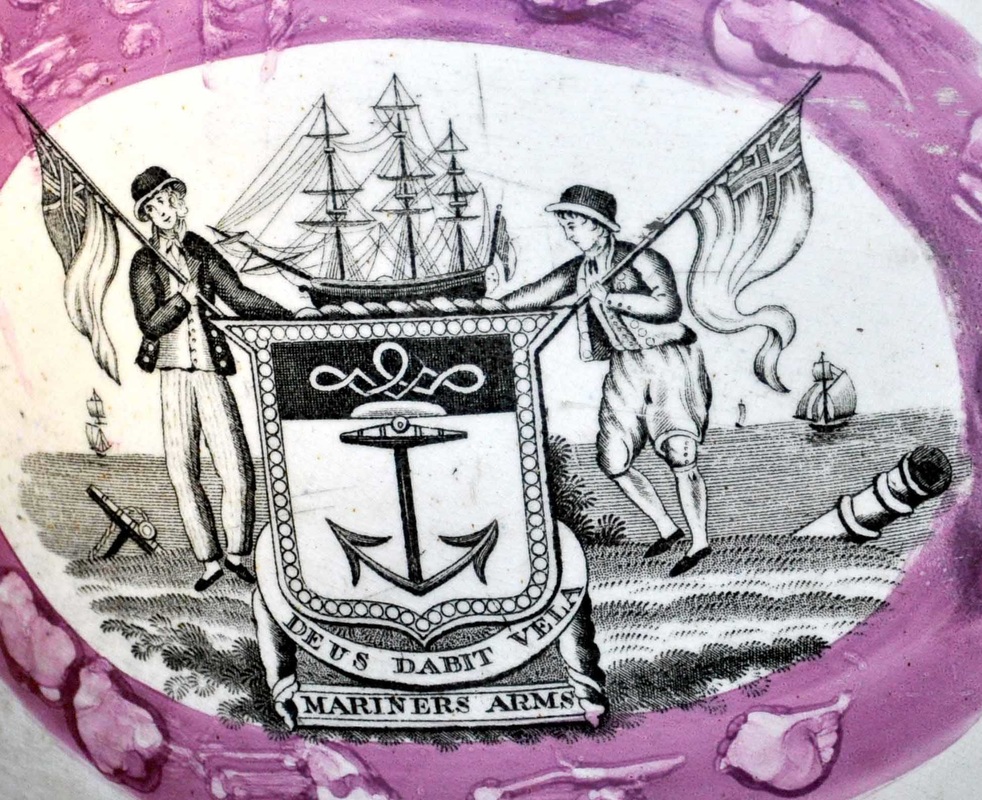  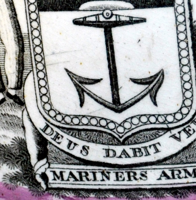 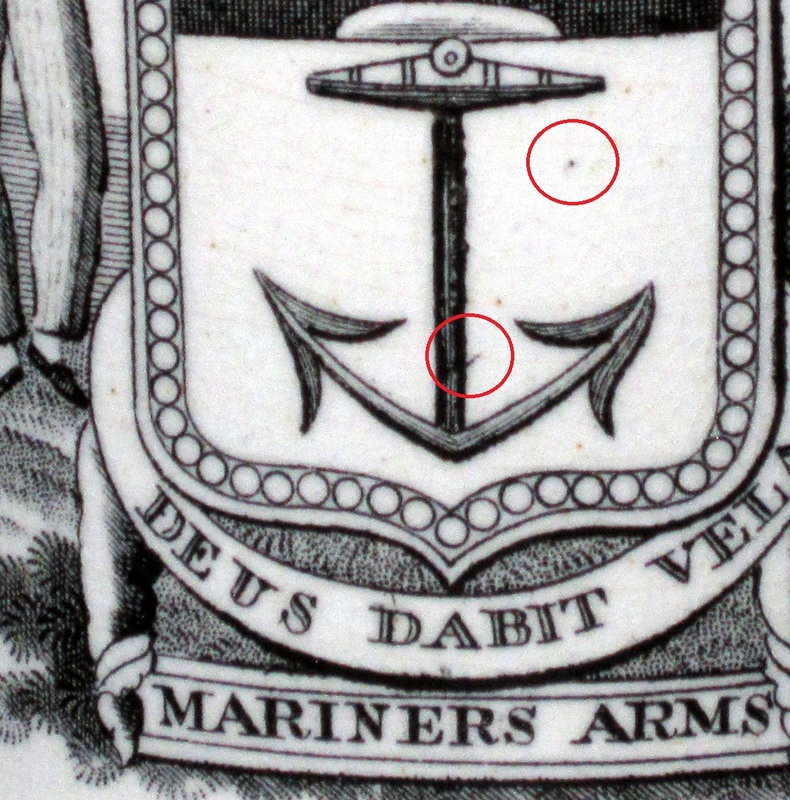 So if we're now sure that Norman's frog mug is Seaham, how does the frog in his mug compare with the one in my Seaham-attributed mug with the Sailor's Return? My frog is on the left below, and he's an ugly brute, with traces of enamel decoration. However, I'm happy that they are a perfect match (click on the images to enlarge and move between them). There are slight differences where the potter has used a tool to bind the limbs of the frog to the inside of the mug, but their bodies appear to be from the same press mould. Note the moulded eyes on the sides of the frogs' heads. N.B. the frog takes up more space in Norman's smaller mug.  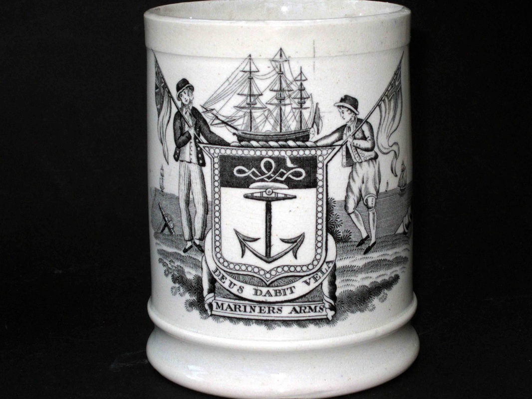   For those doubters who think all frogs look alike, take a look at the variety of Sunderland frogs below. The first, attributed to Newbottle, is the closest match, but it has smooth, rather than pitted, skin. 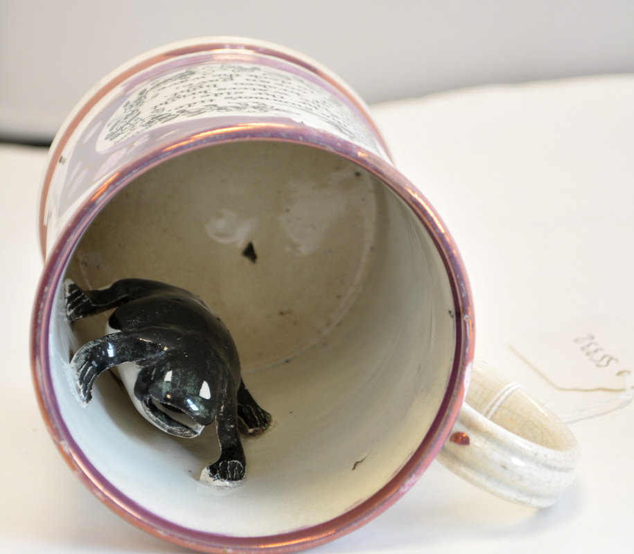 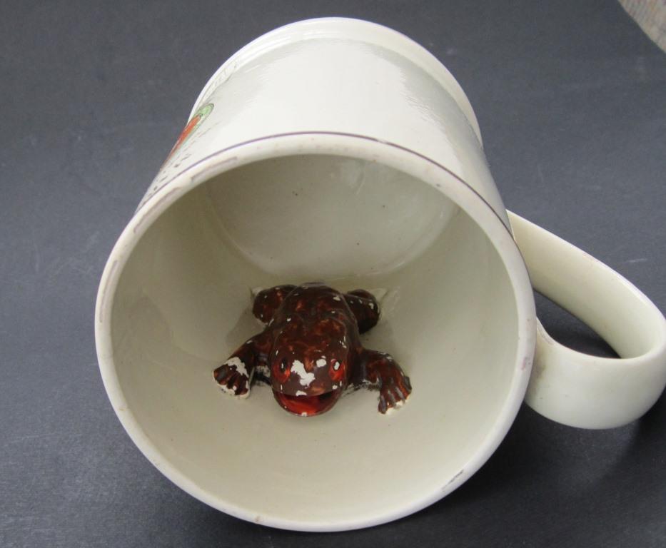  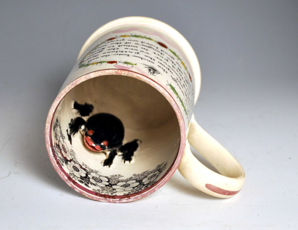 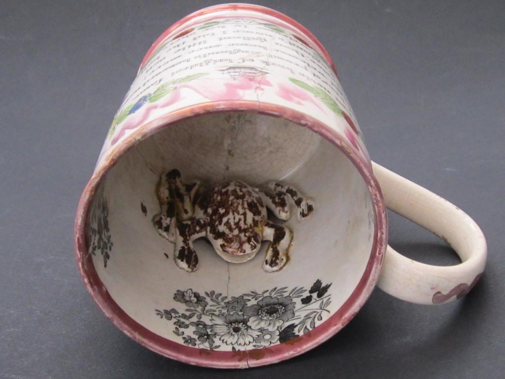 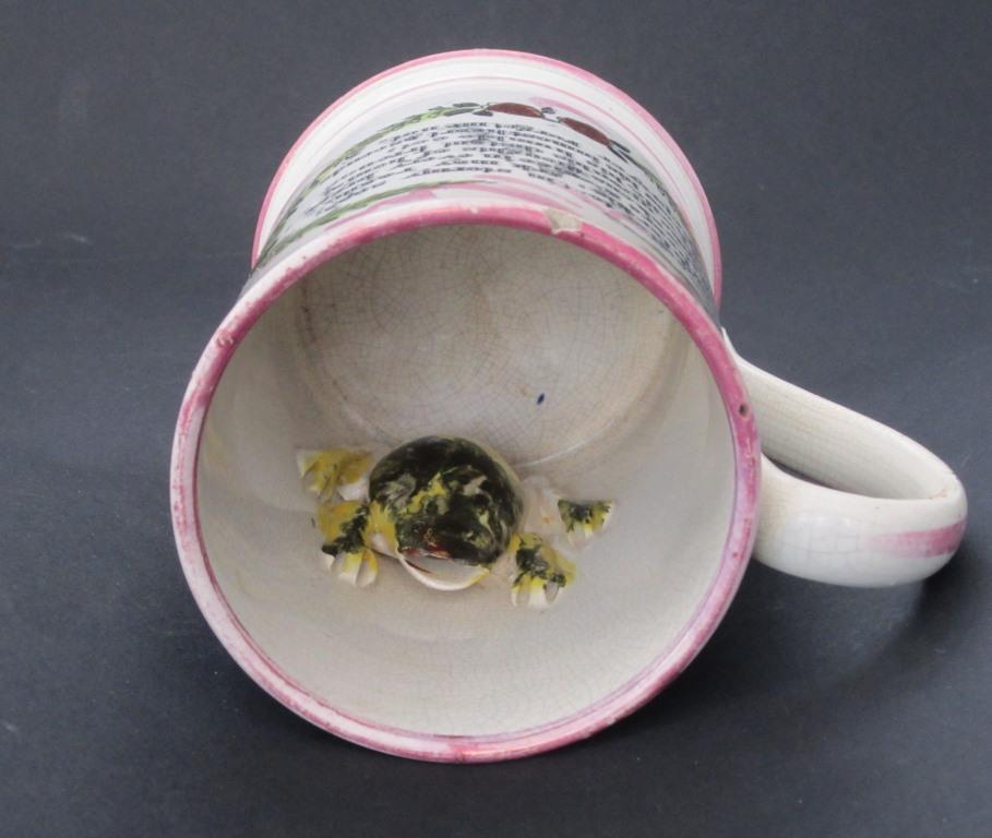 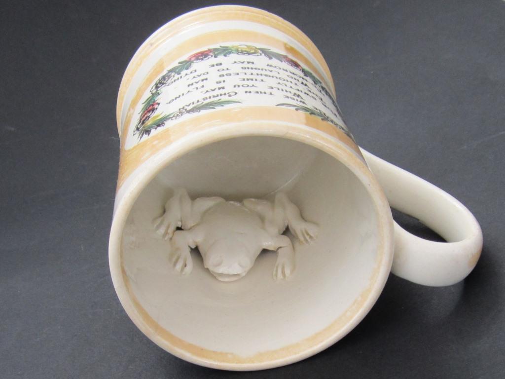  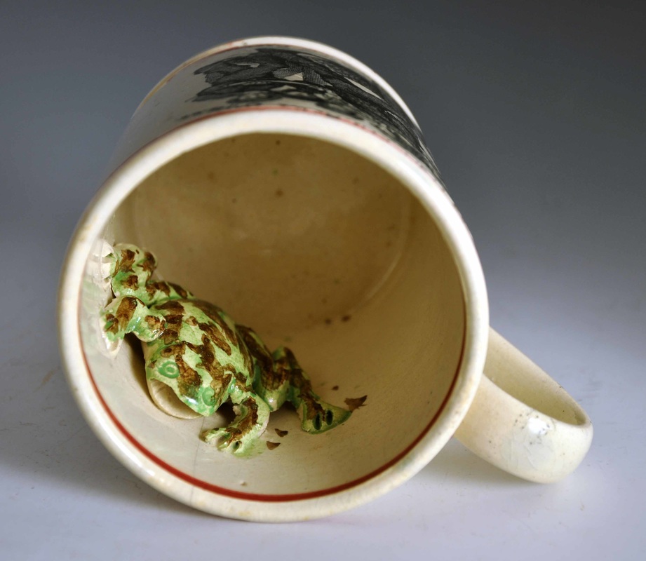 I've e-mailed the Sunderland Museum to see if I can get a photo of the frog in the other frog mug at the start of this post. Although the mug is attributed to Seaham, it has decorative features associated with Stockton. A look at its frog might help move the attribution on. For any diehards who have read this far, here's a sneak preview of my new Sunderland pottery transfers site. I haven't advertised its presence yet, as it is just a few jotted notes. P.S. Thanks to Shauna at the Sunderland Museum for getting back to me about the Seaham/Stockton 'Sailor's Return' mug in their collection. It doesn't have a frog, so we're no further forward I'm afraid. Although that's yet one more difference between the mug and its known Seaham counterparts.
10/27/2016 0 Comments Seaham Pottery 'Sailor's Return'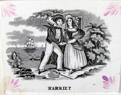 In my previous post I showed a grainy picture of a plaque titled 'Paul Jones' from an old auction catalogue. Below left is its pair, also inscribed 'A Present for E Towning'. Recently a similar plaque came up on eBay, this time with a hand-painted dedication to 'Harriet' – perhaps a sailor bought it as a gift for his sweetheart. If you were the buyer, please get in touch – I'd love a better photo.  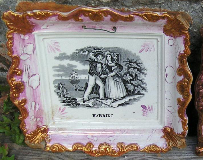 This Sailor's Return transfer is attributed to Seaham, and also appears on very large frog mugs like the one below (click on the images to enlarge). The lustre decoration is similar to that on the 1847 Seaham jug (see centre below) in the Sunderland Museum. The final image shows the mug's immense size, next to a slop bowl with a similar transfer.    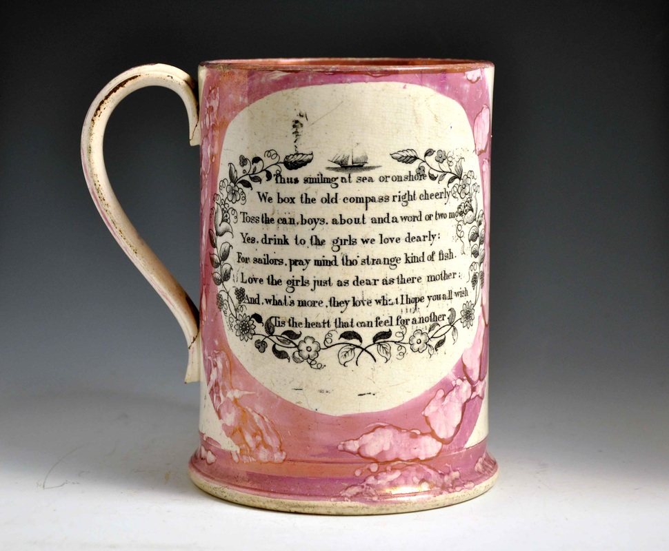   Closer inspection shows that the transfer on the slop bowl, although based on the same image, has some marked differences to the transfer on the mug. Note the lantern in the background in the right image, and the positioning of the sailor's bag.   The transfers on the slop bowl match those on a large frog mug in the Sunderland Museum, also attributed to Seaham Pottery. However, their lustre decoration is unlike any of the items attributed to Seaham so far.    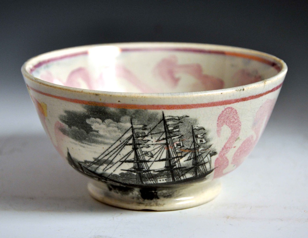 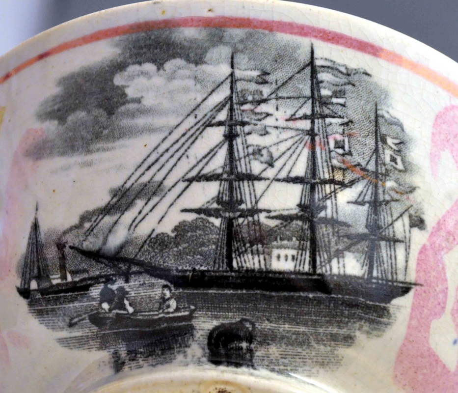 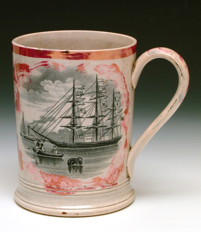 To my mind, the items above look much more like wares from the Stockton Pottery of Thomas Ainsworth (see below). The circular plaques are sometimes found with impressed marks with a castle and anchor (see below centre), so the attribution for these items is pretty solid. Stockton items are often typified by what Ian Sharp has called 'slug trail' decoration. Note also the bands of lustre around the top of the jug, and compare them with the bowl and the mug above.  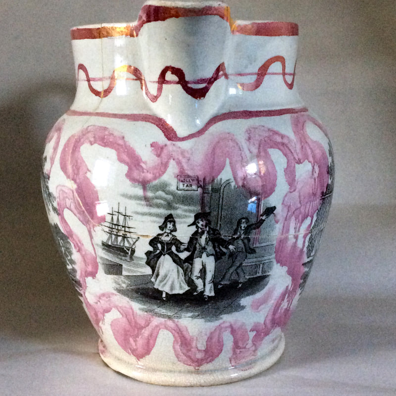 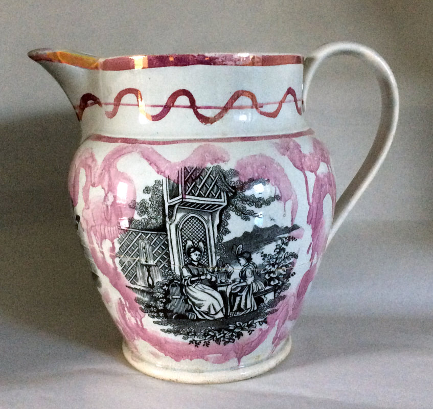   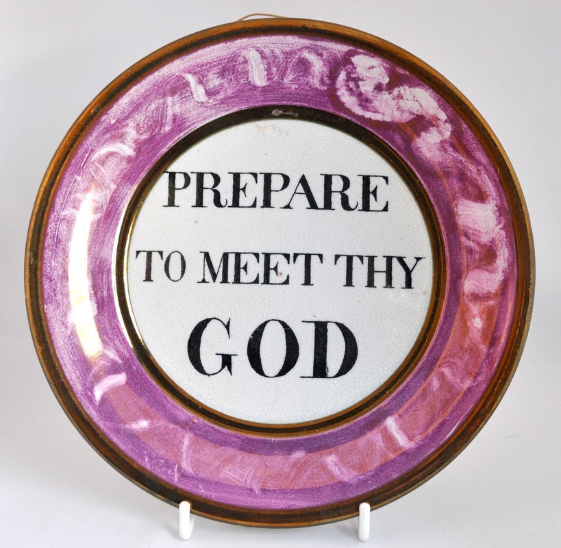 So the jury is out on the attribution of the slop bowl and second mug. As I've said before, attributing items on the basis of lustre decoration is an imprecise science, so more work needs to be done. As always, if you have items with these transfers that might help, please get in touch.
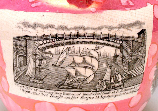
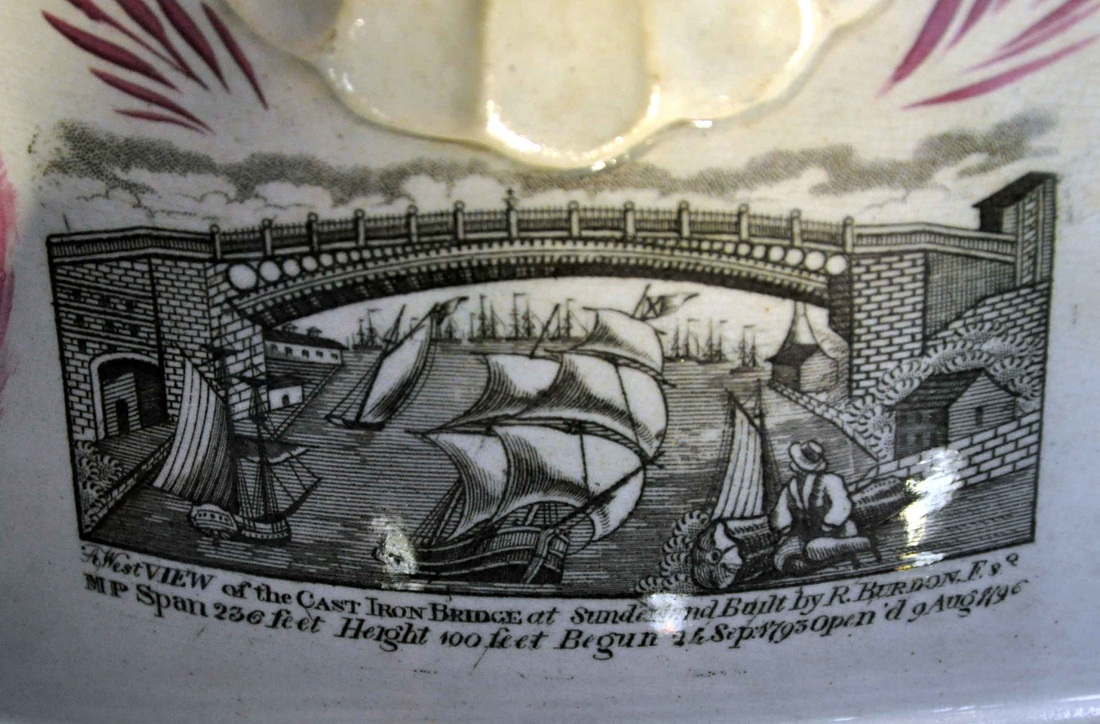
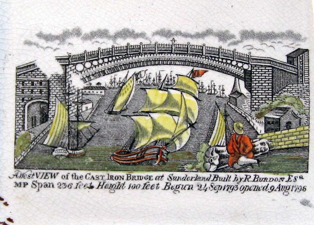
10/17/2016 0 Comments Seaham Pottery 'Paul Jones' transfer Depending on your perspective, John Paul Jones was either the father of the US Navy and hero of the American Revolutionary War (below right), or a pirate (below left). The transfer that appears on Seaham Pottery items is untitled, so it is hard to be 100% sure of its subject, and I haven't been able to identify the source. The Sunderland Museum display states that the figure is Byron. But I've also seen him listed (incorrectly) as Jack Crawford. Perhaps there was a commercial advantage in deliberately leaving his identity open. However, I'm still haunted by the centre image below from an old auction catalogue. (If you own the plaque, please get in touch!) Someone at the Seaham Pottery decided, for one day at least, that the image was to be titled 'Paul Jones'. 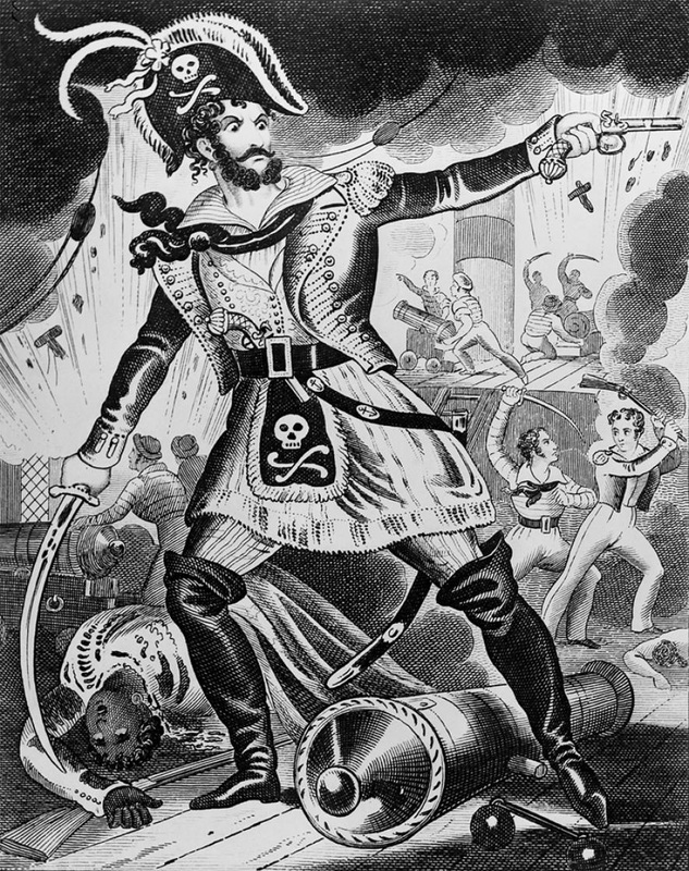 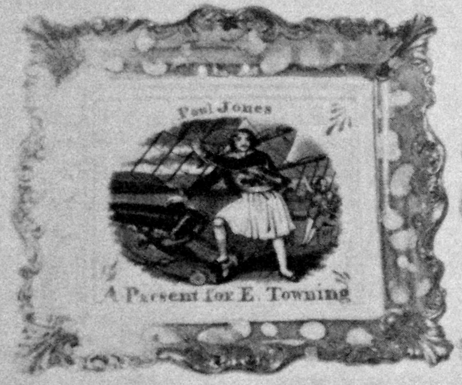 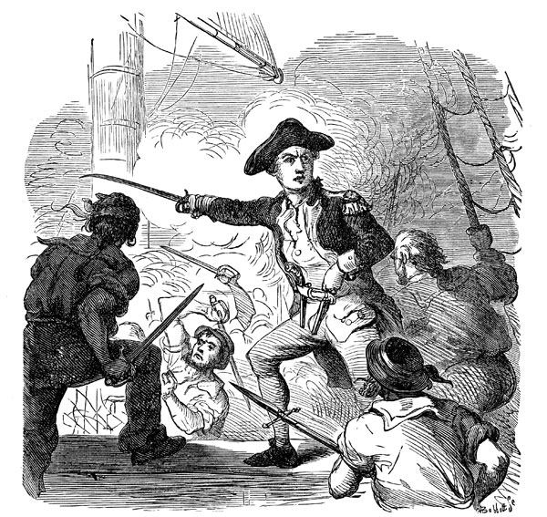 The jug below, in the Sunderland Museum collection, is catalogued as 'probably Seaham Pottery', but I'm unsure on what basis. In fact, there are a whole group of distinctive transfers catalogued this way, which appear to be unique to the pottery. (More on that in the future.)   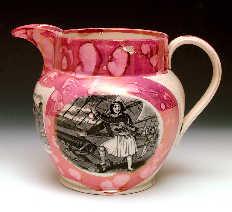 The jug has a bridge transfer (left below) very similar to the one on the large Seaham jug in the museum (centre below), dated 1847, but they are different - from memory, the transfer on the large jug is smaller. The below right image is from an Albion Pottery (Tyneside) plaque, c1864. Again it is different - note the triangular sail on the front of the large ship in the foreground. The bowl below, from John Howard's archived items, has 'Paul Jones', accompanied by a very distinctive ship transfer, which to date I've only seen on the large Seaham jug in the museum collection (bottom centre and right). I'm unsure whether the two ships come from the same copper plate (without a high resolution image, it's difficult to tell). John's bowl has a bridge transfer that matches the one on the smaller jug above. 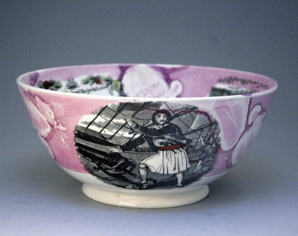 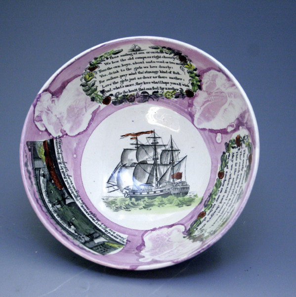 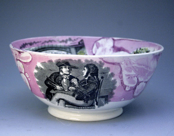 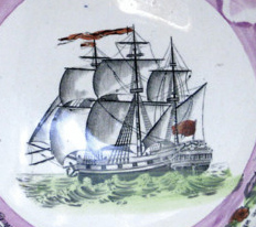  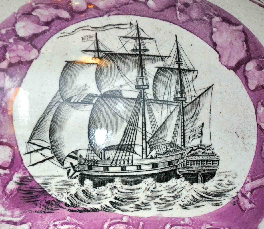 Anyway, here's the exciting thing, for me at least. I've long known that the plaque on the left below was likely Seaham, but I couldn't reconcile that with the fact that identical plaques are found with religious verses – same unusual large size (215 x 238 mm), buttery lustre, and distinctive decoration. Those verse transfers (the very same ones) also appear on 1850s' plaques with the John Carr & Sons impress. So how did the copper transfer plates find their way from south of Sunderland, up to North Shields on the Tyne?   I think the answer could be in the advert below. John Hedley Walker, the owner of the Seaham Pottery, moved his operations to Carr's Hill Pottery near Gateshead in 1849. Now, lest we get too excited, 'Carr's Hill' refers to a village, and not to the North Shields potter of the same name. However, this does provide a plausible explanation for why the copper plates might have migrated northwards beyond Sunderland to Tyneside.  P.S. Thanks to Ian Sharp for getting in touch and pointing out the Byron connection to Seaham. Byron married Annabella Milbanke at Seaham Hall in 1815. So the pottery had more reason than most to celebrate the poet. Byron spent time in Greece and had himself painted in Greek dress (see right below). So it's possible the transfer depicts him. We may never know until we discover the source for the transfer. 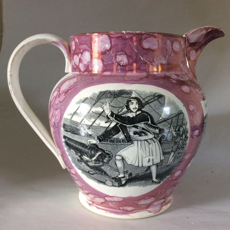  The Seaham jug in the Sunderland Museum (see previous post) provides a catalogue of transfers used by Walker & Co at that pottery in 1847. This is a great resource, because Seaham items are nearly always unmarked, and difficult to attribute. I thought I'd check items in my own collection and see if I could find a match, and where better to start than the Mariner's Compass, which has always been a favourite transfer. The transfer on the Seaham jug is easily distinguishable from the transfer found on plaques attributed to Newbottle and Moore's (a Newbottle plaque shown on the right below). Compare the two details, each from the item above. N.B. the transfer on the jug (left) is applied to a curved surface, so there are distortions of perspective, but even so, it's clear that the transfers come from different copper plates. The shading of the fur on the lion's cheek is running in a different direction. The tufts of grass in the foreground are different.    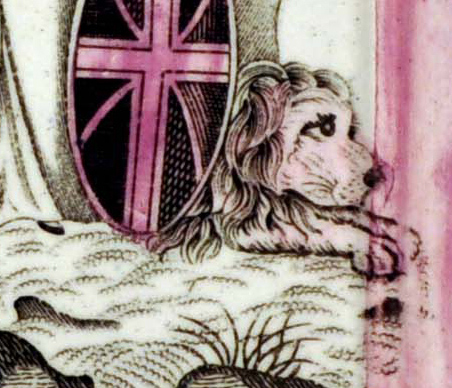 But I did manage to find two items that matched (see below). Again, you need to remember the transfers are on curved surfaces, and stretched in different directions. But the shading on the lion and the tufts of grass now match. We know that the first jug, with coloured enamels was made earlier, because the other two objects show scratches on the copper plate that don't appear on the first. Look at the lower right quadrant of the shield (third row below). The centre jug and the bowl have a dark line through the diagonal white band that doesn't appear on the first. Also look at the lower left points of the star in the centre of the compass (bottom row). The centre jug and the bowl have a scratch coming off the point at SSW, but again the first doesn't.   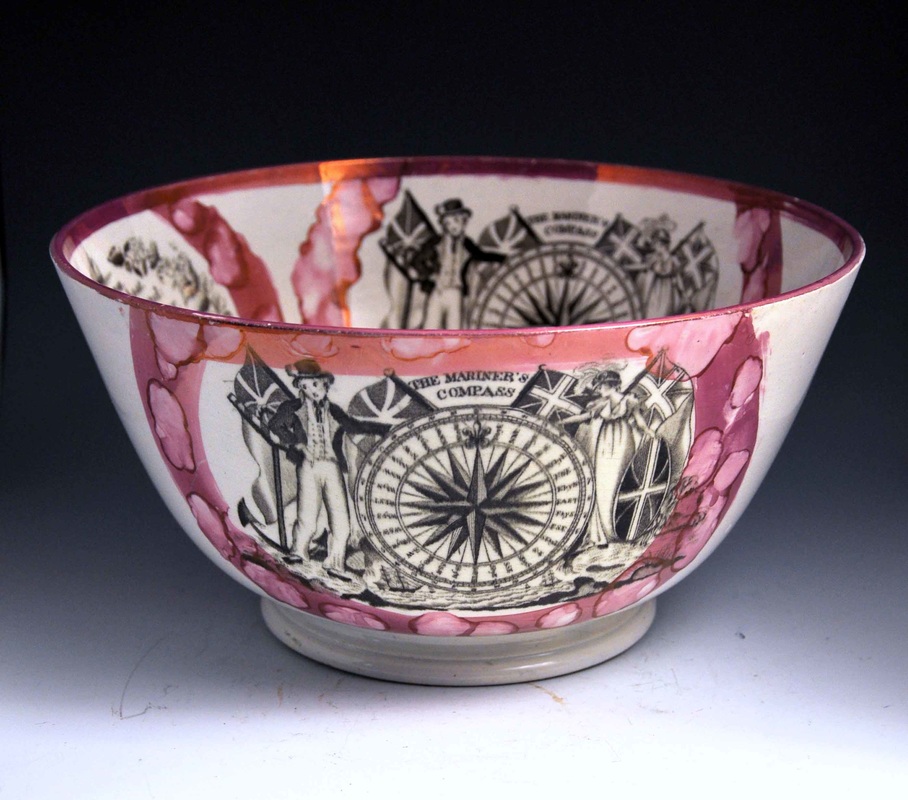 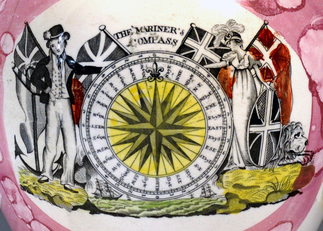 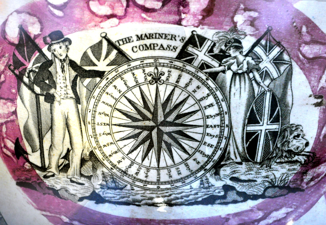 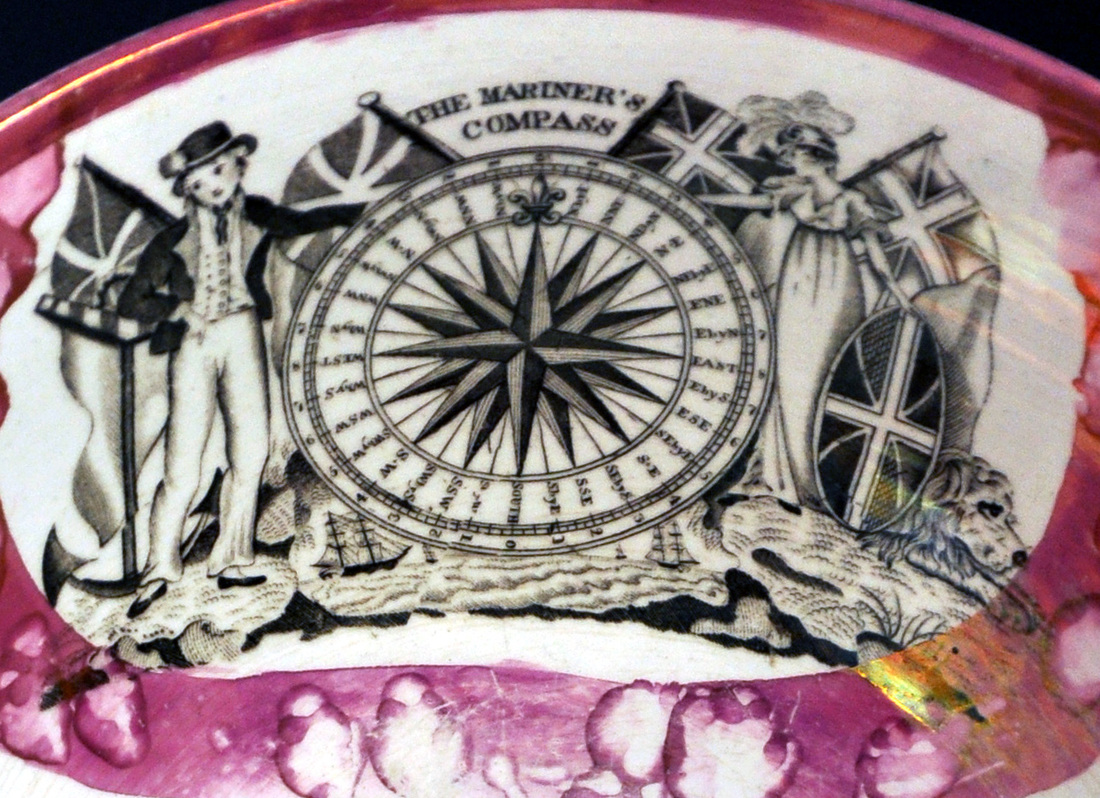 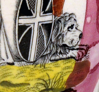 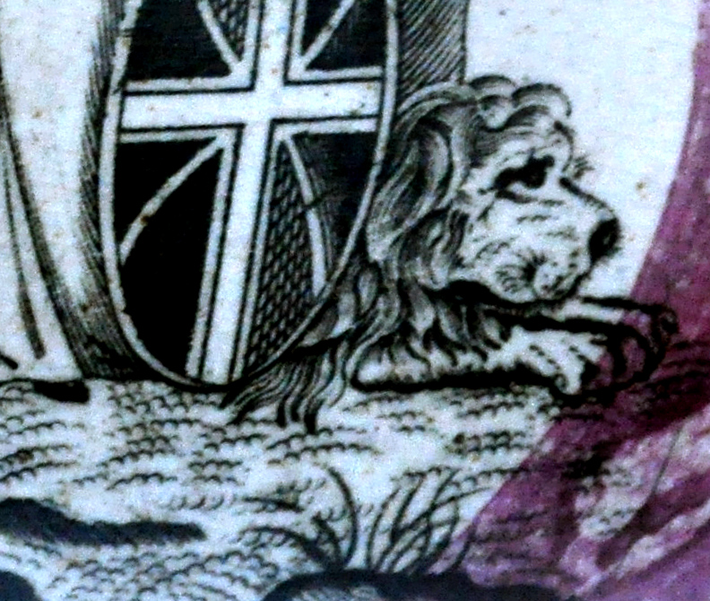 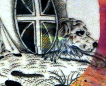 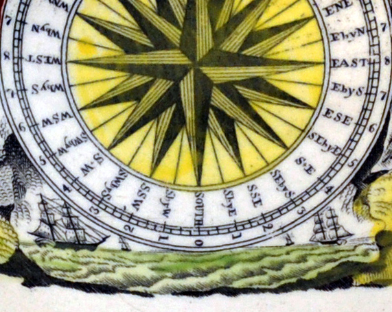 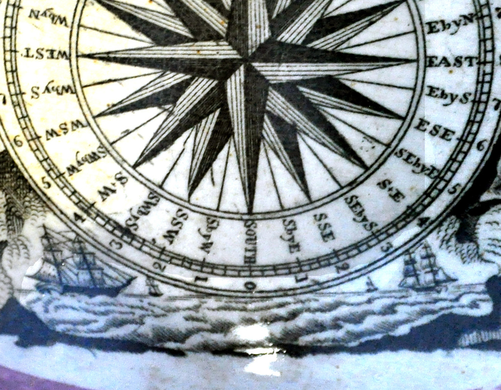 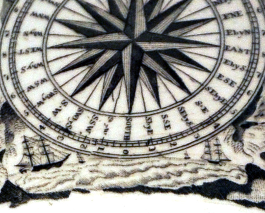 The scratches show that the Seaham jug in the Sunderland Museum and my bowl have transfers that are indisputably from the same copper plate. But are there any imperfections that tie together the two jugs? I believe there are. Firstly, the engraver looks to have slipped, and there's a small diagonal fleck that appears to the left of SSW. Secondly, the shading of the waistcoat of the male figure spills over slightly onto his left lapel.  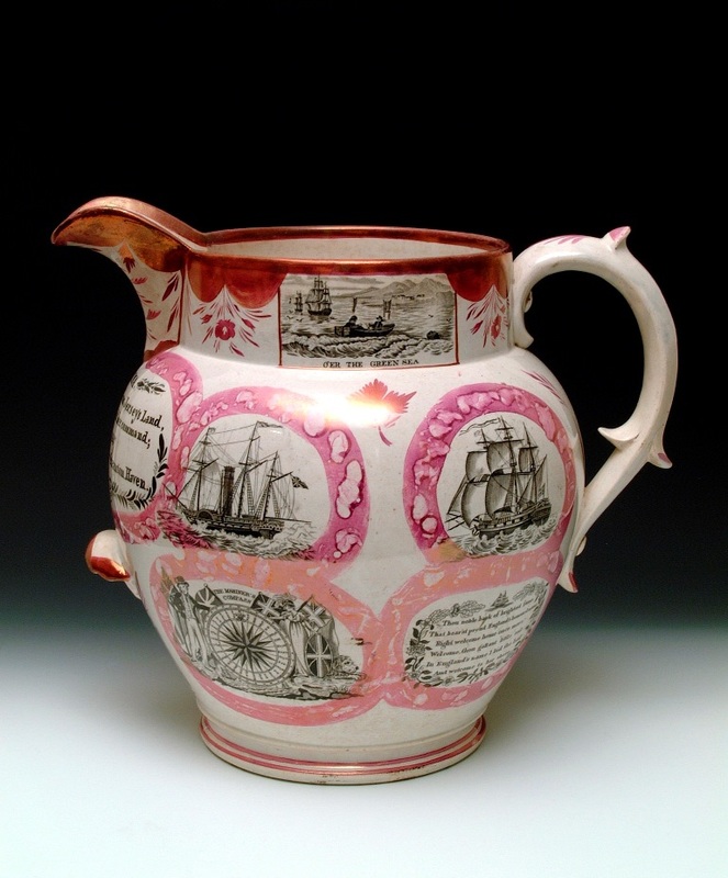 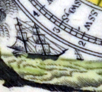 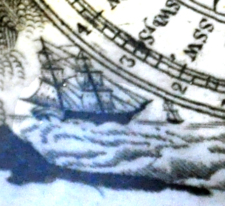 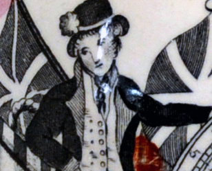 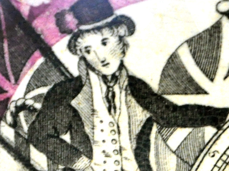 So I have at least two items of Seaham Pottery. The bowl, which has very similar decoration to the Sunderland Museum jug, was likely also made by Walker & Co, c1847. The jug with coloured enamels is earlier but whether made by Walker & Co, John Allason, or an earlier partnership at Seaham, it's hard to say. 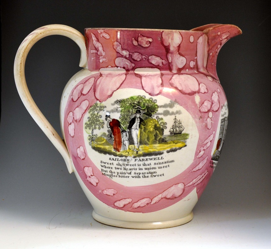 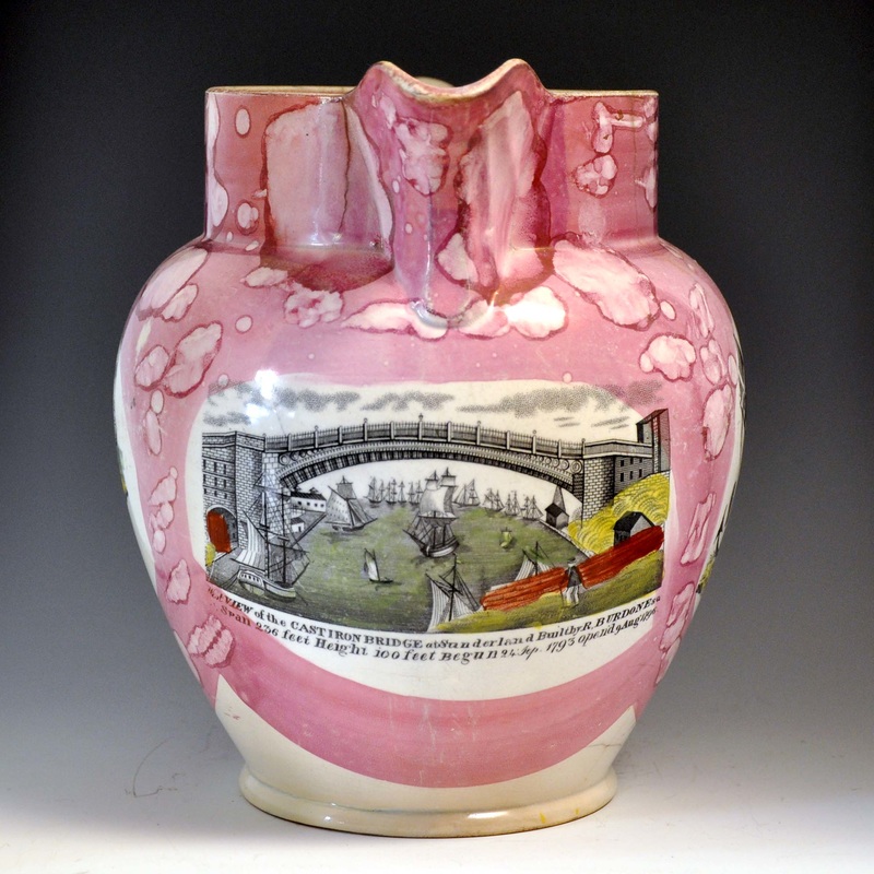 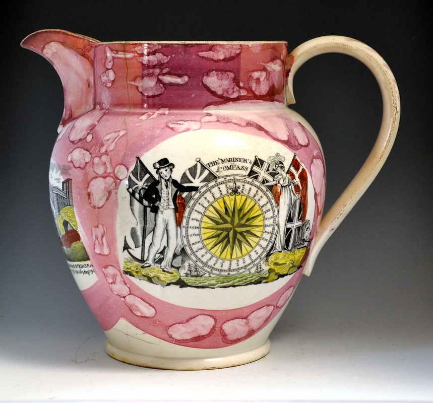 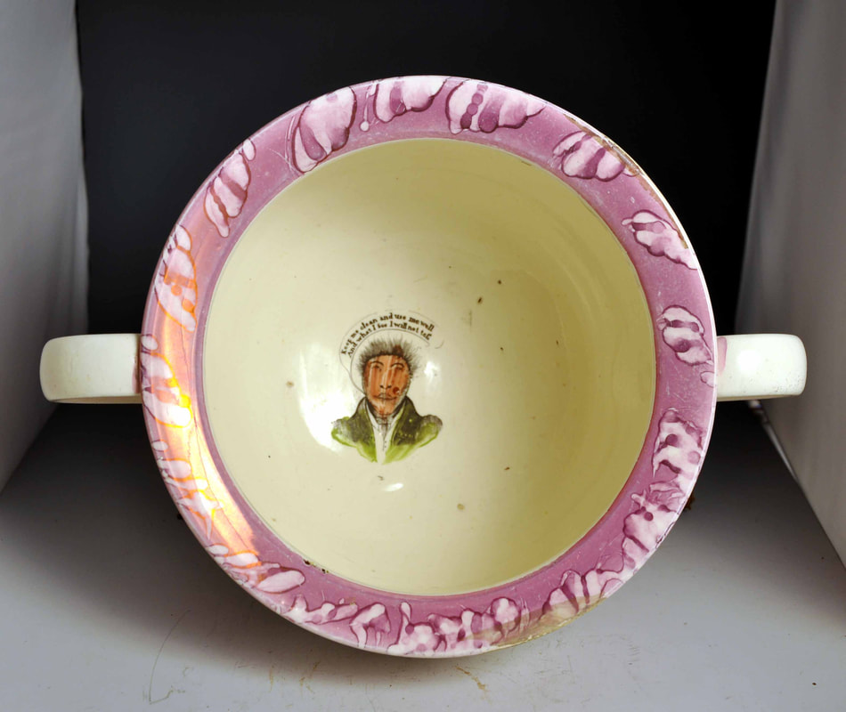 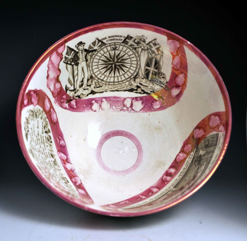  By looking at the other transfers on my jug and bowl we can further expand the Seaham 'catalogue'. If you have a similar item you'd like me to take a look at, please get in touch.
10/15/2016 0 Comments Seaham PotteryArguably, the most impressive item in the Sunderland Museum and Winter Gardens' collection of local pottery is the Seaham Jug. It was purchased with Art Fund money in 1994, a decade after Baker's book on Sunderland Pottery was last updated. The book contains surprisingly little information about the pottery that produced this spectacular item. Baker lists Seaham's products as 'brown ware and transfer-printed tableware'. 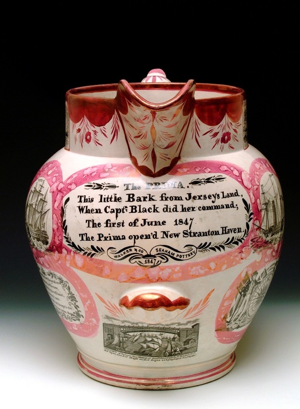 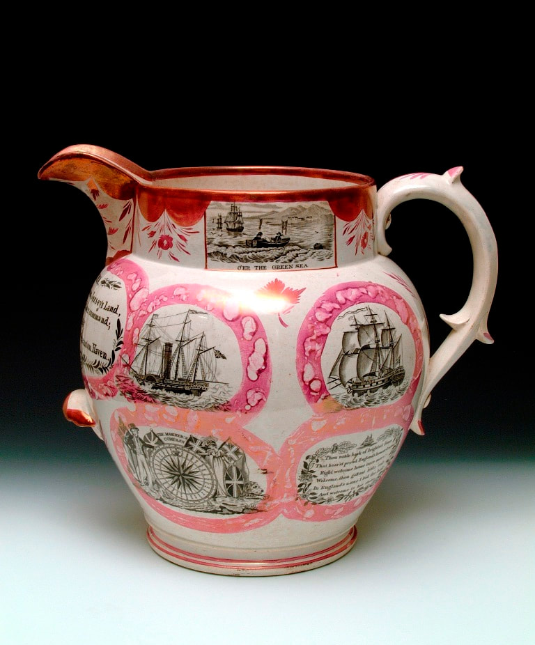 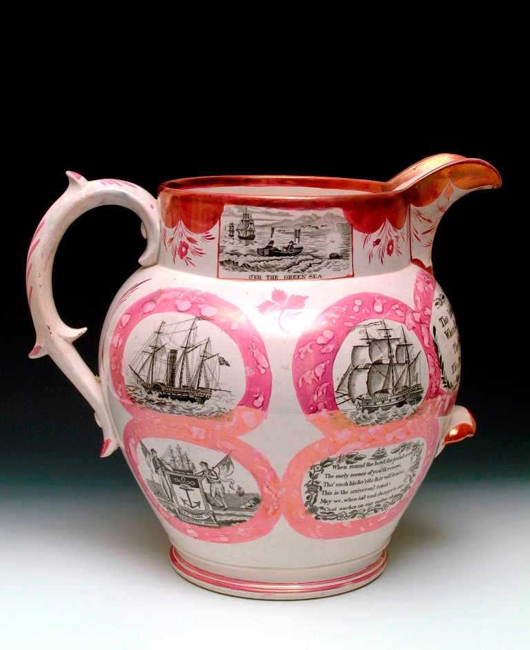  The inscription on the jug includes a painted factory mark 'Walker & Co, Seaham Pottery 1847' (click images to enlarge). However, his ownership is only hinted at in Baker. I am indebted to local historian Fred Cooper for the press cuttings that follow, and to Shauna Gregg at the Sunderland Museum and Winter Gardens for the photos of pottery. Baker suggests the pottery was built 'in 1836 by Captain Plowright of Lynn for the manufacture of brown ware'. The pottery was then owned by 'a group of workers from Dawson's Pottery who converted the works to the production of printed white ware', and operated between 1838 and 1841. The first cutting is from the Newcastle Courant, November 6th, 1840. It advertises the sale of an earthenware manufactory with 'peculiar recommendations' to 'small capitalists especially'. The list of effects confirms Baker's description above and includes 'four printing presses' and 'several copper plates, of new and approved patterns'. 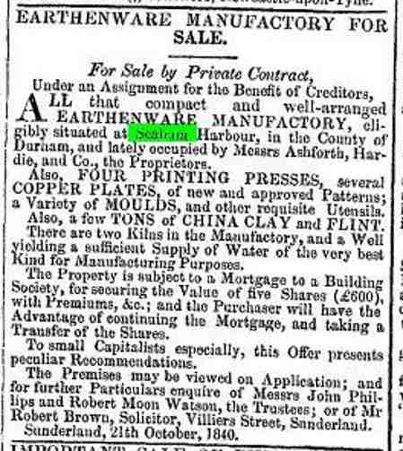 Contrary to Baker's dates, the factory appears to have then been run by John Allason between 1841 and 1846. Here's an item with the impressed mark 'John Allason, Seaham Pottery' from the Sunderland Museum collection.   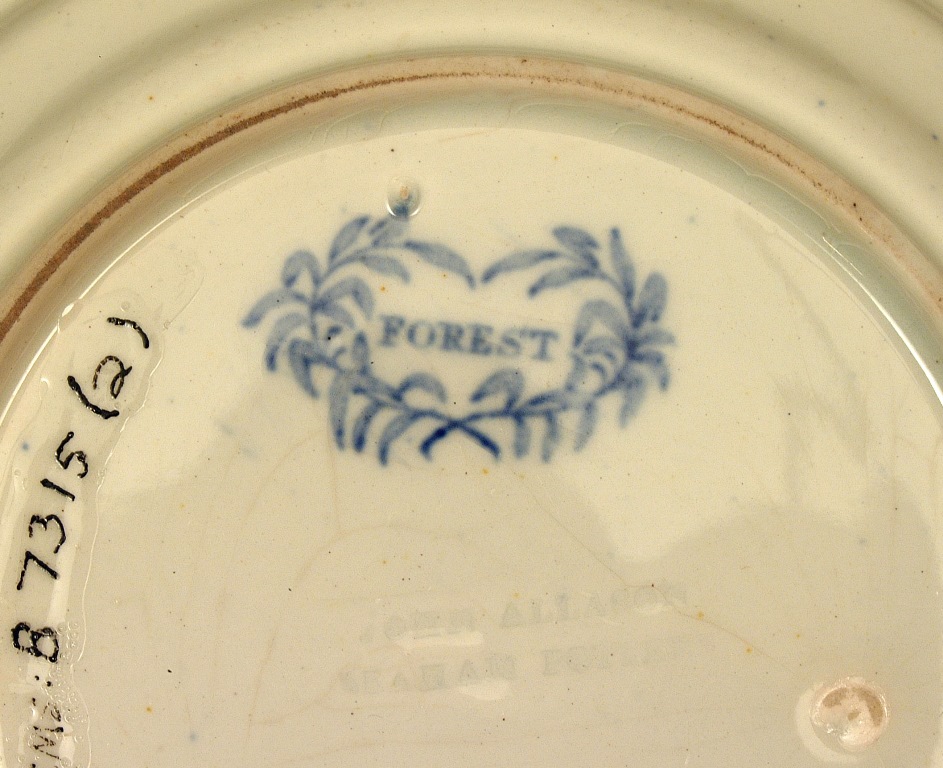 The advert below, interestingly from the Staffordshire Advertiser, tries to attract buyers from the other side of the country. The advert draws attention to the close proximity to the docks, railway and colliery district – factors which created a huge competitive advantage for north-east pottery manufacturers. 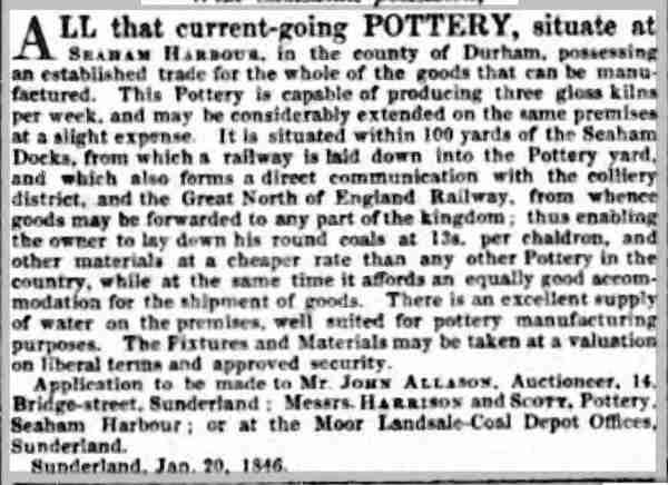 From 1846 to 1850, the pottery was owned by John Hedley Walker. So the Sunderland Museum jug fits in here, made in 1847 by 'Walker & Co'. In March 1849, there's a notice in the Newcastle Guardian offering the premises to let 'immediately', and Walker appears to have moved to Carr's Hill Pottery, near Gateshead. 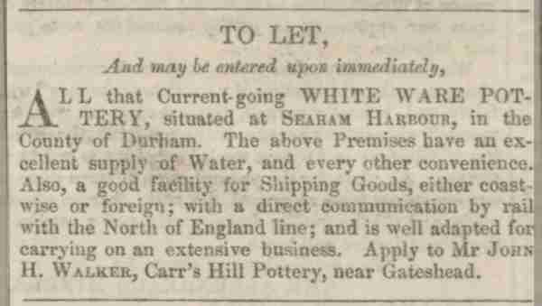 Walker sold the premises at an auction on December 11th, 1850 (this notice taken from the Newcastle Journal, November 23rd, 1850). The property is again offered for 'immediate possession'. 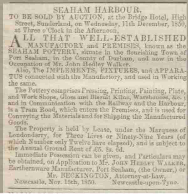 The property appears to have been bought by R.C. Wilson, but his ownership was short lived. An advert in the Newcastle Courant, September 10th, 1852, describes R.C. Wilson as 'a bankrupt', and offers the pottery's effects, including copper plates, for sale without reserve. 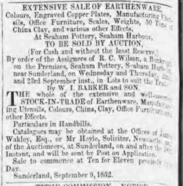 The misfortunes of the pottery continue with a fire in 1854 'entirely consuming' the premises (this cutting from the Newcastle Guardian, April 1st, 1854). 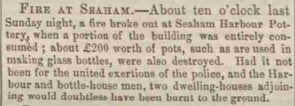 Interestingly, Baker writes that 'Fordyce in his History of the County of Durham, 1857, states that Seaham Harbour Pottery belongs to Mr John Hedley Walker'. However, it seems unlikely that after having to let the property in 1849, and after it had driven R.C. Wilson to bankruptcy, that Walker would want to rebuild it.
|
Proudly powered by Weebly