|
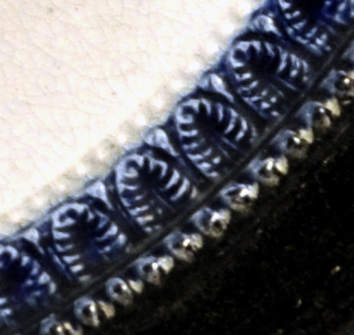
7/27/2013 0 Comments Garrison Wesley transferAs plaques go, the one below is pretty undistinguished. Circular black and yellow plaques are usually more desirable than their pink counterparts, but plaques like the Wesley below are so commonplace, they must have been made in their many hundreds (perhaps thousands). Over time, the etched grooves in the transfer plate wore shallow, and on this plaque, Wesley has lost his nose.  This Wesley transfer is associated with the Garrison Pottery - Dixon & Partners. (Note the 6 'prongs' of the 'aura' to Wesley's right. Transfers from other potteries have fewer prongs. Read more here.) The black and yellow plaques were likely first made by the Dixon, Austin & Co partnership in the 1830s. The first plaque below doesn't have the banner 'The Best of all God is with us'. That could be because the plaque is very early and the banner was engraved on the transfer plate after the plaque was made (see the Dixon, Austin & Co page for a similar soup plate without the banner). Or it could be because the banner was trimmed off before the transfer tissue was applied to the plaque. I had the thought that if we compared lots of plaques with this transfer, we might be able to get an idea of the age of the worn plaque above. For instance, if there were pink plaques with the 'Dixon Co' impress and Wesleys with missing noses, it might imply that production of the black and yellow plaques continued into the 1850s or even into the 1860s. But that's not what I found. All the plaques below could come from the same transfer plate. Look at the spacing of the letters in the second detail. In particular the space around the letter 'o' in 'Methodist' and 'Society'. That is consistent through all the transfers below. The contrast of the details has been turned up in PhotoShop, so it is the first image that best shows the relative strengths of the transfers. I have ordered them from strong to weak as best I can. 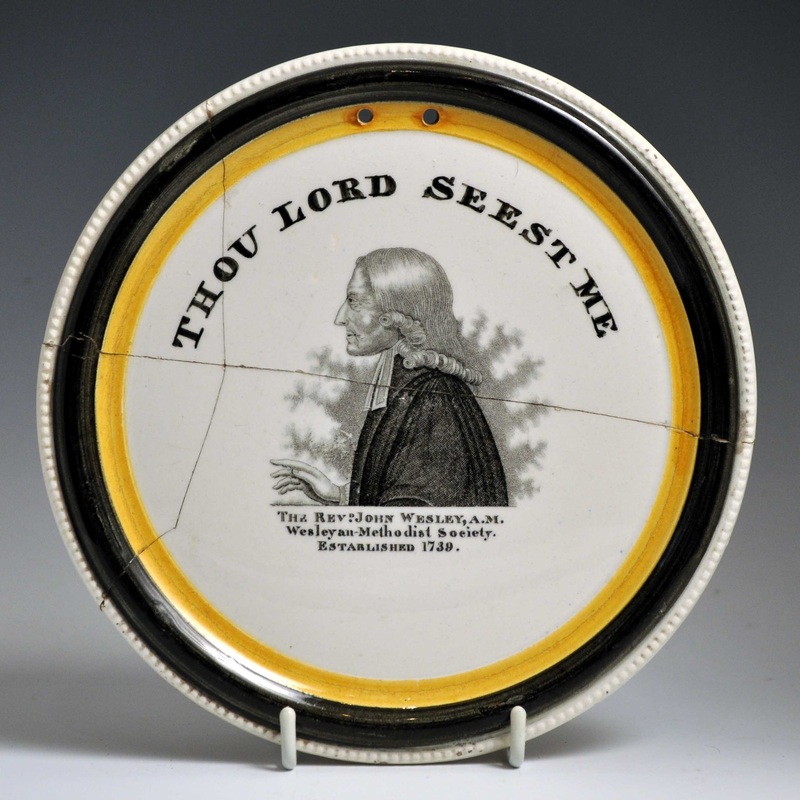 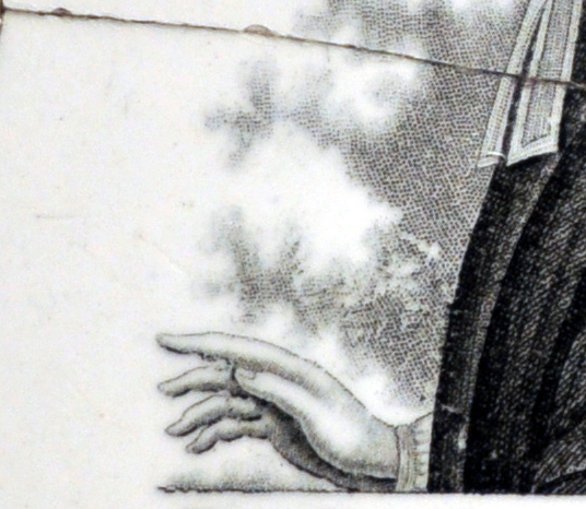 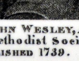 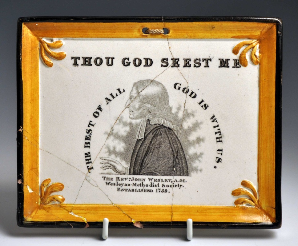 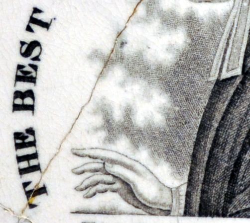 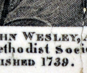 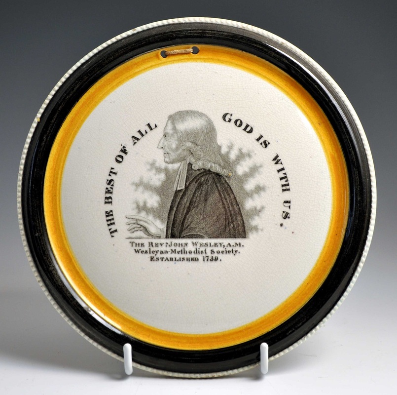  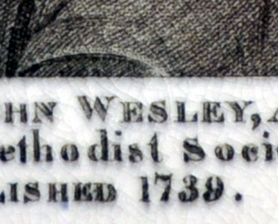 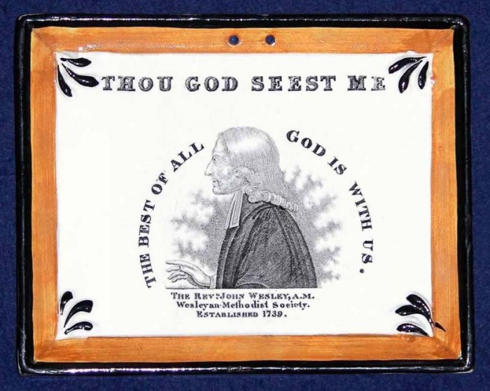   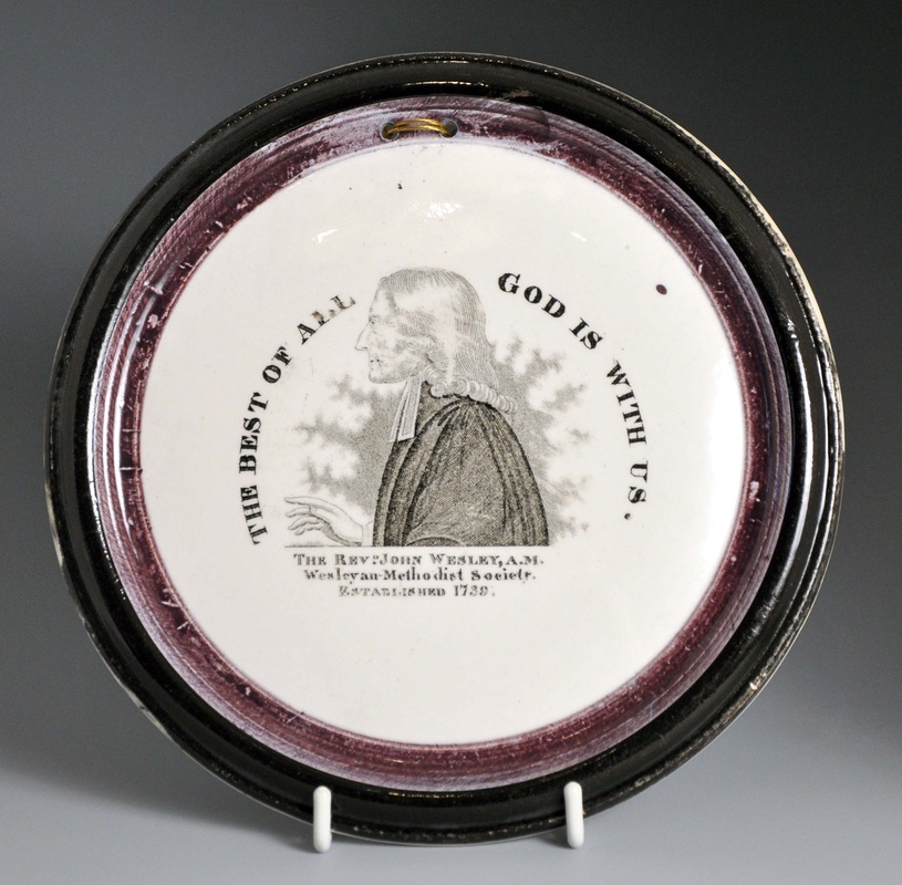  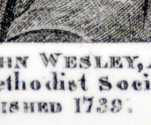 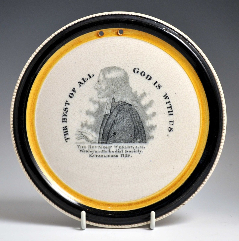 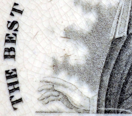 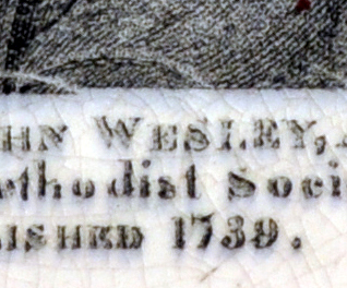 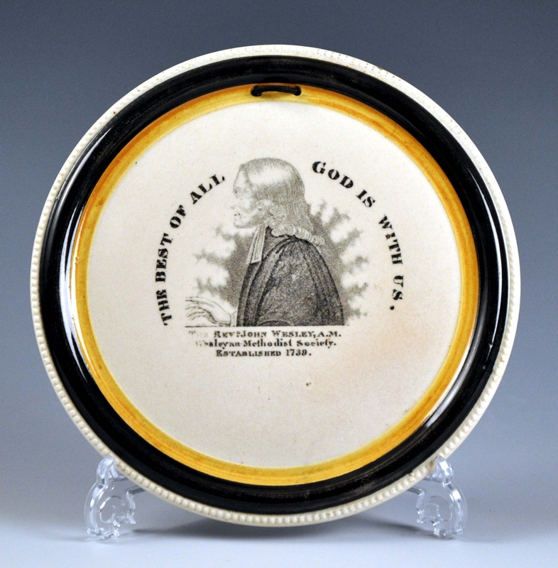  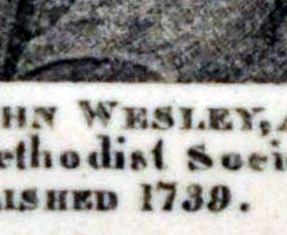 This was the point at which things became surprising. The plaques with pink lustre, which we know were produced later, have stronger transfers than those above. There are two possible explanations for this. Firstly, that they came from a different transfer plate (although the spacing of the lettering remains identical). Secondly, that the transfer plate was re-engraved to restore clarity. As you'd expect the pink plaques with the 'Dixon, Phillips & Co' impress generally have stronger transfers than those with the later 'Dixon Co' mark. 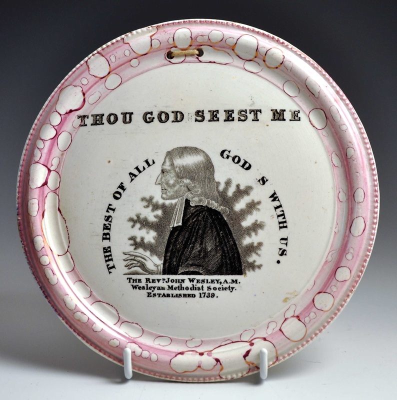 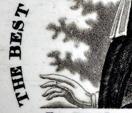 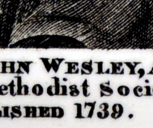 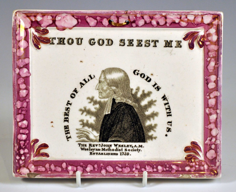 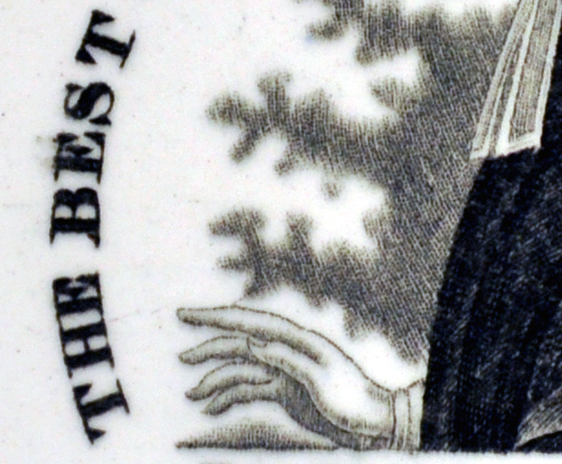 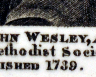 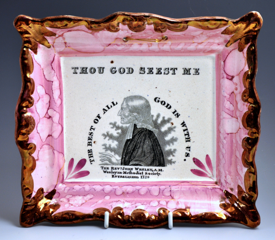 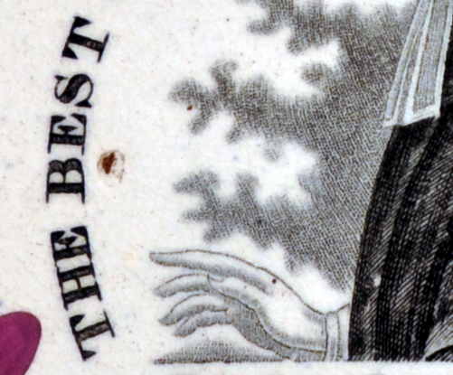 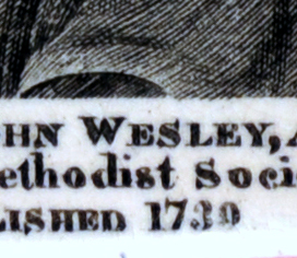 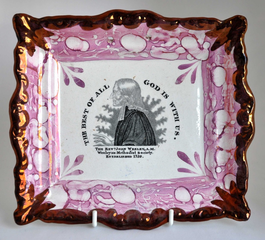  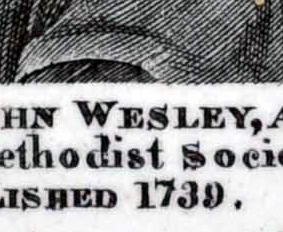 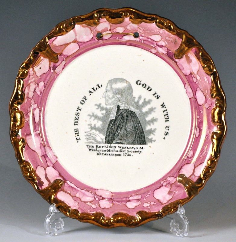 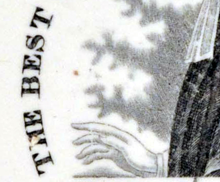 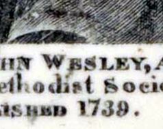 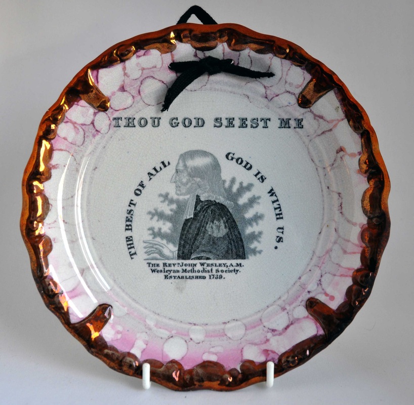 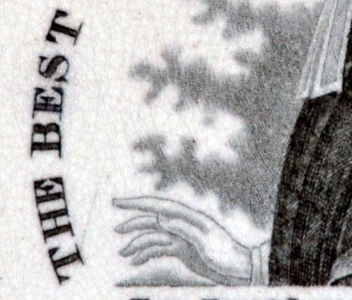 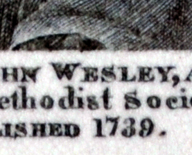 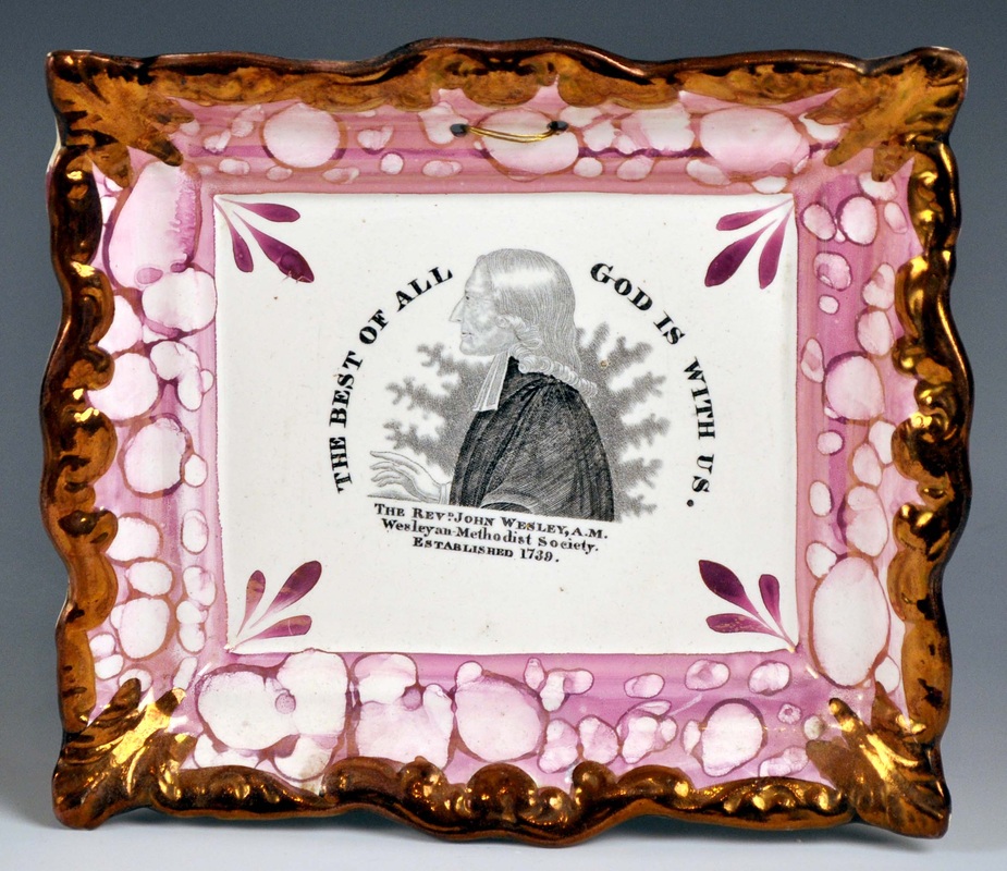 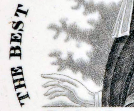 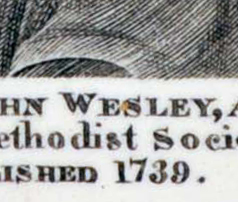 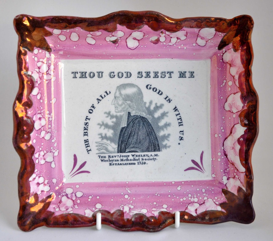 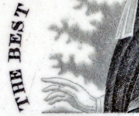 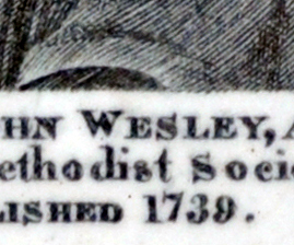 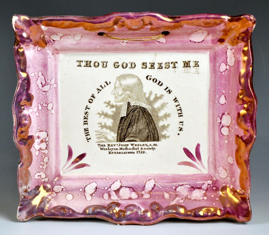 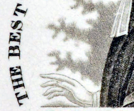 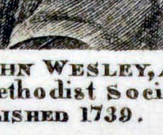 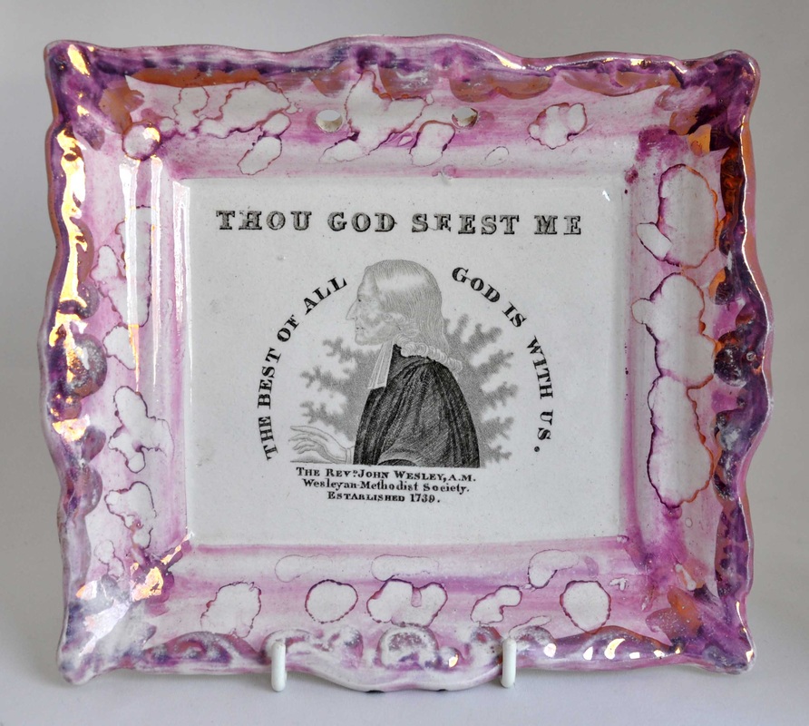 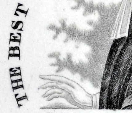 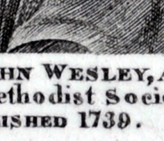 The hatching on Wesley's sleeve (second detail) on the pink plaques is identical. There are a couple of white diagonals that appear in the same place on every sleeve. Wesley's aura is also more pronounced on the pink plaques. I think all of that is consistent with re-engraving a transfer plate that had seen heavy use in the 1830s. By the 1840s, black and yellow plaques had fallen out of fashion, and pink lustre was all the rage. (I have noted this phenomenon with plaques attributed to Sheriff Hill also.) Interestingly, this would mean that the pink rectangular Wesleys and Clarkes could not have been made as early as 1832 to commemorate Clarke's death. 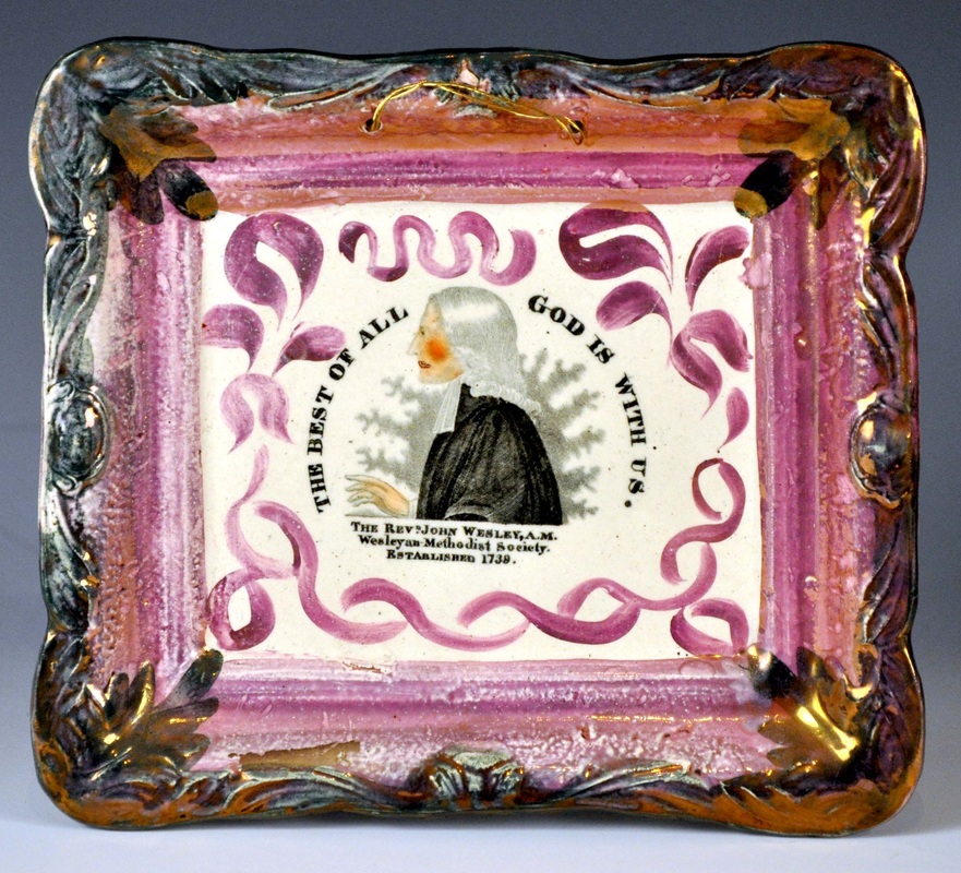 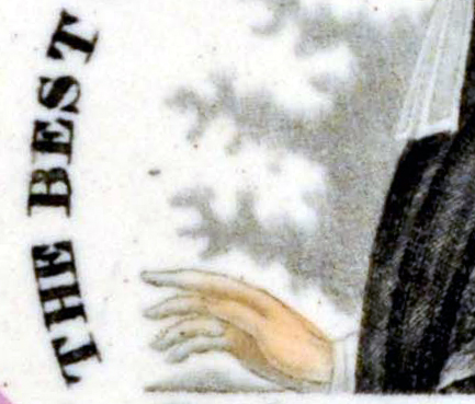 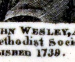 Finally, here's the last incarnation of this transfer on a plaque attributed to John Carr. The transfer plate likely moved to North Shields when the Garrison Pottery closed in 1865. Carr appears to have had the plate re-engraved again to restore the black.
The interesting find for me is that there appears to have been no overlap between the production of black & yellow and pink lustre plaques. For this transfer at least.
0 Comments
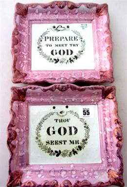
7/9/2013 0 Comments Hand-painted plaquesAnyone who has followed this blog will know I'm a sucker for a hand-painted religious verse. They don't come up very often, but this summer has turned up an embarrassment of riches. Firstly, here's a broken 'Prepare' plaque that appeared in a job lot. It is tiny: 137 x 117mm. It's of a form I've attributed to Sheriff Hill, as is the circular plaque beside it, painted in the same font. 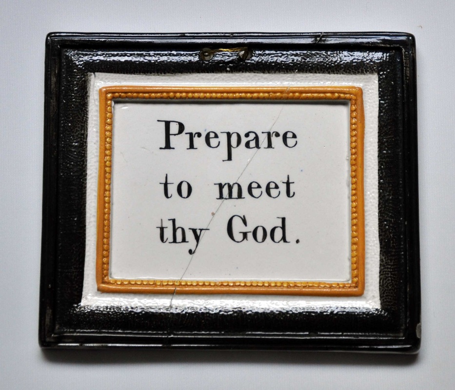  Staying on Tyneside, I've attributed the plaque below left to C, C & Co, on the basis of its similarity to the plaque below right, which has an impressed mark. I love the brown and yellow plaque with its doom-laden verse. 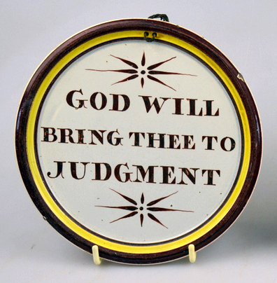 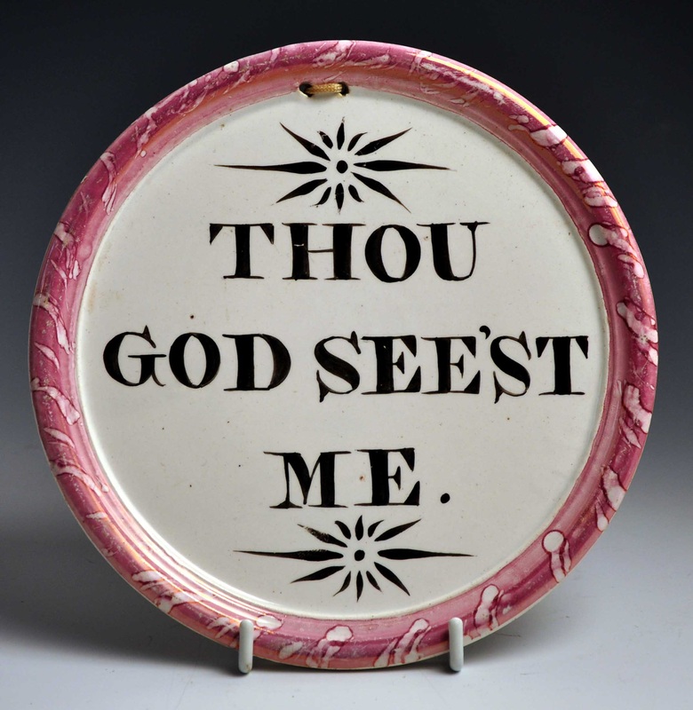 The next pair is spectacular. Although unmarked, I've attributed the plaques to Dixon, Austin & Co, on the basis of decorative similarities to marked plaques. It is possible that these verses, like the other rarer ones in this post, are unique and were made to order.  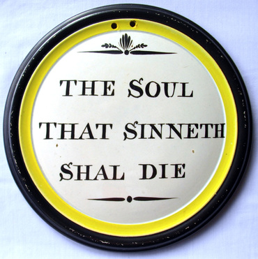 The next plaque has the text 'I know that my redeemer Liveth'. It is apparently from the same mould as the 'Thou God' beside it, and is painted in similar colours and font. They are from an as-yet unidentified pottery. 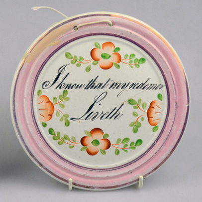 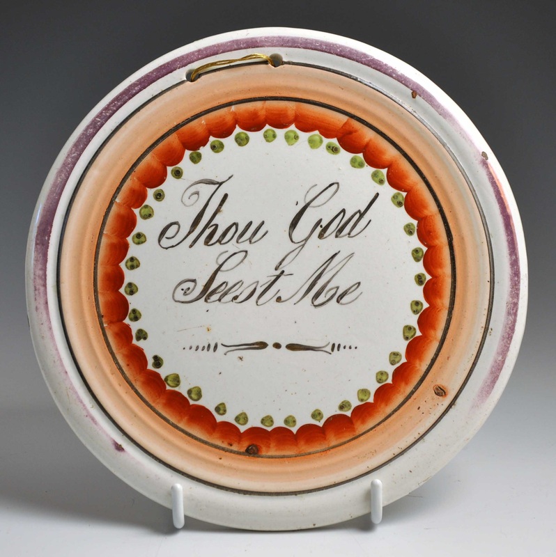 Finally, here's a plaque from the same group in my June 15th blog entry. In fact, it provides the missing link between a group of plaques I now feel confident attributing to Dixon, Phillips & Co. I have added a new page in their honour.  So this plaque, unlike the others above, likely belongs to the 1850s or even 60s. This is much later than we'd normally suppose for a small circular plaque. I'd be interested to hear from anyone who has a jug, bowl, mug, plate or plaque with any of the decorative elements shown on the Dixon, Phillips & Co page. P.S.Here's another hand-painted plaque I'd desperately like to catch up with: 'Salvation Cometh from The Lord'. It came up for auction in May 2007, and I'd love a better photo. 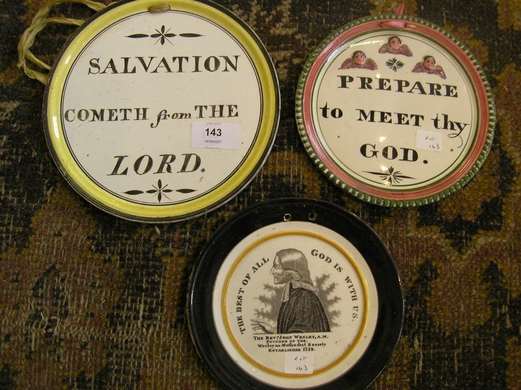 7/3/2013 0 Comments More Wallace & Co attributionsIan Sharp has just listed the fabulous plaque below on his website (click here to see the listing). Unusually, the transfer is printed in blue. The transfer is similar in design to a plaque in my collection (which Ian sold me a couple of years ago) with a Wallace & Co impressed mark. Ian's plaque below is, however, unmarked.  Compare the three plaques below and their details. The plaque in the centre has the Wallace & Co impress. The plaque on the right has an unusual printed border (click to enlarge) but no garland around the verse, and no impressed mark. The angels (first detail) are very similar to those that appear on verse plaques from Scott, Moore and C.C.& Co. However, the crossed sprigs of leaves below the verse (second detail) don't appear on verse transfers from any other pottery.    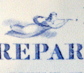 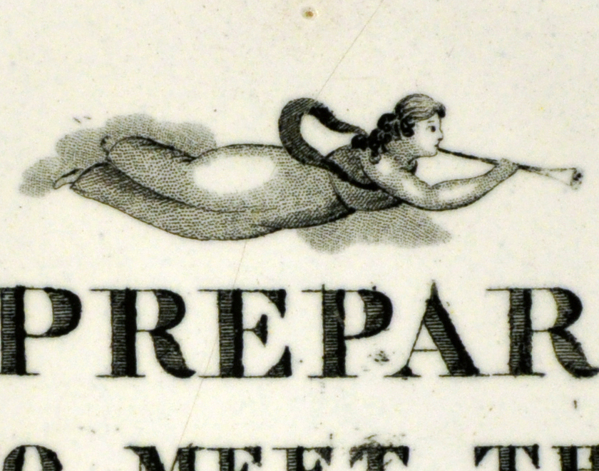 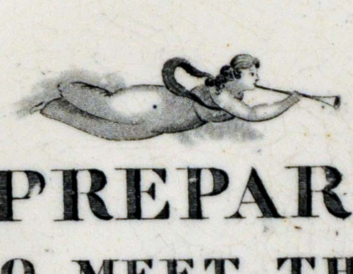  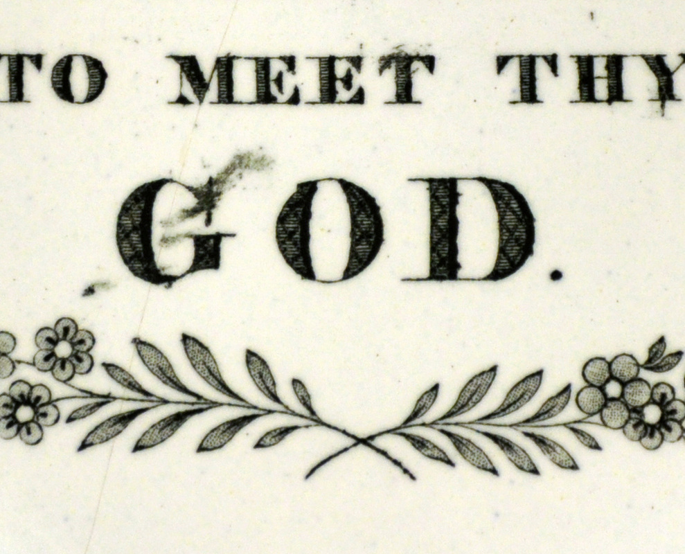 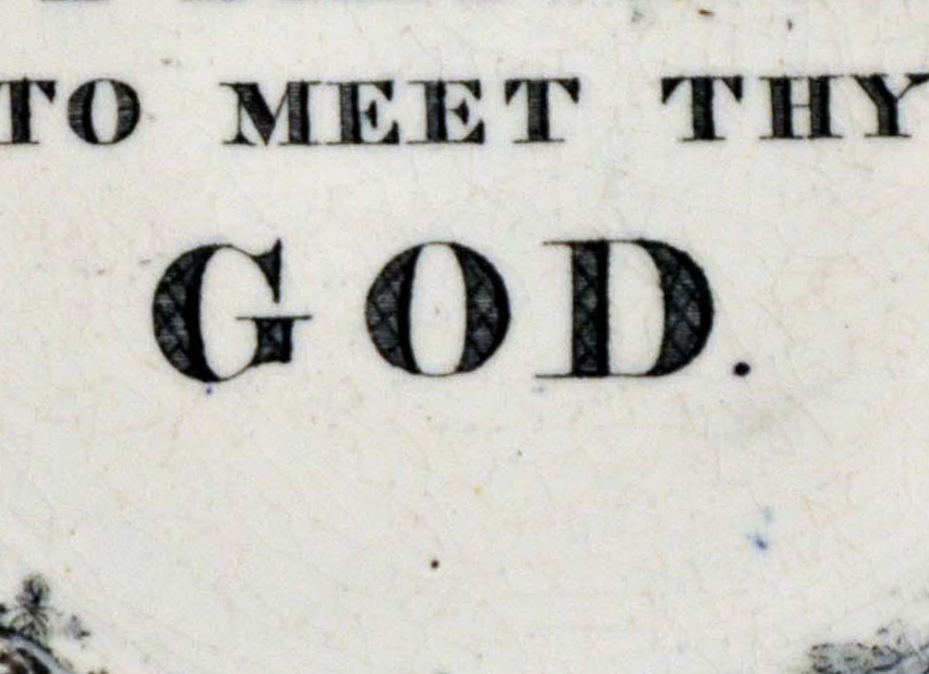 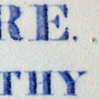 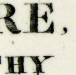 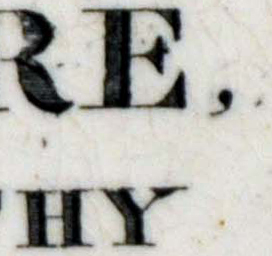 The first two plaques above, despite similarities of design, clearly come from different transfer plates. Compare the flowers in the second detail. However, the similarities are striking enough for us to attribute the first plaque to Wallace & Co.
The second and third plaque come from the same transfer plate. Note the scratch above the letter 'H' in the third detail. The garland was simply trimmed off before applying the transfer to the third plaque. This is exciting for me, as I'd never linked the two plaques until last night. I've seen many 10s of plaques with this verse from Scott, Moore and C.C.& Co. However, after nearly 15 years of collecting, these are the only three 'Wallace' versions I'm aware of. You can read a little more about the pottery on the Wallace & Co page. 6/15/2013 0 Comments Some new Dixon attributionsThanks to Ian Holmes for sending me the photo below. He recently bought the bottom right plaque and noted similarities with two others in his collection. The large rectangular plaque is marked 'Dixon Co'. Ian describes the decoration under the verse as 'colliding meteorites'! It shares that feature with the smaller rectangular plaque, bottom left. The other decoration on that plaque bears a startling similarity to the circular plaque beside it. Seeing them together it seems likely that they all came from the Garrison Pottery (Dixon and partners). 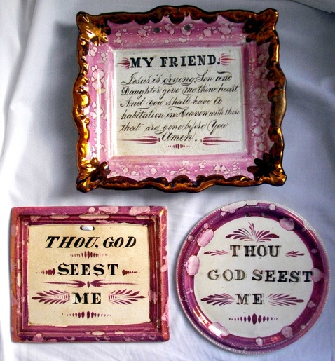 The wonky lettering is also familiar. Compare Ian's new plaque (top left, below) with the brown and yellow plaque beside it, attributed to Dixon. The serifs are different on the 'G' and 'S', but the artless spacing of the words is very similar. The plaques also appear to come from similar moulds. Beneath them are two further Garrison plaques, the bottom left with the impressed mark 'Dixon, Austin & Co'. 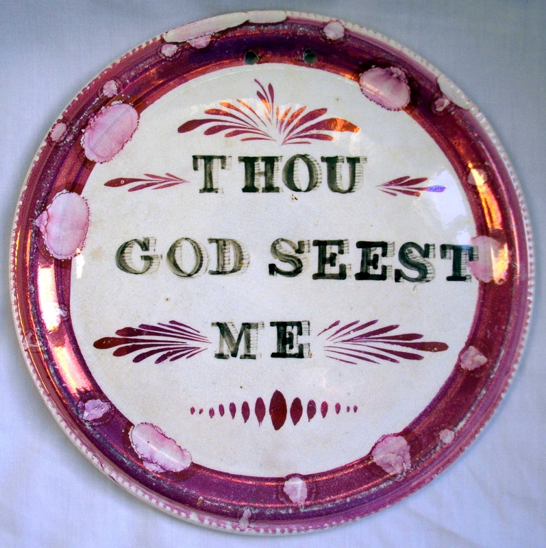 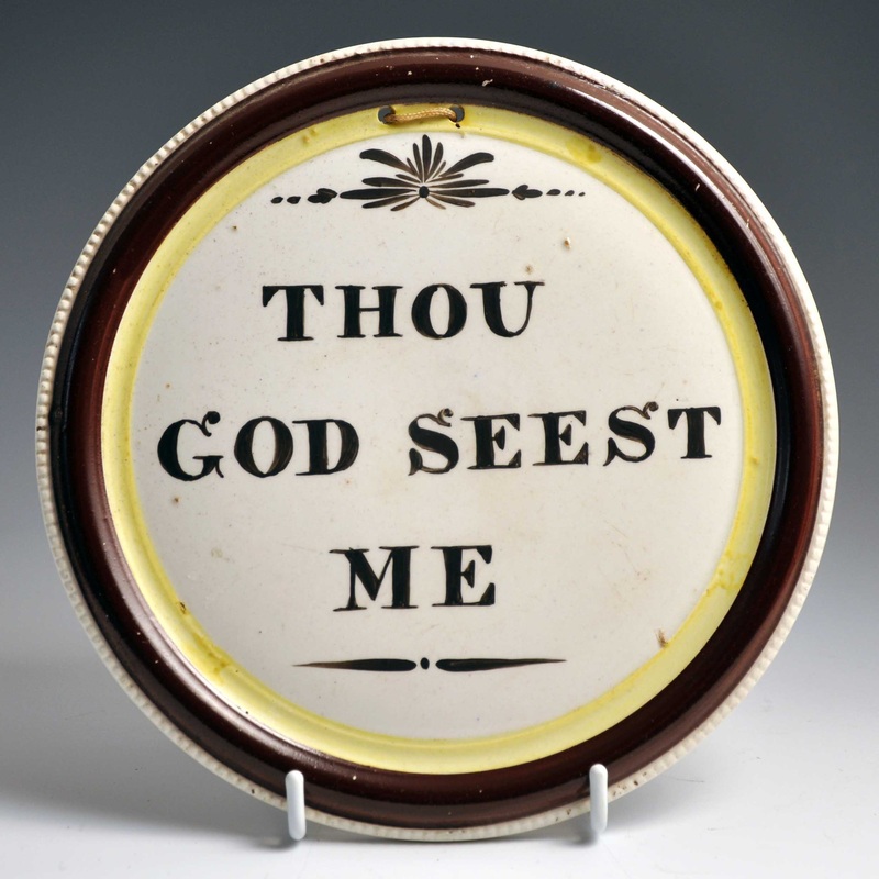   Pink-lustre Garrison plaques of this period are less common than their black/brown and yellow counterparts. The revelation for me is the small rectangular plaque in Ian's first photo, which was previously unattributed. The plaques below also fall into that category. The first three have variations of the colliding meteorites. None of them is marked. However, only the bottom right plaque is similar enough to merit a Dixon attribution. More work is needed to include the others in the group. 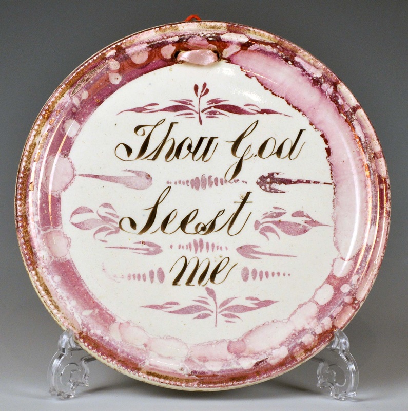 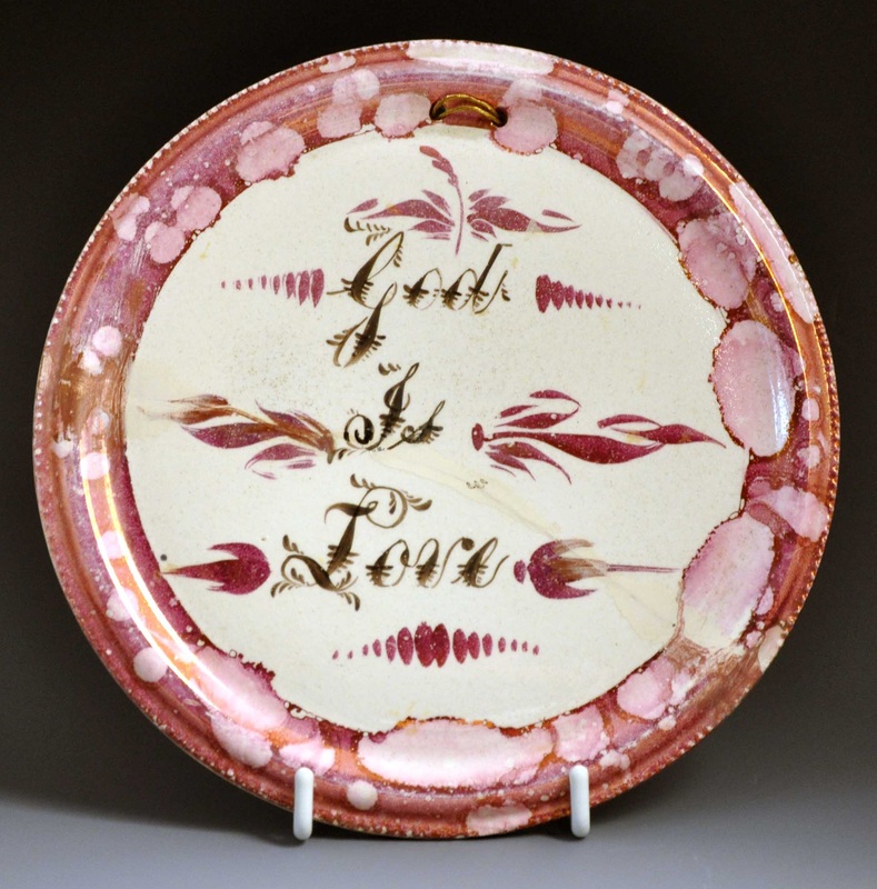 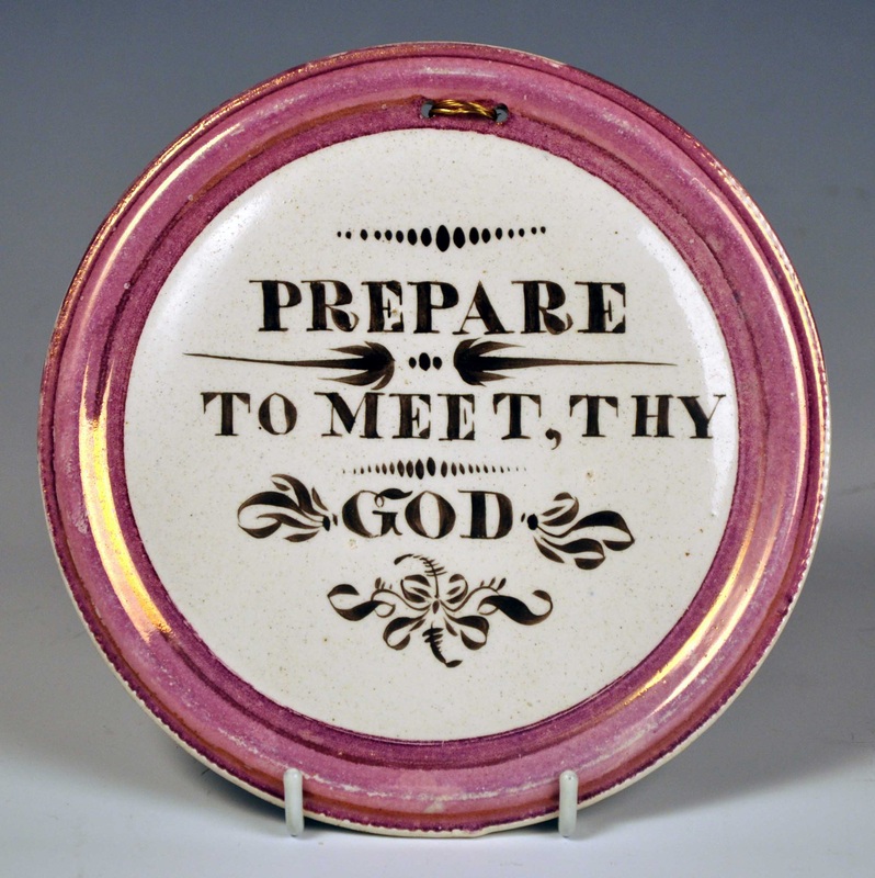 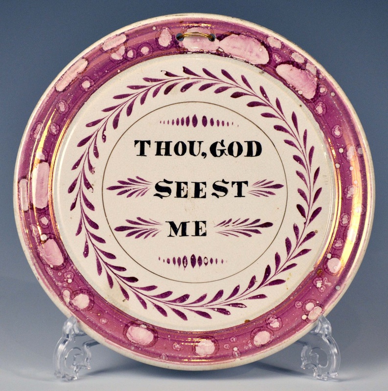 Note the lettering detail (below left) from the bottom right plaque above, and compare it to the detail from Ian's small rectangular plaque (below right). Very similar strokes from the same hand.   I have added the new attributions to the Dixon page. As always, if you have a plaque with similar decoration, please get in touch.
6/5/2013 0 Comments Hacked off!Apologies to anyone who has had a spam e-mail from me today. Along with thousands of others, apparently, my Yahoo account was hacked into. If you have received an e-mail from me today, please don't click on the link.
For anyone else with a Yahoo e-mail account, I'm told that the best way to prevent it being hacked into is by having a complex password, with no words in it, just a combination of random letters and numbers. Needless to say I've changed mine! I search fairly obsessively for plaques, and very occasionally my persistence is rewarded with something special. The best finds are those that are badly listed on the internet, or in auction catalogues, that there's a chance nobody else has seen. Those finds are few and far between. However, I bought the plaque below recently for under £30. It has a less common verse that appears on plaques attributed to Maling, and plaques from another, as yet unidentified, Tyneside pottery.  The border is finely moulded with something similar to a 'leaf and dart' motif (see below). I can't recall seeing this moulding on any other plaques. So is the plaque attributable to Maling, like the one left below, or to the other Tyneside pottery, like the plaque below right? Look at the black outline around the letters in the details (click to enlarge). The plaque with the 'leaf and dart' border (in the centre), appears much closer to the unidentified Tyneside pottery on the right, but I'm not certain they are from the same transfer plate. The plaque moulds are also very similar, and the plaques unusually thin.   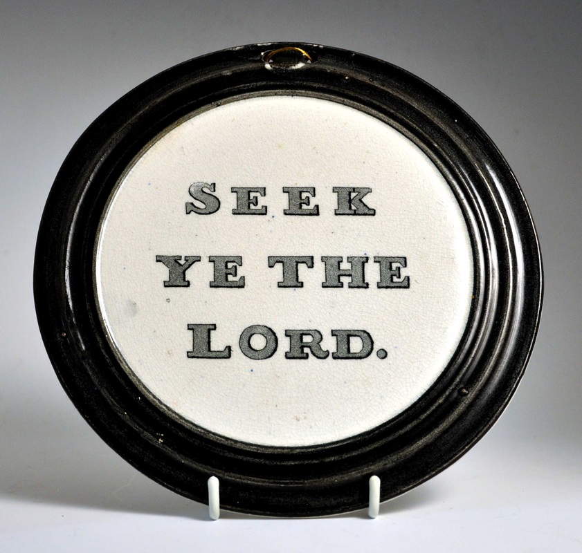 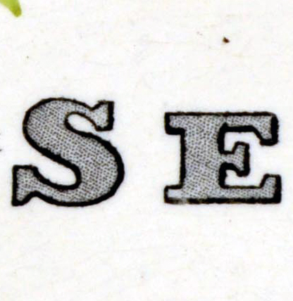 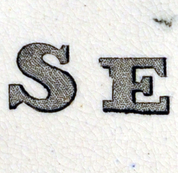  There must be other plaques out there with this border. If you have one, please get in touch.
Most of the plaques on this site come from the North East of England. However, at least one pottery in Staffordshire was prolific in making circular and rectangular black and white transfer-printed plaques. I have a small collection of these, some of which I've just got around to photographing. 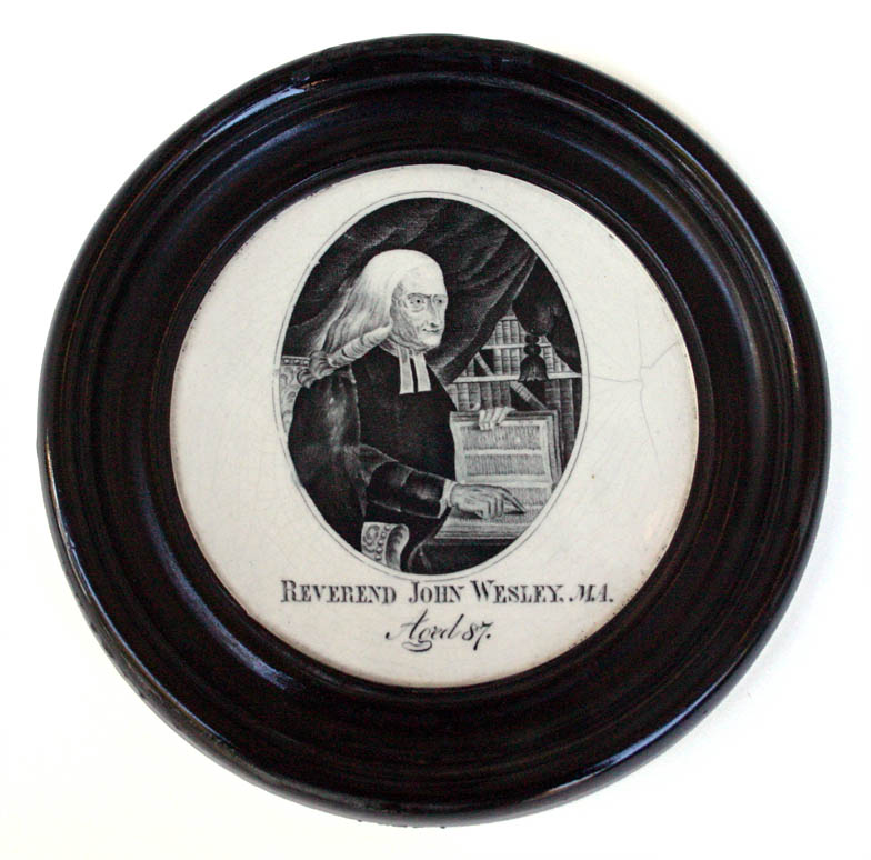   The John Wesley and Adam Clarke transfers most commonly appear on 8" x 6.5" plaques, like the Clarke on the right above. In fact, I haven't recorded Clarke on any other size. Wesley, however, appears on a whole range of sizes (see above centre), and also extremely rarely on circular plaques (above left). The circular Wesley plaque has the under-glaze inscription on reverse 'H.B. 1832'. 1832 is the year of Clarke's death, and some of these plaques may have been sold in Wesley-Clarke pairs to commemorate that. 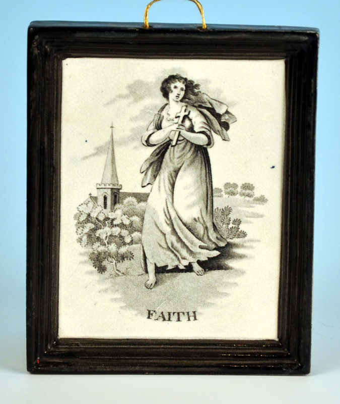 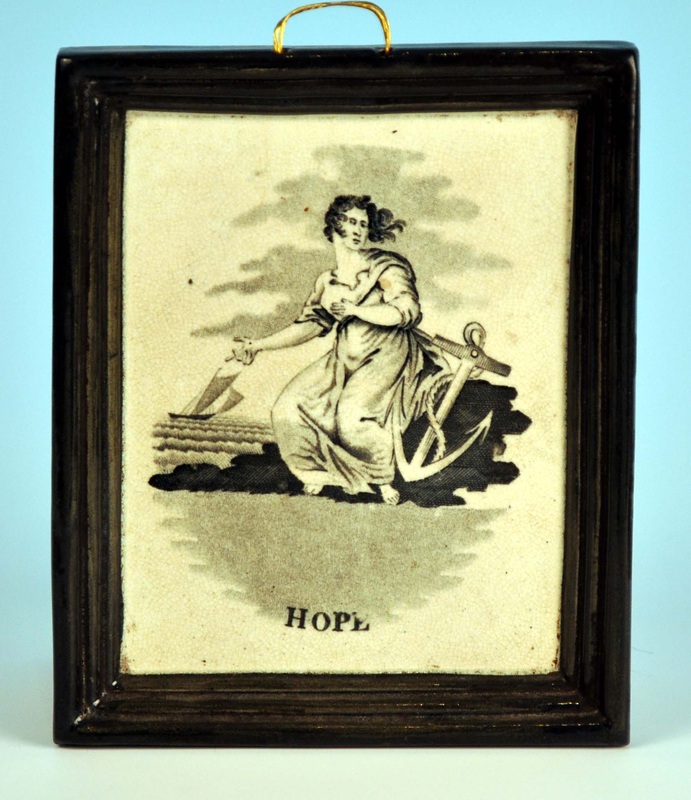 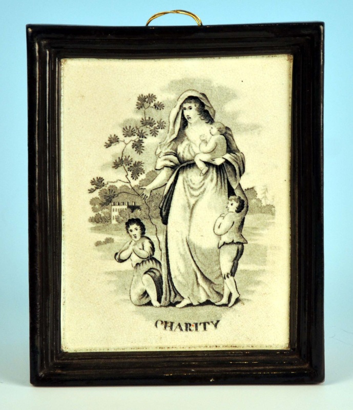  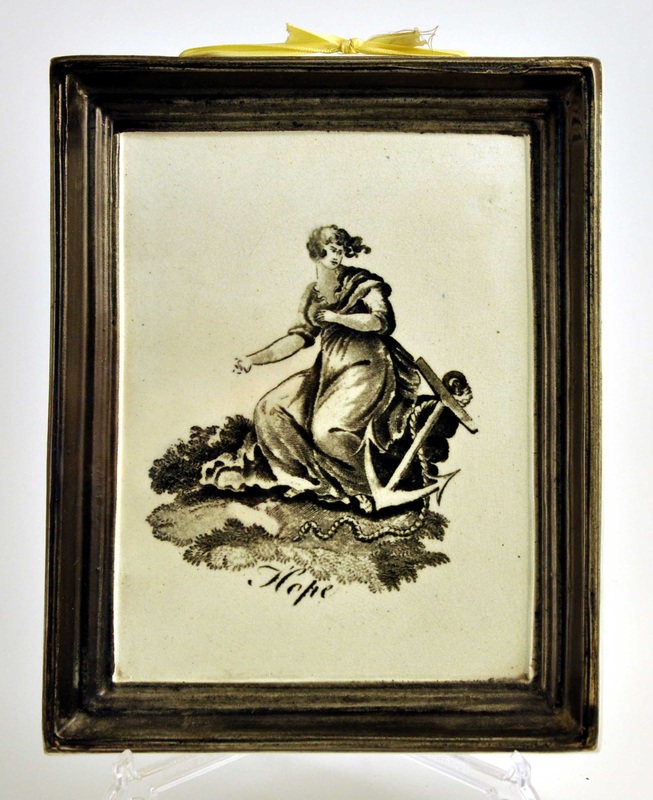 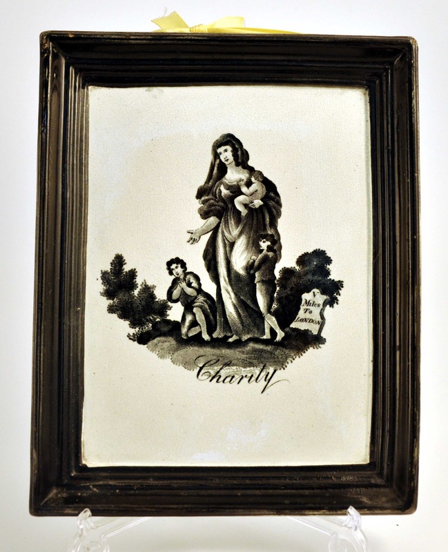 Probably the most common transfers on this plaque form are Faith, Hope and Charity (see above). The plaques come in two different sizes: small, 5.5" x 4.5", on the top row; and large, 8" x 6.5", on the bottom row. The two sizes have different transfers. The smaller size is rarer. The larger plaques are sometimes found with black and yellow borders, or white borders for factory seconds (see the Staffordshire plaques page). 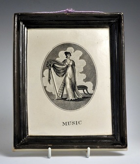 The music plaque above (8" x 6.5") is superb, and relatively rare. It may be one of a series of transfers symbolising the arts, but if so, I've never seen any of the others: painting? theatre? dance? The Willett Collection in Brighton has, I recall, a similar plaque with a classical subject, but the search function on their site is down at present, so I can't provide the link. 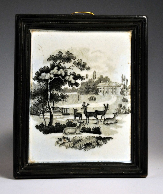 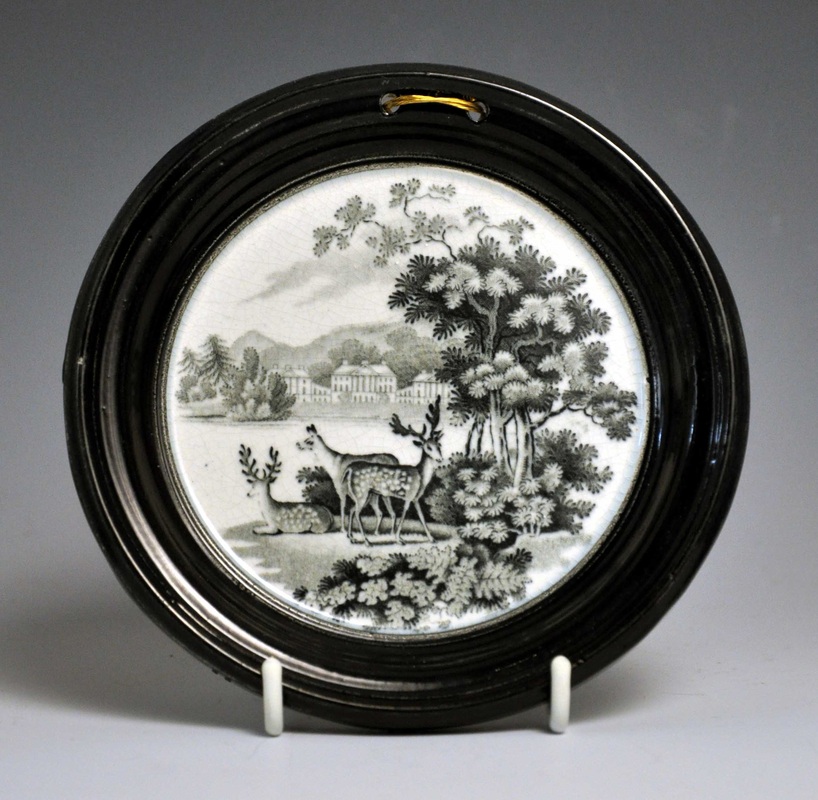 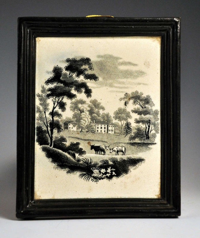  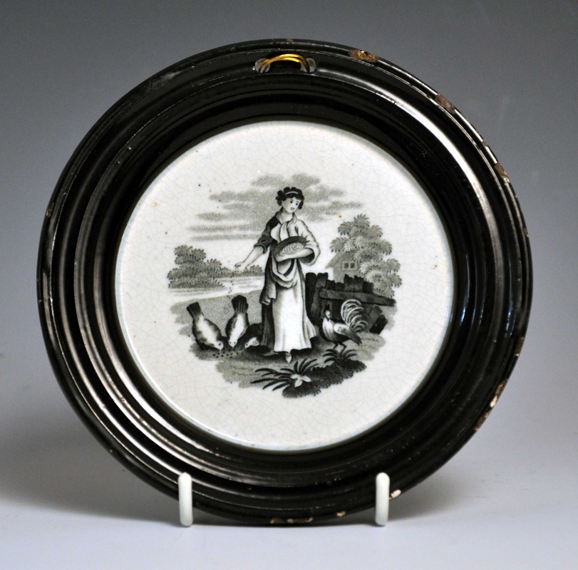 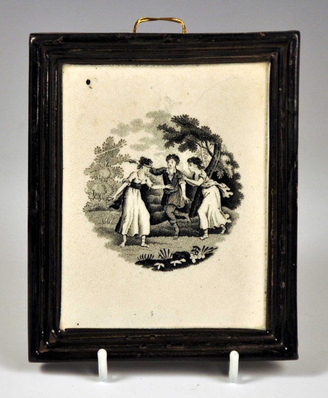 The first four plaques above show landscapes with deer, cows and a windmill (click to enlarge). The bottom centre plaque, which appears to be identical in form to the circular Wesley above, has a transfer of a girl feeding chickens, and the bottom right shows a game of blind man's bluff. The rectangular plaques are 5.5" x 4.5", and the circular plaques are 5.5" and 6" diameter respectively. 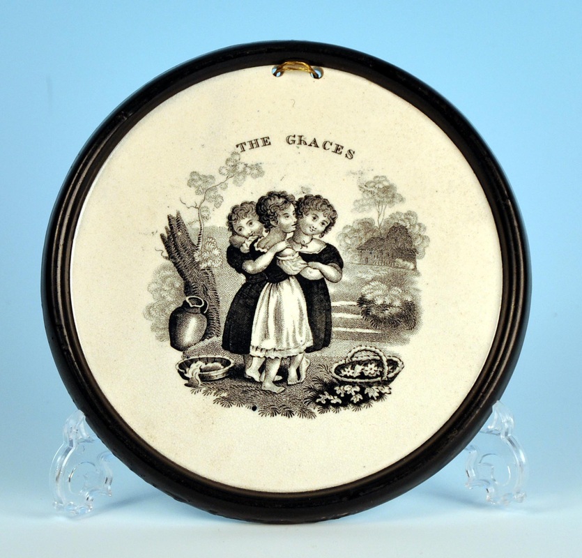 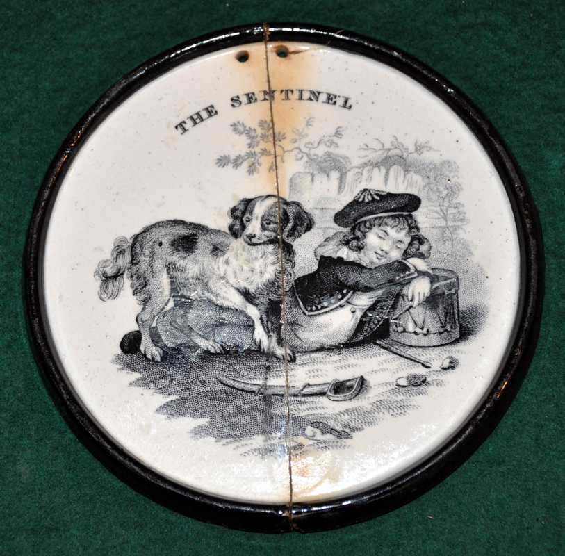 The above small plaques titled 'THE GRACES' and 'THE SENTINEL' have a very different form and feel to the other plaques above. Page 199 (757) of Riley (Gifts for Good Children) shows a similar alphabet plate, titled 'THE SENTINEL' with the impressed mark T.& B. GODWIN. NEW WHARF. (New Basin Potteries, Burslem, Staffordshire 1809-1834). Page 37 of Gibson (19th Century Lustreware, 2000) shows another similar plaque with two girls. 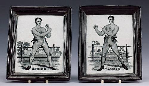 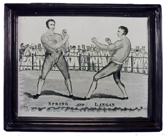 As an antidote to the rather twee plaques above, here are some magnificent plaques of the boxers Spring and Langan. Read more about them on the Portraits page. The larger size of the single plaques sometimes appears with black and yellow borders. The right plaque is huge, measuring 16.5" x 13", and appears with black and yellow, and red/puce borders.
4/14/2013 1 Comment A footnote on FellI got out my camera this morning to catch up with photographing plaques, and to allow a more detailed comparison of the transfers on three plaques below. I'm now certain that all three came from the same transfer plate. Look at the identical way the black is distributed on the leaves in the first detail (click to enlarge and to move between images). Even better, note the black fleck to the right of the flower in the second detail, on the two rectangular plaques. The transfer plate must have acquired this tiny scratch sometime after the circular plaque was produced. 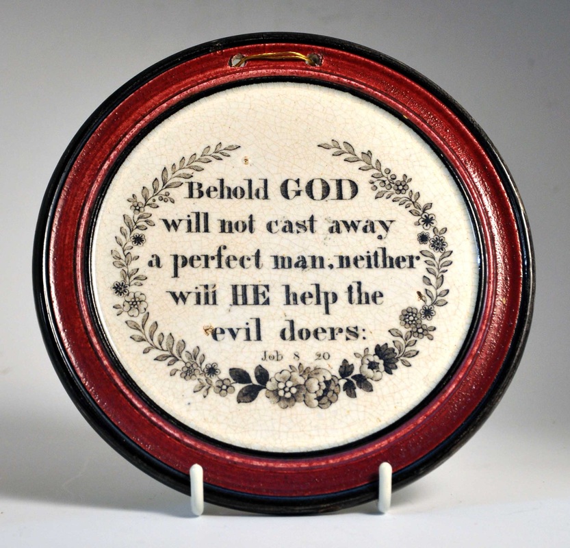 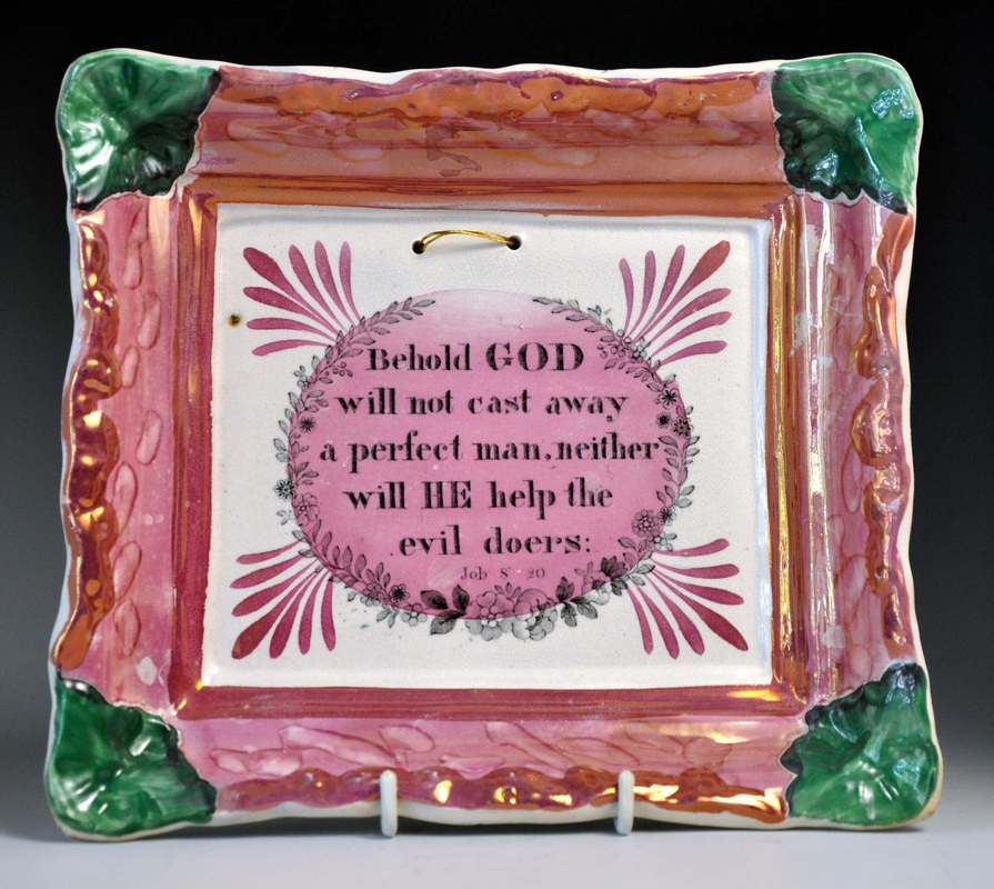 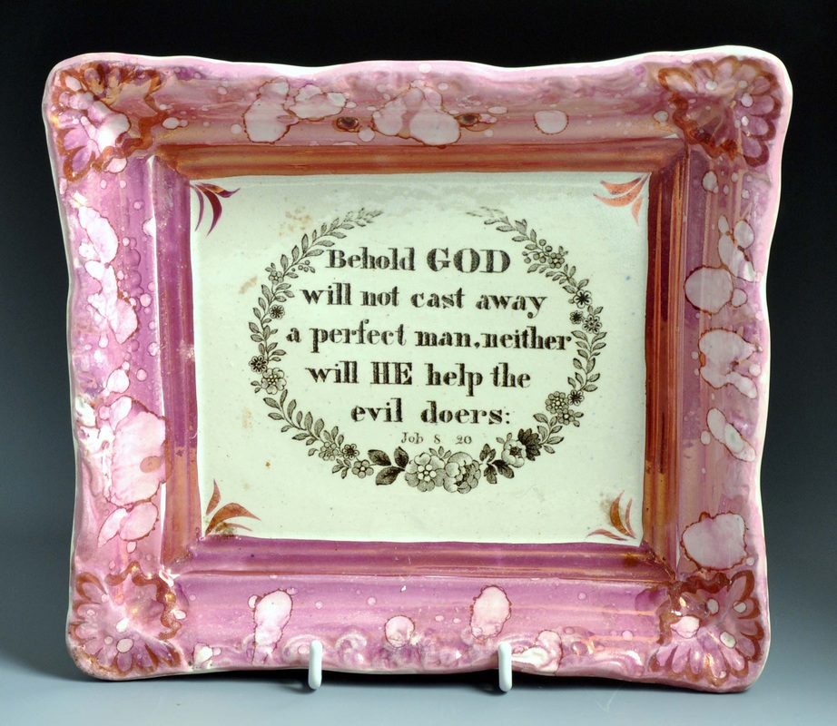 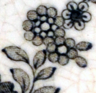  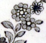 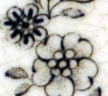 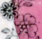 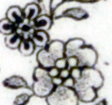 The thing of note here is that the third plaque has hanging holes pierced through the outer lustre border (see my previous post on the subject). So it appears that Fell produced rectangular plaques with hanging holes in two different positions (compare it with the plaque beside it). That means that we can't rule out Fell as the maker of the as-yet unattributed plaques below. 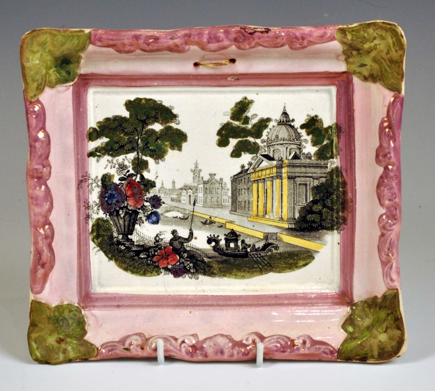  However, as discussed before, Fell is the only pottery known to have produced plaques from similar moulds pierced beneath the lustre border.
Two and a half years ago I wrote about plaques with 'scalloped' corners. I'm not sure that that's the perfect description for them - Ian Sharp calls them 'butterfly' corners. Moore & Co (Sunderland) made larger-sized versions of these plaques in the 1840s (see below).    All other variations of this plaque form appear to come from Tyneside. Both Robert Maling (below left and right) and CT Maling (below centre) made smaller plaques of this form in the 1840-50s. Many Tyneside plaques of similar size are unmarked and, naively, I wanted to attribute them all to Maling. Many have green decoration, a feature common on early Maling plaques (but a feature associated with Tyneside pottery in general).    My prejudices were reinforced when I saw the entry below in an old Railtons' auction catalogue. Many of the unmarked plaques have similar religious verses, with a wash of pink lustre over the central transfer, so my attribution seemed to gather strength.  The first challenge came discovering the plaques below, both marked B.&Co, so surely not Maling. Ian Sharp identified them as Burn & Co, from the Stepney Bank Pottery, 1852-1860. So green decoration on plaques, certainly wasn't unique to Maling.    In my last blog post, I identified a further group of these plaques as Fell & Co. They were often washed with lustre over the central transfer, so that's another feature we can't solely attribute to Maling (those with eagle eyes will have noted that the first Moore & Co plaque above also shares this feature).  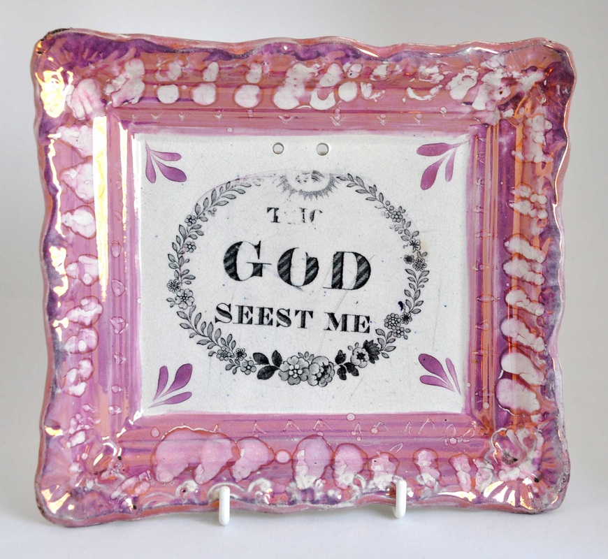  This week I remembered the bridge plaque below, from the Anderson and Garland website. The transfer appears on marked wares by Galloway & Atkinson at the Albion Pottery, c1864. I'm unsure whether the plaque below is marked, but the auction house identifies it as Albion Pottery. 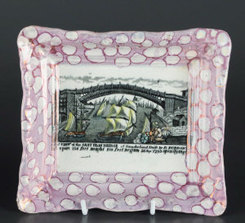 Photo Anderson and Garland So nearly all the larger Tyneside potteries produced plaques with scalloped corners. This brings me to my final examples below. The obvious attribution for these plaques is from one of the North Shields partnerships (Low Lights Pottery) of John Carr. They share the same transfers as later Carr-attributed items. But I previously resisted this attribution on the grounds that the plaques below look nothing like their later counterparts, and in fact have features more commonly associated with Maling. But we now know that nearly every pottery on Tyneside was using this rectangular plaque form. And at least two other potteries, Burn and Fell, used green decoration. I'm now more confident about attributing the plaques below to Carr.   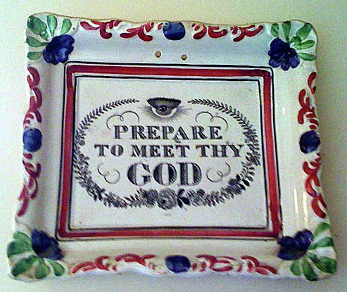 Take a look at the items below. The ferry plate on the left has the impressed mark C.C.&Co. The ferry started in 1829, so the initials could stand for Cornfoot, Colville & Co (1828-32), or for the later North Shields partnership, Cornfoot, Carr & Co (1832-38). Note the similarity of decoration to the third plaque above. The later plaque, on the right below, again with similar decoration, is attributed to John Carr & Sons (c1870). For more information on dates see the North Shields partnerships page. Although we've already shown that decorative similarities must be treated with some caution, it is great to have this link.   Of course, the strongest basis for this attribution is the use of the same series of transfer plates. The copper plates did sometimes move between potteries, but usually after a pottery closed down and its effects were auctioned off. Whereas the Carr partnerships in North Shields ran from 1832 almost to the end of the century, so there's no obvious reason for them to let the transfer plates go.
So I've got more work to do reorganising these pages. My best guess is that the two scalloped cornered plaques above belong to the Carr and Patton, 1838-46, period at North Shields. As new items emerge, the picture becomes clearer. Who knows what will turn up in the next three years. 3/23/2013 0 Comments A feature peculiar to Fell?I got very excited when I saw these plaques at Bellmans Auctioneers recently. They are a true pair in terms of decoration, and have probably been together all their life. One of the plaques has the London impressed mark over an anchor. 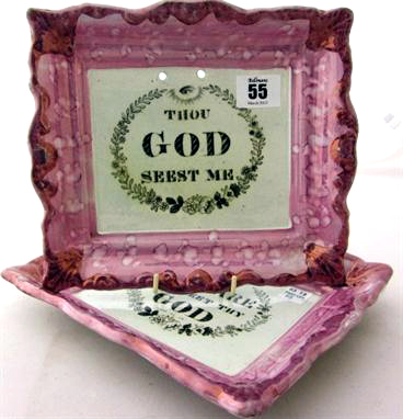  Looking at the spacing of the holes, it appears to be the 'Prepare' plaque that has the impressed mark.
These plaques sometimes appear with an impressed crown mark (see below), which identifies them as Fell & Co. Fell is on Clarice Blakey's list of potteries using the London mark, so it is great to have photos of an example. I have added the Bellmans' plaques to the London impressed mark page. 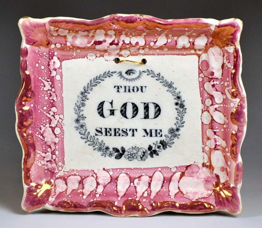  Another feature of the Bellmans' plaques got me thinking. The transfers also appear on plaques with green corners (see below). In a previous blog post I suggested that perhaps the green-cornered plaques were Maling, and that the transfer plates moved to Fell at a later date. I might now have to eat my words. The plaques below all have an unusual feature in common with the Bellmans' plaques. Can you spot it? 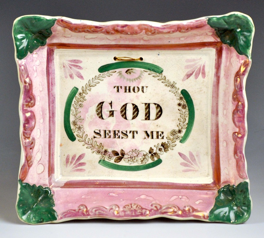 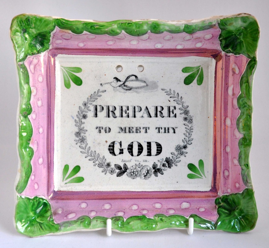 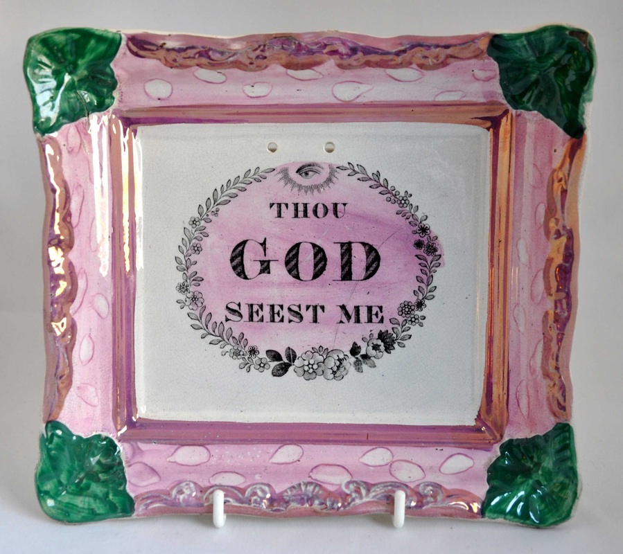 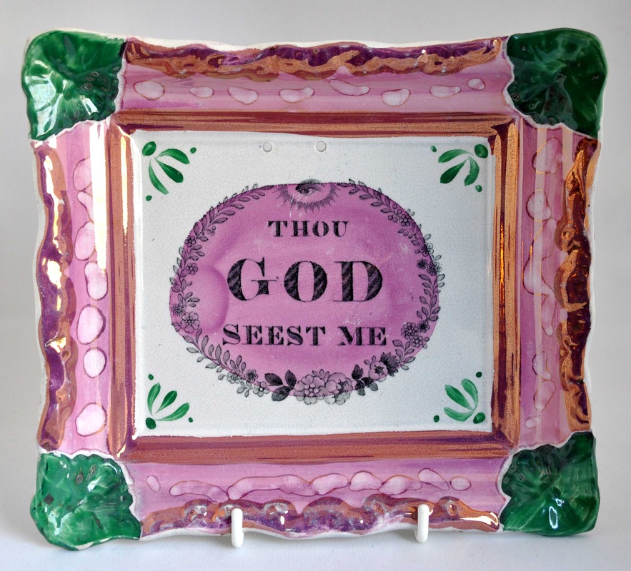 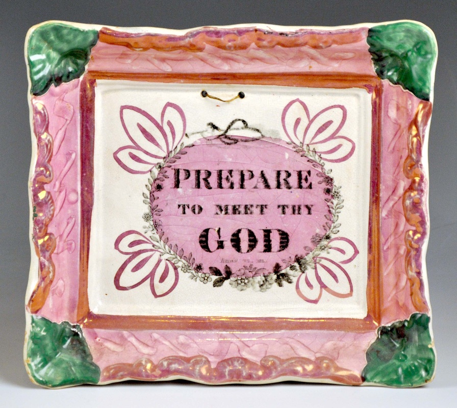  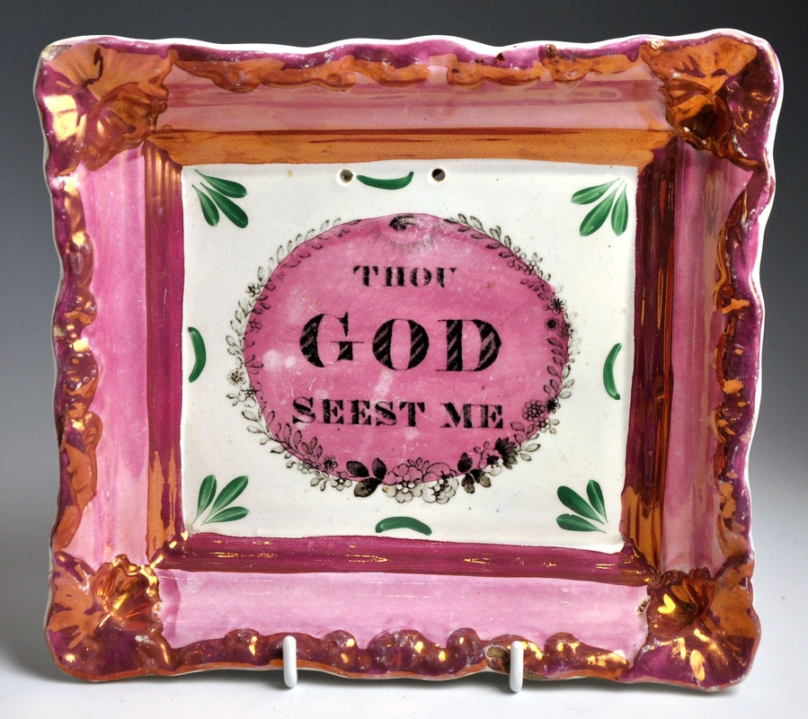 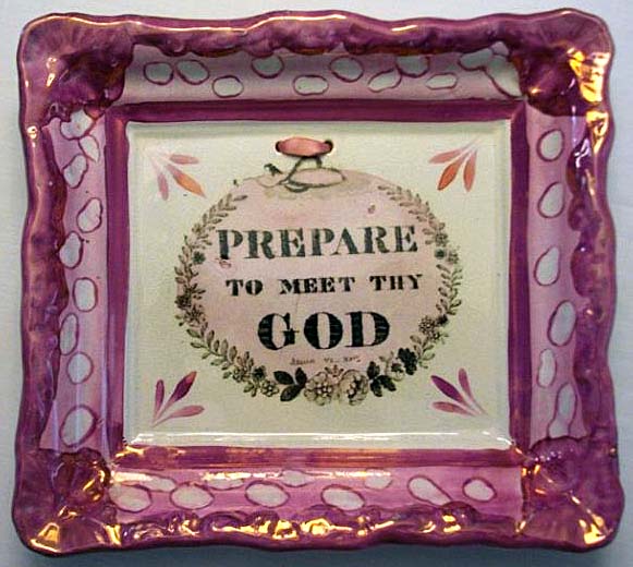  The feature doesn't appear on any of the plaques I know of with a Maling impressed mark. See below for several examples with impressed Robert Maling and C T Maling marks.  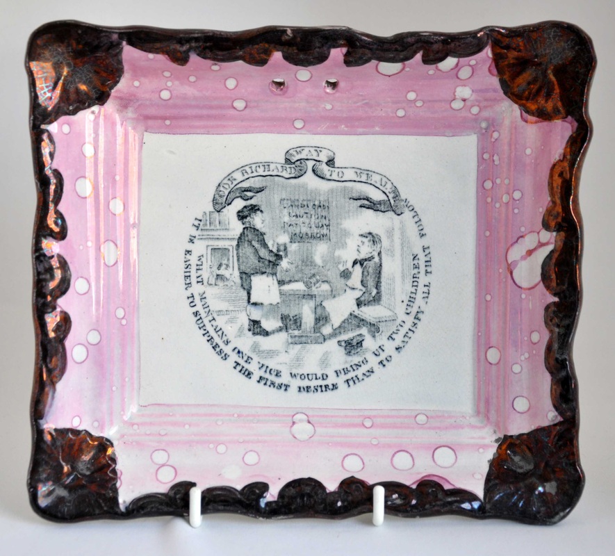 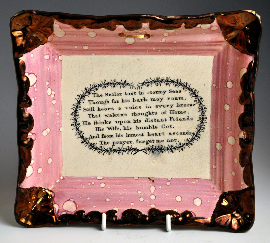 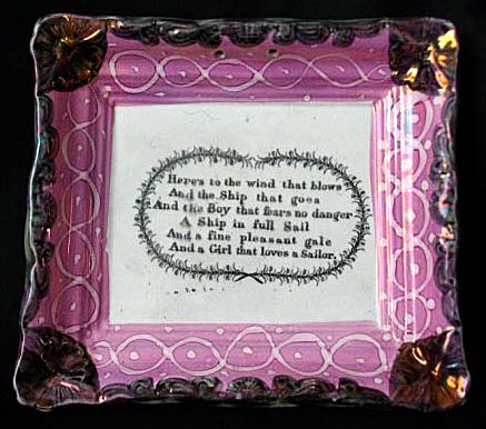  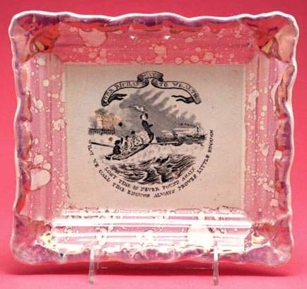 In case you haven't already guessed, it is the positioning of the holes for hanging the plaque. As with the rectangular plaques made in Sunderland, the Maling plaques have their holes pierced in the lustre border. See below for a Maling-marked religious example and compare it to the 'Prepares' and 'Thou gods' above. The holes on the Maling plaque are in the lustre border, whereas the green-cornered plaques, as with the Bellmans' plaques, are pierced within the central rectangle of the plaque.  So what of other Tyneside users of this plaque form? Below are two marked B & Co plaques, for Burn & Co of the Stepney Bank Pottery. As with the Maling plaques, they are pierced through the lustre border. So does this prove that the green-cornered plaques above are all Fell? You'll notice that one of them has very similar decoration to the plaque on the left below. I think there are two possible explanations for this. Firstly, we know that B & Co emulated Fell and even copied their printed mark (see my previous post). So should we really be surprised if they copied Fell's green decoration? Secondly, it's possible that B & Co supplied Fell with earthenware plaques (or vice versa) for lustre decoration. 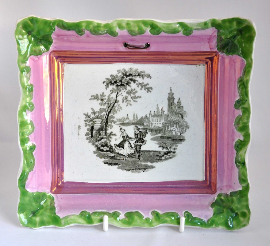  Something similar could be said for the lustre decoration over the verse transfer on some of the green-cornered plaques. On the basis of the Mustard collection plaque above, I'd previously assumed this to be a feature peculiar to Maling. However, there's no reason why both Maling and Fell couldn't have decorated plaques that way. I can hear your protests already: there's no reason either why both potteries couldn't have varied the position of their hanging holes. I've been through hundreds of photos, trying to find a Fell example pierced through the lustre border. Take a look at the two ship plaques below. Plaques with this transfer sometimes have the Fell crown impressed mark. However, the right plaque, although pierced through the border, has a different transfer (compare the details below). The left plaque with the holes in the centre rectangle, is decorated very similarly to the Bellmans' plaques above, and is, therefore, the one with the claim to be the Fell version.     The only other two examples I have recorded with the crown mark, both have holes in the central rectangle.  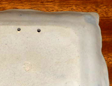 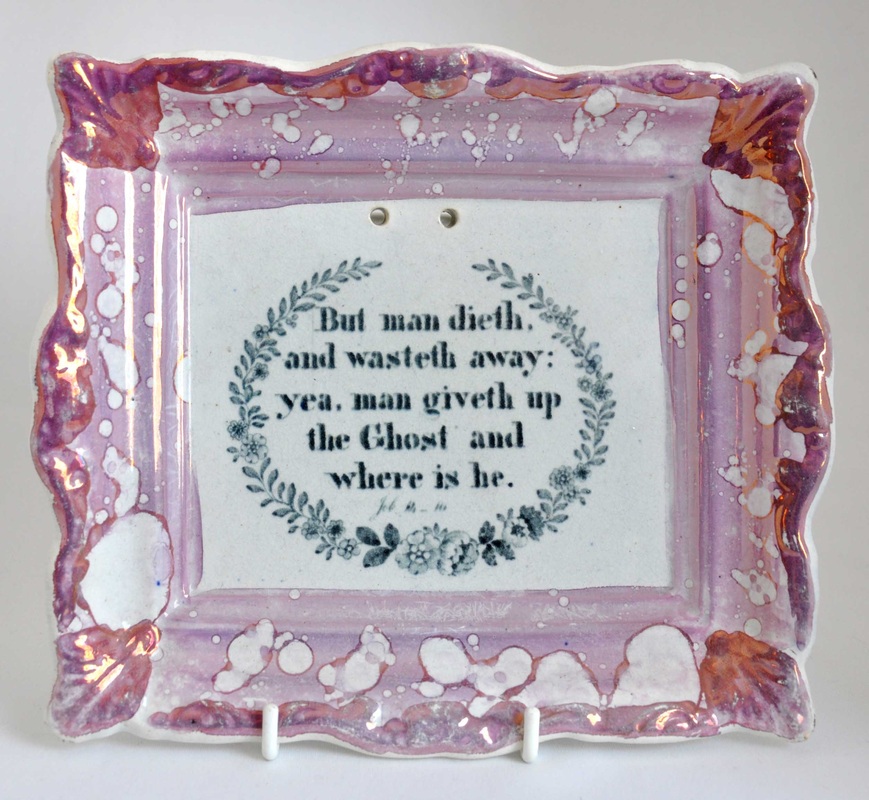 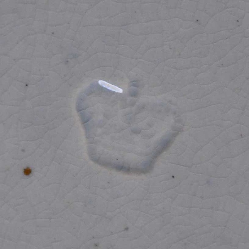 The only similar example I could find pierced through the lustre border, is that on the right below. I'm still not 100% convinced it has the same transfer as the plaque beside it.   So this Tyneside series of common verse transfers appears on plaques with a feature apparently peculiar to one pottery. It's not a decorative innovation that other potteries would likely copy. The guy who did the piercing simply preferred his holes lower down, and was damned if he was going to put them anywhere else. As some of these plaques have the Fell crown impress, it seems fairly safe to attribute the others (with the same transfers and the same lower holes) to Fell also.
So my hypothesis is... - Both Burn & Co and Fell produced plaques with green corners/borders (perhaps Maling too) - Both Maling and Fell produced plaques with lustre over the central transfer - Only Fell produced plaques with hanging holes through the central rectangle As always, I'd be very happy to hear from anyone who can add anything to this. |

Proudly powered by Weebly