|
7/27/2013 0 Comments Garrison Wesley transferAs plaques go, the one below is pretty undistinguished. Circular black and yellow plaques are usually more desirable than their pink counterparts, but plaques like the Wesley below are so commonplace, they must have been made in their many hundreds (perhaps thousands). Over time, the etched grooves in the transfer plate wore shallow, and on this plaque, Wesley has lost his nose.  This Wesley transfer is associated with the Garrison Pottery - Dixon & Partners. (Note the 6 'prongs' of the 'aura' to Wesley's right. Transfers from other potteries have fewer prongs. Read more here.) The black and yellow plaques were likely first made by the Dixon, Austin & Co partnership in the 1830s. The first plaque below doesn't have the banner 'The Best of all God is with us'. That could be because the plaque is very early and the banner was engraved on the transfer plate after the plaque was made (see the Dixon, Austin & Co page for a similar soup plate without the banner). Or it could be because the banner was trimmed off before the transfer tissue was applied to the plaque. I had the thought that if we compared lots of plaques with this transfer, we might be able to get an idea of the age of the worn plaque above. For instance, if there were pink plaques with the 'Dixon Co' impress and Wesleys with missing noses, it might imply that production of the black and yellow plaques continued into the 1850s or even into the 1860s. But that's not what I found. All the plaques below could come from the same transfer plate. Look at the spacing of the letters in the second detail. In particular the space around the letter 'o' in 'Methodist' and 'Society'. That is consistent through all the transfers below. The contrast of the details has been turned up in PhotoShop, so it is the first image that best shows the relative strengths of the transfers. I have ordered them from strong to weak as best I can. 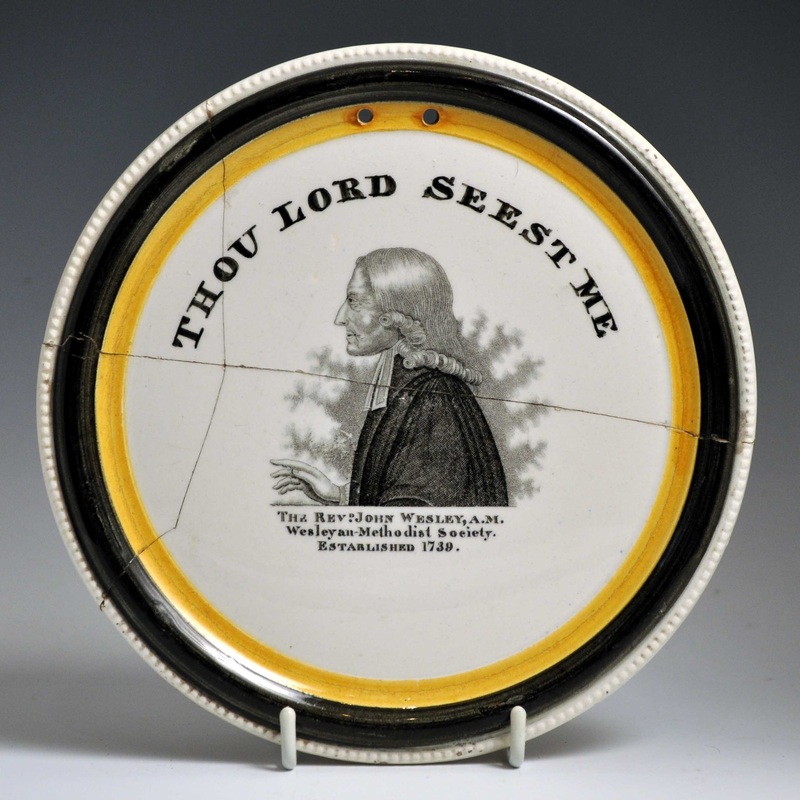 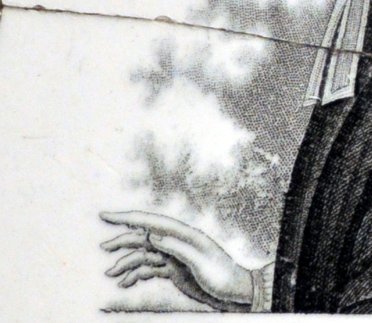 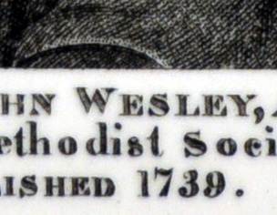 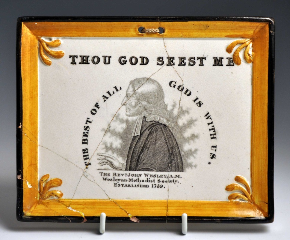 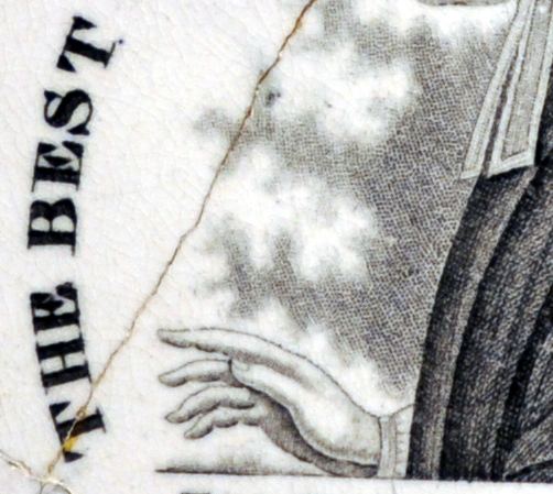 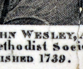 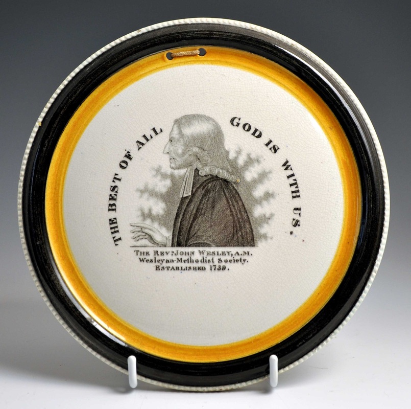 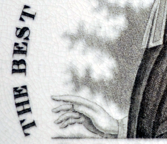 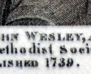 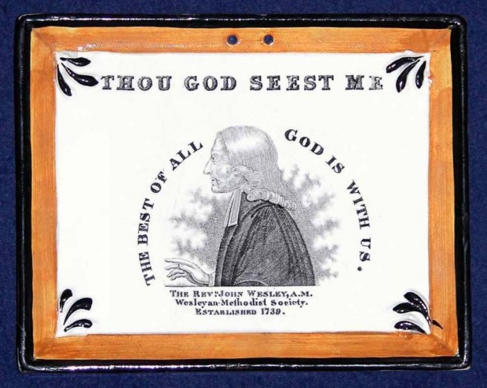 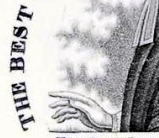  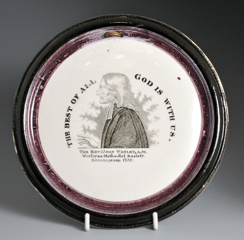  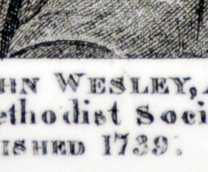 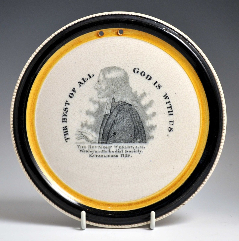 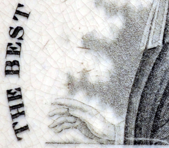 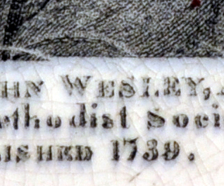 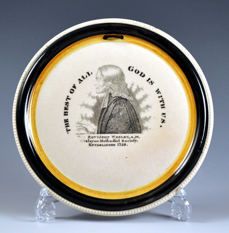  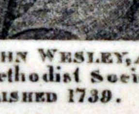 This was the point at which things became surprising. The plaques with pink lustre, which we know were produced later, have stronger transfers than those above. There are two possible explanations for this. Firstly, that they came from a different transfer plate (although the spacing of the lettering remains identical). Secondly, that the transfer plate was re-engraved to restore clarity. As you'd expect the pink plaques with the 'Dixon, Phillips & Co' impress generally have stronger transfers than those with the later 'Dixon Co' mark. 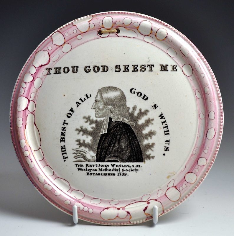 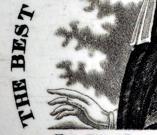 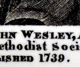 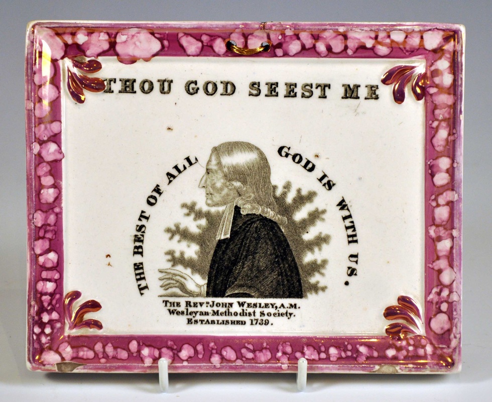 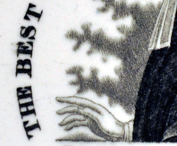 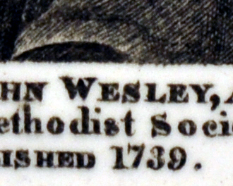 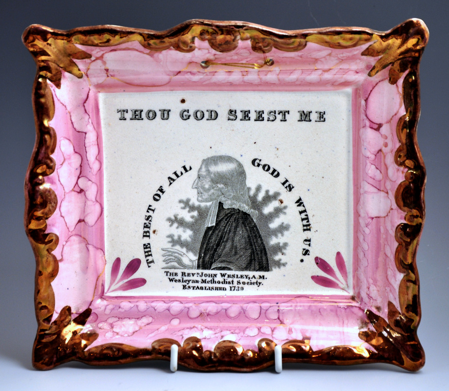 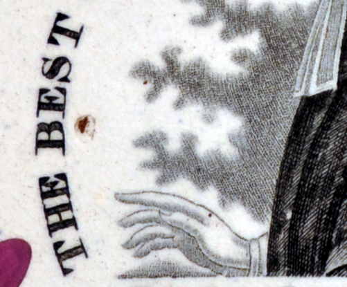 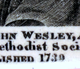 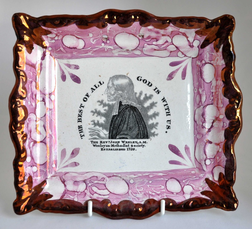  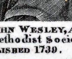 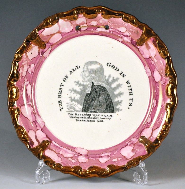 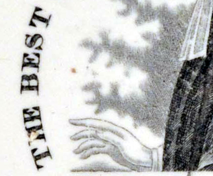 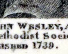 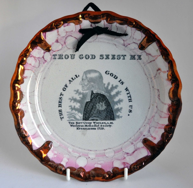 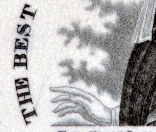 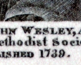 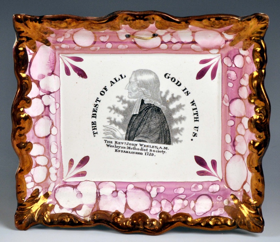 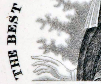 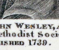 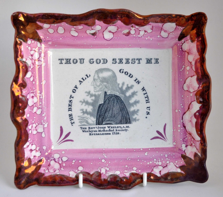 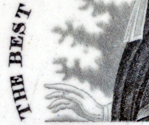 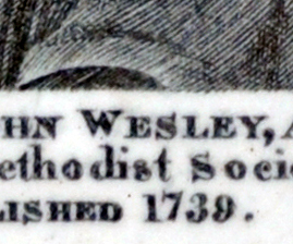 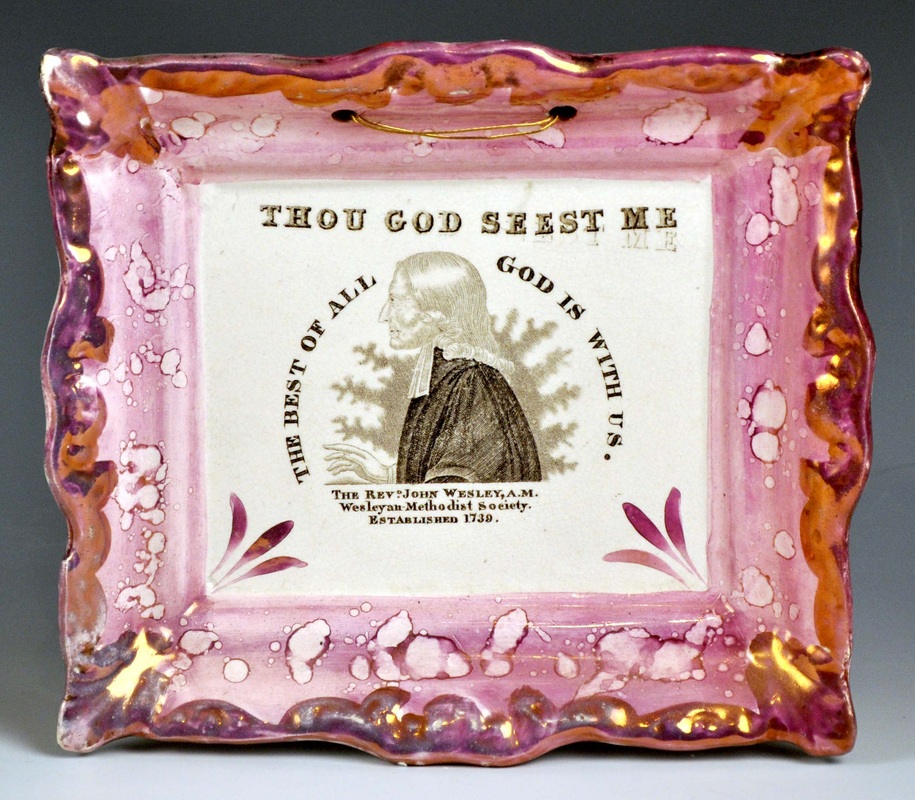 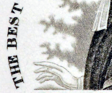 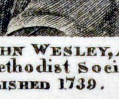 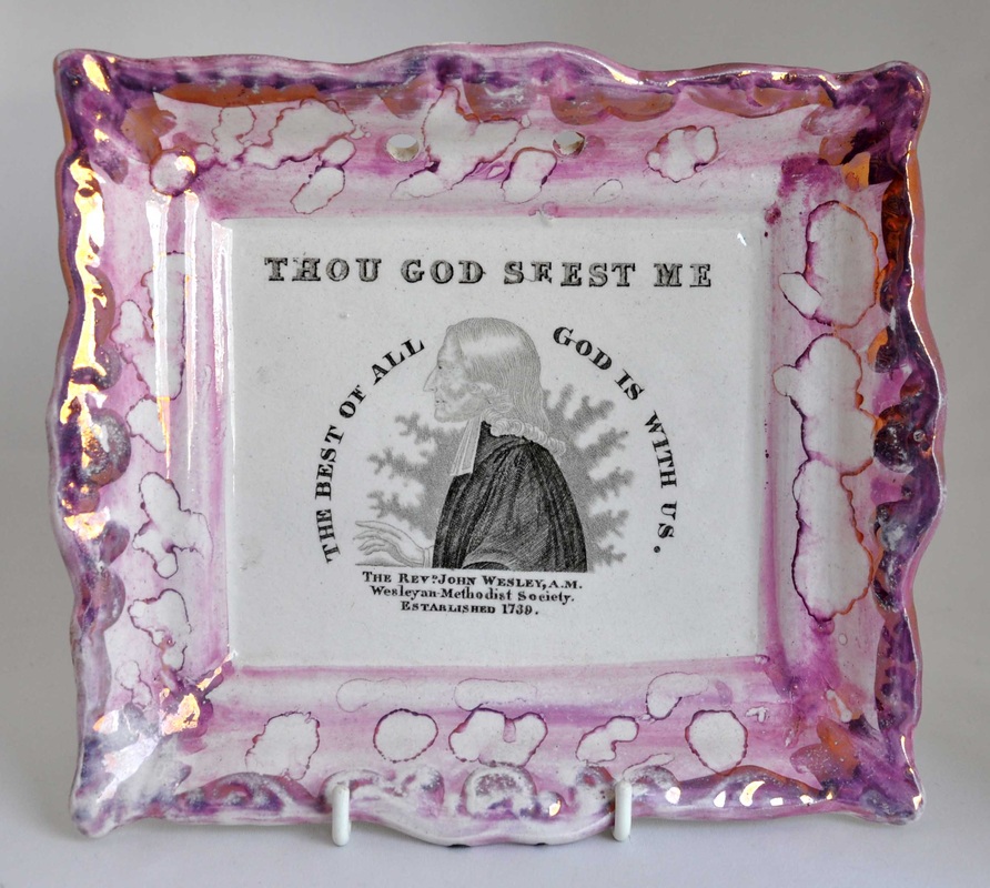 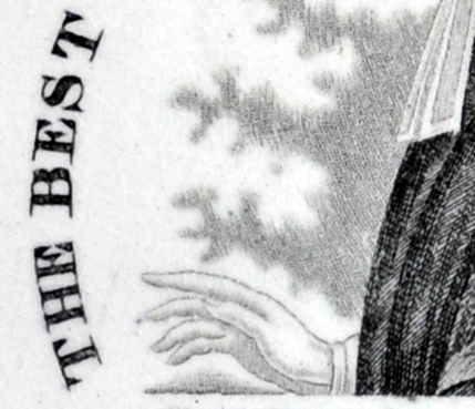 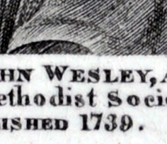 The hatching on Wesley's sleeve (second detail) on the pink plaques is identical. There are a couple of white diagonals that appear in the same place on every sleeve. Wesley's aura is also more pronounced on the pink plaques. I think all of that is consistent with re-engraving a transfer plate that had seen heavy use in the 1830s. By the 1840s, black and yellow plaques had fallen out of fashion, and pink lustre was all the rage. (I have noted this phenomenon with plaques attributed to Sheriff Hill also.) Interestingly, this would mean that the pink rectangular Wesleys and Clarkes could not have been made as early as 1832 to commemorate Clarke's death. 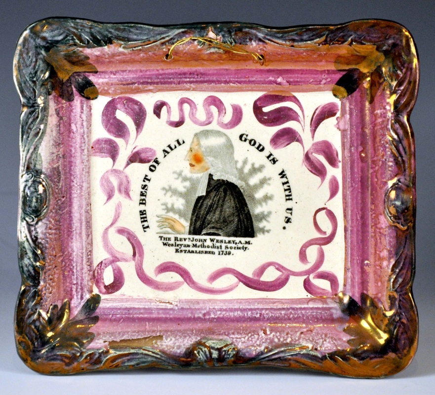 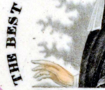 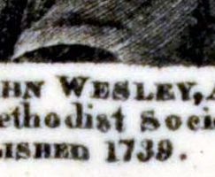 Finally, here's the last incarnation of this transfer on a plaque attributed to John Carr. The transfer plate likely moved to North Shields when the Garrison Pottery closed in 1865. Carr appears to have had the plate re-engraved again to restore the black.
The interesting find for me is that there appears to have been no overlap between the production of black & yellow and pink lustre plaques. For this transfer at least.
0 Comments
7/9/2013 0 Comments Hand-painted plaquesAnyone who has followed this blog will know I'm a sucker for a hand-painted religious verse. They don't come up very often, but this summer has turned up an embarrassment of riches. Firstly, here's a broken 'Prepare' plaque that appeared in a job lot. It is tiny: 137 x 117mm. It's of a form I've attributed to Sheriff Hill, as is the circular plaque beside it, painted in the same font. 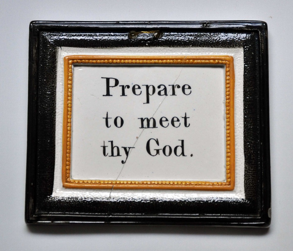 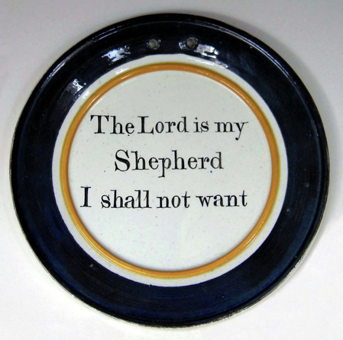 Staying on Tyneside, I've attributed the plaque below left to C, C & Co, on the basis of its similarity to the plaque below right, which has an impressed mark. I love the brown and yellow plaque with its doom-laden verse. 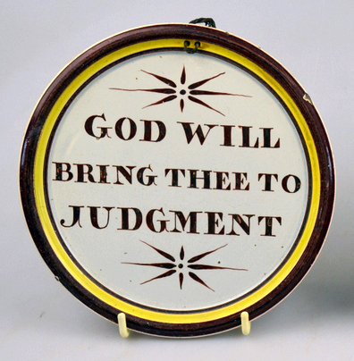 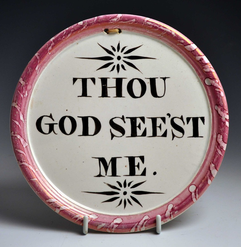 The next pair is spectacular. Although unmarked, I've attributed the plaques to Dixon, Austin & Co, on the basis of decorative similarities to marked plaques. It is possible that these verses, like the other rarer ones in this post, are unique and were made to order.  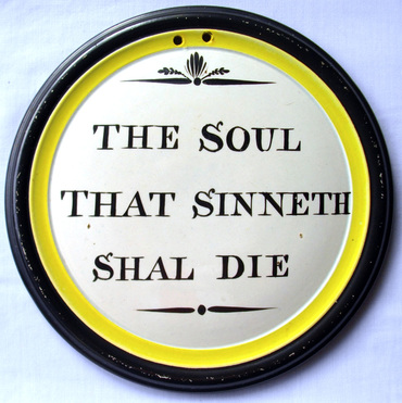 The next plaque has the text 'I know that my redeemer Liveth'. It is apparently from the same mould as the 'Thou God' beside it, and is painted in similar colours and font. They are from an as-yet unidentified pottery. 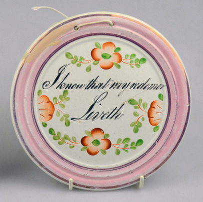 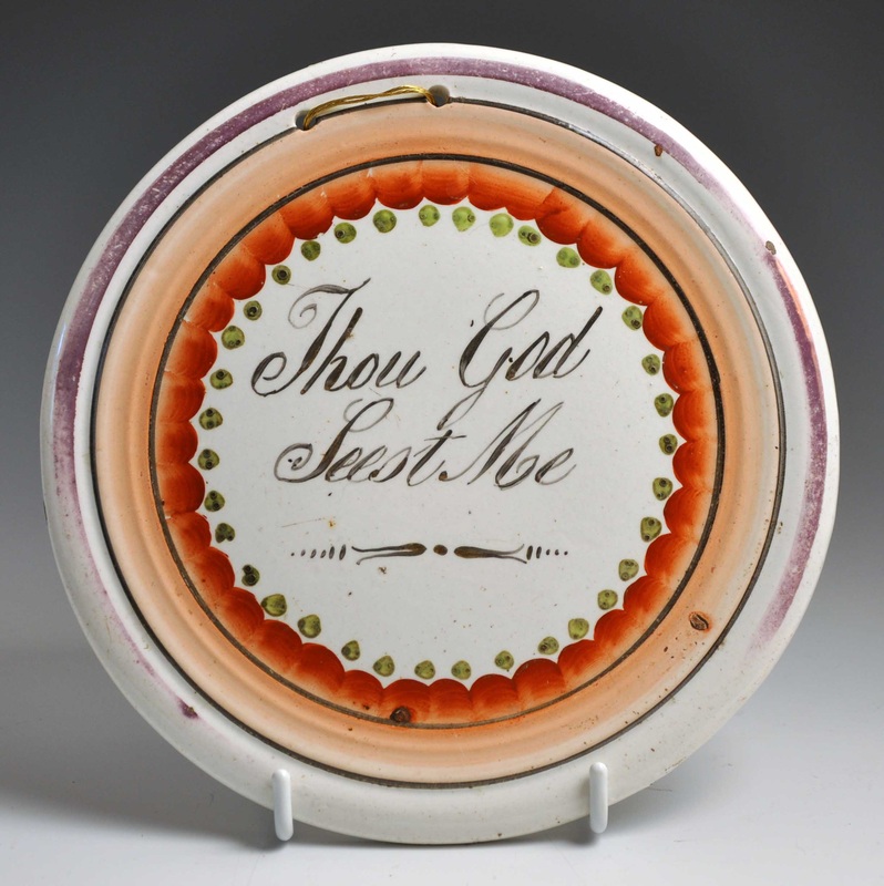 Finally, here's a plaque from the same group in my June 15th blog entry. In fact, it provides the missing link between a group of plaques I now feel confident attributing to Dixon, Phillips & Co. I have added a new page in their honour. 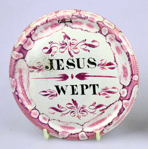 So this plaque, unlike the others above, likely belongs to the 1850s or even 60s. This is much later than we'd normally suppose for a small circular plaque. I'd be interested to hear from anyone who has a jug, bowl, mug, plate or plaque with any of the decorative elements shown on the Dixon, Phillips & Co page. P.S.Here's another hand-painted plaque I'd desperately like to catch up with: 'Salvation Cometh from The Lord'. It came up for auction in May 2007, and I'd love a better photo. 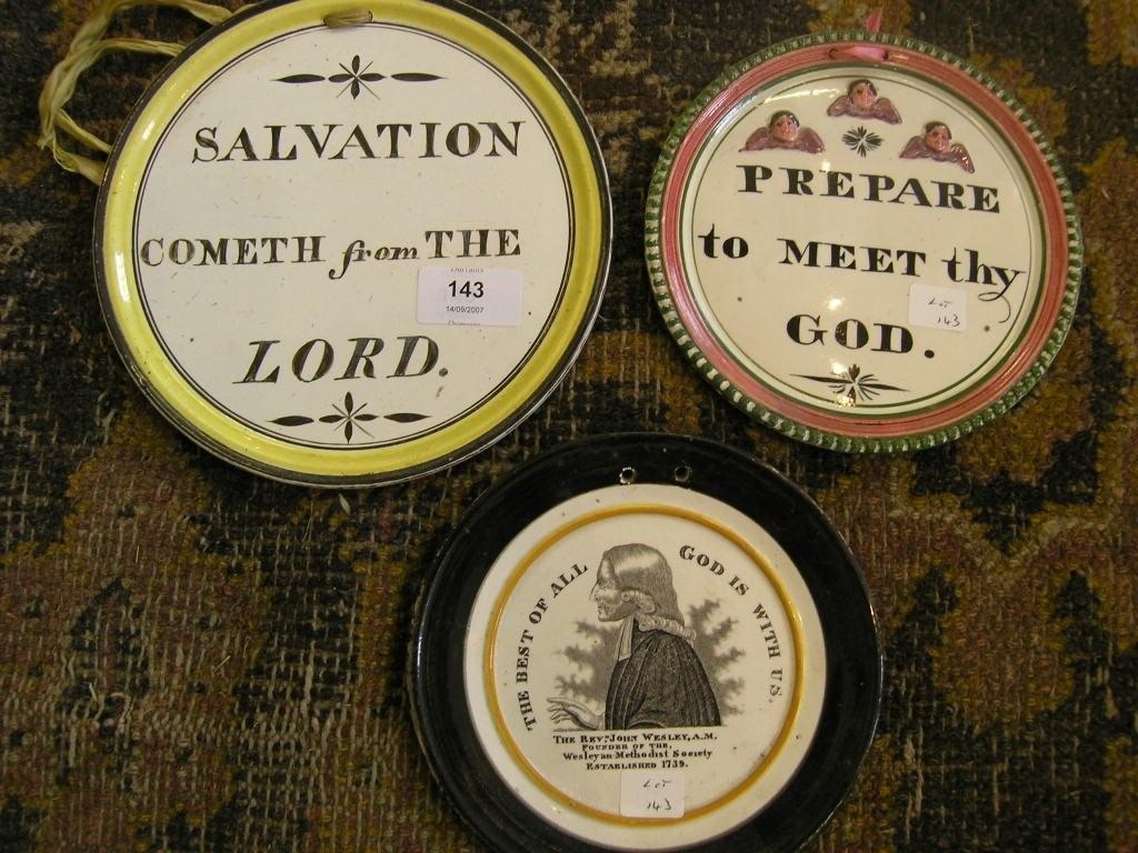 7/3/2013 0 Comments More Wallace & Co attributionsIan Sharp has just listed the fabulous plaque below on his website (click here to see the listing). Unusually, the transfer is printed in blue. The transfer is similar in design to a plaque in my collection (which Ian sold me a couple of years ago) with a Wallace & Co impressed mark. Ian's plaque below is, however, unmarked.  Compare the three plaques below and their details. The plaque in the centre has the Wallace & Co impress. The plaque on the right has an unusual printed border (click to enlarge) but no garland around the verse, and no impressed mark. The angels (first detail) are very similar to those that appear on verse plaques from Scott, Moore and C.C.& Co. However, the crossed sprigs of leaves below the verse (second detail) don't appear on verse transfers from any other pottery. 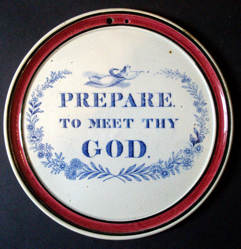 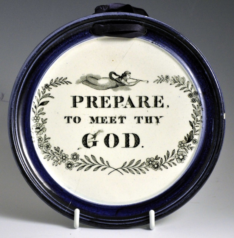 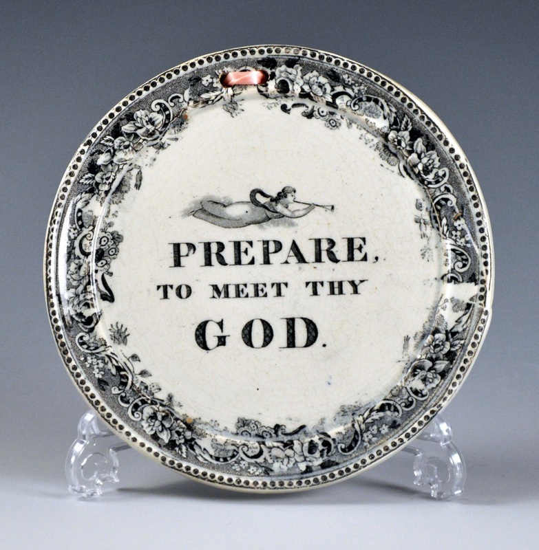 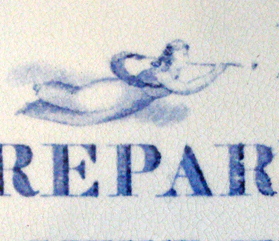 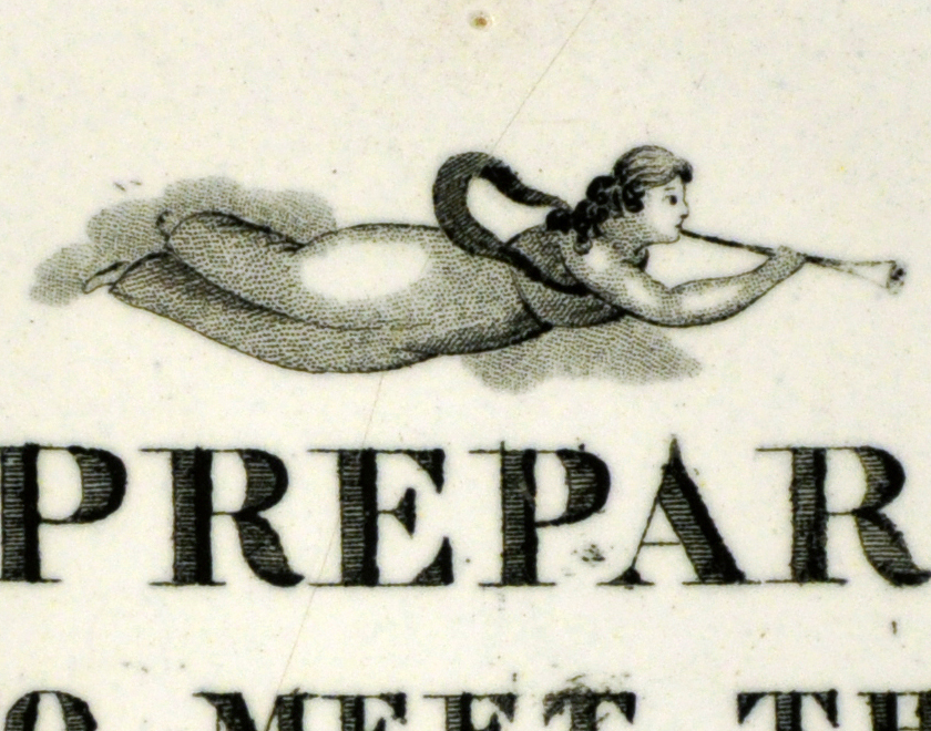 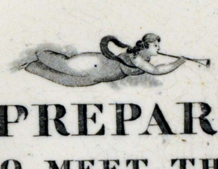 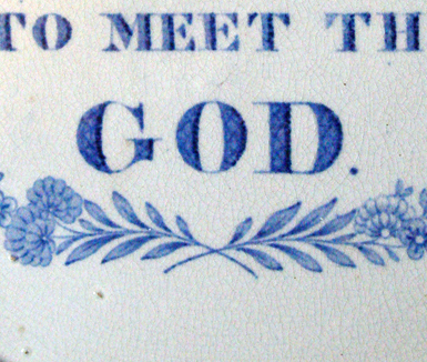 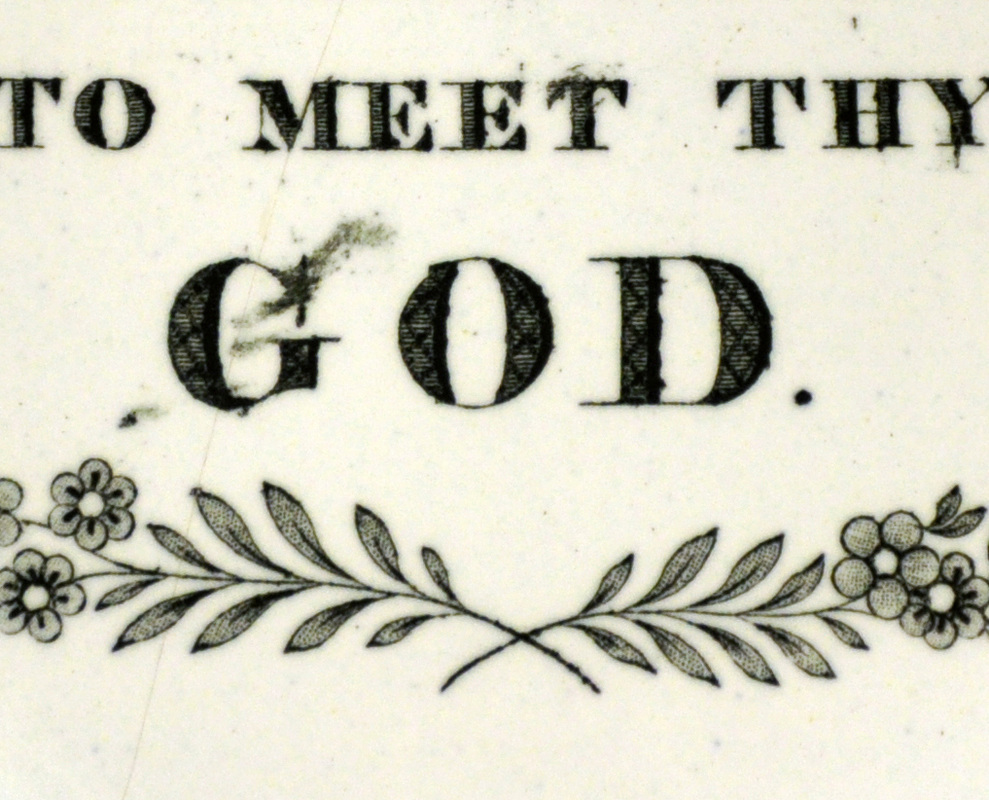 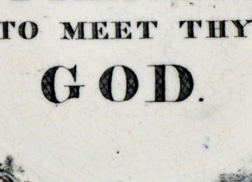 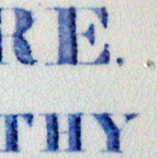 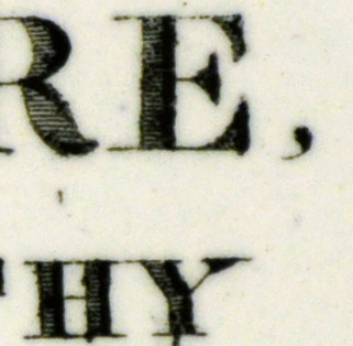 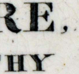 The first two plaques above, despite similarities of design, clearly come from different transfer plates. Compare the flowers in the second detail. However, the similarities are striking enough for us to attribute the first plaque to Wallace & Co.
The second and third plaque come from the same transfer plate. Note the scratch above the letter 'H' in the third detail. The garland was simply trimmed off before applying the transfer to the third plaque. This is exciting for me, as I'd never linked the two plaques until last night. I've seen many 10s of plaques with this verse from Scott, Moore and C.C.& Co. However, after nearly 15 years of collecting, these are the only three 'Wallace' versions I'm aware of. You can read a little more about the pottery on the Wallace & Co page. |
Proudly powered by Weebly