|
11/27/2011 0 Comments More on plaques with scrolled bordersPlease read my previous blog post first. So do any of the plaques with scrolled borders have transfers that appear on other marked items? The obvious one is the Crimean 'May they ever be united' with two sailors shaking hands. This also appears on plaques with the 'Dixon Co' impress. So could Dixon have made the mystery group of plaques? I've compared the transfers below. The left column shows a marked Dixon plaque. The centre and right columns have plaques with scrolled borders. Click on the images to enlarge and to move between the details. 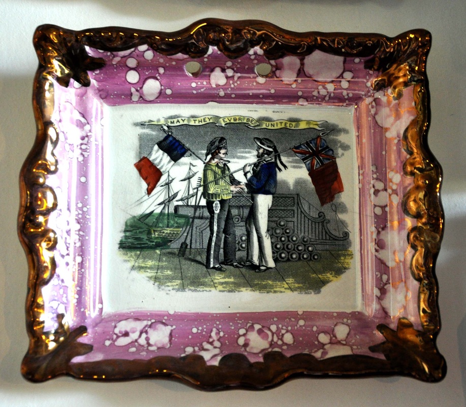 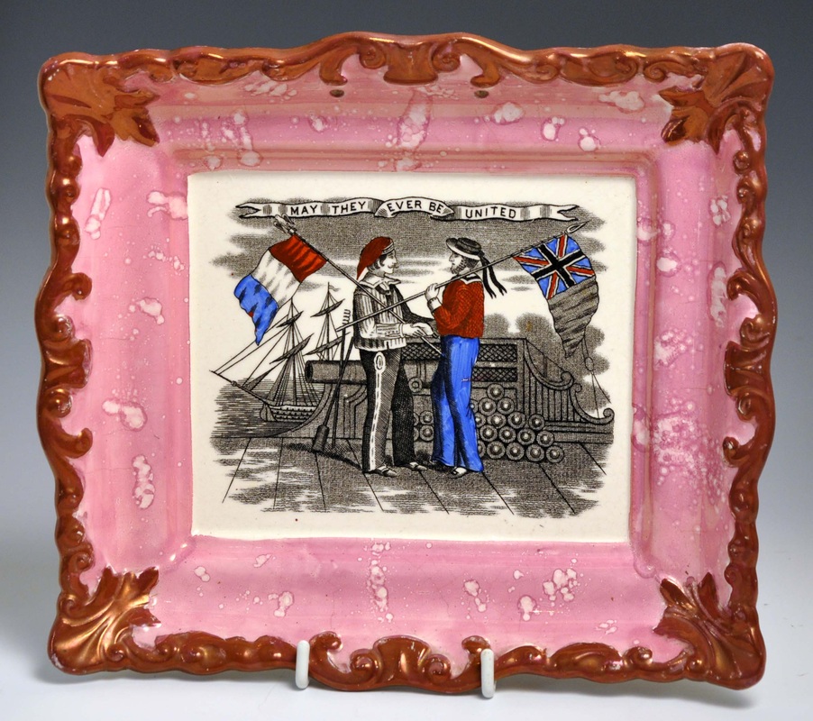  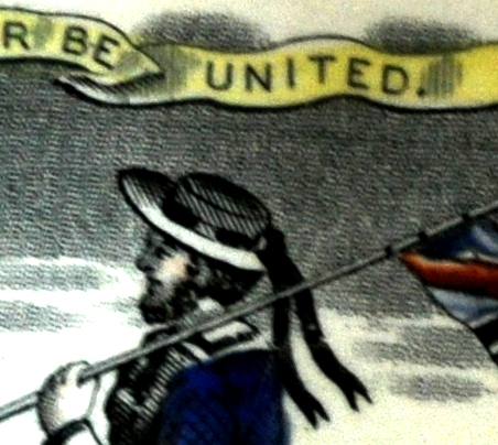 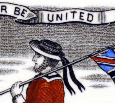 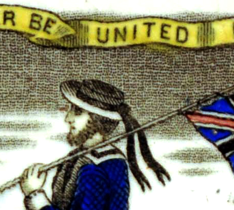    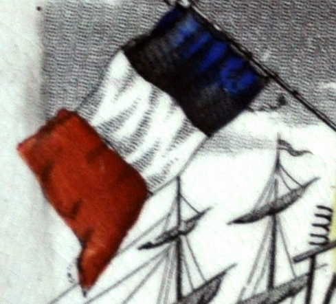 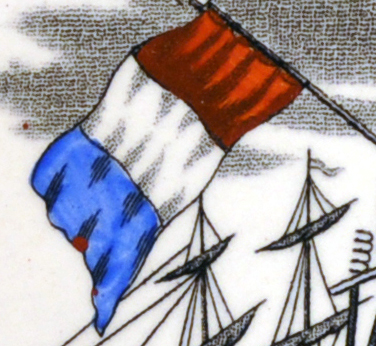 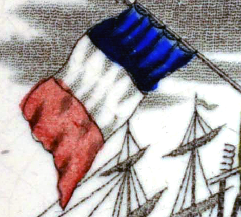 The Dixon transfer (left) is clearly from a different plate. Notable differences are... In the Dixon version, there's a full stop after the word 'UNITED' in the title (see first detail). The Dixon plaque's English sailor (standing on the right) doesn't have a buckle on his shoe (see second detail). The pattern of shading on the French flag is different in the Dixon version. N.B. the order of colours of the French flag has been transposed incorrectly on the centre plaque. This is nothing to do with the transfer plate. These colours were added later by hand, over the transfer.
We know that some potteries commissioned multiple versions of the same image to use on different wares. So we can't entirely rule out Dixon. All we can conclude is that these plaques are no more likely to come from the Garrison Pottery (Dixon) than anywhere else. So back to square one I'm afraid. If you have a jug or bowl with the non-Dixon version of this transfer, it could be really useful in helping to pin down other transfers used by this pottery.
0 Comments
11/24/2011 0 Comments Plaques with irregular crackleIn April 2010, I wrote about a group of plaques with distinctively moulded borders, without shells. Please click here to read again, before reading this post. I recently bought the two plaques below, which from the front look almost mint. But they both have an unusual pattern of crackle on the reverse. N.B. I've greatly turned up the contrast in Photoshop to better illustrate what I mean.  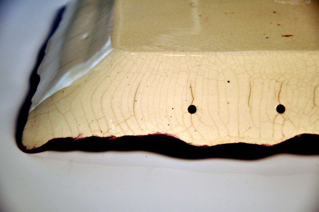  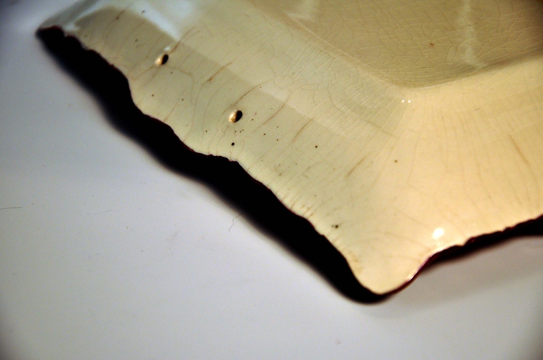 Thanks to Ian Holmes for providing the following photos, which confirm that extensive irregular crackle and stress marks are a common feature of plaques from this unidentified pottery. Again, I've turned up the contrast on Photoshop. Click on the images to enlarge.  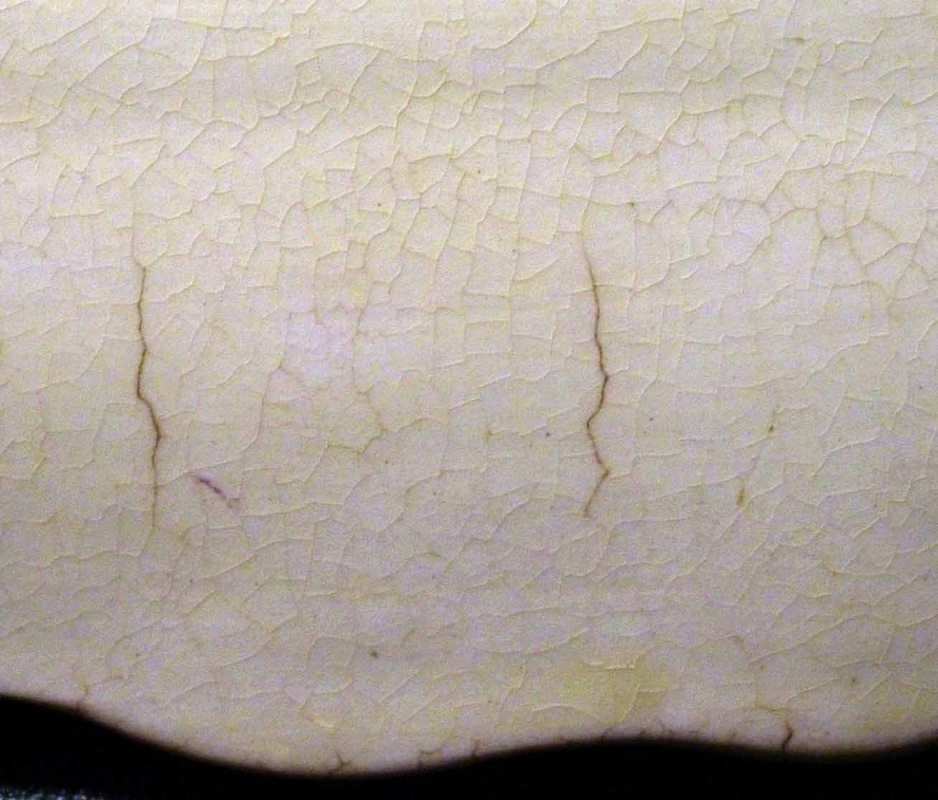 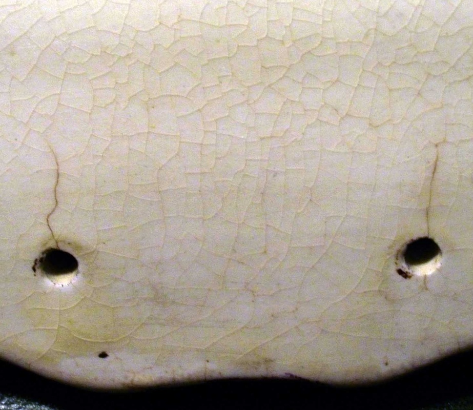 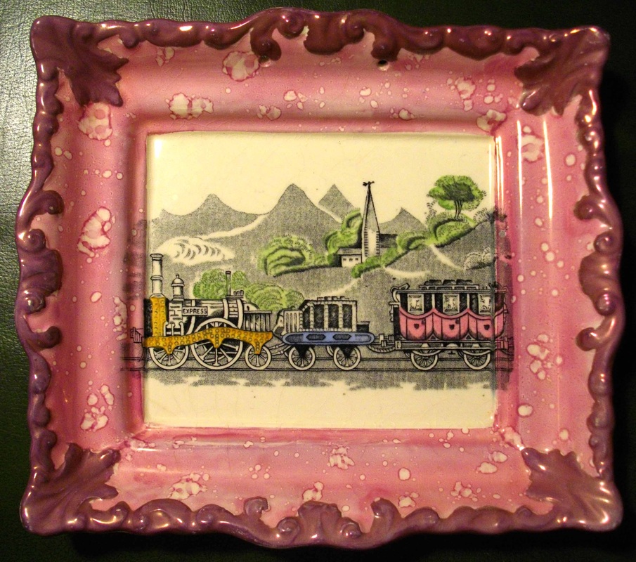 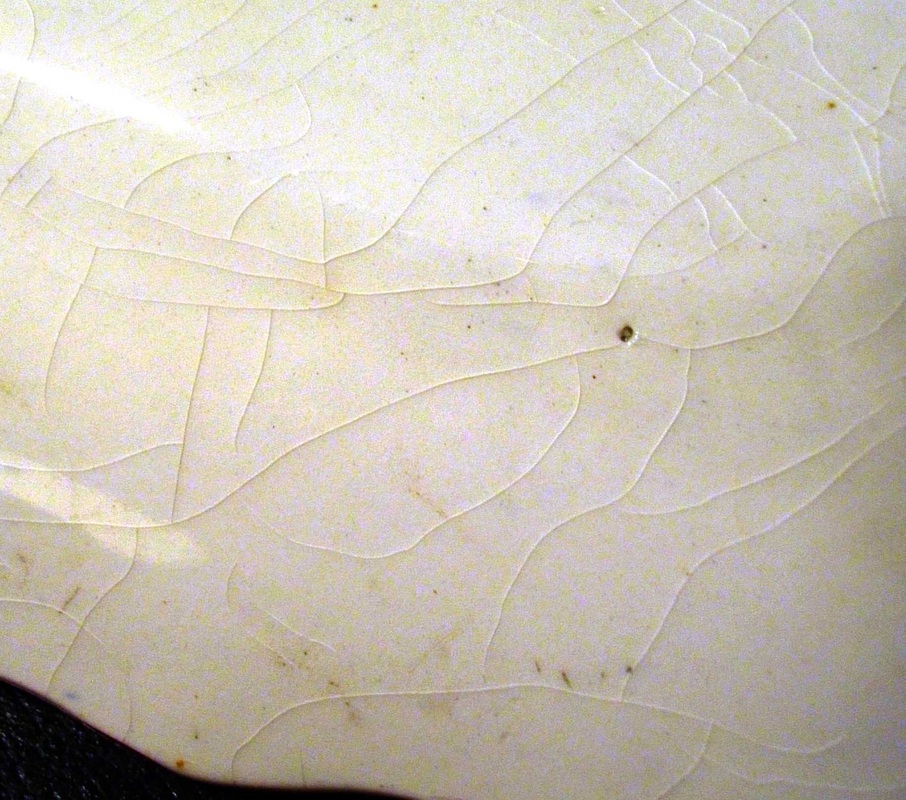 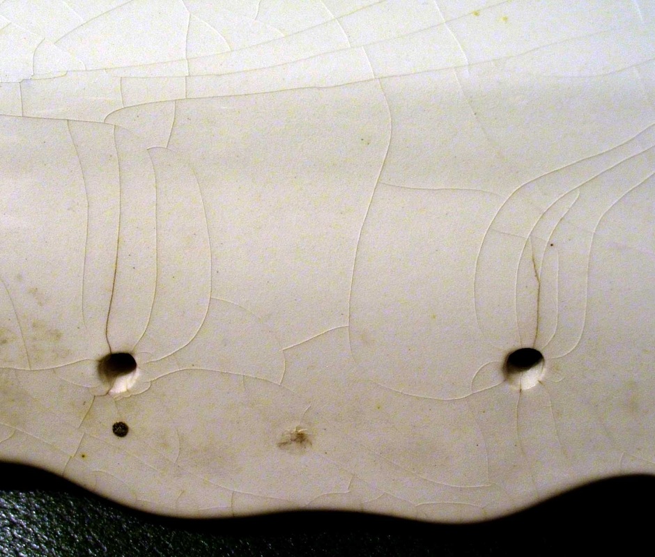  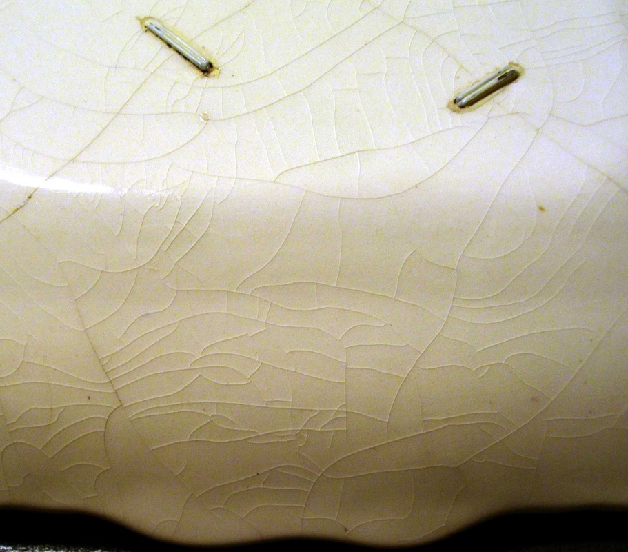 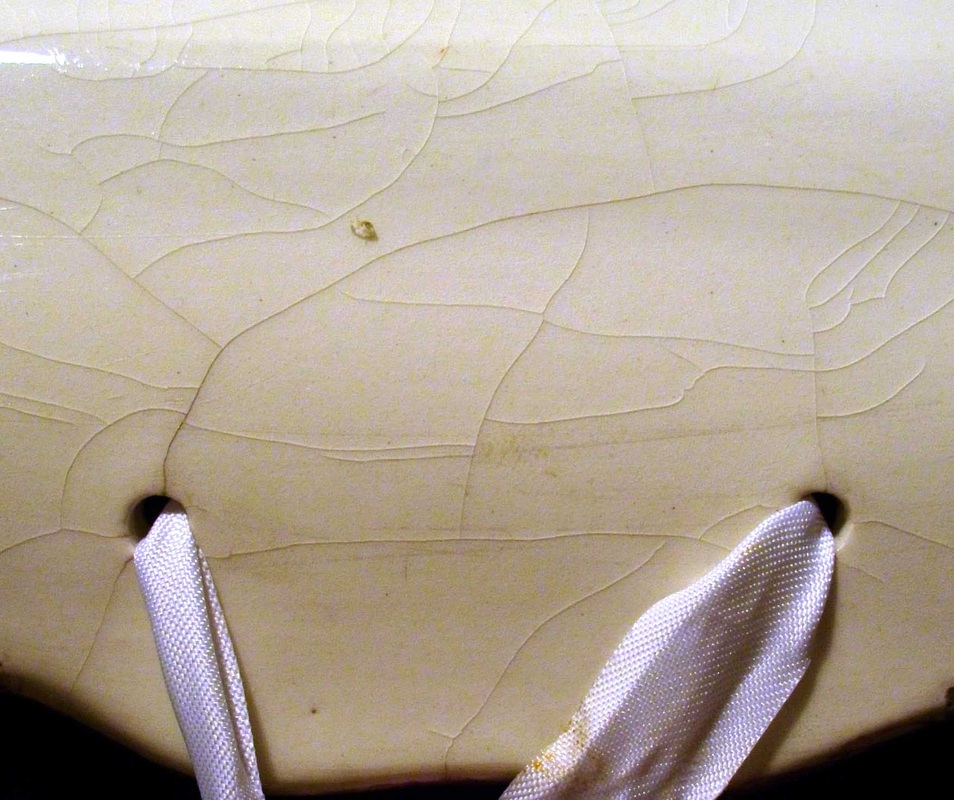 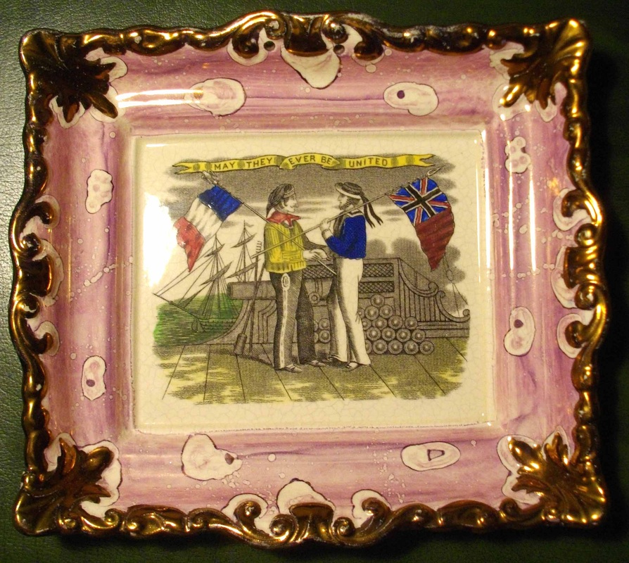 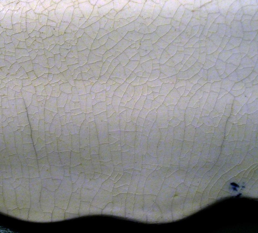 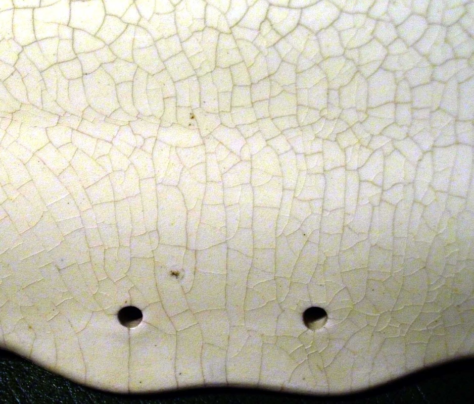 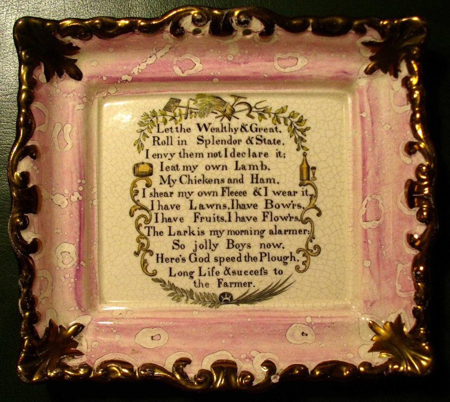  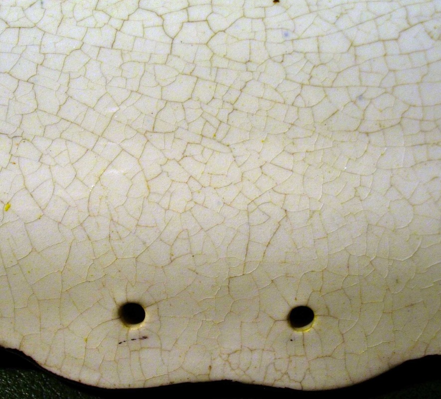 On some, the crackle continues on the front (see below left). On others, the stress marks penetrate right the way through to the front. This is particularly noticeable around the hanging holes (below centre). 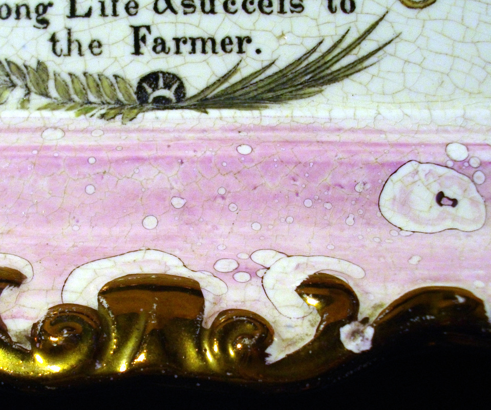   The plaques above tend to sell for high prices, so it would come as some reassurance if we could lay to rest the idea they may be 20th century reproductions. Have a look at the Adams plaque below. Again, I've turned up the contrast to better show any crackle. In fact, the reproduction plaque shows none of the signs of stress of the plaques above. The surface has a very, very fine and even crackle (if that isn't overstating it), of a kind I feel I've seen before on 1920's or 30's pottery. So nothing like the plaques above.   Unfortunately, that doesn't bring us any closer to knowing which pottery made the other plaques.
11/21/2011 0 Comments Prepare to meet thy god (again)The 'Prepare' transfer below has defied my attempts at attribution. The two plaque forms in the left photo are unusual – the rectangular form resembles plaques I've attributed to Sheriff Hill. The plaque form in the right picture, on which the transfer most commonly appears, is similar to those produced by several potteries – Carr, Dixon, Moore, Scott – in the 1850s and 60s. 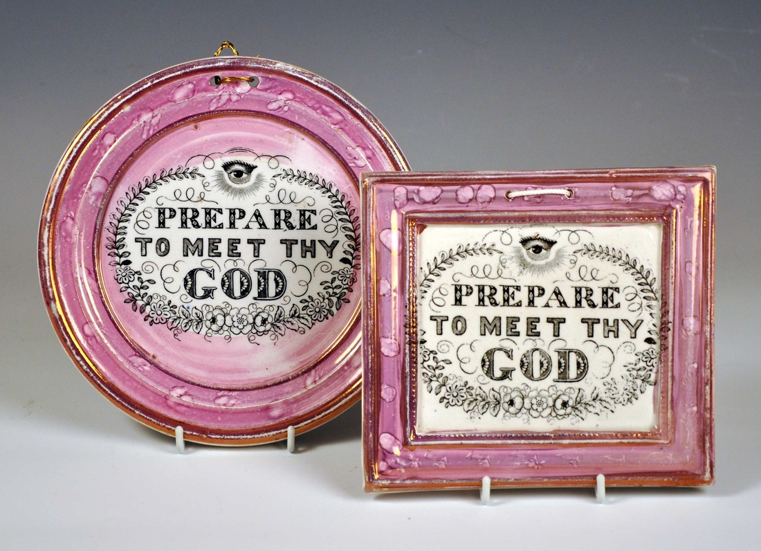  I've been having a clear out and found the cracked plaque below, shoved in a pile in a cupboard. It's unusual because of its size. 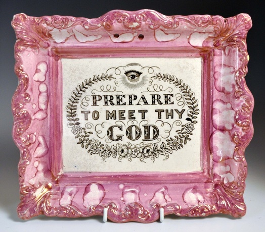 Compare the sizes of two plaques in the photos below. The larger plaque is 233mm x 202mm, and the smaller plaque, 210mm x 188mm. So a big difference. 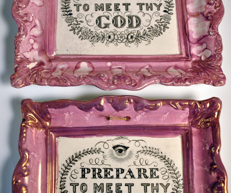 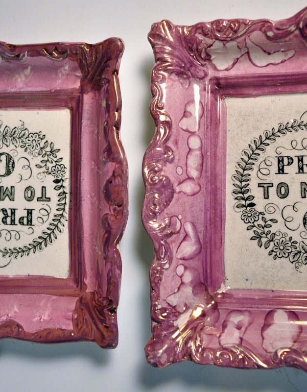 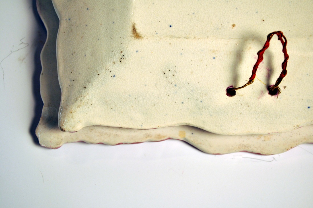 What struck me looking at the large plaque, was its similarity in shape and feel to the brown-bordered plaques, commonly attributed to Scott (below right). The 'Thou god' plaque measures 231mm x 203mm. It is less finely modelled than the 'Prepare' plaque, but could in my view have come later from the same mould.  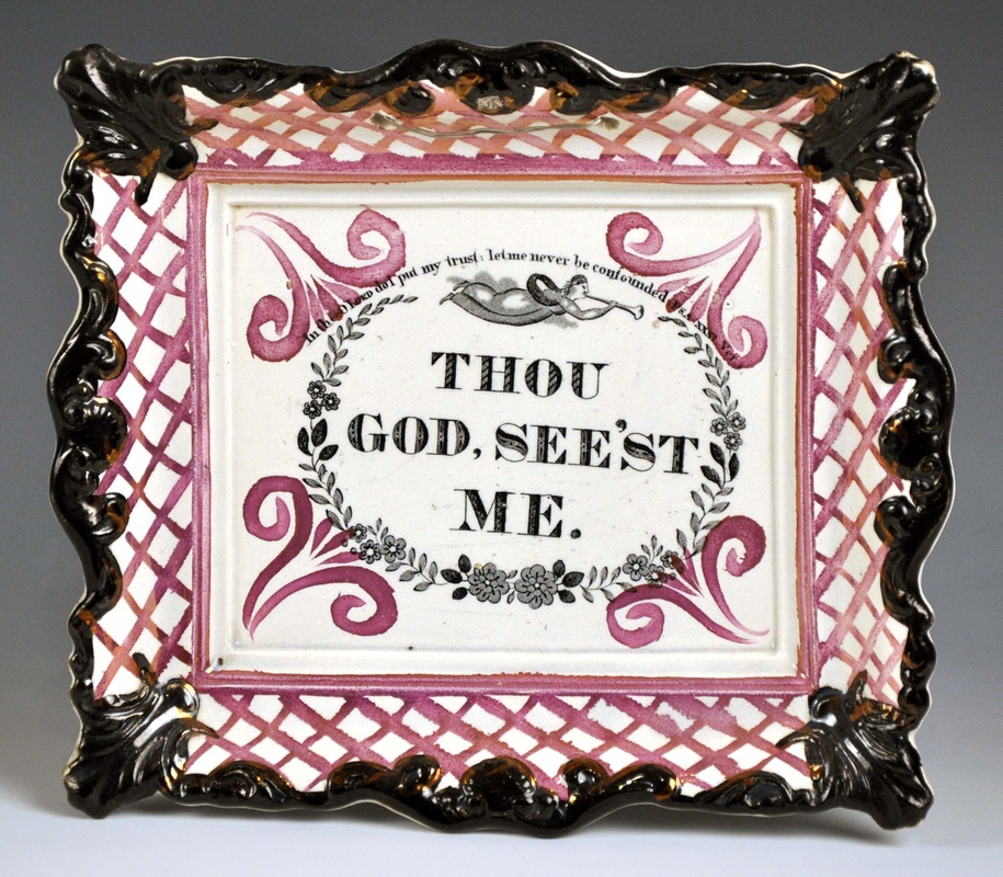 So what of the smaller plaque? It is almost identical in size to the plaque on the right, which has a Moore & Co impressed mark (210mm x187mm). Note also that the 'Prepare' plaque shares another Moore feature – a darker pink inner and outer lustre border 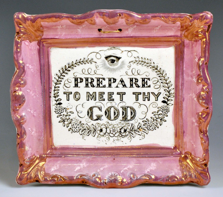 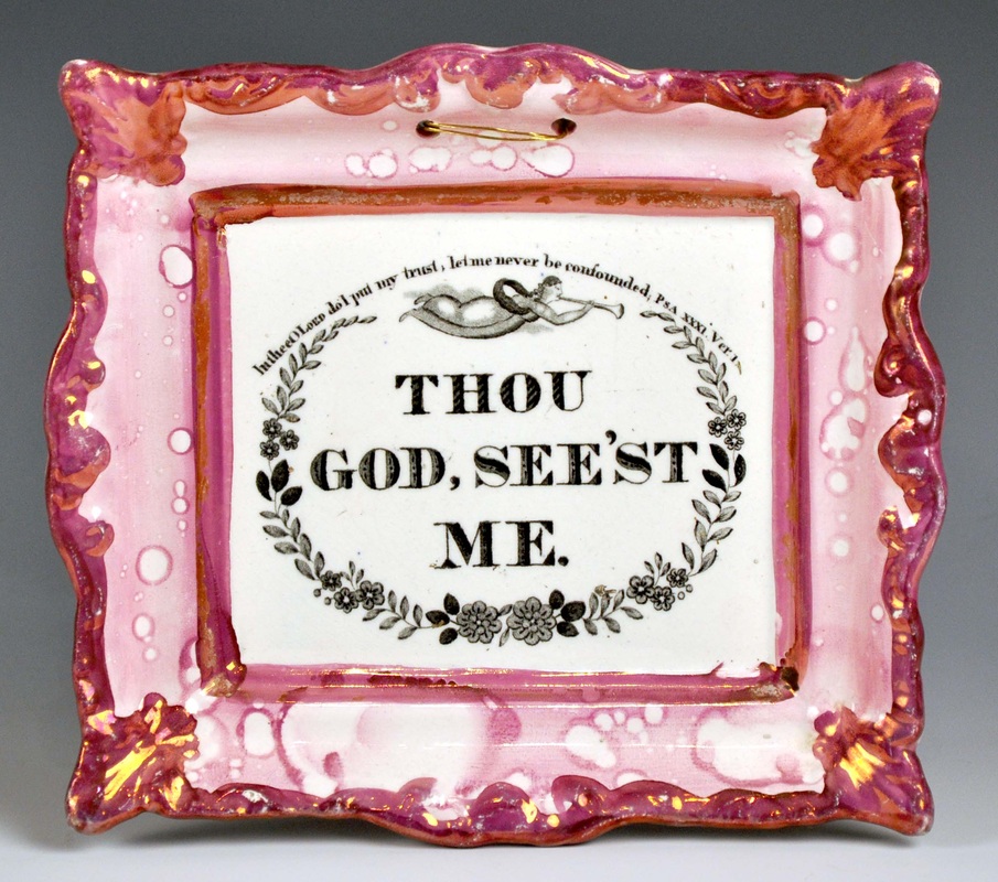 We know that Scott and Moore shared transfers, so the dual attribution sounds even more feasible. One thing slightly bothers me though... these plaques are fairly common, and Moore & Co (unlike Scott) were pretty good at marking their plaques. If the attribution were correct, it wouldn't be unreasonable to expect to find one with a Moore & Co impressed mark. But I haven't seen one yet. Perhaps you have one? P.S.At the risk of being accused of having my cake and eating it, I should remind everyone that only four months ago, I was tentatively attributing a similar plaque to Carr, on the basis of its lustre decoration. Read more here.
11/13/2011 0 Comments Maling attributionsIan Sharp's description of a plaque on his website got me thinking. The plaque has a prepare to meet thy god transfer with an unusual scroll motif. Ian writes that the 'enamel colours are usually associated with either John Carr, North Shields, or C T Maling, Newcastle, both c1845.' See Ian's plaque below. 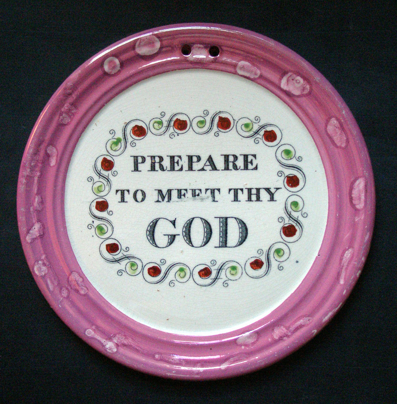 I've been kicking myself for not noticing it sooner, but the plaque form is one I've already attributed to Maling. It is 180 mm in diameter and finely potted. Compare a similar plaque from my own collection with the Maling-attributed Wesley below. 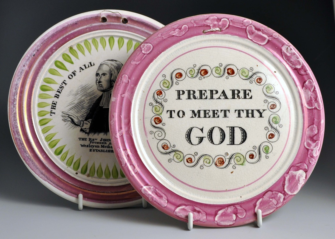 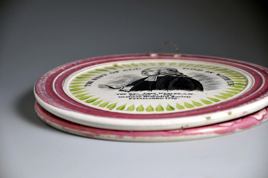 So are there any other plaques I've missed that we might attribute to this group? One thing to note about many of these plaques is that the pink lustre tends to be washed out (see two below). But on Ian's plaque the lustre is particularly strong. It could simply be that for a limited period, Maling experienced problems with their lustre process. Both the plaques below are also 180 mm diameter. 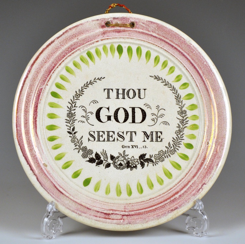 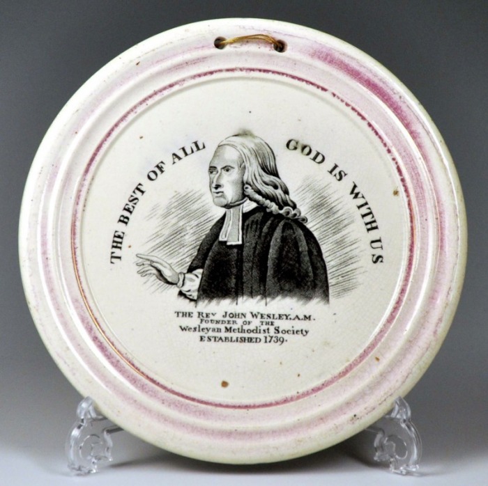 The Independent Order of Odd Fellows plaque (below left), has a lovely strong lustre border like Ian's plaque, though it measures 175 mm. But note the same use of brick red and green enamels. It is actually the same diameter as the early plaque on the right with the Maling impress. However, the Odd Fellows plaque is more heavily potted. 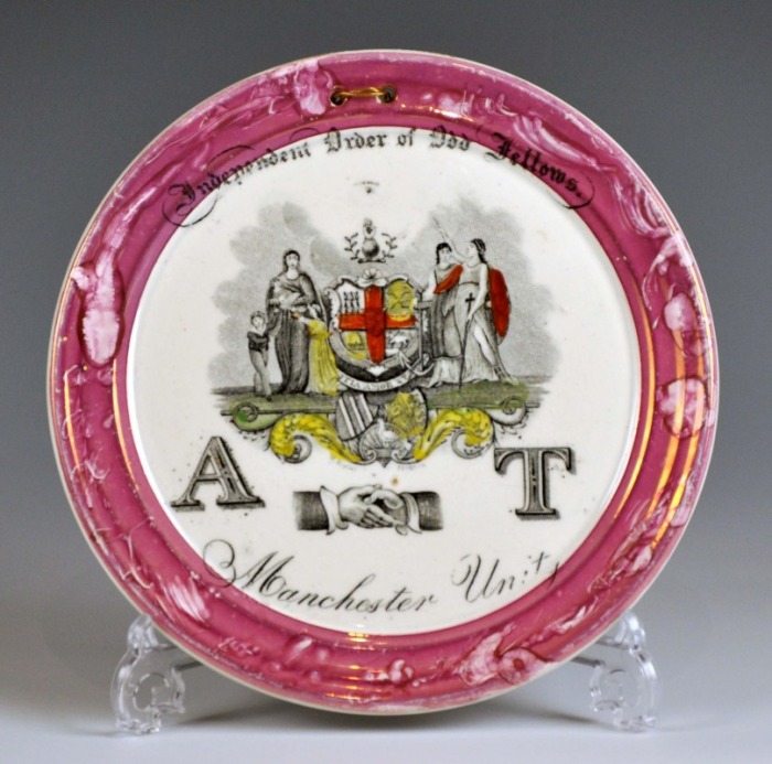  But for me, the most exciting connection is between the plaques below. In the flesh, the yellows are more obviously from the same palette. Though they are different sizes (left plaque, 178 mm diameter; right plaque, 173 mm diameter), the similarity of the decoration is startling. I can't believe that these plaques have hung on my wall for 5 years, and I've not noticed it before. 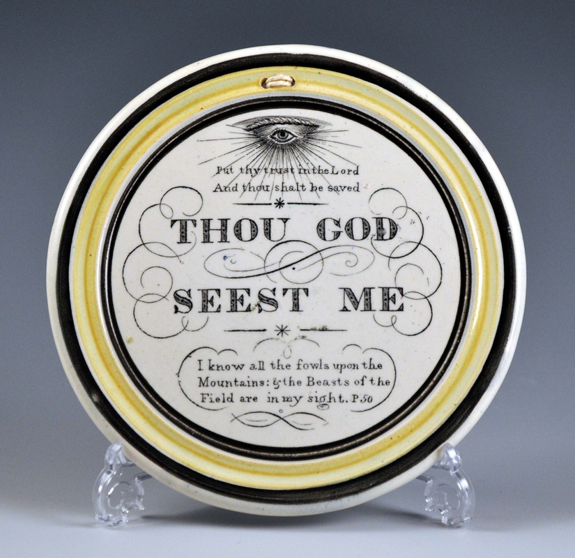 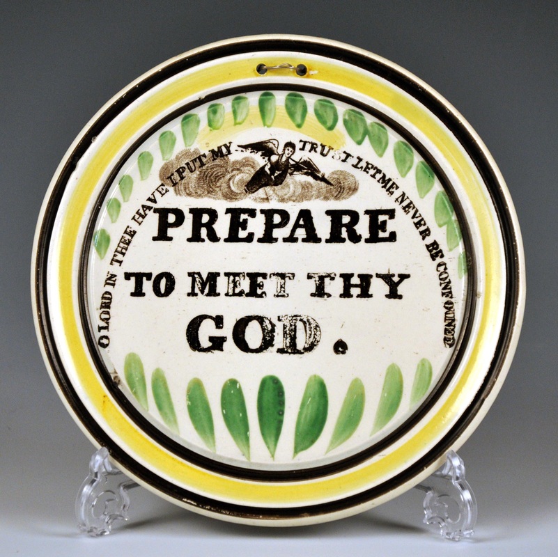 The Maling page still needs a lot of work. The problem is that Maling don't appear to have marked their circular plaques after about 1830. The Thou God plaque above is very rare. I've only ever seen one other, which came up on eBay a few years ago. It had an orange/red border. As always, I would love a photo if the owner happens to read this, as it might help to link other plaques to Maling.
11/9/2011 2 Comments Tee Total transfersThe interesting plaque below came up at auction recently. It is titled TEE TOTAL SOCIETY. The article on Teetotalism on Wikipedia states: One anecdote attributes the origin of the word to a meeting of the Preston Temperance Society in 1832 or 1833. This society was founded by Joseph Livesey, who was to become a leader of the temperance movement and the author of The Pledge: "We agree to abstain from all liquors of an intoxicating quality whether ale, porter, wine or ardent spirits, except as medicine." The story attributes the word to Dicky Turner, a member of the society, who had a stammer, and in a speech said that nothing would do but "tee-tee-total abstinence". An alternative explanation is that teetotal is simply a reduplication of the 'T' in total (T-total). It is said that as early as 1827 in some Temperance Societies signing a 'T' after one's name signified one's pledge for total abstinence. In England in the 1830s, when the word first entered the lexicon, it was also used in other contexts as an emphasized form of total. In this context, the word is still used, predominantly in the southern United States.  In terms of dating plaques with that subject, either explanation will do. As we'd expect, the transfer appears on plaque forms associated with the 1830s. The plaque above is very similar to the Wesley plaque below, which I've attributed to the Sheriff Hill Pottery. 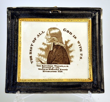 I felt pretty excited when I remembered a pair of plaques that came up at Anderson and Garland in 2007. Unfortunately, I don't have a clearer image than the scan below. Again, I've attributed the Wesley to Sheriff Hill. The plaque is of the same form, with an inner beaded frame picked out in yellow. But you don't need a better photo to see that the Tee Total transfer is different to the one above. Compare the size of the shaded area under the two figures holding flags. In fact the first Tee Total plaque is a much smaller size (138 x 118 mm) than the three others (165 x 150 mm). The transfer isn't just a trimmed down version of the one on the larger plaque. It appears to have been specially engraved for smaller items. Who knows, it's possible that the large and small versions of the engravings sat side by side on the same transfer plate. If you own the plaque on the right below, or have one similar, I'd love a better quality image. 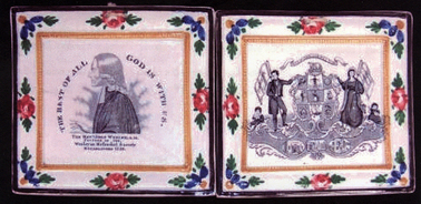 So how do the Tee Total transfers compare? The two circular plaques below, although unmarked, are similar to those with the C,C & Co impress. There are some startling differences between the three transfers though. As discussed above, the first plaque has fewer scrolls and less shading under the figures carrying flags (see the first detail – N.B. click on the images to enlarge and to move between them). The scrolls are differently arranged in the second and third plaques. They also have an oval inset with a picture under each figure. The third detail shows the right inset of a man up a ladder lighting a street lamp (?). Perhaps the message is that this isn't a job for anyone who's had a drink or two! In the second transfer the street light has one lamp. In the third transfer it has two. There are also more windows on the detail of the third plaque. Another obvious difference between the transfers is that the words 'TEE TOTAL SOCIETY' are enclosed in a ribbon banner on the first and third plaque (see second detail). Note also the differences between the lettering.  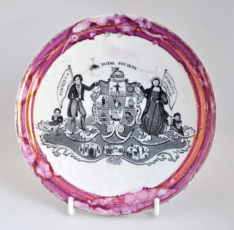 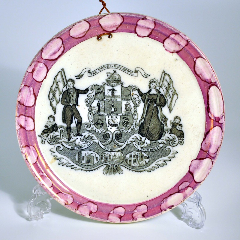 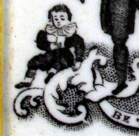 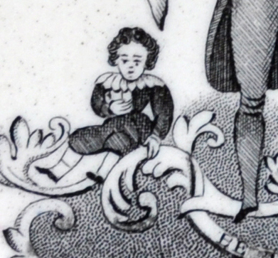 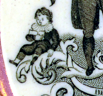 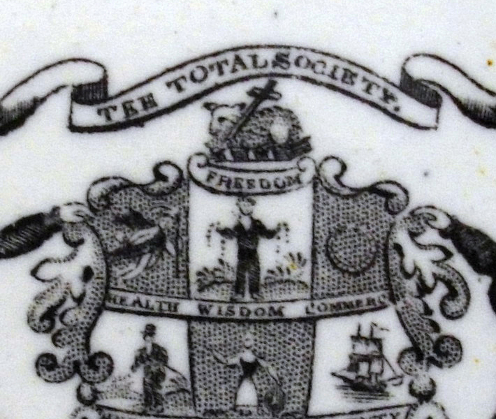 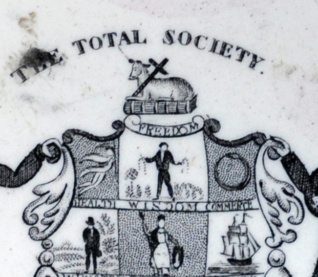 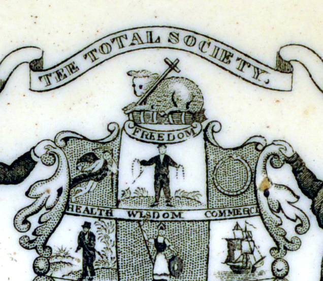  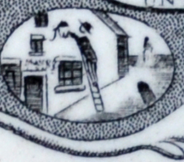 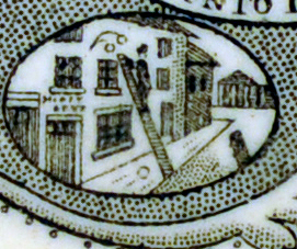 Gratifyingly, I did manage to find three transfers that matched. There are some minor differences, perhaps consistent with re-engraving to restore clarity to a transfer plate worn over time. The first two plaque forms are amongst those I've attributed to Dixon. The third is of a rarer larger size, which I now feel confident about attributing to Dixon also. 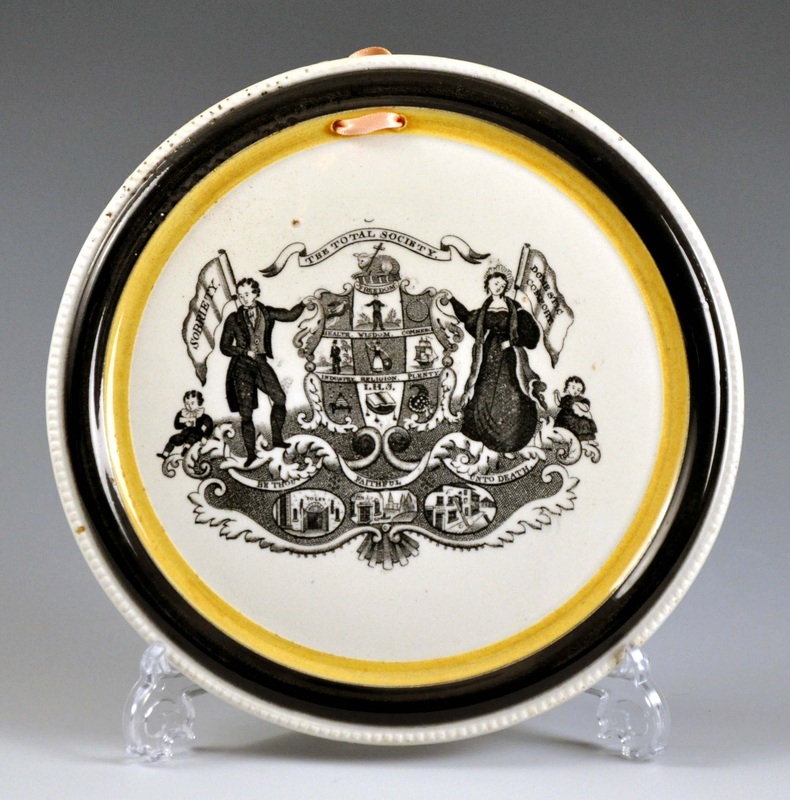 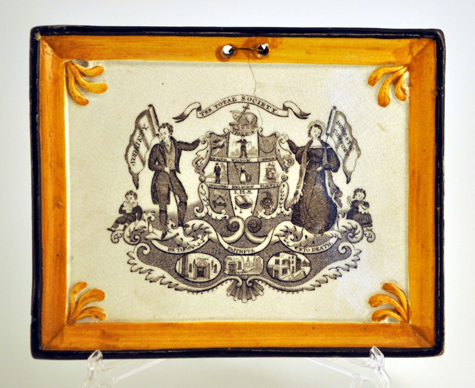 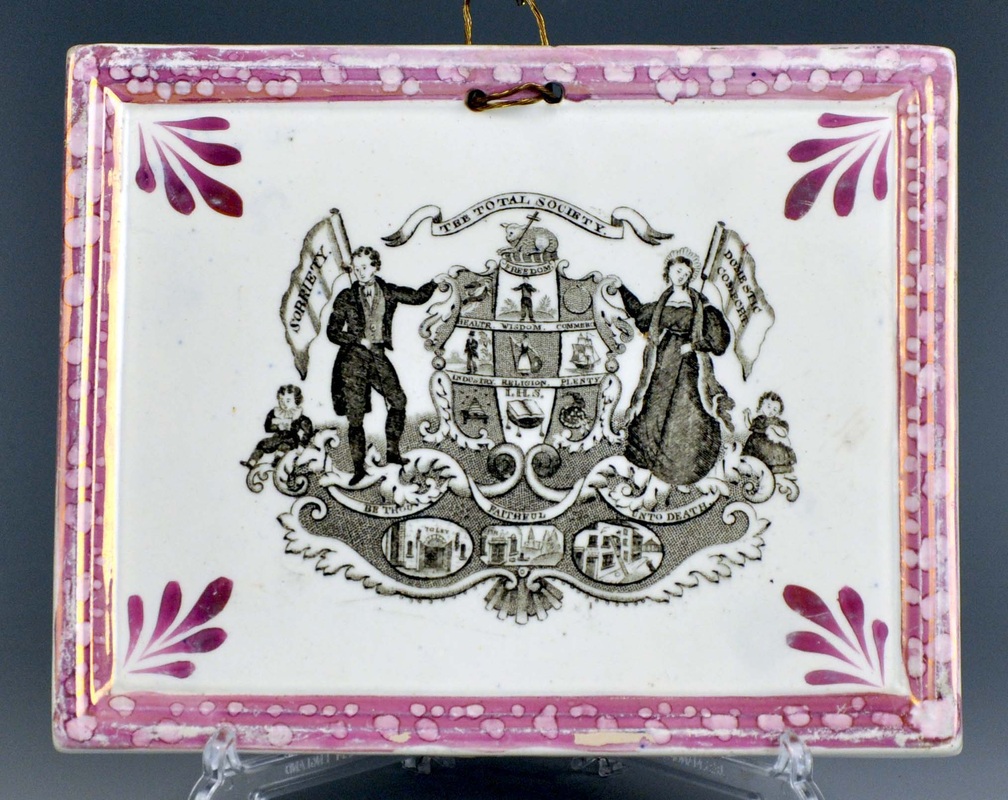   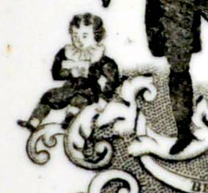 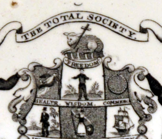 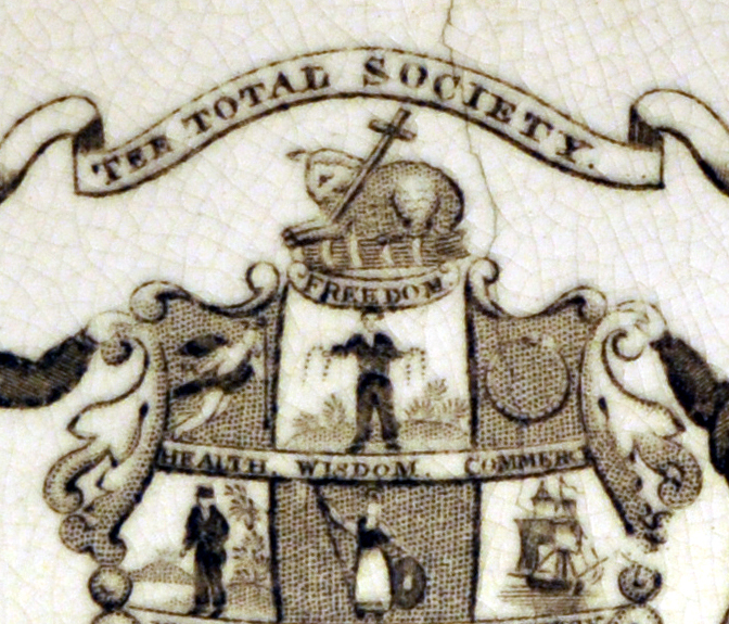  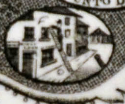  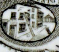 There are many more variations of these transfers that appear on children's plates.
I will update the Dixon and Sheriff Hill pages with Tee Total plaques over the next few days. The jury is still out over C, C & Co. Because of similarity in the lustre decoration, I expect the second circular plaque is the C, C & Co version. If you have a marked example, please get in touch. 11/6/2011 0 Comments Attributing plaquesSince I set up the pages of this website 22 months ago, my understanding of plaques has developed at a speed that my typing finger (note singular) has struggled to keep up with. Much of that is down to the contributions of other collectors (and dealers) who have shared their thoughts and photos of their plaques. So thanks again. The more plaques that have been added, the clearer the picture has become. (MSTP is probably now the largest database of plaques ever assembled.) On my blog, I've had a stab at attributing plaques to potteries. So the original pages I set up, which grouped religious plaques by colour, have for a while looked inadequate. Over the last two weeks, I've given the site its largest reorganisation since I built it. (Apologies for the blips that have occurred in the interim - missing images etc.) I'm wary that anyone reading a reference work, whether a web page, a published article or a book, is hoping to find a definitive set of answers. In that respect, the web is generally deemed to be much less reliable than books and magazine articles, which have to go through an editorial process. So I've held back to some extent for fear of providing the wrong information. But as time has gone on, I've discovered errors in the key reference books: plaques with Crimean ships listed as 1820; the wrong dates and names for some of the pottery partnerships; and attributions of plaques to the wrong potteries. The books are still invaluable, and I've huge respect for the authors (I'm decades away from being able to provide the same level of scholarship). But they were mostly written in the pre-internet era,when confirming a historical detail meant a day trip to the British Library. And finding new plaques to write about meant driving around the country from one auction house to another. In these respects, I've got it really easy. I've set up a new series of pages headed 'Early plaques (pre-1845)', and grouped the plaques by pottery. I've made my attributions based on the information available to me now, and there's no guarantee that some of them won't change if new plaques come to light. It will take a while to tidy up the new pages, which are a work in progress. As I've got no editor checking my work, I'm reliant on your help. If you think I've got something wrong, please get in touch. It's exciting to be proved wrong. When you remove a misfit piece in a jigsaw puzzle, sometimes other pieces then fall into place. I'll finish with a photo of an as-yet unattributed plaque, which is perhaps my favourite of all the images sent to me while I've been working on the website. I love the verse. At times over the last year or so, the same could be said of plaques.  |
Proudly powered by Weebly