|
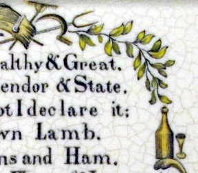
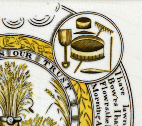
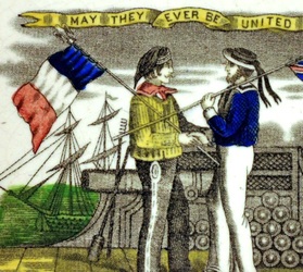
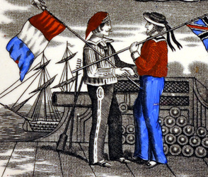
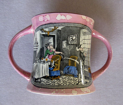
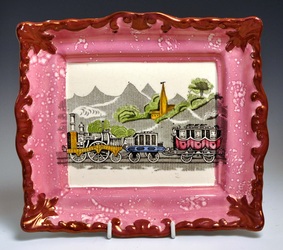
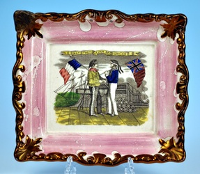
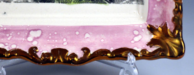
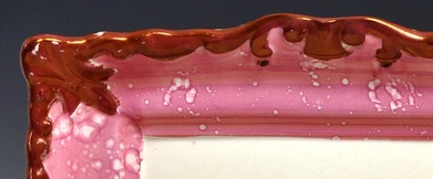
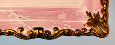
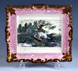
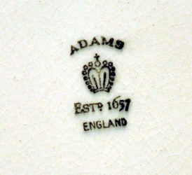
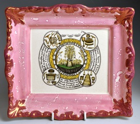
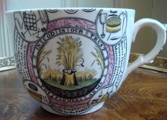
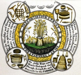
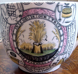
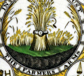
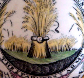
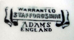
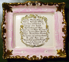
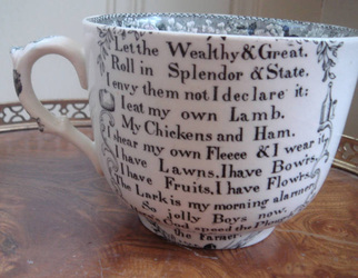
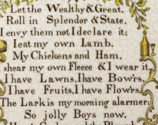
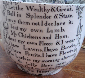
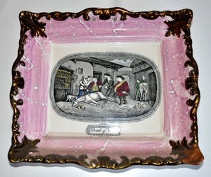
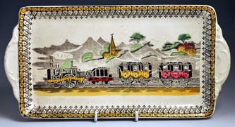
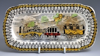
1/17/2012 0 Comments Yet another post on Adams' reprosOn reflection, it does seem that the group of plaques with distinctive scrolled borders were produced by Adams' Staffordshire pottery (see my previous post). I can't claim credit for this discovery. Ian Sharp told me a year ago he thought the train plaque was a 'fake'. More recently, Steven Moore e-mailed to say the 'Death of Punch' was an Adams' repro. So why has it taken me so long to accept this? Ian's opinion (which I've always valued) was almost in a minority of one. When these plaques appeared in reference books and articles (not just Gibson) they were listed as Victorian. (Although, perhaps tellingly, they do not appear in Baker's 'Sunderland Pottery' – the key work of scholarship on the subject.) Similarly, whenever a Crimean plaque of this kind or a train plaque turned up in an auction house or on a reputable dealer's stall, it was always catalogued as 19th century Sunderland lustre (see lots 384 and 402 in Sotherby's Tolson Collection catalogue, for instance). The vetters of the major antique fairs agreed. The collectors, who were prepared to pay £400 –700 for the train, agreed also. And as discussed at the end of my previous post, the Sunderland Museum accepts the plaques as 'right' and displays them alongside originals. For me the real sticking point was that they looked old – often with cracks, and corners missing. But here are 5 reasons which contribute to why I now believe they are copies (or fakes if you prefer)... 1. They are coloured in too neatlyLook at the idividually painted leaves and farming implements on these plaque details. They are nothing like the slap-dash washes of colour typical of Sunderland potteries like Moore & Scott. N.B. the neat enamel decoration on the right plaque detail above is identical to that on the marked 20th century Adams' cup with the same transfer (see my previous post). 2. They have a 'greasy' feelIan Sharp used the word 'greasy' to describe the feel of these plaques. The glaze has an almost synthetic/plastic quality to it. Ian's description is perfect. But it applies to some plaques more than others, and I've noticed this phenomenon on some Scott plaques too. 3. Some of the colours look wrongThe two details above are from alleged Adams plaques. Some of these colours – the electric blue and scarlet on the right in particular – never appear on plaques from Sunderland. 4. Limited number of a broad range of subjectsIan Holmes noted that according to the way he'd numbered his collection, nearly all of the plaques of this form fell into the 'miscellaneous' category. If they were really made in the 1850s, why no religious verses? Why no ships? The pick and mix choice of subjects seems consistent with someone putting together a range of attractive designs with retro appeal. 5. The transfers don't appear on other lustre itemsWhy does the train transfer never appear on pink-lustre jugs or bowls? Or the Crimean transfer? (N.B. the Dixon version does.) The Death of Punch appears on the reverse side of the pink-lustre loving cup below, but the cup is unlike anything produced in the 19th century. Some final thoughtsWhy do many of the plaques look so old? In my November 24th post I noted that the pottery body of this group of plaques was prone to cracking and stress. Also, the corners of these plaques turn slightly upwards, which makes them particularly vulnerable to damage. I've seen at least four Crimean plaques with damaged or missing corners. And yet it is rare to find one of these plaques (particularly those with pink borders) with rubbed or faded lustre. After believing for so long they were 19th century, I'm loath to put a new date on them. The first half of the 20th century is the best I can suggest. They are old enough to have been worth repairing pre-1950 (see my December 22nd post). They're also old enough to have been accepted as originals by W D John & Warren Baker when they wrote their book 'Old English Lustre Pottery' (1951). Adams added printed marks to much of its 20th century output. The mark on the plaque below was used over a long time frame: at their Greenfield site 1914–1955, and at their Greengates site 1914–1970. The marked plaque doesn't show the same signs of stress or age, so I assume it was made later. Is it possible that some of the unmarked plaques were made in Sunderland, and some in Staffordshire? That doesn't seem likely given that all the unmarked plaques show similar signs of stress, they mostly have the same feel, unusual colouring, and neatly painted enamels. And I've recorded nearly all of them with both pink borders (left below) and copper lustre borders (right below). All of this suggests they came from the same pottery. There are, however, some slight variations to the crispness of the moulding (see below). The Crimean plaque (third below) has the best defined features. The hunting plaque (first below) the least well defined, suggesting it came later from the mould. Will I be putting the Adams-attributed plaques in my collection in a box in the attic? Absolutely not. Unlike the awful 'Flying Cloud Boston' and 'Agamemnon' repros, these items have some intrinsic value, and will continue to be desirable to collectors. What's more, within the next twenty years or so they will be real antiques, if they aren't already! P.S.Ian Holmes points out that the times at which the English and the French got on well enough for a pottery to commission a Crimea plaque are few and far between. He suggests 1904, at the time of the Entente Cordiale, or perhaps 1908 for the Franco-British exhibition. This might fit as a date for the copper-lustre-bordered Crimean plaque, which looks to be the oldest, and is the most common, suggesting a longer span of production.
Ian says that by 1920, items celebrating war had little commercial appeal. Interestingly, around this time, British toy manufacturers switched from making soldiers to farming figures. Perhaps this was a good time for a pottery to produce retro farming verse plaques? But this is an edited selection of Ian's comments. Like me, he's struggling to get his head around this new attribution.
0 Comments
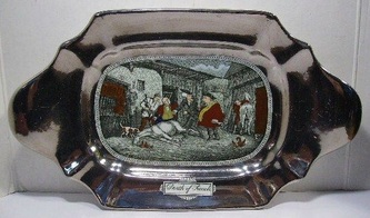
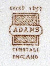
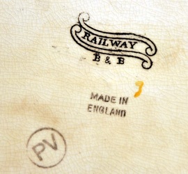
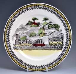
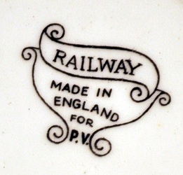
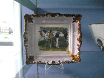
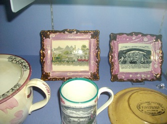
1/14/2012 2 Comments More on Adams' reproductionsEver since finding the plaque below with a 20th century Adams' printed mark, a question mark has hovered over the many unmarked plaques that have this unusual scrolled border. In my November 24th post, the doubt seemed to recede a little, when I noted a striking difference between the appearance of the crackle/stress marks on the unmarked plaques compared with the almost crackle-free reproduction. But today I found some more links between the unmarked plaques, and 20th century Adams' items with printed marks. Compare the transfers on the cup and plaque below. Click to enlarge and to move between the photos. You have to bear in mind the curvature of the cup, but I have little doubt that these transfers came from the same transfer plate. Here's the printed mark on the cup... And here's another unmarked plaque, shown next to the reverse side of the cup. And take a look at the items below. They both show the 'Death of Punch' – a scene from Dr Syntax. The left plaque is unmarked. The silver lustre platter has an Adams' printed mark (below right). See this link for more photos. So are all of the plaques with this kind of border 20th century Adams' reproductions? We know that the train also appears on items with 20th century printed marks (but in the case of the three items below, not Adams). See p143 of the 5th edition of Griselda Lewis' 'A Collector's History of English Pottery' for two mugs with this transfer and the printed mark 'RAILWAY W. ADAMS & CO ENGLAND'. Perhaps Adams acquired transfer plates from a Sunderland pottery after the plaques were made. Even if not, Adams was in operation right the way through the 19th century, so I suppose there's still a chance that unmarked Adams' plaques might be Victorian. As you can see, I'm still struggling to get my head around this one. Not least because many of these plaques look old. Here are two in the Sunderland Museum: a Crimean subject on the left, and a train in the centre of the right photo. I've put in a request for information. Could 20th century Staffordshire really have found its way into the museum collection? As always, if you can add anything, please let me know.
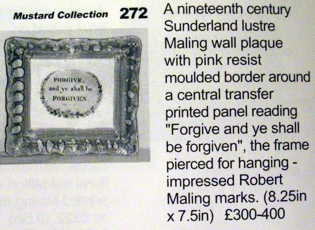
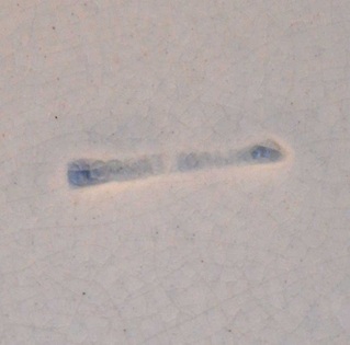
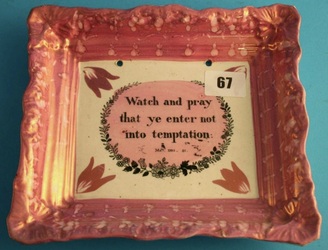
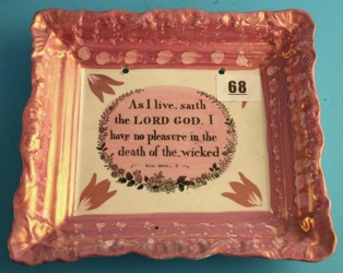
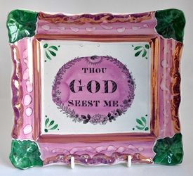
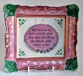
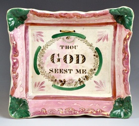
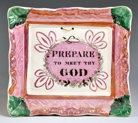
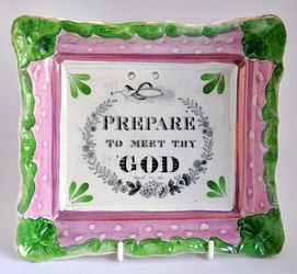
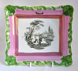
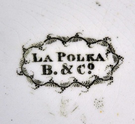
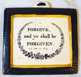
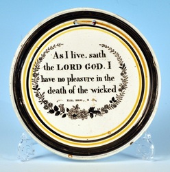
Nearly two years ago now, I wrote a short blog post about the Maling plaque below, which has a 'Mustard collection' sticker on the back. I recently contacted the Maling Collectors' Society, and they put me in touch with Maling historian, David Johnson. He has been enormously helpful sending me copies of two films, 'Maling Memories' and 'Potty About Maling' (you can view the former on the Maling Collector's Society link above). They make fascinating viewing, showing interviews with ex-Maling employees, making and decorating items of pottery from original Maling moulds. In 'Potty About Maling' (1997) Nona and Jerry Mustard make an appearance talking about their collection. Tantalisingly, as the camera pans around their home, there's a table covered in plaques. One of them is a pink rectangular plaque with the motto 'Forgive and ye shall be forgiven'. It is of a kind I've been longing to attribute to Maling. And it seemed safe to suppose that if it was in the Mustard collection, it had a Maling impressed mark. David very kindly contacted Nona Mustard on my behalf to see if they still had the plaque. He got a very nice reply, but, as suspected, the Mustard's sold their plaques some time ago. David suggested that if I contacted Jim Railton Auctioneers who sold the collection, they might be able to provide details. But Ian Holmes came up trumps with a copy of their auction catalogue from 2001 when the plaque was sold. So why has this modest looking verse plaque got me so excited? Firstly, the Robert Maling mark confirms an early date for these plaques of between 1830–40. N.B. sometimes this mark is hard to decipher. Take a look at the poor impress below. It is possible that you might have a religious verse plaque with a similar mark, and have failed to identify it. Secondly, it confirms what I hinted in my December 5th blog post, i.e. that a wash of pink lustre over the central transfer is an attribute of Maling plaques. Other potteries might have used it, but the vast majority of plaques on which it occurs are types associated with Maling. Look at the two fabulous plaques below which came up a year or so ago at Boldon Auctions. I think that we can now attribute these with some confidence to Robert Maling. There are many more common verse plaques with green corners, which also have pink lustre over their central transfers (see below). But lest we get too carried away with the idea that green corners = Maling, remember the similar 'La Polka' plaque (below centre), with the printed mark B & Co. Ian Sharp has identified this mark as J Burn & Co from the Stepney Bank Pottery, Ouseburn, 1852–1860. However, neither of the plaques below have lustre over the transfer. Another fly in the ointment is that two of the rarer verses above appear on plaques I've attributed to the Sheriff Hill Pottery (see below). This is a problem, because we'd expect these to have been produced around the same period (1830–40). If I had better photos of their counterpart plaques above, I could perhaps tell whether they came from the same transfer plates. But I'm not disheartened by any of this. In fact, I couldn't be happier (writing this post has saved me from an afternoon of ironing). And as someone famous once said, 'The truth is rarely pure, and never simple'.
|
AuthorStephen Smith lives in London, and is always happy to hear from other collectors. If you have an interesting collection of plaques, and are based in the UK, he will photograph them for you. Free advice given regarding selling and dispersal of a collection, or to those wishing to start one. Just get in touch... Archives
February 2022
AcknowledgementsThis website is indebted to collectors, dealers and enthusiasts who have shared their knowledge or photos. In particular: Ian Holmes, Stephen Duckworth, Dick Henrywood, Norman Lowe, Keith Lovell, Donald H Ryan, Harold Crowder, Jack and Joyce Cockerill, Myrna Schkolne, Elinor Penna, Ian Sharp, Shauna Gregg at the Sunderland Museum, Keith Bell, Martyn Edgell, and Liz Denton.
|
