|
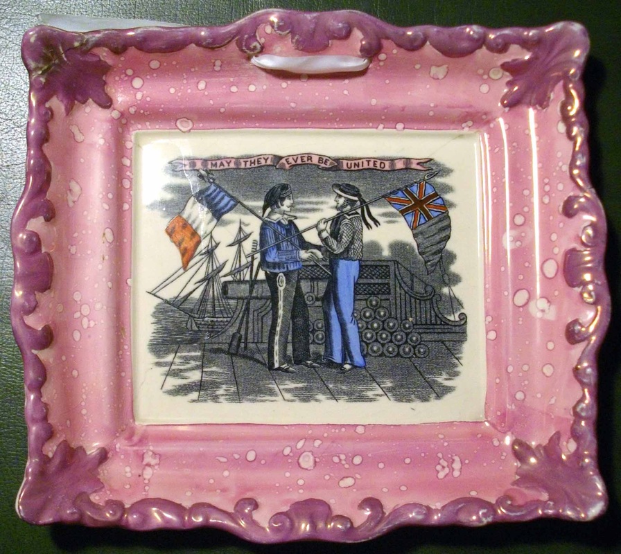
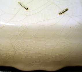
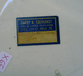
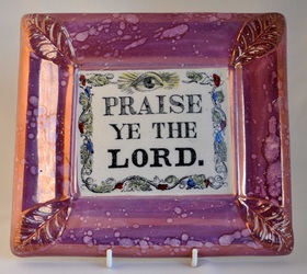
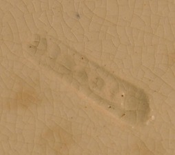
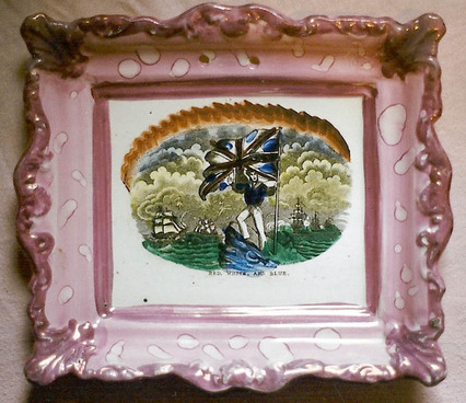
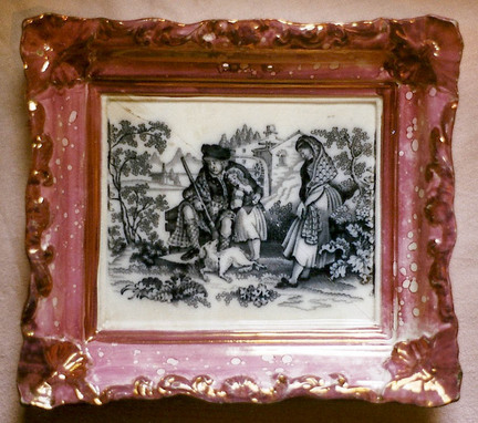
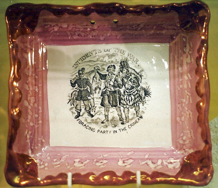
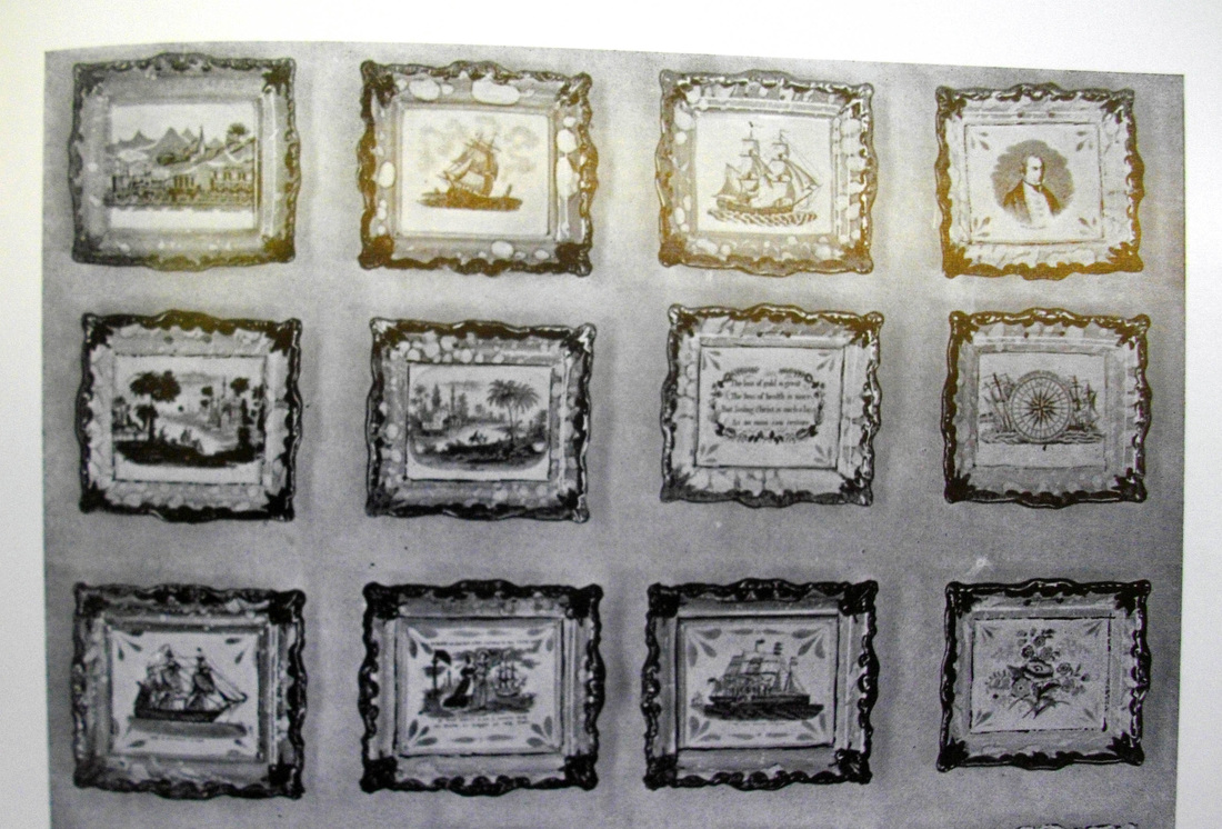
12/22/2011 0 Comments Dating plaques with scrolled edgesOn November 24, I wrote a post about a group of plaques with unusual borders and an irregular crackle. Since finding a plaque from a similar mould with a 20th century Adams printed mark, a question mark has hung over this group. But how do you prove the age of an unmarked item? We know that the train plaque in this series must predate 1951, because it appears in W D John & Warren Baker's book 'Old English Lustre Pottery' (The Ceramic Book Company, 1951). But can we get further back? Ian Holmes has a plaque from this group with a Crimean subject we'd expect to have been produced in the late 1850s. Interestingly, from the point of view of dating it, there is an old stapled repair. Even better, it has the restorer's sticker on the reverse. Ian suggested that if we could establish the date that staples ceased to be used, we could perhaps get back even further. I entered the details on the sticker into Google, and could hardly believe my luck when I found this link. http://eberhardts.com/ Not only that... Founded in 1888, Eberhardts say they are the oldest antique shop and restorer in the US. That takes us back well beyond the 20th century Adams printed mark. Eberhardts have moved since the time of the repair. I e-mailed them and asked whether they could confirm the date of the move, and when staples stopped being used for repairs. They couldn't have been more helpful, and even contacted Mr Eberhardt to answer my questions. Here's what they said. That is definitely an Eberhardt's repair job. Harry Eberhardt was the only China repairer/restorer to use double silver staples for repairs. The idea is that the double silver staple is stronger with less thickness or protrusion than a single staple. You'll also notice that the staples are somewhat recessed into the porcelain, also for less protrusion. Harry Eberhardt moved from 213 S. 11th Street about 50 years ago. Today I got a further response... Mr Eberhardt says the staples went out of use in about 1950 and we moved from 11th street about 1956. The double staples were in use from 1888 or before. The Eberhardts sticker was in use for many years. So not the news I was hoping for. I do, however, feel I've learnt a bit in the process. Thanks to Jonathan Novak at Eberhardts for all his help. Though this doesn't doesn't take us back beyond the 1930s, when the Adams Pottery repros were likely produced, it does add to the weight of circumstantial evidence. Would someone go to the trouble of repairing an object that was barely 20 years old? I'll leave you with a final Eberhardt's link to browse... http://antiquesshowcases.com/
0 Comments
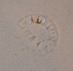
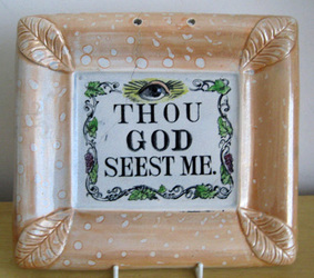
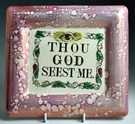
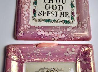
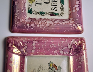
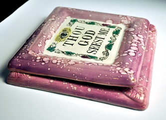
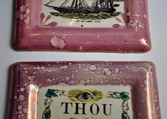
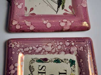
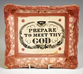
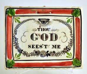
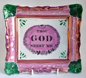
In 1864 Galloway & Atkinson succeeded Isaac Bell, Galloway & Atkinson in running the Albion Pottery (previously owned by Robert and C T Maling as the Ouseburn Bridge Pottery). The 'G&A' partnership only ran for 1 year, but made some very distinctive plaques with wide borders (below left), more often than not with an impressed mark (below right). The mark is circular, and has the words 'ALBION POTTERY' around the initials 'G&A'. There were two similar plaques in the collection of 'Thou gods' that recently came up at auction. However, only the left plaque (240 mm x 215 mm) is marked. The right plaque is of a smaller size (219 mm x 198 mm), and lacks the leaf decoration to each corner of the mould. The photos below show the relative sizes of the plaques. N.B. I've shown the small plaque against a typical Albion 'May Peace and Plenty' plaque from my own collection (238 mm x 213 mm). The small unmarked plaque (219 mm x 198 mm) is in fact similar in size to a plaque form I've attributed to Scott (see it relative to the 'Victoria and Albert Yacht' below). Note that the Scott plaque (215 mm x 195 mm) also has no leaf decoration in the corner. My first thought was that perhaps the 'Thou God' transfer plate had passed to Scott c1865, when Galloway & Atkinson disbanded. However, there is enough variation between the dimensions of the two plaques above for them to have come from different moulds. Note also that the lustre effect on the 'Thou God' is in fact much more similar to the Albion 'May Peace and Plenty' above.
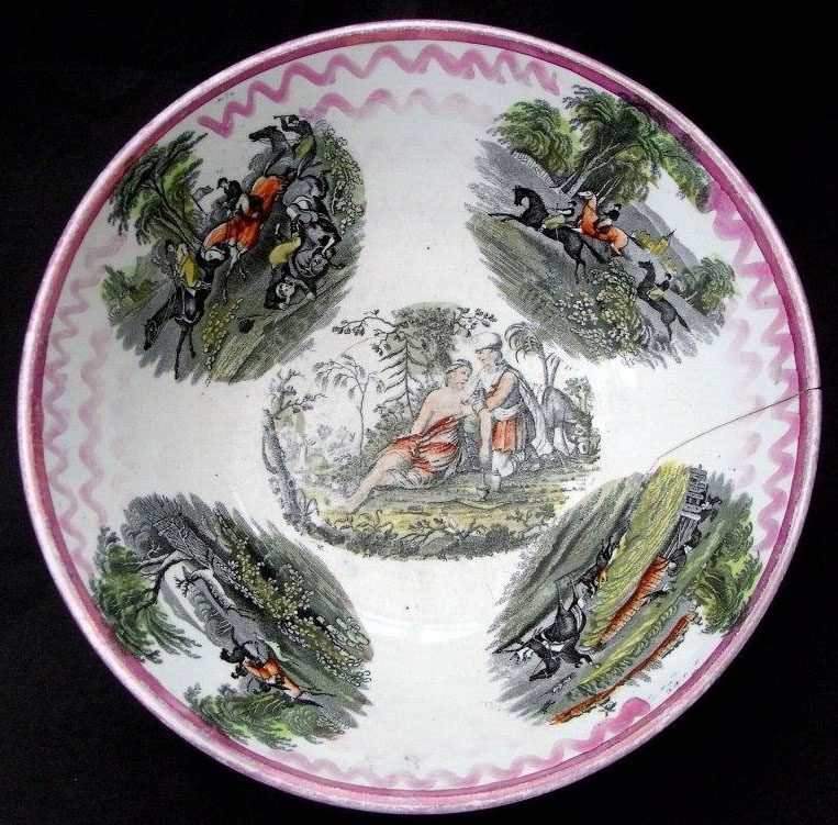
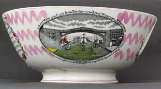
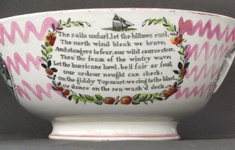
My guess is that the 'Thou God' was made at the Albion Pottery, but perhaps after 1864, which would explain why it doesn't carry the G&A impress. I have still no reason to doubt the Scott attribution for the 'Victoria and Albert Yacht'. One last note of interest is that in taking the 'May Peace and Plenty' plaque off the wall again to measure it, I noticed that the Albion impress on the reverse doesn't have the G&A initials in the centre. So perhaps it too was made after, or slightly before, 1864. I can't imagine I will squeeze in another blog post this week, so Merry Christmas, and thanks again to everyone who has contributed to MSTP in 2011. 12/16/2011 0 Comments The Good Samaritan part 2Please take a look at my previous (short) blog post before reading this. Huge thanks to Norman Lowe for sending the photo of a Moore & Co bowl below. It has the well known 'Sporting' transfers, which you can see examples of on plaques on the Landscapes page. But more excitingly, perhaps, it also has an image of the Good Samaritan. It looks incongruous amongst the hunting transfers, and without its title must have confused a few people. Has one of the hunters fallen off his horse? So how does it compare with the plaque? Click on the details below to enlarge, and to move between them. The most obvious difference is that one is the mirror image of the other. Notice also that the image is too big for my small circular plaque, so that the tree trunk that should appear on the right is missing. Is the c1830's plaque Moore & Co? It doesn't seem likely. The image appears so rarely we have to assume it didn't take off commercially. So there seems little reason for one pottery to want two transfer plates. Who made the plaque? Your guess is as good as mine. P.S.In my original post I wrote... 'the image would appear in reverse upon the copper transfer plate. My guess is that the engraver had an early plaque or similar in front of him and painstakingly copied the image onto the copper plate. He couldn't copy the title in the same way, because when printed it would appear in reverse.' Thinking about it, this is wrong! The image appeared exactly the way on the copper transfer plate as it would the object. It was first printed onto tissue paper, on which it appeared in reverse. Then the image on the tissue paper was transferred onto the object, the right way around again. So why would we end up with a reverse image on pottery? Perhaps all the engraver had to work from was an imprint on paper direct from the copper plate. P.P.S.Norman has sent some further photos of the bowl. He writes: I’m never sure about dates on lustre pieces without primary evidence. I imagine that bowls like this were produced over a long period and while it might be 1850s it could just as easily be earlier, including the 1830s. The transfers are clear and seem to be from dies that have been relatively un-worn. And Baker indicates 1830-1850 for this transfer.
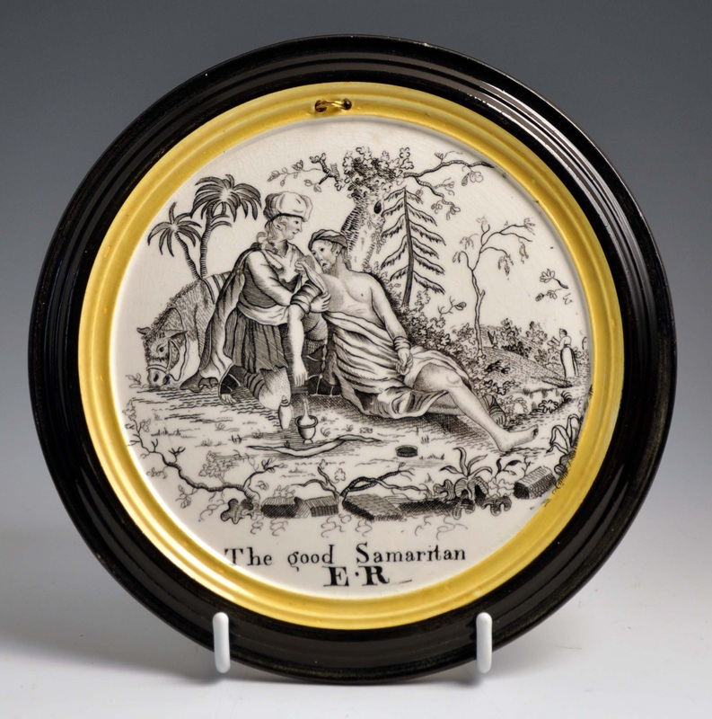
I guess that means that it is just possible that bowl pre-dates the plaque. 12/12/2011 0 Comments The good SamaritanThe last month or so has thrown up so many interesting finds, that I've been struggling to keep up. This is the only early plaque I can think of with a representation of a story from the bible – the parable of the good Samaritan. The initials ER are under the glaze, so perhaps not just the initials of the person it was commissioned for, as I first thought. The plaque is relatively small (170mm) and the mould doesn't match any of my other plaques. It is so unusual that it will have to rest for the foreseeable future on the Unidentified page. I love it.
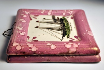
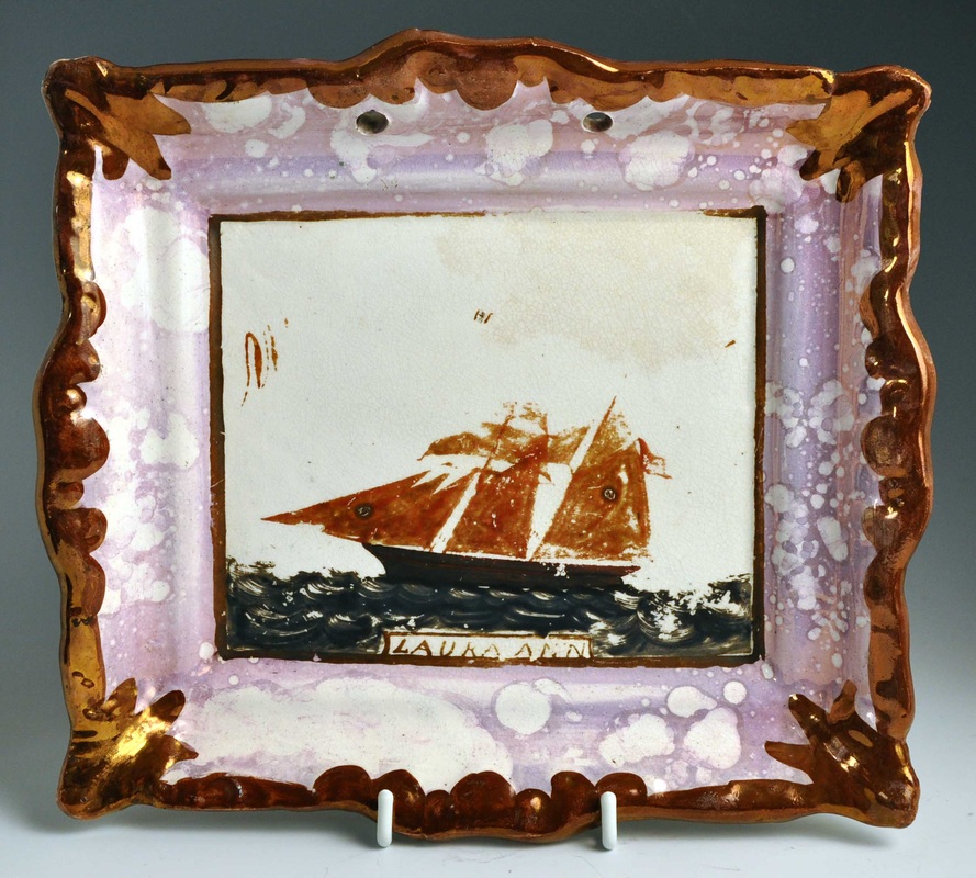
12/10/2011 0 Comments Hand-painted ship plaqueMy friend Myrna has talked about the existence of a pottery God, who occasionally smiles on collectors, allowing them to track down a yearned for and elusive object – perhaps to complete a series or to pair. Well, I'm now a believer. In my October 15th blog post, I put out a request for an image of a rare hand-painted ship plaque I'd bid on several years ago. I hoped the collector who bought it might get in touch. They didn't (they very seldom do). But the plaque came up for auction a couple of weeks later in the US, and it now sits on my shelves. So here's that better image I wanted. The ship is more proficiently painted than I'd imagined. Clearly the design is incomplete, as it has rubbed away over the years. A few finely painted curves in the upper half give scant clues to what is missing. The plaque has an indistinct 'Dixon Co' impress (see below). I will shortly add the image to the rare ships page, so it can sit together with its pair.
12/9/2011 0 Comments More imagesHuge thanks to Ian Sharp for digging out many images from his archive of plaques he's sold over the years (you can visit his website by clicking here). I will sort through them properly when I get a spare moment, but here are three plaques I've wanted images of for a while... What a great way to start the weekend!
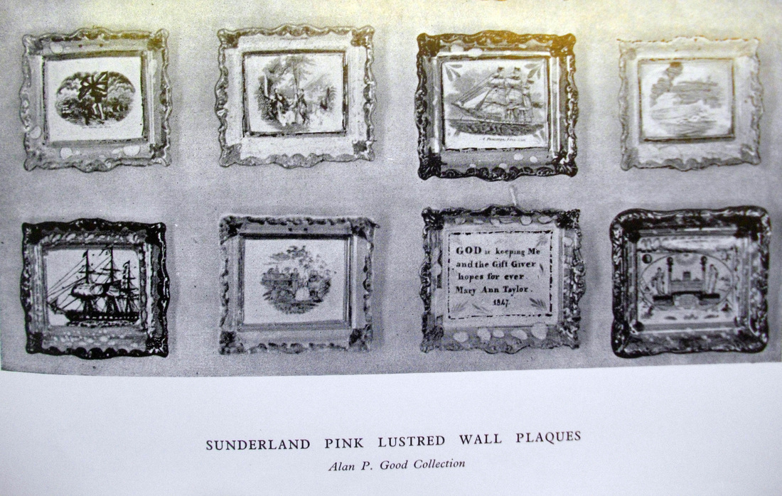
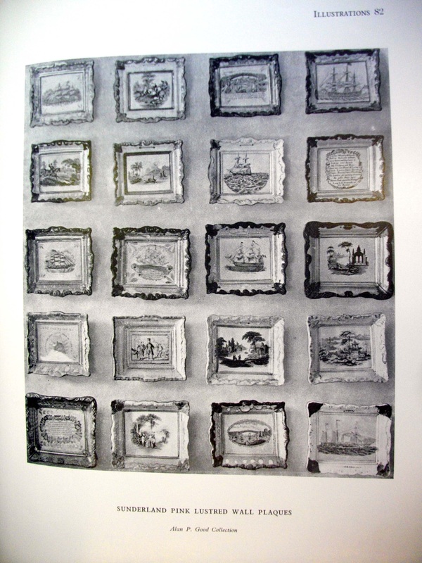
12/9/2011 0 Comments More old photos of plaquesFor completeness, here's the second page of plaques from W D John & Warren Baker's book 'Old English Lustre Pottery' (The Ceramic Book Company, 1951). The bottom portion of the page contains two great plaques I would love better images of (top left, and third plaque on the second row). Here they are close up (click to enlarge). Also on the wishlist for better images, are these two plaques that Ian Holmes found in an old auction catalogue. The plaques above show that there are still exciting variations out there waiting to be recorded. If you own the plaques and want to make my Christmas, please get in touch!
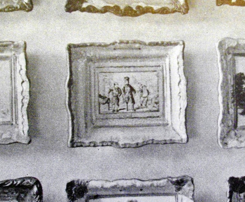
12/8/2011 0 Comments More on reproductionsThanks to Ian Holmes for reminding me of the following plate from W D John & Warren Baker's book 'Old English Lustre Pottery' (The Ceramic Book Company, 1951). Below is one of two pages showing a fabulous collection of plaques. Nearly all of these transfers are now recorded on this website. To the right of Wesley is what appears to be another scene from The Pickwick Papers. The detail below is the best resolution I could manage. Note Mr Pickwick on the right, and the same unusual lustred inner border. The first edition of the book was published in 1951, so this confirms that these plaques aren't very modern reproductions. This fits with what I suggested in my previous post on the subject, i.e. that these plaques were likely made in the 1930s.
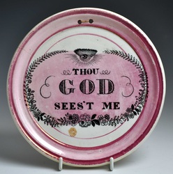
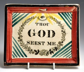
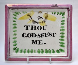
12/5/2011 0 Comments Thou God Sees't MeI've been adding photos of a collection of about 50 'Thou God' plaques. It is unusual for a collector to limit their scope to one verse. My first observation is that there isn't a single transfer in the collection that I haven't seen before. So this website must be closer to being a complete record than I'd imagined. There are, however, some interesting new variations of hand-painted plaques. The two plaques below caused my heart to skip a beat. There are also some variations of decoration that I've never seen before. Do you remember the Thou God (below left) from my November 13th posting? Well here's a plaque (below right) that further ties this transfer into the Maling attribution. Note that the centre of the plaque has been washed with pink lustre. That feature ties these plaques to another group I've tentatively suggested might be Maling. See the Tyneside plaques page. The left plaque below, again with an all-seeing eye, has a wash of pink lustre in the centre. The circular plaque is thicker than average – about 1cm at the edge. Some earlier known Maling plaques appear on this thicker circular form. Maling is also known to have used the plaque form below right. The next plaque (top left below) is probably the most exciting in terms of moving attributions on. Like those above, it's unmarked, but it incorporates a feature peculiar to Maling. Note the yellow sun rays radiating from the eye. Top right is a typical early rectangular Maling plaque. I haven't recorded the plaque mould of the top left before. However, its colouring is very similar to the bottom left plaque, which belongs to the group I've described above. And hey presto, the transfer on the top left plaque also appears on plaques with green corners (below right), which are often attributed to Maling. The Maling attribution for the items above needs more work. Maling were very good at marking their plaques of the 1820s, but marked examples from the 30s and 40s are rare. Judging by their prolific output of earlier plaques, it seems a safe bet that high-volume plaque production continued over subsequent decades. As always, if you have an interesting variation that might help tie up the attribution, please get in touch.
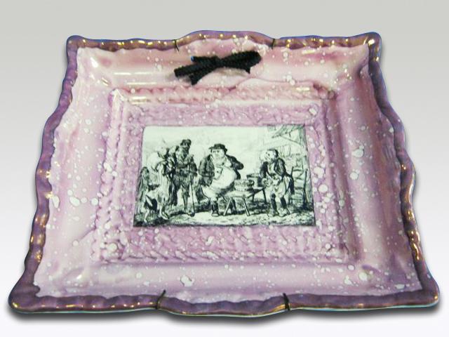
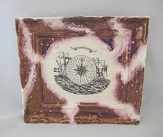
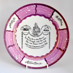
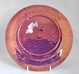
12/1/2011 1 Comment Reproduction plaquesSince my November 24 post, about the crackle on plaques with scrolled borders, I've had an e-mail from Ian Sharp. He confirms what I've long suspected, i.e. that some of the plaques (and other items) in Michael Gibson's book on Lustreware, are in fact reproductions. Like the Adams plaque, they have scrolled borders (see Gibson plate 95, p 104, and plate 99, p 108). Paradoxically, these reproduction plaques are so rare that I've never seen one. They have, therefore, some collecting value. I found the image below on the defunct 'Antiques Republic' website, and believe the plaque is also a reproduction. It doesn't have the scrolled borders, but has the speckled lustre similar to that used by Gray's in the 1930s. Also there is a pitted inner lustre border, which I've never seen on 19th century plaques. Again, this plaque, which appears to be a scene from The Pickwick Papers, is rare enough for me to have never seen another. I've pasted a more typical 1930's reproduction below. This has the more commonly reproduced Mariners' Compass transfer. It is much less likely to be confused with genuine 19th century plaques, and has very little commercial value. Finally, I've included a picture of a bowl. Like the 'Mariner's Compass' transfer on the plaque above, 'Success to the Fleece' appears on genuine 19th century items. From the front it is hard to be sure of its age. But look at its mottled lustre back in the right photo. This only appears on 20th century items. Michael Gibson's book is illustrated with photos of the Tolsen Collection of Sunderland Lustre, which came up for sale at Sotheby's in 1998. One of the plaques in question is described in the auction catalogue (lot 407) as 'a rectangular plaque, possibly Staffordshire, late 19th century, printed with satirical courtroom scene within a moulded frame edged in purple lustre'. This is at least two steps closer to the truth. Gibson's description of the plaque as 'Sunderland' and 'c1820-1830', is completely wrong. His book has value for its many colour photographs, but shouldn't be relied upon as a reference work. Baker's 'Sunderland Pottery' remains the work of scholarship on the subject.
|
AuthorStephen Smith lives in London, and is always happy to hear from other collectors. If you have an interesting collection of plaques, and are based in the UK, he will photograph them for you. Free advice given regarding selling and dispersal of a collection, or to those wishing to start one. Just get in touch... Archives
February 2022
AcknowledgementsThis website is indebted to collectors, dealers and enthusiasts who have shared their knowledge or photos. In particular: Ian Holmes, Stephen Duckworth, Dick Henrywood, Norman Lowe, Keith Lovell, Donald H Ryan, Harold Crowder, Jack and Joyce Cockerill, Myrna Schkolne, Elinor Penna, Ian Sharp, Shauna Gregg at the Sunderland Museum, Keith Bell, Martyn Edgell, and Liz Denton.
|
