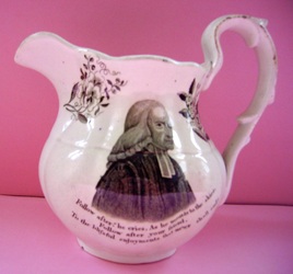
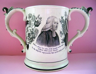
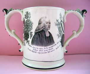
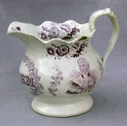
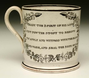
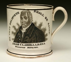
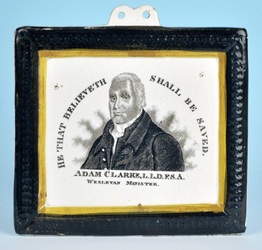
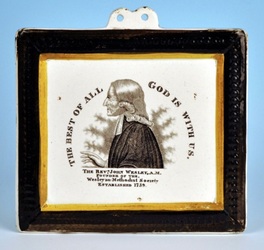
|
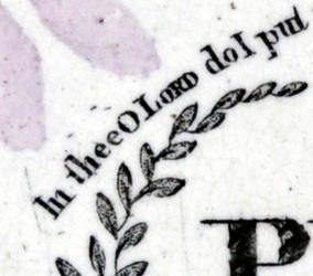
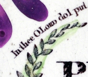
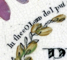
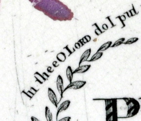
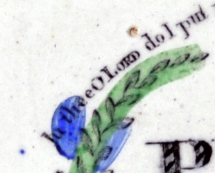
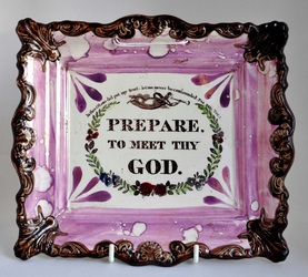
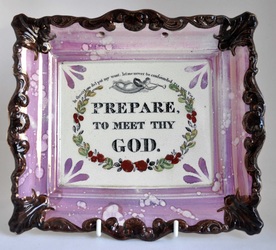
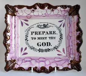
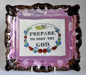
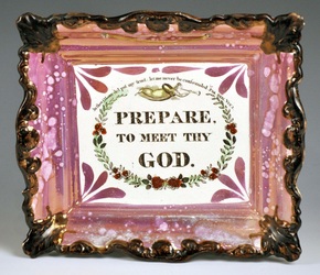
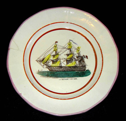
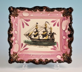
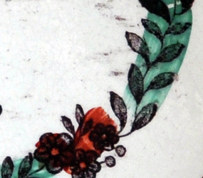
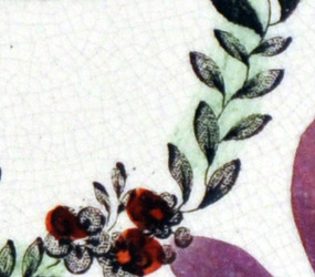
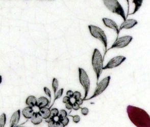
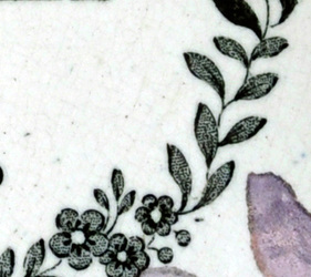
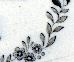
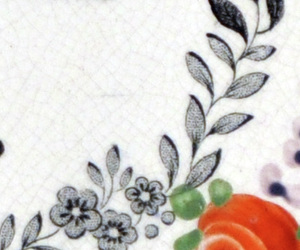
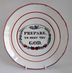
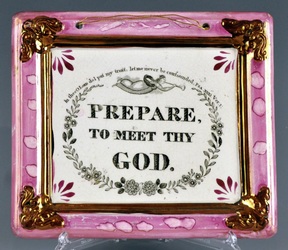
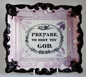
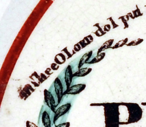
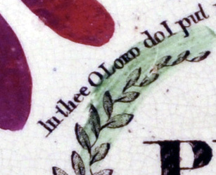
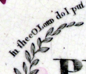
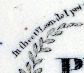
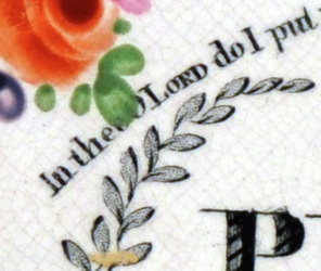
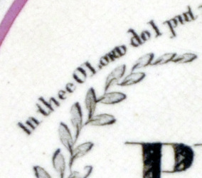
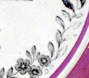
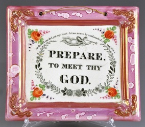
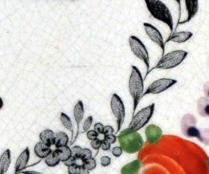
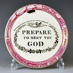
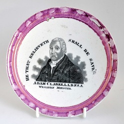
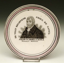
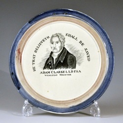
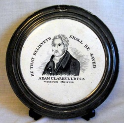
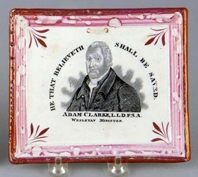
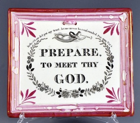
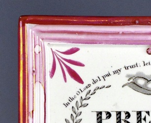
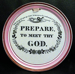
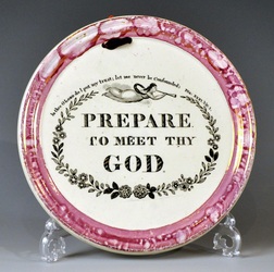
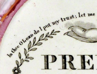
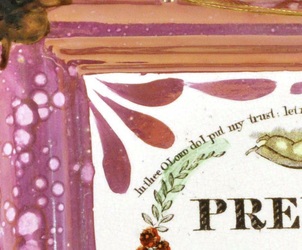
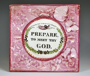
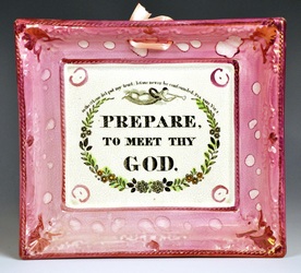
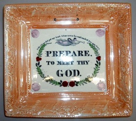
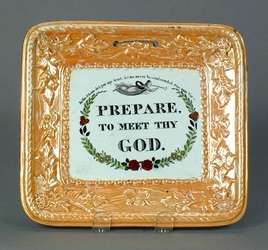
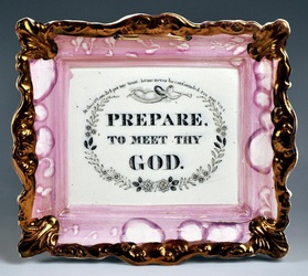
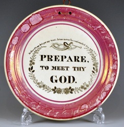
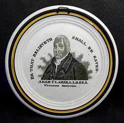
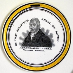
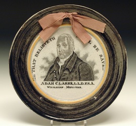
Firstly, in case you missed it, I've added a P.S. to my previous blog post. The two Adam Clarke plaques, despite coming from different transfer plates, share a similar fault of transfer application. Transfers were first printed onto paper, so they could be applied to the (often curved) surfaces of pottery. It was a fiddly business, and sometimes the transfer would get distorted in the process. The edges of the transfer were particularly vulnerable. You can see looking at the two Clarkes that the 'D' in 'SAVED' has broken off. That's a long preamble. But think back to the P.P.S. of my blog post on January 9th. Stephen Duckworth noted that the spacing between the letters 'In thee O Lord' varies on 'Prepare' transfers, which otherwise look very similar. Those letters are on the periphery of the transfer, so could they have possibly been distorted during application? Take a look at the spacing of the letters on the details below. All of them come from the clunky brown-bordered plaques commonly associated with Scott. On some the letters are compressed, so that the 'thee' is pressed against the 'O'. On others there is a distinct space between them. (Click on the images to enlarge and to move between them.) The full plaques are pictured below respectively. So if we're to distinguish between very similar 'Prepare' transfers, we perhaps ought to look for differences other than letter spacing at the edge of the transfer. But first, on what basis are the clunky brown-bordered plaques attributed to Scott? Take a look at the two bowls (below left). Both have Scott impressed marks. Such bowls nearly always have transfers that occur on the clunky brown-bordered plaques (below right). See my July 2010 blog pieces for a more in-depth comparison of the Bretagne transfers below. I did manage to find a subtle difference between some of the 'Prepare' plaques. Take a look at the details below (click on the images to enlarge and to move between them). Note, in particular, which side of each leaf is most heavily shaded. On the first four, the leaves on the left side of the sprig are most heavily shaded on the left side. Whereas on the last two they are heavily shaded on the right side. The two leaves on the top left of the sprig also differ slightly in shape. So where did the details come from? The full items are pictured below, again respectively. Perhaps not what we'd hoped for! I would have expected the two plaques on the right to be printed from the same plate, yet the shading of the leaves is on different sides. Either there were two transfer plates, or one plate was re-engraved at some point, and the shading moved side. The good news is that these details provide a strong link between the smaller rectangular plaques (on the right) and Scott. Look at the details of the top right and bottom left plaques. There is a flaw common to both transfers. To the right of the third flower there is a small horizontal scratch (black mark), which appears on both plaques. They are, therefore, undoubtedly from the same transfer plate. My eyes ache. I'm going to have a cup of tea. P.S.For completeness' sake, here are the details of the letter spacing of the six items above, again in the same order. The shading on the leaves accords on all items this time. But again, there are stronger similarities between the top right and bottom left, this time in terms of letter spacing. Note the larger space after the word 'In'. The last two details are also spaced similarly to each other. Note also that the 'I' in 'In' is shorter on these last two plaques. That could be because these pairings of plaques were produced at the same point in the lifecycle of a single transfer plate, which was more than once re-engraved or flattened out (transfer plates became curved over time from passing through printing rollers). If I had to guess, I'd say the last two were the earliest (c1845) as the plaques are more refined. NB Richard Cobden appears on similar plaques to the bottom right in 1846. The brown-bordered plaques are c1850s–60s, and the bowl with the impressed mark is likely later. So on reflection, it seems more likely that distortion of the transfer plate over time, rather than problems during application of transfers, accounts for the differences in spacing. P.P.S.I've overlooked the circular 'Prepare' at the end of my January 9th blog post. So here it is (top three images) above the c1845 plaque for comparison. As we'd expect, this earlier form of plaque (c1830s–40s) matches its rectangular counterpart. The shading of the leaves is on the right, and the spacing of the text similar.
0 Comments
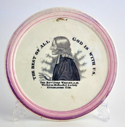
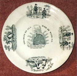
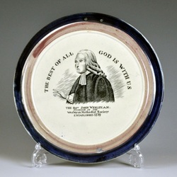
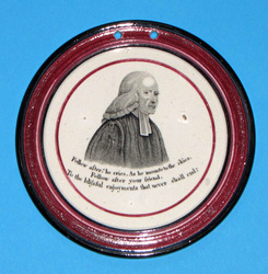
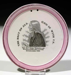
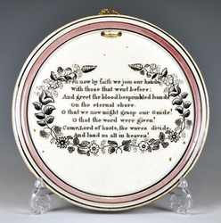
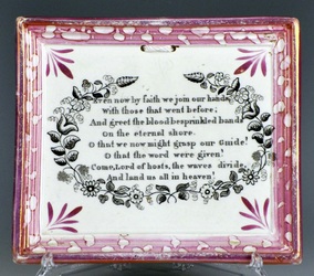
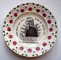
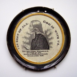
1/18/2011 0 Comments The C, C & Co Wesley?The first time I saw a small, circular, pink-lustre-bordered plaque with a Wesley, my instinct was that it must be from Cornfoot, Colville & Co's Low Lights Pottery, North Shields. On closer examination though, I realised that most of the Wesleys and Clarkes on these small round plaques have transfers associated with Scott of Southwick. But that still leaves our Wesley from my last blog post, with a bobbly, brussels-sprouts-on-a-stalk-like aura. I've posted it below, alongside three verse plaques with the impressed mark 'C. C&Co.' for comparison. Like the C, C & Co plaques, the Wesley plaque is 167mm in diameter. The colour, quality and application of the lustre are also very similar. If the Wesley is C, C & Co, that explains the rarity of the transfer. The pottery closed c1832, the year that Adam Clarke died and North East potteries started mass-producing Wesley and Clarke commemoratives. So assuming C, C & Co made a Wesley and Clarke in 1832, they couldn't have been in production for more than a year or so. Of course, the Wesley could be older, and we don't have an Adam Clarke as yet. Another reason I think that the Wesley is relatively early (C, C & Co era), is the quality of the transfer. As mentioned in my previous post, the lettering has long elegant serifs. It seems more likely that the 'Southwick' Wesley was copied from this transfer than vice versa, and that some of the refinement was lost in the process. C, C & Co were pretty good at marking their wares, so if the attribution is correct, someone out there surely has a marked example. P.S. The C, C & Co Clarke?The plaque on the left below pairs with the Wesley above. I've put it next to the 'Southwick' Clarke for comparison (click on the images to enlarge and to move between them). The C, C & Co-attributed Clarke (left) again has refined lettering, and though the aura differs from its Wesley pair, it is more bobbly than its 'Southwick' counterpart. Sadly, it doesn't have an impressed mark.
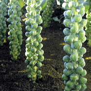
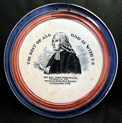
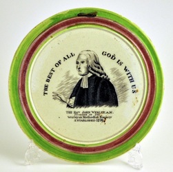
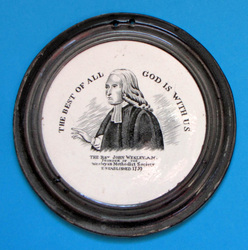
1/17/2011 0 Comments More unidentified WesleysIn case anyone is labouring under the delusion that all of the Wesley transfers have now been accounted for, below are two different transfers, which don't fit any of our groups. They are similar to the 'Southwick' Wesley, except that on the 'Southwick' transfer, the aura is spiked and flame like. On the two plaques above it is bobbly, like Brussels sprouts on a stalk. Even so, the plaques above come from different transfer plates. If you click on and move between the two images, you'll see the sprouts are in different positions. I've put the circular unidentified plaque (below left) next to a 'Southwick' Wesley (below right) for comparison. The text on the unidentified plaque is finer, with long elegant serifs. There is a space after the 'M' in Methodist on the unidentified plaque, and a slight space after the 'o', so it reads: 'M etho dist'. Whereas the spacing on the 'Southwick' plaque is as follows: 'Meth o dist'. P.S.Wesley's 'aura' on the bowl (c1870?) with a Southwick mark (see my previous post), is also sprout like. However, the spacing between the lettering is consistent with the early 'Southwick' plaque (c1832), ie 'Meth o dist'. My guess is that the transfer plate was touched up (re-engraved) at some point to restore definition, and that's when the sprouts appeared. They don't match those on the orange plaque above. It would be interesting, however, to compare the transfer on the bowl to a clean example on a round-cornered orange plaque (see the end of my first 'Southwick' post).
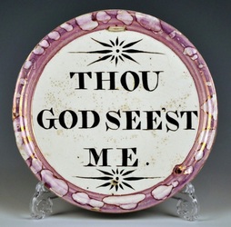
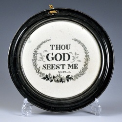
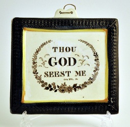
For interest, Keith Lovell has provided an image of a second similar bowl. The Wesleys and Clarkes below, all from the same mystery pottery, are very similar to the 'Maling' Wesley and 'Maling' Clarke (click on the highlighted words to read about the subtle differences between the transfers). The plaque form is very distinctive. They are larger than average – the top two shown are 190mm in diameter compared with 185mm for the 'Maling' leaf-bordered plaques. They are also very thin (5mm). As mentioned before, the clay body is a creamy off-white with a speckled appearance. It's harder to tell whether the transfers below come from the same copper plate. My guess is, like the Wesleys and Clarkes, the below left transfer is a copy of its 'Maling' counterpart (below right). It has the same creamy speckled body as the plaques above, but is slightly smaller – 187mm. This pottery's plagiarism extends beyond transfers attributed to Maling. The 'Thou God...' on the left is from our mystery pottery (190mm diameter), and its transfer imitates that on a 'Sheriff Hill''-attributed form (below right). NB sometimes the word 'ME' is spelt 'MEE' (see the black and yellow plaques page). The transfers below have obvious differences. Click on the images to enlarge, and to move between them. Copying rivals' transfers was common practice – think about the number of Prepare to Meet Thy Gods with minute variations. The Sheriff Hill Pottery was in Gateshead. So as both Sheriff Hill and Maling are Tyneside potteries, it seems likely that's where our plagiarist pottery was located.
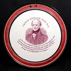
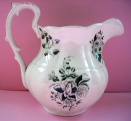
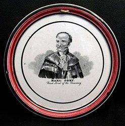
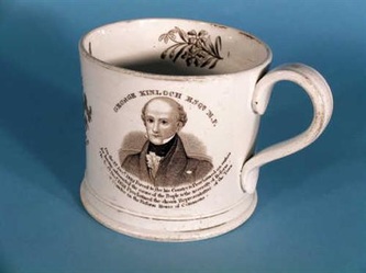
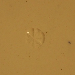
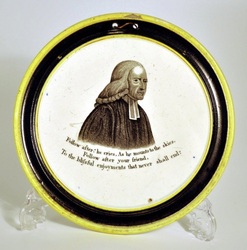
1/12/2011 2 Comments A Staffordshire Wesley?Before Christmas, Doanld H Ryan pointed out the similarity of a plum-bordered Wesley plaque to those with George Kinloch. I gave it little thought until I received the images below from Keith Lovell. Not recognising the floral decoration, I asked around and got this response from Ian Sharp: 'The jug is certainly not north eastern. It has the look of Chesworth & Robinson, by the type of engraving, they were quite prolific with their commemorative subjects. This is just a stab really, but both pieces, certainly not Sunderland/Tyneside.' After some internet browsing I found a 'Reform' jug with flowers (below left) attributed to Chesworth & Robinson. It has a transfer of Earl Grey similar to those on plaques (below right). But don't get too excited. Ian Holmes measured the plaque and it is 170mm diameter, whereas Wesley and Kinloch above are both 160mm. The Earl Grey transfer on the plaque clearly differs from that on the jug. The plaque has the impressed mark 'C.C&Co.', for Cornfoot, Colville & Co of the Low Lights Pottery, Newcastle. Whereas the jug was made in Staffordshire. (C, C & Co also produced circular pink-lustre-bordered plaques of William IV and Queen Adelaide.) I also found this Kinloch commemorative mug with flowers. I've repeated the photo of the plaque so you can compare. More research needs to be done, but it seems that the Kinloch and Wesley plaques were made in Staffordshire, at least. While measuring the Kinloch plaque, Ian noticed something else interesting. It has a circular impressed mark made up of 8 segments. This mark also appears on the Wesley plaque below. So we're looking for a Staffordshire pottery that might have used the above segmented circle impress.
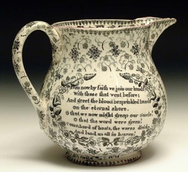
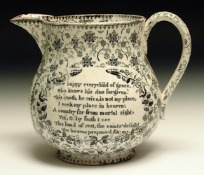
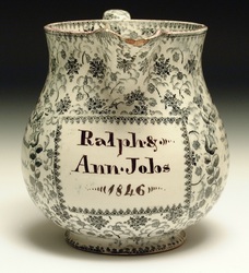
1/11/2011 1 Comment A 'Southwick' jugBelow is a fabulous jug from the Sunderland Museum & Winter Gardens, Tyne & Wear Archives & Museums collection. Though unmarked, the museum attributes the jug to Scott. That's great because it has the same Charles Wesley verses found on the 'Southwick'-attributed plaques in my previous posts. It has the date of 1846 hand-painted on, which is late relative to the small fine plaques. Shauna Gregg at the Sunderland Museum has provided several more interesting images, which I've added to my previous blog posts. I've also added a photo of the 'J.&P' Sheriff Hill impressed mark.
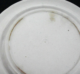
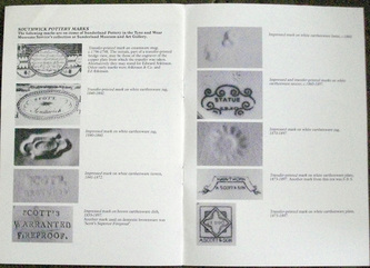
Thanks to Ian Holmes for this next snippet on the 'Southwick' Wesley. At last we have a 'Southwick' Wesley on a bowl with an impressed mark. Ian found a list of Southwick marks in a Sunderland Museum catalogue of a Scott exhibition in 1988. It shows a 'daisywheel' design impress, with 13 petals, found on a later Scott jug. This is the mark on the bowl. Click on the images to enlarge. After yesterday's tribulations, this is good news for the attribution of a 'Southwick' Wesley!
I've been pretty pleased with the way this attribution has being shaping up... until now. This morning I found a hiccup in my assumptions. Until very recently, I'd never considered that the small rectangular plaques might be attributable to Scott (see my previous blog post on the subject). The brown-edged plaques most commonly associated with Scott are heavily potted, large and clunky (see below left). The smaller rectangular plaques are just the opposite (see below right). Thanks to Shauna Gregg, at Tyne & Wear Archives & Museums, for the photos below of 'Southwick' Wesley and Clarke plaques, from the Sunderland Museum & Winter Gardens, Tyne & Wear Archives & Museums collection. They provide another 'Southwick' connection to a series of very fine and lightly potted circular plaques. As we might expect, these plaques appear with the Charles Wesley verses found on the small rectangular plaques (see images below). But here's what's been bugging me. The 'Southwick' Wesley and Clarke, and the Charles Wesley verses, never appear on the clunky, brown-edged, rectangular plaques most commonly associated with Scott. On its own that doesn't prove anything. Perhaps Scott felt that the nearby Garrison Pottery (Dixon) had cornered the market for large rectangular Wesleys and Clarkes, and decided to differentiate their products by making smaller plaques. This morning I looked for a transfer that might unite the small rectangular plaques with the larger brown-edged ones, but didn't find what I'd expected. The 'Prepare To Meet Thy God' transfers are almost identical. However, look at the verse that runs above the trumpetting angel. On the small rectangular plaque it begins 'In the O Lord ...'. Whereas on the brown-edged plaque it begins 'In thee O Lord...'. The use of 'the' instead of 'thee' appears to be unique to our finer-potted 'Southwick'-attributed group. (Incidentally, this also applies to 'Thou God seest Me' and 'Praise Ye The Lord' plaques, of which there are both 'the' and 'thee' versions.) 'The' appears on finely potted circular plaques (below left) from the same mould as the three circular plaques above. Whereas 'thee' appears on circular plaques from Cornfoot, Colville & Co (Newcastle) (below right). NB despite sharing the word 'thee', the Cornfoot, Colville & Co transfer (detail below left) is NOT the same as that on the clunky brown-edged plaques (detail below right). Note the positioning of the leaves on the sprig. 'The' appears on the two fine wide-bordered plaques below. Note that the 'Southwick' Wesley also appears on plaques like the one below right. 'The' appears on orange-bordered plaques, of both the fine variety (below left) and heavily-potted type with rounded corners (below right). These round-cornered plaques are often attributed to Scott. So the 'the' transfer was in use from c1830 (small rectangular and fine round plaques), right the way through to c1870 (orange-bordered plaques). Whereas the 'thee' transfer was used on clunky brown-edged plaques c1850s–60s. It doesn't seem logical that they were both produced by Scott. Transfer plates were expensive to engrave. Why would one pottery commission two such similar transfers? 'Prepare To Meet Thy God' rarely appears on jugs etc (see lot 418 of the Tolson Collection catalogue for a jug with the Cornfoot, Colville & Co 'Prepare' transfer). Perhaps somewhere there's a Scott-marked jug with a 'Prepare' transfer? P.S.The 'Prepare' transfer, on the clunky brown-edged plaques, appears to match those on the plaques below. It also appears on plaques with the Moore & Co impressed mark. However, as discussed before, the Southwick potteries (Moore and Scott) sometimes shared transfers. P.P.S.Stephen Duckworth has pointed out that the spacing between the word 'thee' and 'O' varies in the plaques above. So it seems even more close examination is required before we can group these into families. On some of the above plaques it almost looks as if an extra 'e' has been squeezed in, to change 'the' into 'thee'. So was the 'Southwick' transfer plate at some point re-engraved with an extra 'e''? A strong argument against this is that 'the' still appears on orange-bordered plaques of the 1870s, which post-date those above.
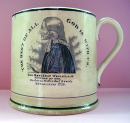
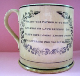
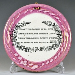
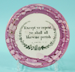
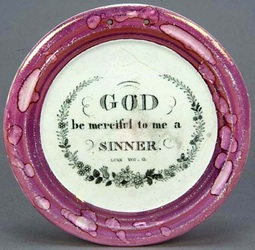
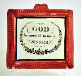
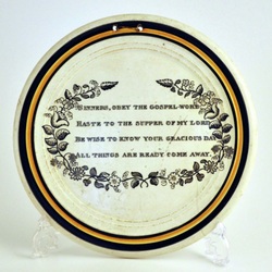
Please read my blog post on the 'Sheriff Hill' Wesley first. The mug below right has a much clearer transfer impression than the one in my previous posting. Click on the images to enlarge and to move between them. (The plate on the left has the 'J.&P' impressed mark of the Sheriff Hill Pottery.) The verse on the mug is, as before, from Charles Wesley's hymn, 'Sinners Obey the Gospel Word' (see the poetic verses page). The verses of this hymn have been recorded on distinctive circular plaques, with either black-and-yellow or broad pink-lustre borders (see below right). Below are two plaques of that broad-bordered form with biblical verses. The biblical verses above also appear on rectangular plaques with a 'tab' for hanging. As does the 'Sheriff Hill' Wesley. I'm not sure that the above proves anything, though it is fun making connections. The plaques do, however, give an indication of the kind of transfers we might like to find on objects with the back stamp 'J.&P'. P.S.Look how neatly the first verse of this hymn pairs with the 'Sheriff Hill' Clarke. Even better, look at this mug from Sunderland Museum & Winter Gardens, Tyne & Wear Archives & Museums.
1/6/2011 0 Comments The 'Sheriff Hill' ClarkeThe attribution of this Clarke transfer to the Sheriff Hill Pottery, is tentative to say the least. No objects with Clarke have yet been found with the 'J.&P' Sheriff Hill impressed mark. However, this Clarke pairs with the Wesley in my previous blog post, which appears on a plate with the impressed mark. The 'Sheriff Hill' Wesley appears on a wider variety of plaque forms than the Clarke. Below are a 'Sheriff Hill' Wesley and Clarke pair. Note the 'FOUNDER OF THE' in Wesley's title. The plaque below left also has the 'Sheriff Hill' Clarke transfer. Its defining feature is a spiky 'aura' (much like Wesley's). As discussed in previous posts, the 'Dixon' and 'Southwick' Clarke have curvy undulating auras. I've posted a 'Southwick' Clarke below right for comparison. If anyone has an object with the impressed 'J.&P' mark (with or without Wesley and Clarke), I'd love to hear from them. P.S.Take a look at the 'Sheriff Hill' Clarke below from the Sunderland Museum collection. Its form is similar to some of the 'Sheriff Hill' Wesleys for which, as yet, I've seen no Clarke to pair. Like the 'Sheriff Hill' Wesley beside it, it has a finely moulded inner ring of yellow beading, which crops off some of the transfer.
|
AuthorStephen Smith lives in London, and is always happy to hear from other collectors. If you have an interesting collection of plaques, and are based in the UK, he will photograph them for you. Free advice given regarding selling and dispersal of a collection, or to those wishing to start one. Just get in touch... Archives
February 2022
AcknowledgementsThis website is indebted to collectors, dealers and enthusiasts who have shared their knowledge or photos. In particular: Ian Holmes, Stephen Duckworth, Dick Henrywood, Norman Lowe, Keith Lovell, Donald H Ryan, Harold Crowder, Jack and Joyce Cockerill, Myrna Schkolne, Elinor Penna, Ian Sharp, Shauna Gregg at the Sunderland Museum, Keith Bell, Martyn Edgell, and Liz Denton.
|
