|
Of all the North East potteries producing transfer-printed plaques, Moore & Co's Wear Pottery in Southwick is hard to beat. Which other pottery could match the quality of the plaque below (the best of its kind I've ever seen)? For lightly potted plaque forms, quality of decoration, and the sheer variety of transfers - series like The Bottle and Aesop's Fables - Moore takes, in my view, the gold medal. 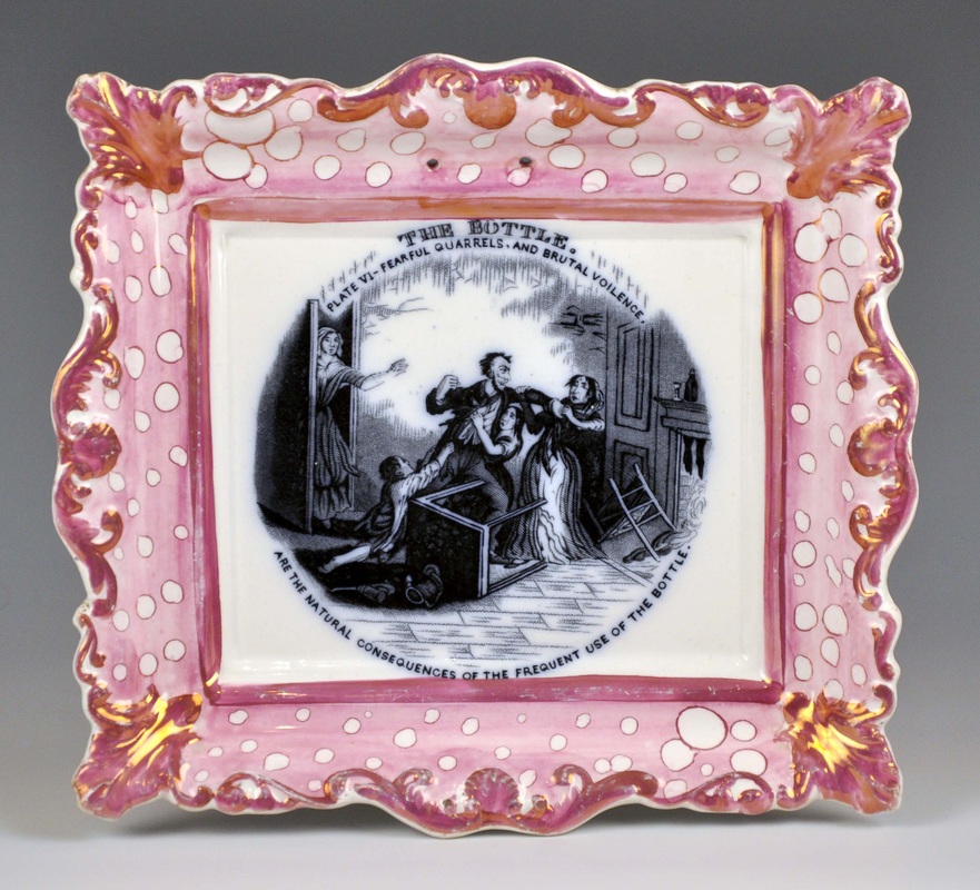 I have written before about transfers which Moore shared with the neighbouring Sunderland pottery Scott. But Moore produced many transfers that never appear on Scott wares. My guess is that these were produced earlier, in the 1840-55 period. Here's a short survey of those which appear on plaques. Cruickshank engraved The Bottle series in 1847. It's perhaps a surprise that the circular plaque on the left was produced that late, as it's a form I'd associate with the previous decade (if you are the owner, I would love better photos). The elaborate printed mark is another detail that few North Eastern potteries troubled with. Incidentally, Moore used the 'S. M & Co' mark, long after Samuel Moore's death in 1844. 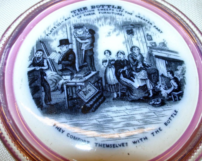   Although many of the ship transfers used by Moore also appear on Scott items, the transfers below appear to be exceptions. HMS Volage (images 1 & 2 below) served in the first Opium War of 1839–42, before becoming a survey ship in 1847. The Steamship Trident (images 4 & 5) was commemorated in an engraving in 1842. This would fit with an 1840s' date for the plaques below, which mostly have Moore & Co impressed marks. 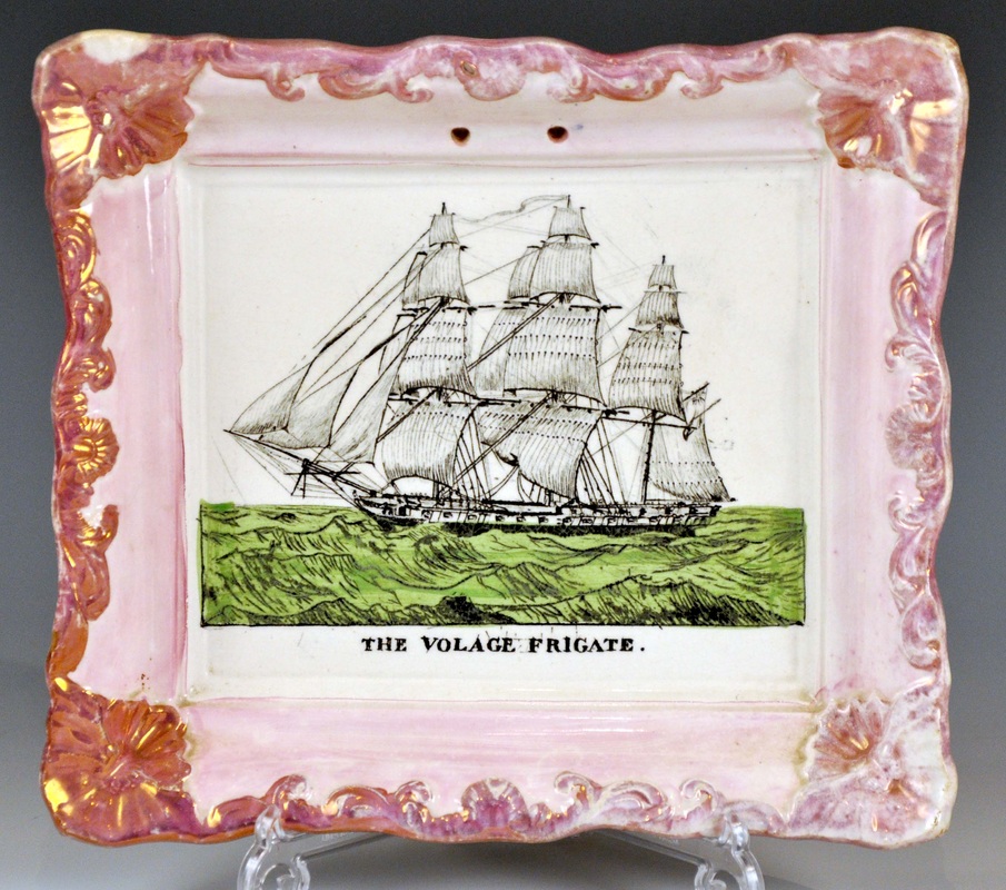 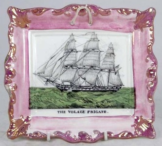   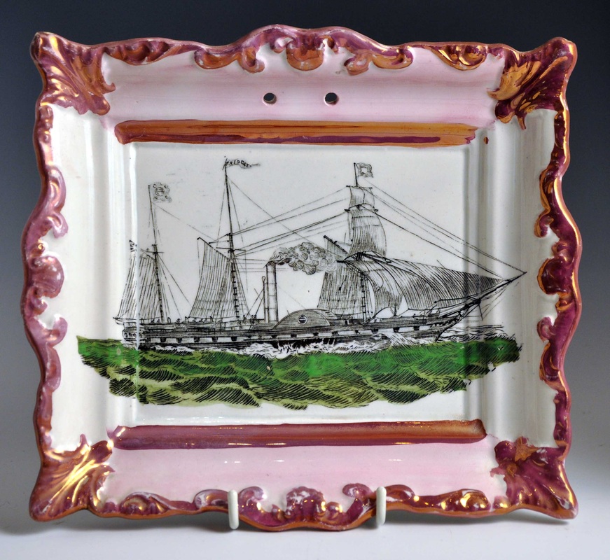 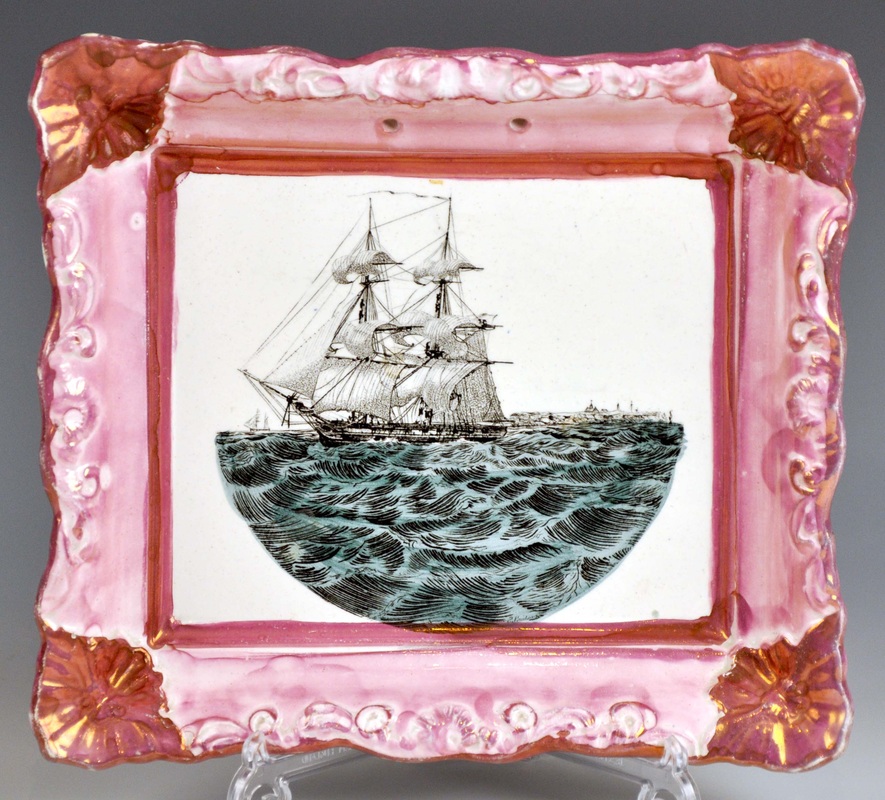 Below is another transfer of a ship, which appears on plaques with different titles (Commerce, Union, Resolution, Victor, Eclipse). The ship names would have been engraved on separate transfer plates - another Moore touch. The ship transfer appears untitled on jugs (see below) with distinctive decoration. One came up at Anderson & Garland recently with a dated inscription, 1838 (bottom right). This ship transfer nearly always appears on rectangular plaques with 'scalloped corners' (Ian Sharp calls them 'butterfly corners', which is perhaps better) as below. The circular plaque is the only one of its kind that I've seen with this ship transfer. 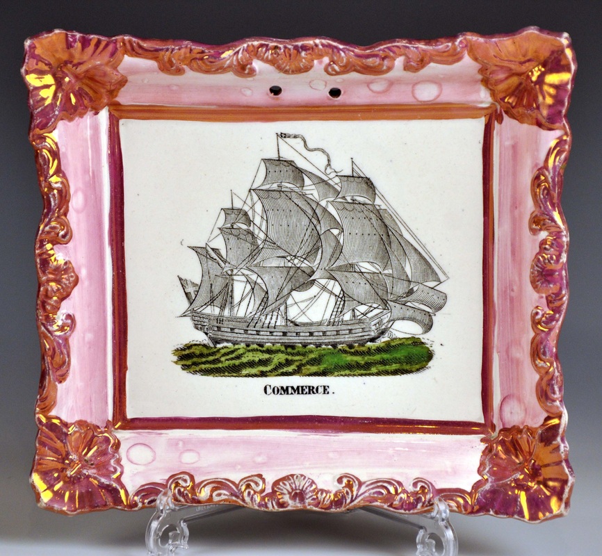 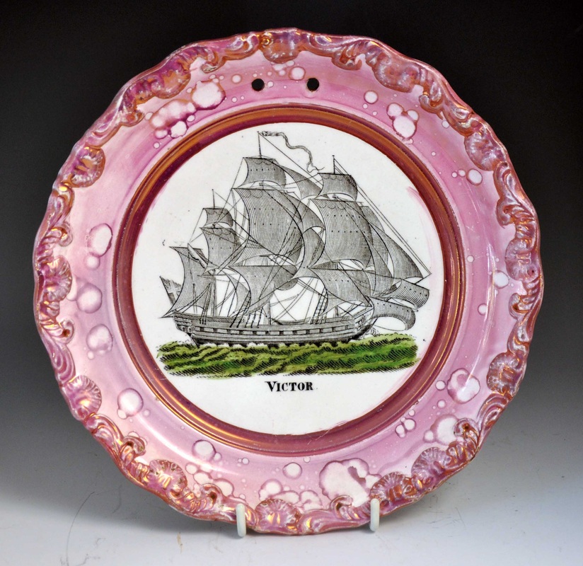 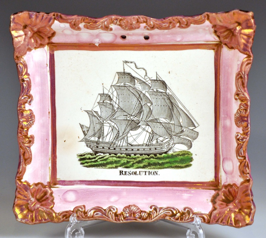 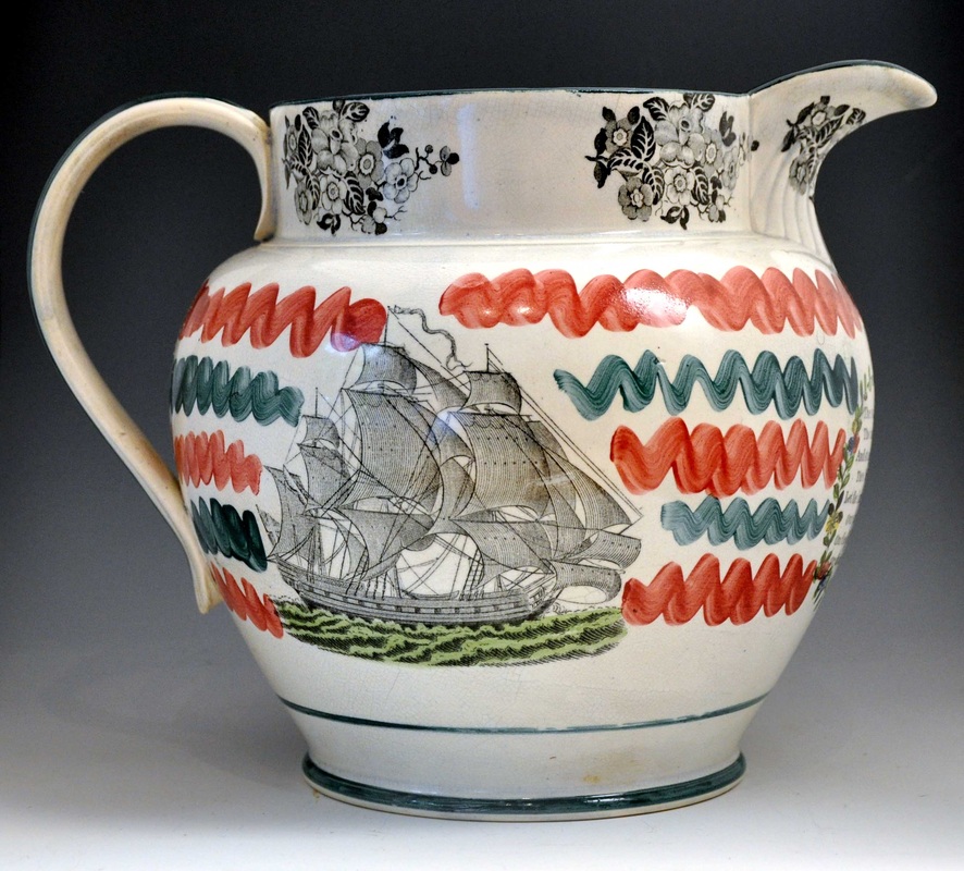  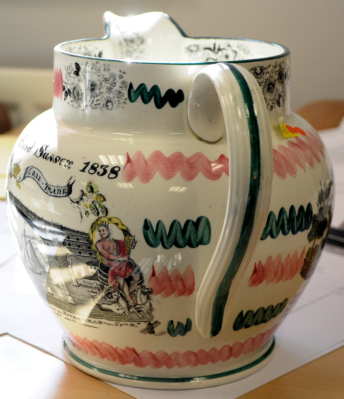 Transfers titled 'Waverley' (images 1 to 6 below) and 'Chantry' (images 6 to 9) appear on unusually large rectangular plaques, which Baker dates as 1840s. They also appear on the more usual plaque forms with pink lustre. These transfers were reproduced in large numbers, relative to most of the others in this post, but to my knowledge never appear on Scott items.  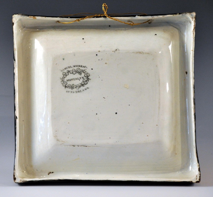 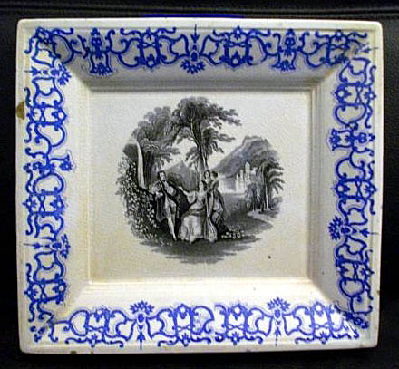 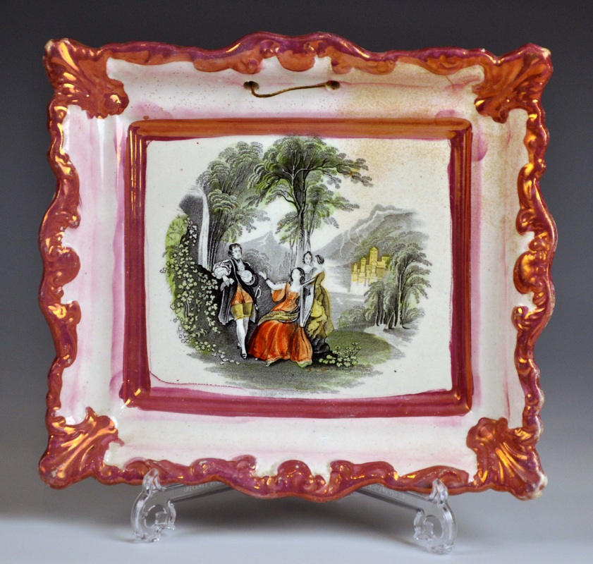 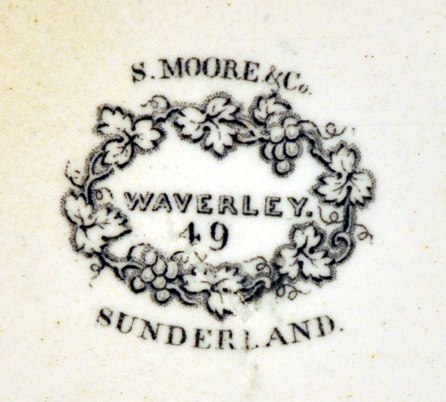  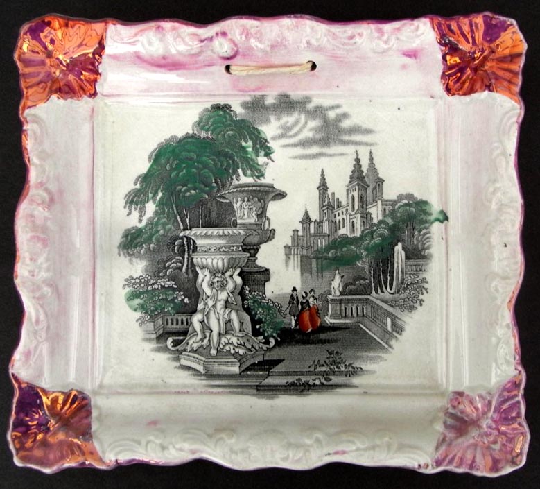 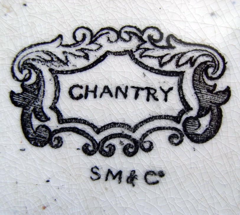 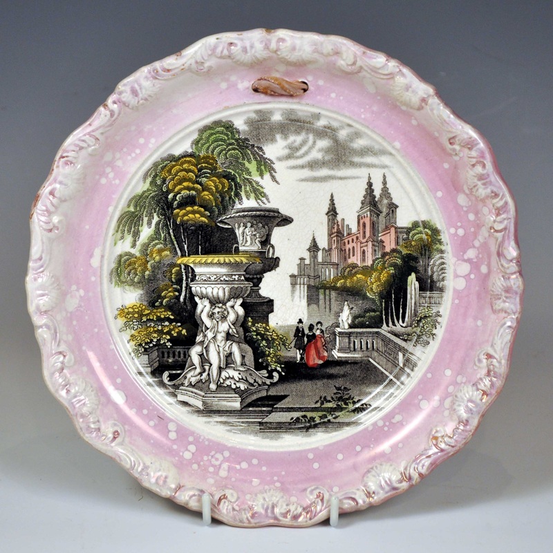 The next Moore series, 'Sporting', are interesting from the point of view of dating. The first three plaques below have the printed mark 'Sporting'. However, by the time the last two were produced, a pattern number '50' had been added to the printed mark. The first three plaques were likely made in the 1840s, and the last two perhaps into the 1850s. The marks belong to the plaques to their left. Note that the third appears in conjunction with the impressed mark 'Moore & Co'. 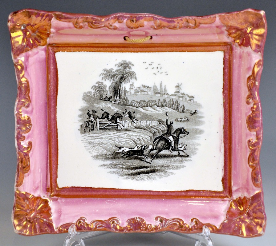 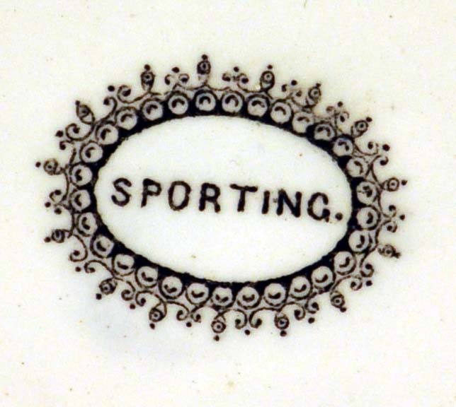 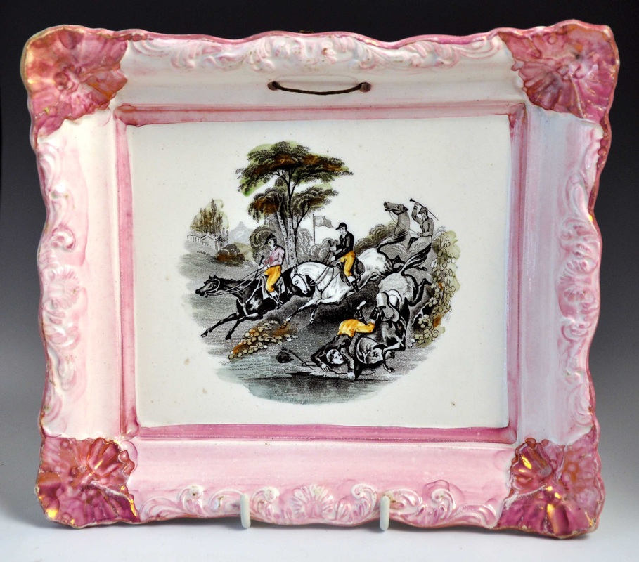 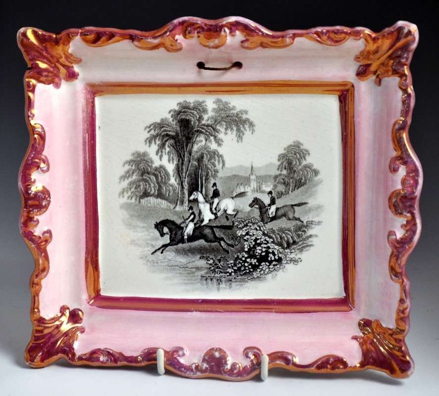 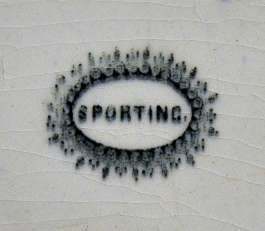  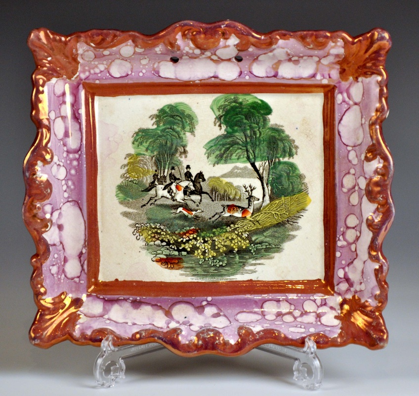 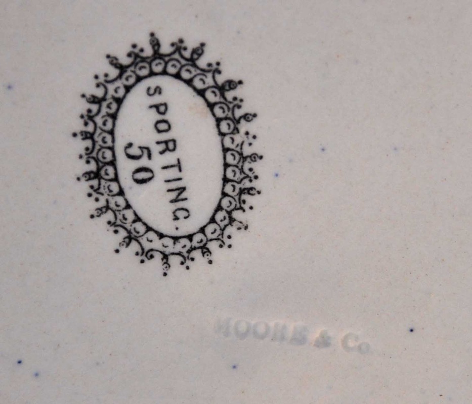 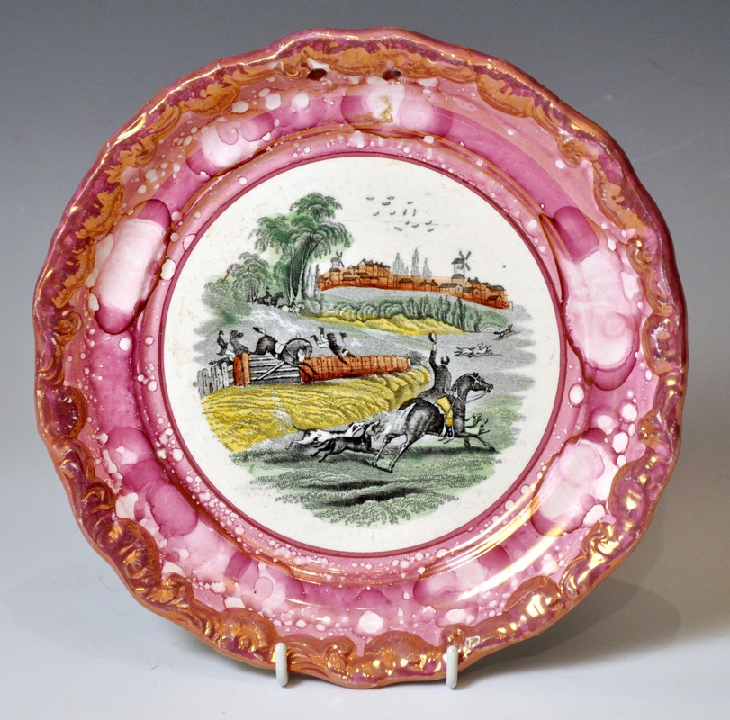 Moore produced several other landscapes. The first three have the Moore & Co impress, and are typically decorated with an inner and outer frame of dark lustre. The second row have the printed mark 'Cuyp' after the Dutch painter of cows. The last plaque commemorates the 'California' gold rush of 1848.   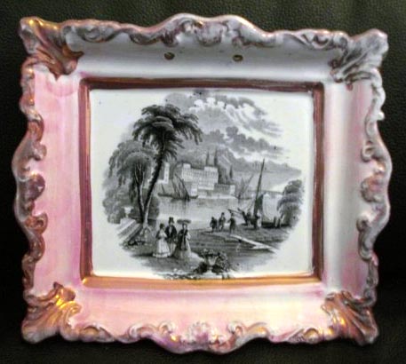 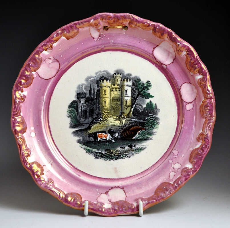  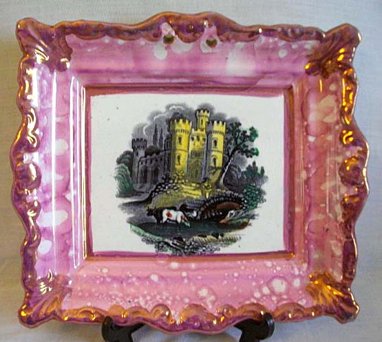  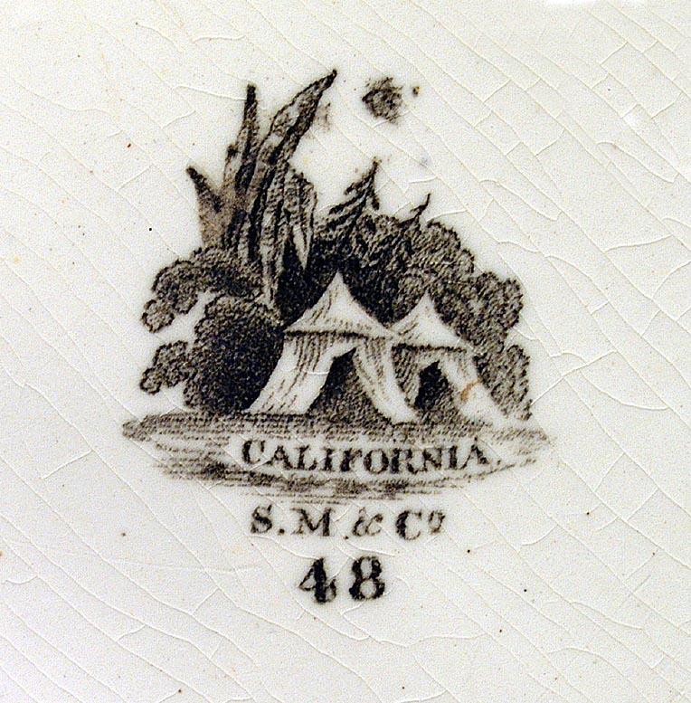 Moore produced a series of transfers of Aesop's fables, but they so rarely appear on plaques the two below are the only ones I've ever seen. They both have three marks. The left mark identifies that the designs were registered in 1853. You can see more of the series on a bowl here.   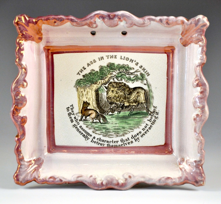 To go out with a bang, here are two Moore portraits. They could be a little later than the plaques above, as the centenary of Robert Burns' birth was in 1859, and the tricentenary of William Shakespeare's birth in 1864. The transfers are very rare, but to date I haven't seen them on Scott items. 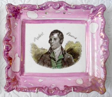 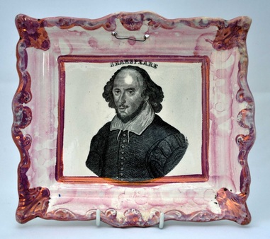 So why does dating them matter? Well, the copper transfer plates from which the transfers were printed could only be in one place at a time. So I've been wondering where the transfers shared by Scott and Moore originated. It seems almost certain that it was Moore (with their track record of design innovation) who had the plates engraved. The Moore plaque below left is entirely in keeping in style with the Crimean period of c1855. What's more, the plaque has the Moore & Co impress, just like the plaques above. The confusion arises because Scott is attributed with making, I'm guessing sometime after 1860, many, many more plaques with this transfer than Moore ever did (see below right). Incidentally, since writing the blog post in 2011, I've seen several bowls with the ship transfers and a Moore impress. One came up at Bonhams recently with a hand-painted date, 1859. I've included another below. However, it has a letter under the impress, so is likely later. 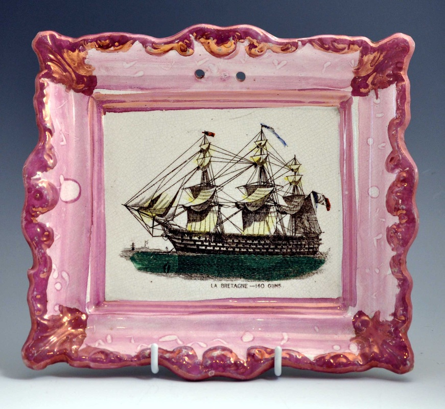 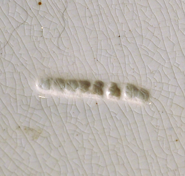 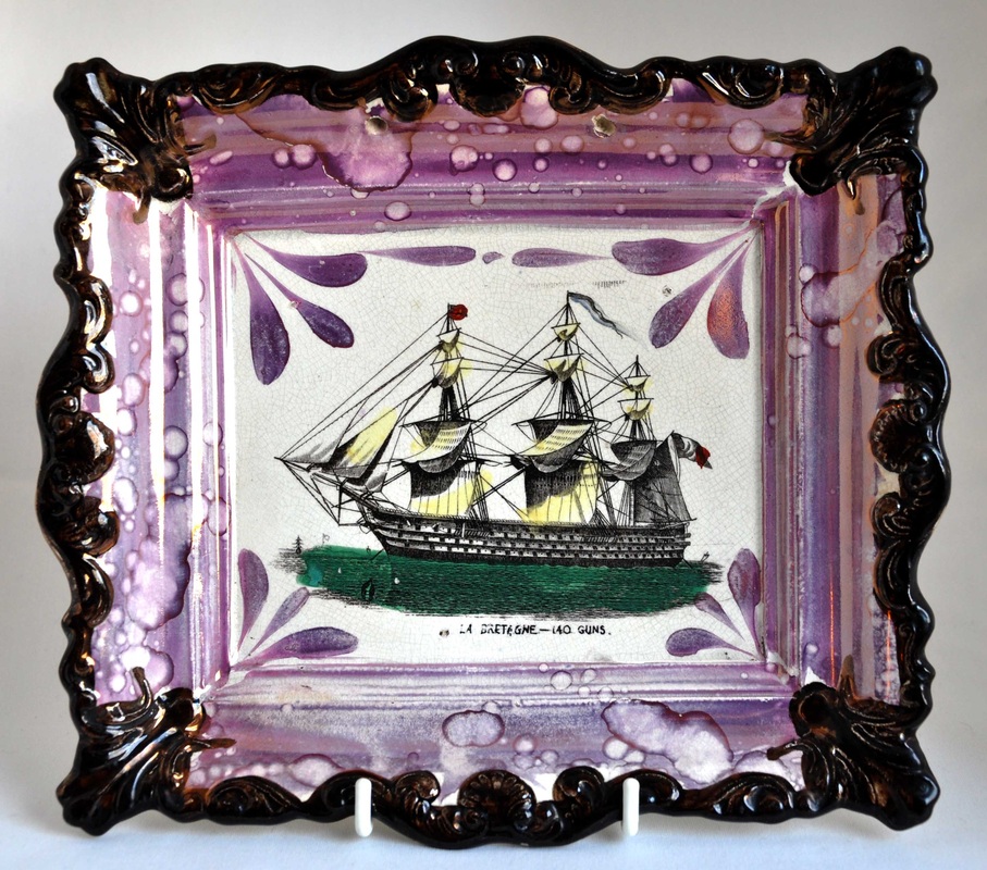 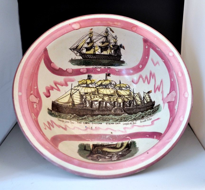 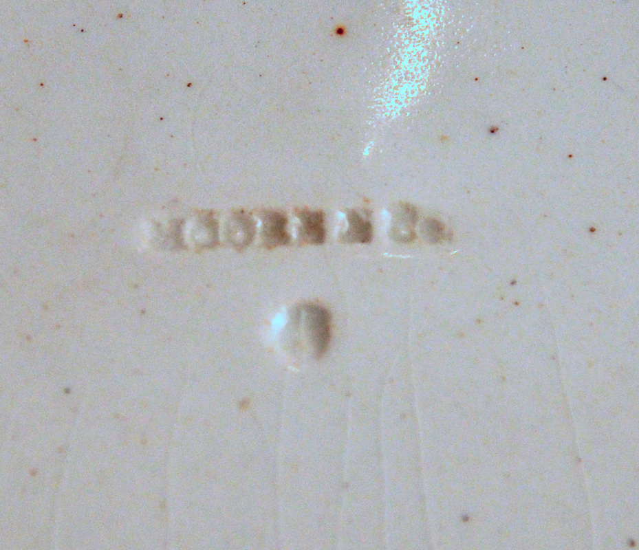 My guess is that there was no overlap of production of the two plaque types above. Sometime around 1860 either:
P.S. There are likely more plaques with mid-century Moore transfers to be discovered. For instance, I know of one with a Highland family, which I haven't yet managed to photograph.
0 Comments
4/28/2014 0 Comments A present from HartlepoolI feel I have neglected this blog for a while (I've spent weeks cataloguing files, we lost one of our cats and found her again, I've had shirts to iron...), but as recompense, here's a transfer I'd never seen before. It's a Dixon, Phillips & Co plaque, with colliding meteorites motif, and the transfer 'PRESENT FROM HARTLEPOOL.' It has the 'Dixon Co' impressed mark, in a straight line, used from after circa 1850. 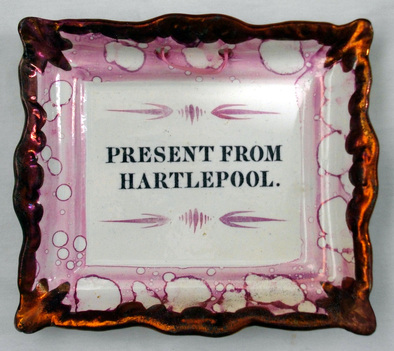 Copper transfer plates were expensive to engrave, and could produce hundreds, perhaps thousands, of transfers, and yet to date this is the only one I've seen of its kind. I've seen a pink-lustre plate with the title 'PRESENT FROM SUNDERLAND', or similar, but never on a plaque. The plaque's new owner says that the text is 'raised up' and that 'you can almost read it with your finger'. 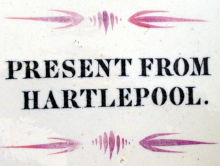 I haven't been to Hartlepool, which is about 20 miles south of Sunderland, so had to look it up. I found this interesting website... http://www.thisishartlepool.co.uk/gallery/oldpictures3.asp ...from which the pictures below were taken (the first three between 1905 and 1910). 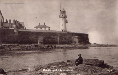 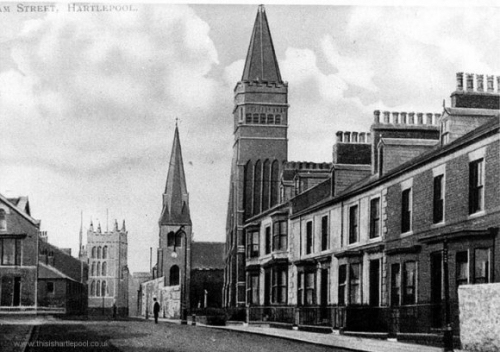 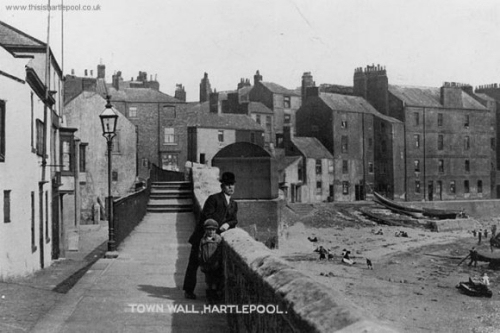 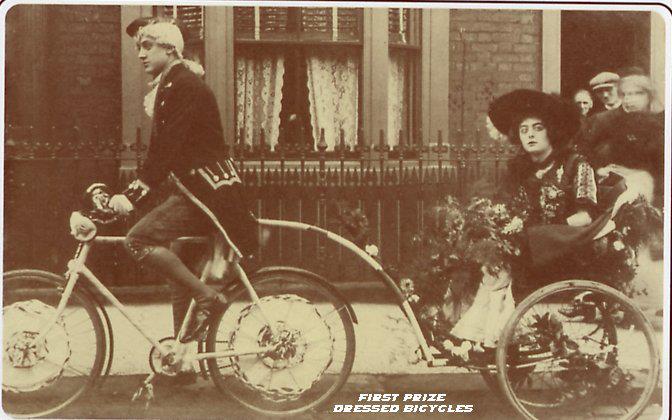 It perhaps seems an unlikely destination to have a lively trade in souvenirs, which gives me hope of one day finding a plaque marked 'PRESENT FROM HULL.'
I aim to take some photographs in the next few weeks and have a long overdue catch up, adding them to the website. If you look closely at the Sunderland 'Prepare to meet thy god' plaques, it's apparent that there are multiple variations of the same transfer. Sometimes the differences are obvious – an angel facing in one direction or another – and sometimes they're minute – a leaf shaded on a different side, a flower bud with or without a stalk. The smaller differences are interesting in as much as they hint at the way that plaques were produced. Anthony Scott of Southwick had several near-identical copper plates made up for his more commercial transfers (see the Scott page for photographs of two plates used to generate John Wesley transfers). Transfer plates wore out, and sometimes needed repair or replacement. But Scott apparently used his plates side by side to increase production, or perhaps to allow production of items with the same transfer at different locations within his factory. N.B. designs were first printed onto tissue paper, which had to be applied to pottery while the ink was still wet, so the copper transfer plates would have been kept close to the area of production. The small differences of engraving, and the occasional scratches or dinks in the copper, allow us to trace with certainty the movement of the transfer plate from one pottery to another, e.g. when a pottery closed. Up until now, I had identified 4 near-identical variations of the same 'Prepare to meet thy god' transfer used by Scott, and the neighbouring Moore & Co factory (they often shared transfers). But I hinted that there may be a fifth, confirmation of which has come through this plaque, currently listed on eBay. 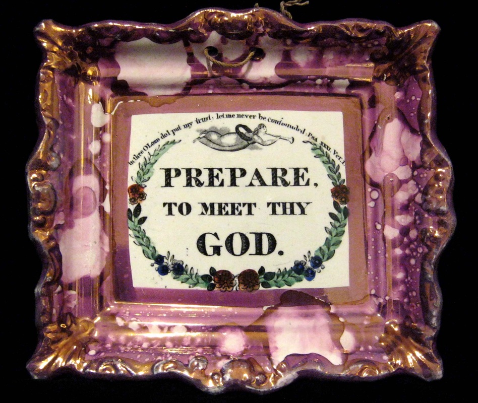 Compare it in the line up below (shown second) with the three other plaques. The first two are attributed to Scott, and the second two to Moore & Co. We know that they are all from the same transfer plate because there were small dinks in the copper transfer plate that appear as black dots to the left of the letter 'G' in the second detail. I've ordered the plaques, newest first (the top plaque perhaps as late as the 1870s, and the bottom as early as the 1850s) – the marks appear to have become more numerous, and to show up as darker over time.  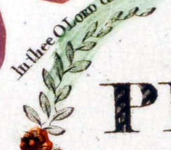    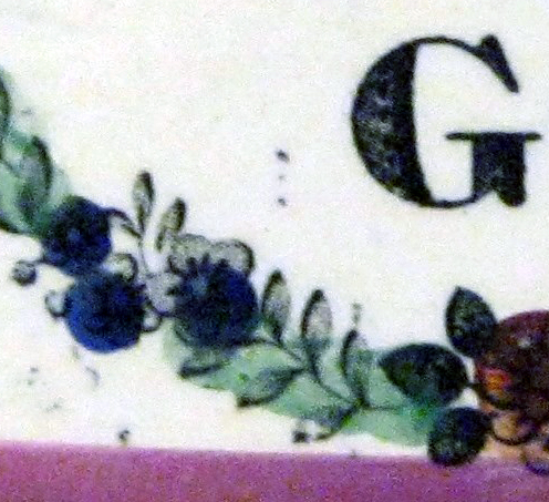 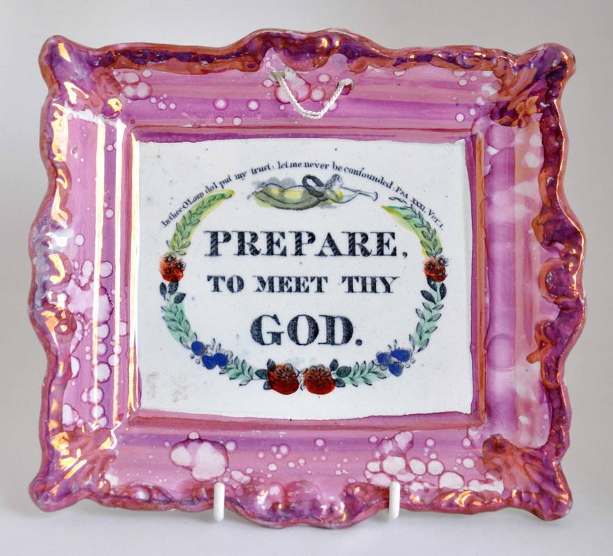 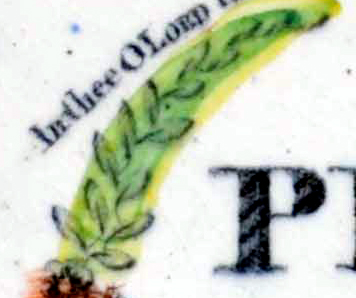 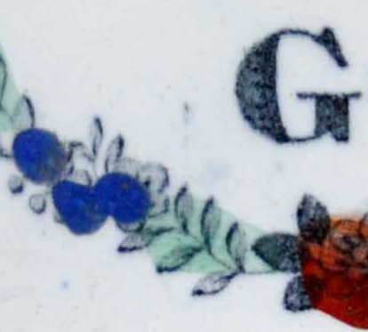 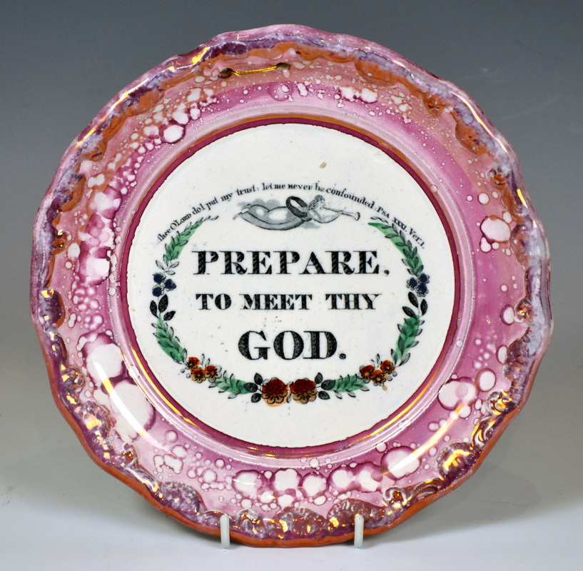  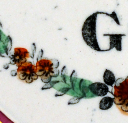 Below is another group of plaques that until now I'd thought came from the same transfer plate as those above. The leaves are all shaded on the same sides, the buds are connected to the flowers with stalks in the same way (see second detail). The first soup bowl has a 'SCOTT' impressed mark, the next three plaques, although unmarked, are typical of Moore & Co. But none of them has any trace of the marks to the left of the letter 'G'. Also, unlike the plaques above, there is no space between the word 'thee' and 'O' in the first detail, and the word 'thee' seems set slightly lower down. At first I thought perhaps the lettering had shifted when the transfer plate had been hammered flat (N.B. the plates, repeatedly passed through rollers, sometimes curled over time). In that case the items below could have been made before the plaques above: i.e. before the dinks appeared to the left of the 'G'. But the soup bowl is too late for that, I think.   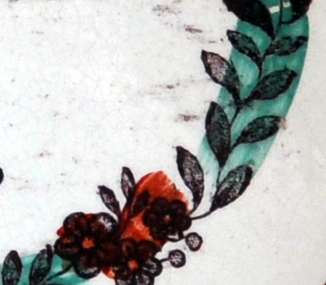 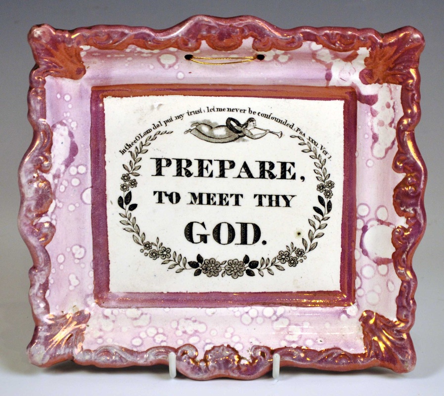 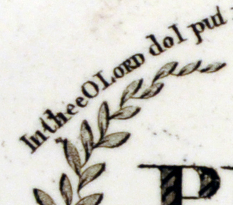 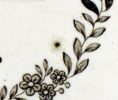 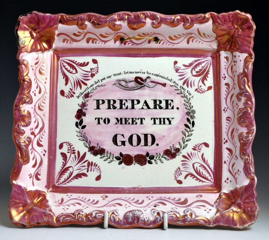 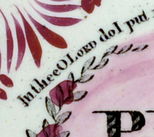 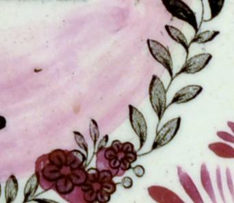 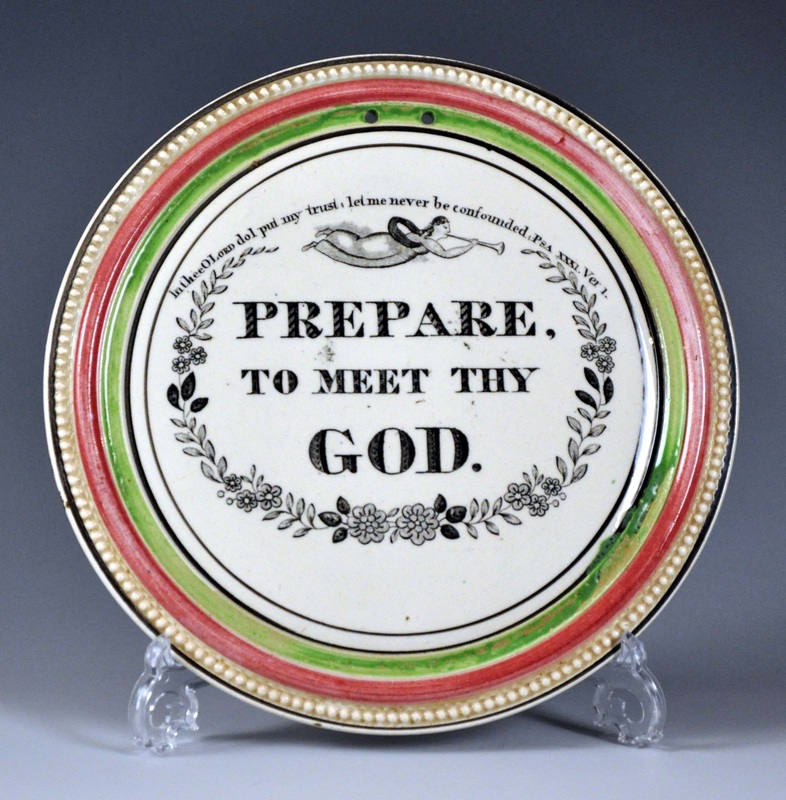 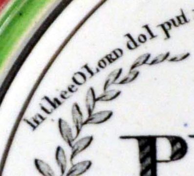 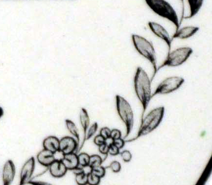 So there had to be some other difference between the two groups. If you look at the bottom right leaf in the first detail of all the plaques above, there's a striking difference between the first group (see below left) and the leaves in the second group (see below right). In the second group the leaf is longer, and in most of that group, there's evidence of a scratch running off the leaf to the right. This shows beyond doubt that the two groups come from different transfer plates. Interestingly, both plates seem to have started their life at Moore's and ended up at Scott's.
There are a whole series of transfers shared by the two potteries (click here to read about some of them). But in each case, the copper plates must have started work at either one pottery or the other. These small differences help us untangle which pottery was making what, and when. I will update the 'Prepare to meet thy god' page when I get a second. Thanks to Georgina at Swan Antiques for providing the photo of their plaque on eBay. 11/24/2013 0 Comments Truelove from HullMy grandfather collected, amongst other things, Staffordshire figures, ironstone plates, blue and white, and a bargeware teapot, so Victorian pottery was something I grew up with, and has childhood associations and familiarity. When I started collecting lustre plaques though, I thought I'd found something entirely my own. But mum has since told me there were two ship plaques in the house in Hull where I spent my early years - 'Truelove from Hull' and 'The Unfortunate London'. It seems likely, aged 3 or 4, I was dandled in front of them. So perhaps plaques were always there, buried in my subconscious. I've been looking for a Truelove from Hull for over 10 years now. A broken one came up on eBay 7 or 8 years ago. I underestimated the bidding - it sold for over £200 as I remember. A square orange one with rubbed lustre came up about the same time in a group lot at auction, and I missed out on that too. So despite a hairline and faded lustre, I was happy to get the plaque below in a Derby saleroom recently. 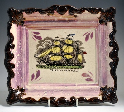 How many of them exist? An impossible question to answer, but not many. There's one in Hull's Maritime Museum. And although I've only been searching a decade or so, I've had access to some very large collections of Sunderland lustre, built up over much longer periods, and never seen another. I have added it to the rare ships page, with links to information about the ship's fascinating history. Truelove was captured by the British in the American War of Independence, and sailed for 124 years. I couldn't resist including this photo of the ship's Captain Parker in 1854 (from here). Like something straight out of Melville! 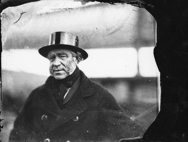 The plaque is one of a series of ships by Anthony Scott of Southwick. If you wanted to quick-start a collection of ships, Martyn Edgell has the selection below for sale, for a very reasonable £165 each. Click here to browse Martyn's site.   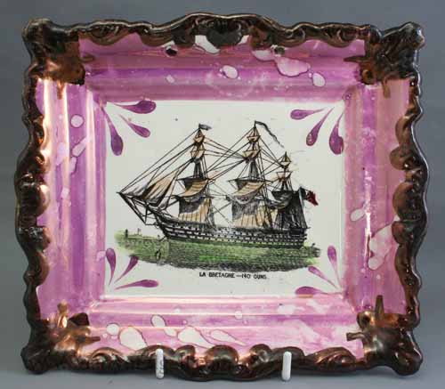 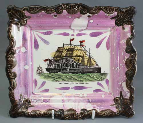 I bought one from Martyn myself (see below left). If someone is looking to make up a set, I will sell my other near-perfect example (below right) for £165. Just drop me an e-mail. 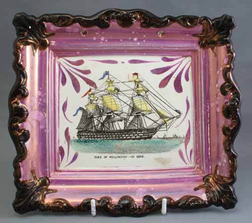  Congratulations to Hull for being named City of Culture 2017. Hull was the home of William Wilberforce, and, we were always told, one of Queen Victoria's favourite cities.
11/3/2013 0 Comments Our Dumb CompanionsThanks to a tip off in an auction listing from Anderson and Garland, I recently purchased a copy of "Our Dumb Companions". It has, so far, provided printed sources for 5 transfers on plaques attributed to Scott of Southwick. Be sure to take a look at the new page I've just added. 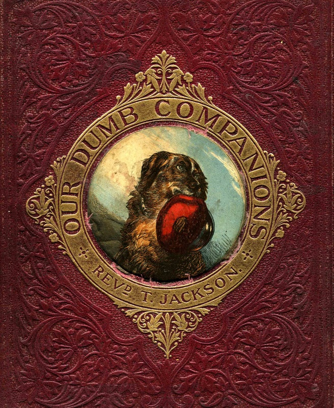  If you think you have further plaques in this series, drop me a line and I will try to match them up with illustrations from the book.
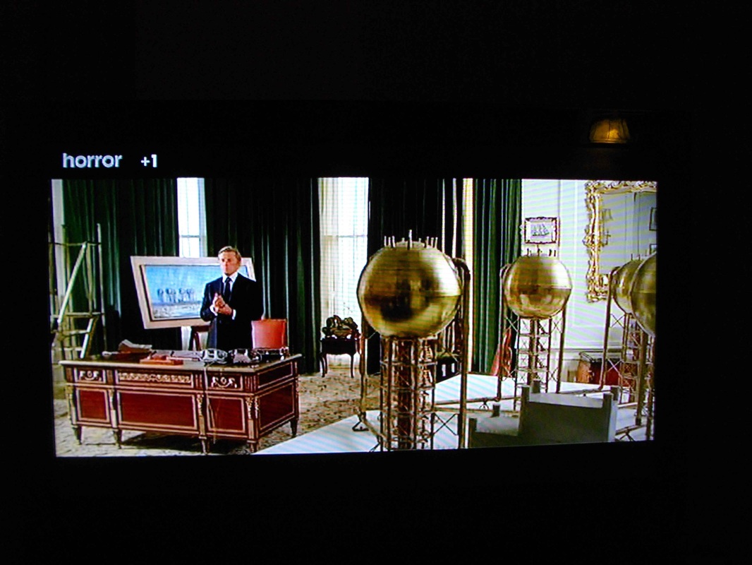
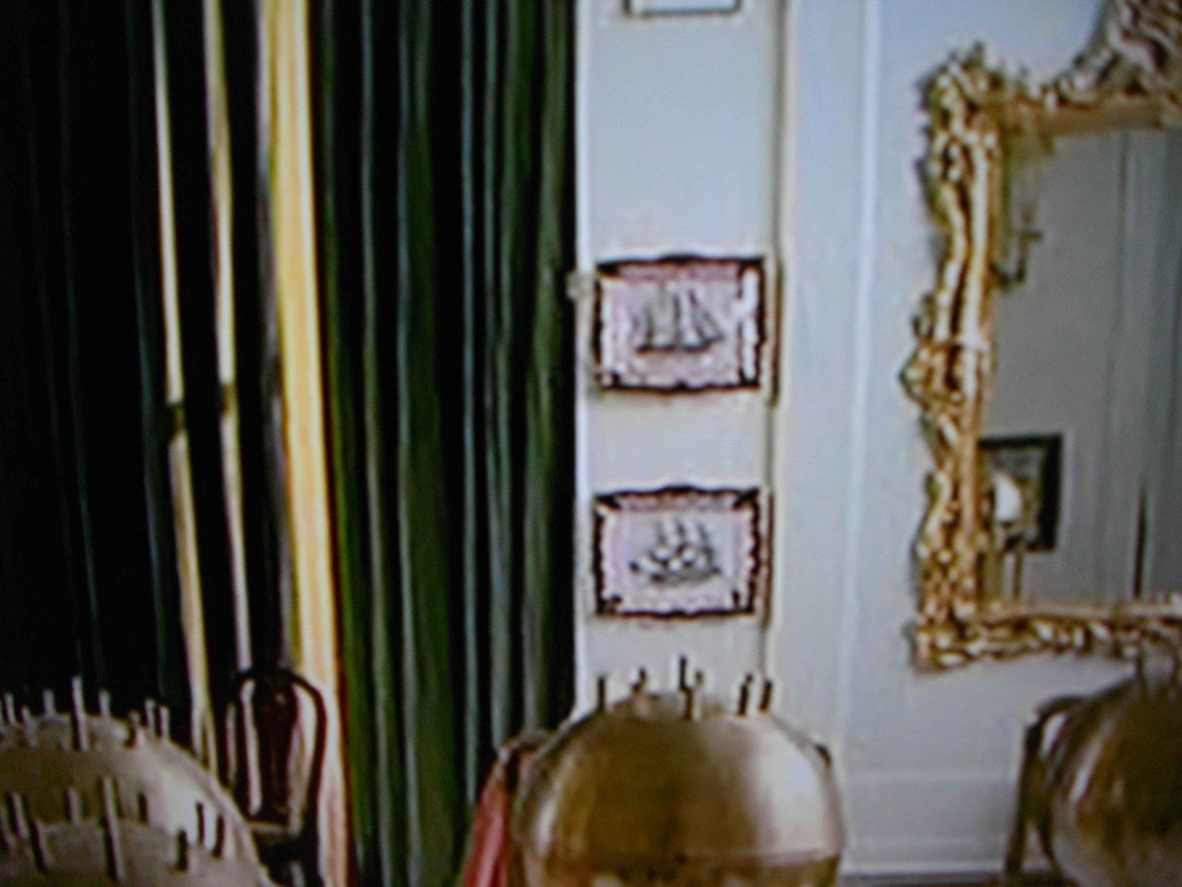
As prices for common examples of Sunderland lustre (and Victorian pottery in general) slowly fall, strangely, the prices fetched by the reproduction ship plaques titled 'Agamemnon' and 'Flying Cloud Boston' appear to be on the rise. I blogged about these reproductions several times in the early days of this website, and added a page on reproductions. Ian Holmes valiantly e-mails eBay sellers to tell them that the items are fakes and were made in the latter half of the 20th century. Some sellers defer to Ian's greater knowledge and change their listings, others argue that they purchased the plaques from 'a reputable auction house', and although other sellers' Flying Cloud Bostons and Agamemnons may be fake, their example is definitely 19th century.  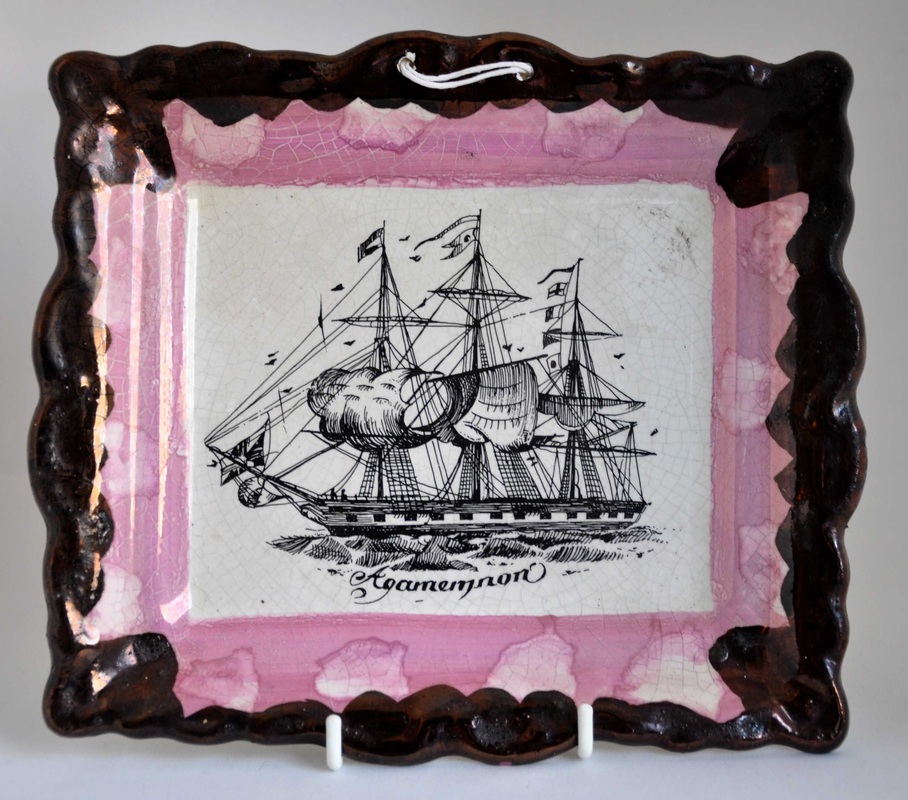 Sad to say, if your plaque looks like the titled ship plaques above, it is, without any shadow of a doubt, a modern fake (even if it appears to have an old crackle to the glaze). There are no known 19th century Sunderland lustre originals like these with these titles. Here are a few recently listed: eBay number 390650457018 sold for £47.10; eBay number 181214125187 sold for £48.95; eBay number 290972418687 sold for £47.00; and eBay number 141044042847, which sold for a jaw-dropping £98.85. There's currently a Flying Cloud Boston, eBay number 350910531493, which is already at £52.00, but at least the seller has had the decency to publish a question about its authenticity, and has admitted his own ignorance of its age. Interestingly, the entirely original plaque below sold on eBay for £27. OK, it is far from being the best example of its kind (!), but at least it has some age to it. Note, there is no title under the transfer. The ship shown is actually the Marco Polo (see the common ships page for more details). 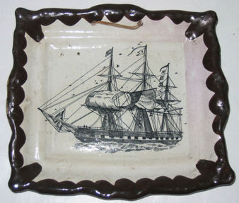 Ian glimpsed the pair of repros in the background of the set of the horror film, Holocaust 2000, filmed in England in 1977. They do seem quite at home in the realm of horror (see below). So if we're looking to date them, the 1960s to mid 1970s seems about right. They were mass produced in thousands. I have a cupboard full of these reproduction plaques (only a slight exaggeration), which were thrown into job lots by 'reputable auction houses' to make up the numbers. Ian says he has a box of them too. So if you'd like to purchase a pair of repros for £80, please drop me a line. You'll be doing me a huge favour!
10/28/2013 0 Comments The Thomas Fell WesleyTwo years ago, I wrote about a transfer of John Wesley, and another of George Kinloch, that appear on round plaques and Staffordshire commemorative wares (see here). On that basis, I attributed the plaques to Staffordshire, and filed them on the Staffordshire page. This year I started to attribute verse plaques with similar decoration to Thomas Fell. A plaque came up recently (top left below), which I think confirms that these Wesley plaques were made by Thomas Fell in Newcastle, and not in Staffordshire. The verse transfers below appear on later pink-lustre plaques with the impressed crown mark used by Fell (click here to read more). The top left plaque's black and white decoration is very similar to that on the Wesley beside it. Similarly the plum-bordered plaques below them have strikingly similar decoration. So that's now two strong decorative links between the Wesley plaques and the Fell verses. Interestingly, the spacing of the hanging holes matches according to the decoration.  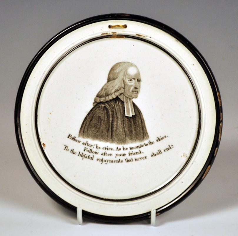  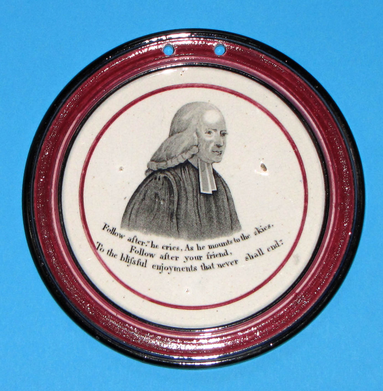 My guess is that Fell copied the portrait transfers from Staffordshire wares. You can see from the shape of the shading in the background that the Kinloch transfers (bottom row below) come from different transfer plates. (Incidentally, the two plaques below are larger than those shown above, and decorated with a different red.) 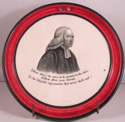 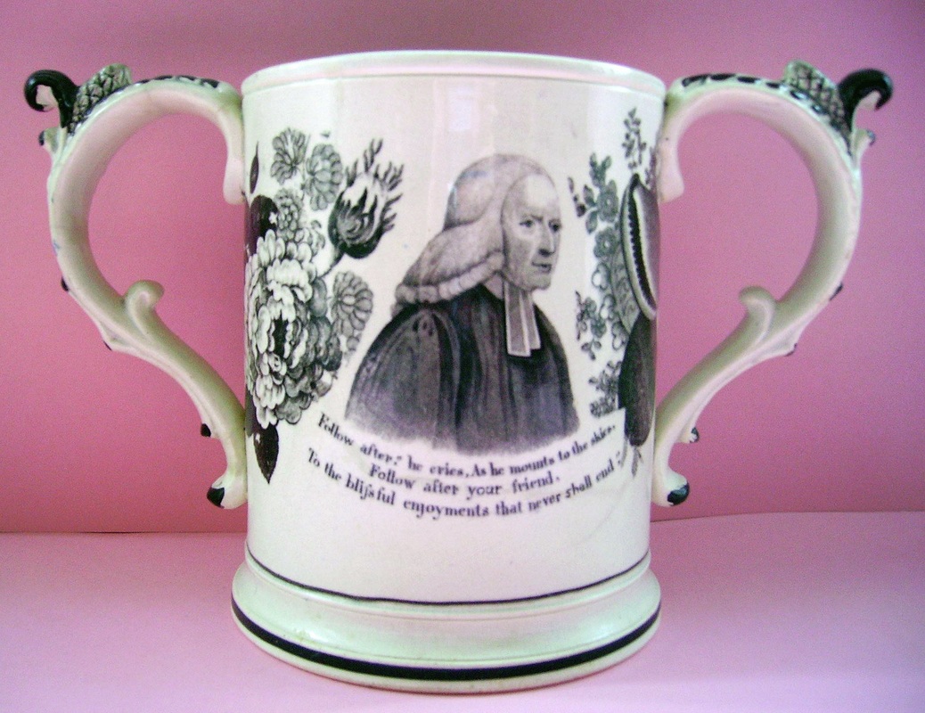 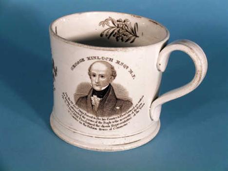 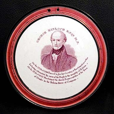 The Kinloch plaque has an impressed mark like a segmented circle (see centre below), as do the two plaques below. So that's another small group of attributions we can shift to Thomas Fell. 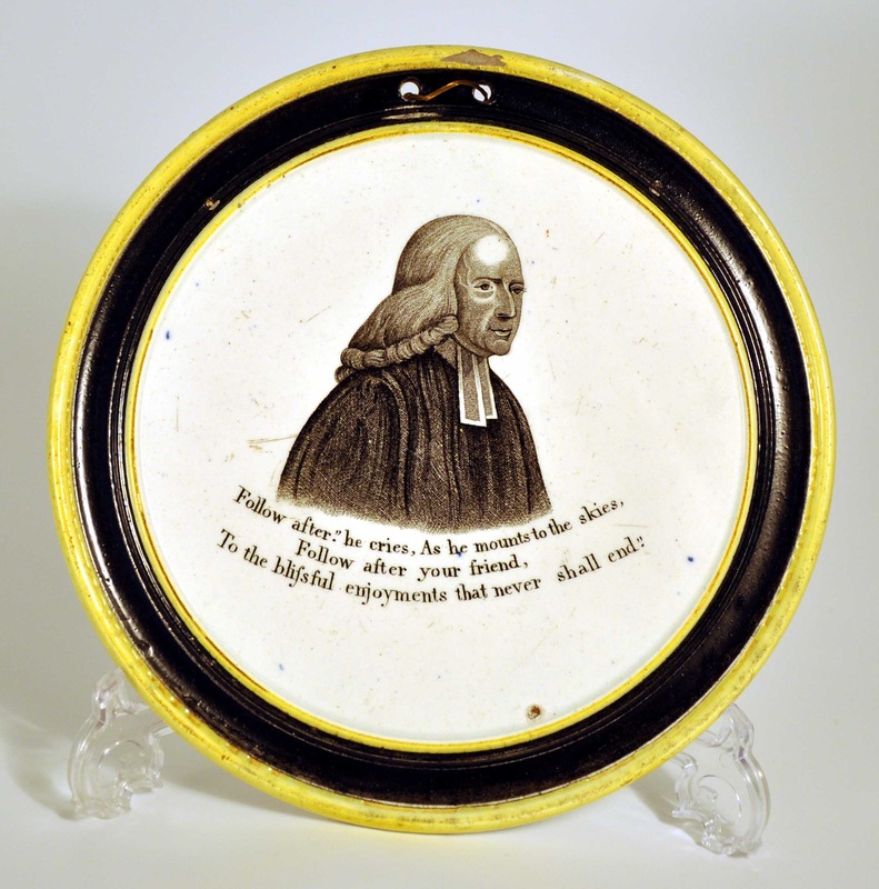  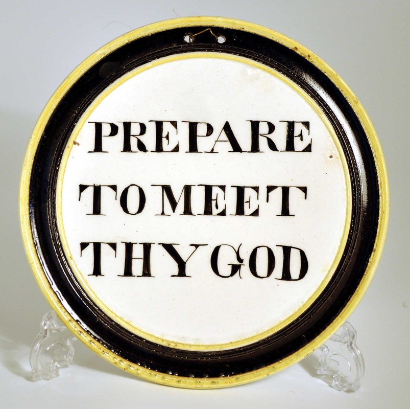 In theory, it's possible that the Wesley transfer might appear on pink-lustre plaques like those below. However, this transfer hasn't to date been found on any item with pink lustre. My guess is that the transfer plate was retired, either through damage or wear, before Fell started producing the pink lustre plaques. But if you have a pink Wesley of the kind above, please get in touch and prove me wrong!   9/25/2013 0 Comments Crowder collectionThanks to Harold Crowder for getting in touch and sharing photos of his collection. Below are 9 variations of decoration I hadn't seen before. Top left and right, attributed to Maling. Top centre and all of second row attributed to Sheriff Hill. Bottom left attributed to Staffordshire. And bottom centre and right, Dixon Austin & Co. More colourful than a selection of Liquorice Allsorts, I would gladly make space for any one of them on my walls.      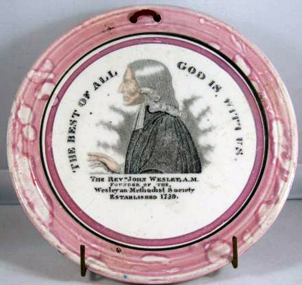  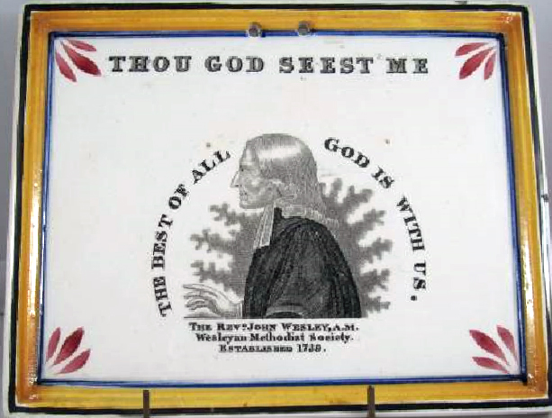 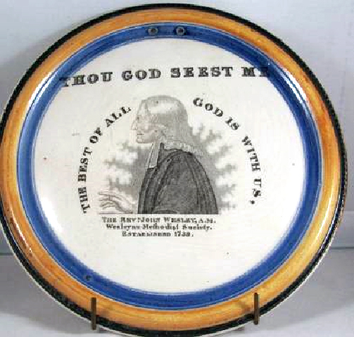 Most exciting, for me at least, is the circular plaque below titled 'R Raikes', 'Founder of Sunday schools'. I've attributed this series of preachers to Wallace & Co. The black and yellow border is, however, similar to those used by Dixon Austin & Co. One day, I'd love to see one of these plaques in the flesh, to get a feeling for the weight of the potting, etc. 
Crowder collection
If you'd like to see Harold's plaques, they are on display in the World Methodist Council Museum in the US.
I found a Tyneside plaque recently (below left) with a transfer based on George Cruickshank's 'The Bottle' series: plate V. There are many variations which appear on children's plates etc from North Eastern potteries (take a look at the United Collections website for some good examples), but only two variations of the series, to date, recorded on plaques. The transfers more usually, but still rarely, appear on plaques from Sunderland (below right) with Moore & Co marks. Click on the images to enlarge, and to move between them. 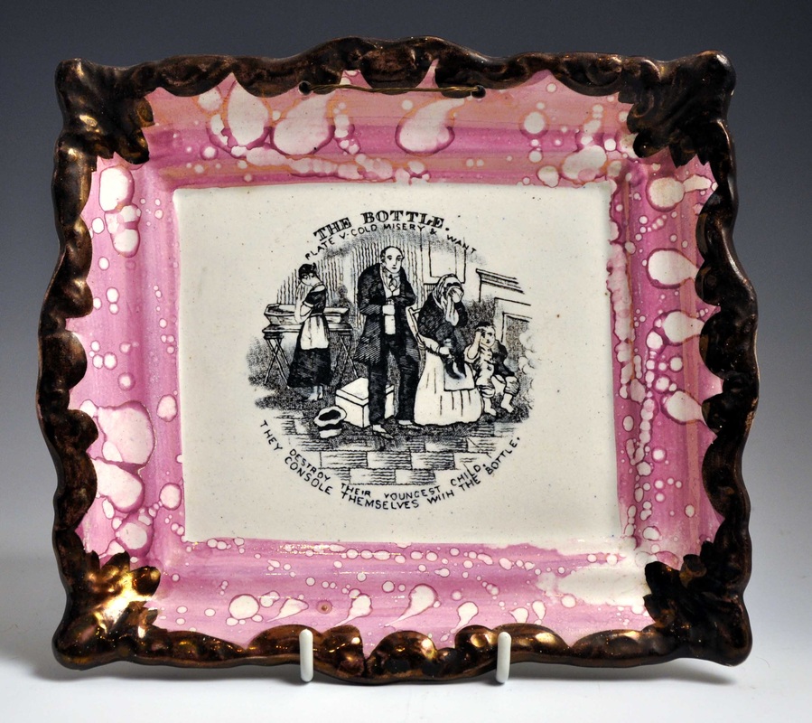  The Tyneside transfer is cruder - more like those that appear on children's plates - and the plaque is smaller. Last week a pair with the plate II transfer came up in the same auction lot (see below). It is odd that someone collected two rare plaques with the same transfer (there were no other plaques in the sale). They are not without interest to compare though. Take a look at the details below. The left plaque is more heavily printed, and the lines and lettering on the transfer are slightly wobbly. The right plaque has an altogether different feel. The lettering is applied more precisely, the lines are straighter, and the image is softer. So what's the reason for the difference? 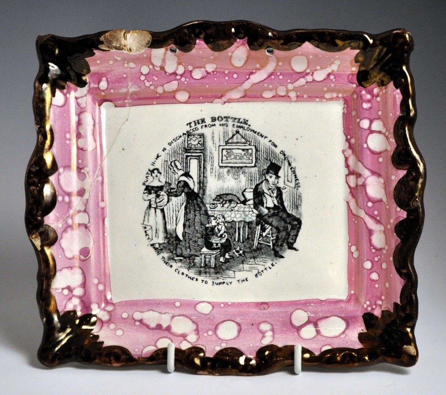    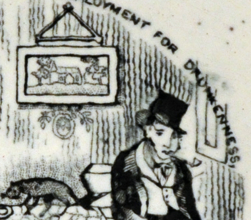 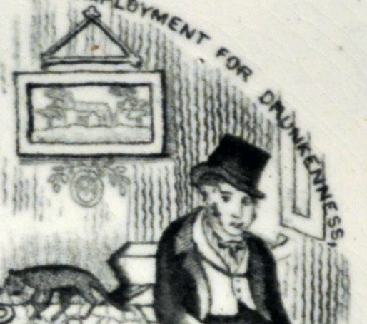 The left plaque, like the plate V plaque at the start of this post, is printed over the glaze. When the transfer, printed on tissue paper, was rubbed onto the plaque, the image moved around slightly on the glassy surface. The right plaque has the transfer applied under the glaze, directly onto the pottery body. Some of the ink soaked into the absorbent body, so there's not so much black left sitting on the surface. The surface gave more friction, so the letters and lines are less wobbly.
I would love images of the other 6 transfers in this Tyneside series. So if you're reading and you have one, please drop me a line. 9/7/2013 0 Comments John Carr & Sons impressHuge thanks to John Hotham for sharing the images below, showing a pair of verse plaques with the John Carr & Sons impressed mark. Although the verses are relatively common, it is rare to find a pair with impressed marks.    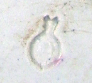 The image below, from RC Bell's 'Tyneside Pottery' shows the detail of the impress. The mark was used after 1846, when the Carr & Patton partnership dissolved at the North Shields Pottery (also called the Low Lights Pottery). 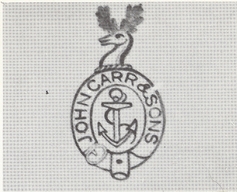 We can now lay to rest the suggestion that these plaques were made at the Middlesbrough Pottery. The confusion arose because the plaques are found with a variation of the London mark with the number 18 above it, which RC Bell (see below right) attributes to Middlesbrough. Click on the images to enlarge.  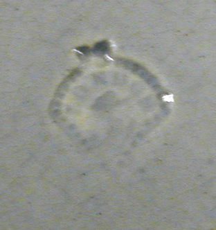  The transfer, mould and decoration of the London-marked plaque, are identical to those above with the Carr impress. So London marks with the number 18 appear to have been used by both Middlesbrough (who to our knowledge never produced lustre items) and John Carr.
|
Proudly powered by Weebly