|
I found a Tyneside plaque recently (below left) with a transfer based on George Cruickshank's 'The Bottle' series: plate V. There are many variations which appear on children's plates etc from North Eastern potteries (take a look at the United Collections website for some good examples), but only two variations of the series, to date, recorded on plaques. The transfers more usually, but still rarely, appear on plaques from Sunderland (below right) with Moore & Co marks. Click on the images to enlarge, and to move between them. 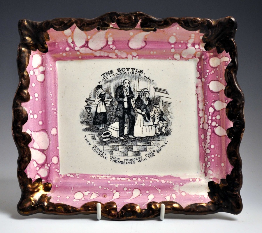 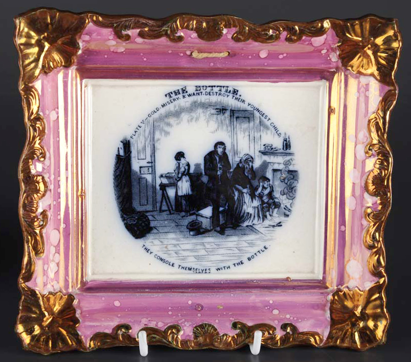 The Tyneside transfer is cruder - more like those that appear on children's plates - and the plaque is smaller. Last week a pair with the plate II transfer came up in the same auction lot (see below). It is odd that someone collected two rare plaques with the same transfer (there were no other plaques in the sale). They are not without interest to compare though. Take a look at the details below. The left plaque is more heavily printed, and the lines and lettering on the transfer are slightly wobbly. The right plaque has an altogether different feel. The lettering is applied more precisely, the lines are straighter, and the image is softer. So what's the reason for the difference? 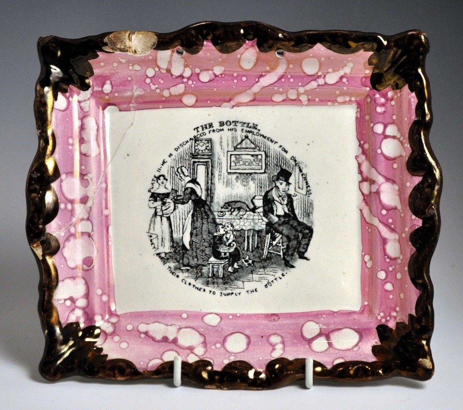    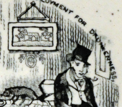 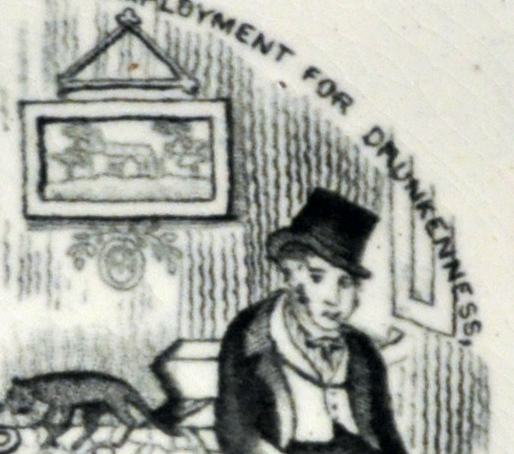 The left plaque, like the plate V plaque at the start of this post, is printed over the glaze. When the transfer, printed on tissue paper, was rubbed onto the plaque, the image moved around slightly on the glassy surface. The right plaque has the transfer applied under the glaze, directly onto the pottery body. Some of the ink soaked into the absorbent body, so there's not so much black left sitting on the surface. The surface gave more friction, so the letters and lines are less wobbly.
I would love images of the other 6 transfers in this Tyneside series. So if you're reading and you have one, please drop me a line.
0 Comments
Leave a Reply. |
Proudly powered by Weebly