|
Firstly, in case you missed it, I've added a P.S. to my previous blog post. The two Adam Clarke plaques, despite coming from different transfer plates, share a similar fault of transfer application. Transfers were first printed onto paper, so they could be applied to the (often curved) surfaces of pottery. It was a fiddly business, and sometimes the transfer would get distorted in the process. The edges of the transfer were particularly vulnerable. You can see looking at the two Clarkes that the 'D' in 'SAVED' has broken off. That's a long preamble. But think back to the P.P.S. of my blog post on January 9th. Stephen Duckworth noted that the spacing between the letters 'In thee O Lord' varies on 'Prepare' transfers, which otherwise look very similar. Those letters are on the periphery of the transfer, so could they have possibly been distorted during application? Take a look at the spacing of the letters on the details below. All of them come from the clunky brown-bordered plaques commonly associated with Scott. On some the letters are compressed, so that the 'thee' is pressed against the 'O'. On others there is a distinct space between them. (Click on the images to enlarge and to move between them.)  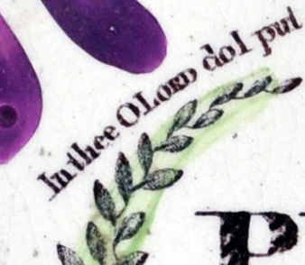 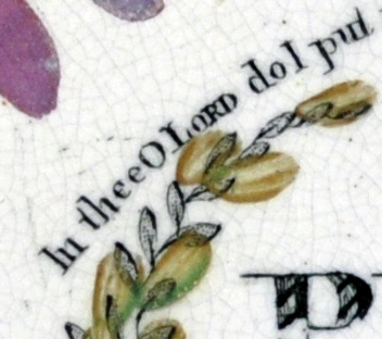 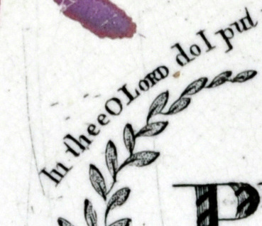 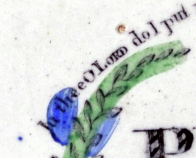 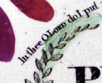 The full plaques are pictured below respectively.   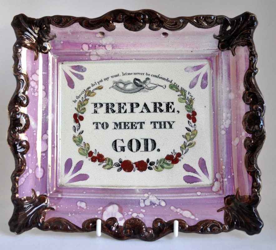 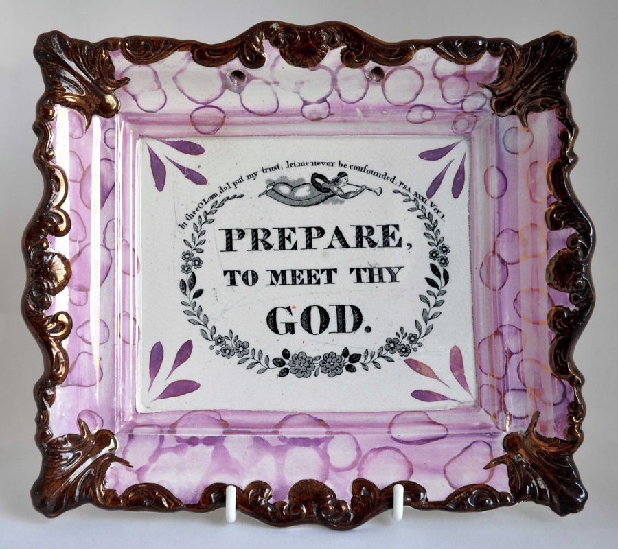 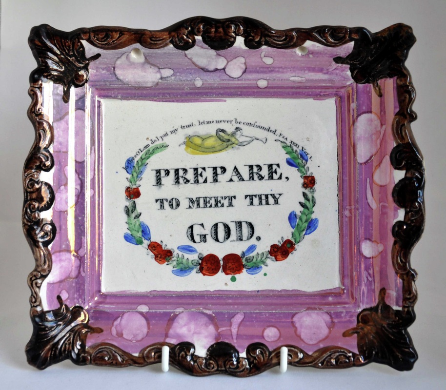  So if we're to distinguish between very similar 'Prepare' transfers, we perhaps ought to look for differences other than letter spacing at the edge of the transfer. But first, on what basis are the clunky brown-bordered plaques attributed to Scott? Take a look at the two bowls (below left). Both have Scott impressed marks. Such bowls nearly always have transfers that occur on the clunky brown-bordered plaques (below right). See my July 2010 blog pieces for a more in-depth comparison of the Bretagne transfers below.  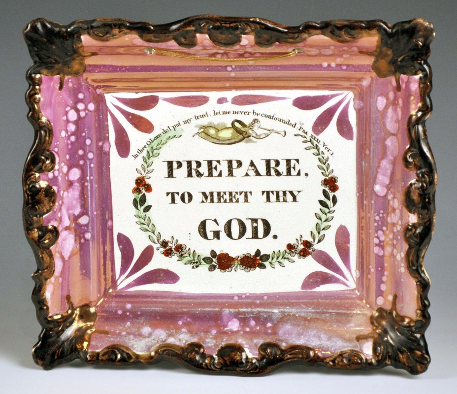 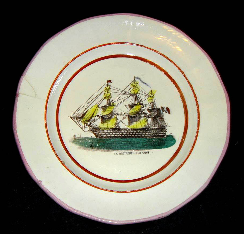 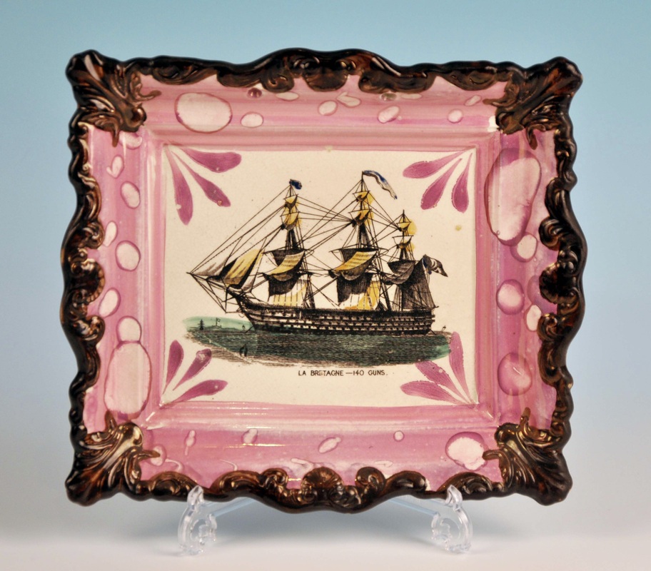 I did manage to find a subtle difference between some of the 'Prepare' plaques. Take a look at the details below (click on the images to enlarge and to move between them). Note, in particular, which side of each leaf is most heavily shaded. On the first four, the leaves on the left side of the sprig are most heavily shaded on the left side. Whereas on the last two they are heavily shaded on the right side. The two leaves on the top left of the sprig also differ slightly in shape. 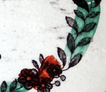 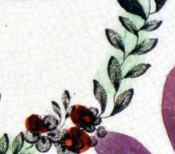 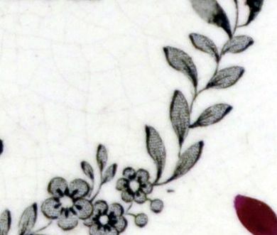 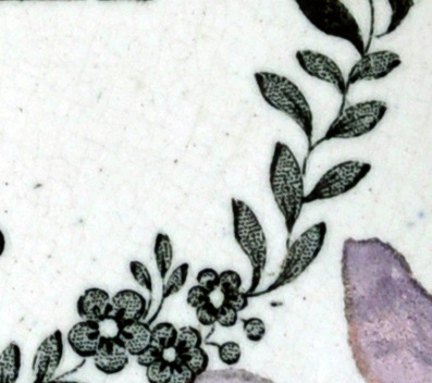   So where did the details come from? The full items are pictured below, again respectively. 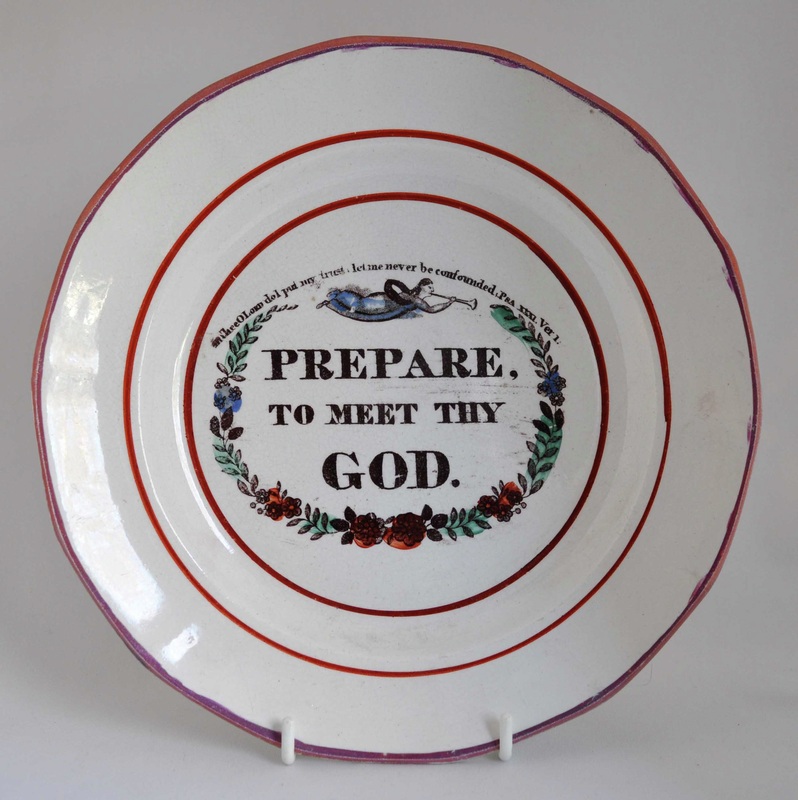  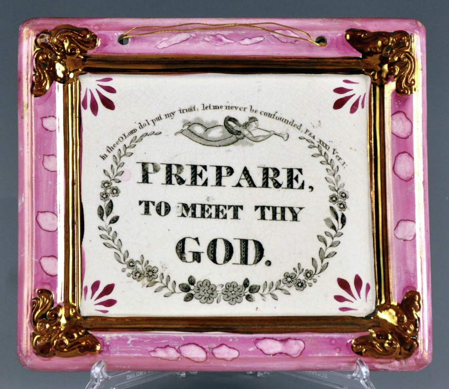 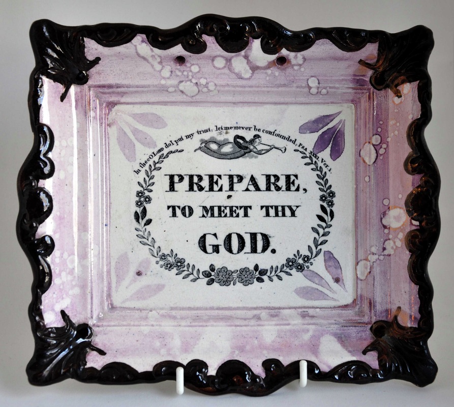 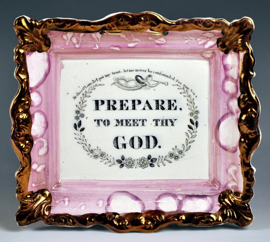 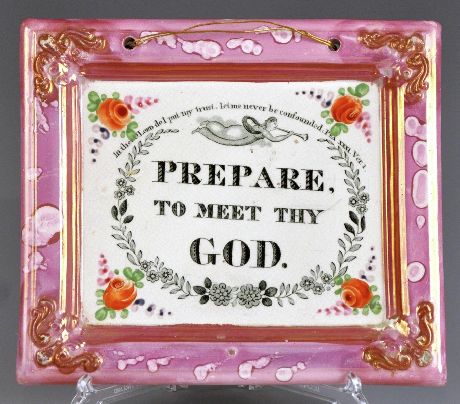 Perhaps not what we'd hoped for! I would have expected the two plaques on the right to be printed from the same plate, yet the shading of the leaves is on different sides. Either there were two transfer plates, or one plate was re-engraved at some point, and the shading moved side. The good news is that these details provide a strong link between the smaller rectangular plaques (on the right) and Scott. Look at the details of the top right and bottom left plaques. There is a flaw common to both transfers. To the right of the third flower there is a small horizontal scratch (black mark), which appears on both plaques. They are, therefore, undoubtedly from the same transfer plate. My eyes ache. I'm going to have a cup of tea. P.S.For completeness' sake, here are the details of the letter spacing of the six items above, again in the same order. 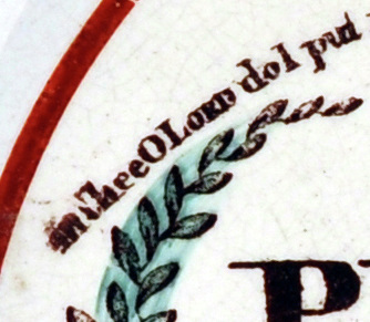  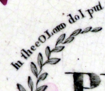 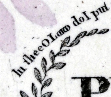 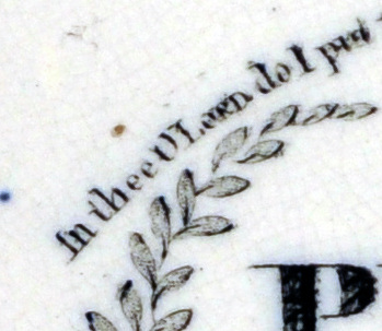  The shading on the leaves accords on all items this time. But again, there are stronger similarities between the top right and bottom left, this time in terms of letter spacing. Note the larger space after the word 'In'. The last two details are also spaced similarly to each other. Note also that the 'I' in 'In' is shorter on these last two plaques. That could be because these pairings of plaques were produced at the same point in the lifecycle of a single transfer plate, which was more than once re-engraved or flattened out (transfer plates became curved over time from passing through printing rollers). If I had to guess, I'd say the last two were the earliest (c1845) as the plaques are more refined. NB Richard Cobden appears on similar plaques to the bottom right in 1846. The brown-bordered plaques are c1850s–60s, and the bowl with the impressed mark is likely later. So on reflection, it seems more likely that distortion of the transfer plate over time, rather than problems during application of transfers, accounts for the differences in spacing. P.P.S.I've overlooked the circular 'Prepare' at the end of my January 9th blog post. So here it is (top three images) above the c1845 plaque for comparison. As we'd expect, this earlier form of plaque (c1830s–40s) matches its rectangular counterpart. The shading of the leaves is on the right, and the spacing of the text similar. 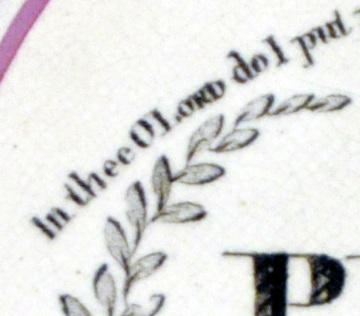 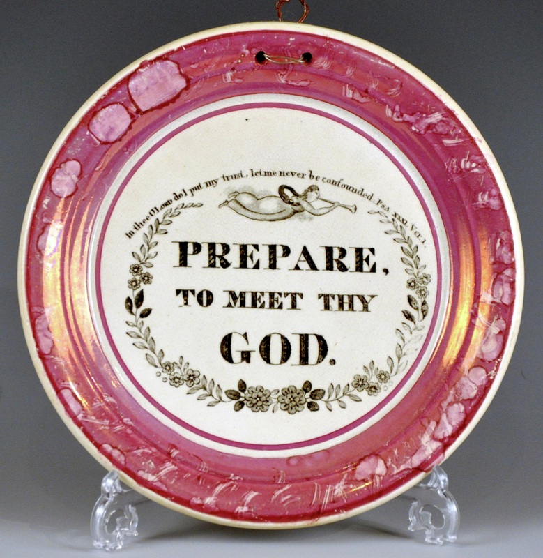 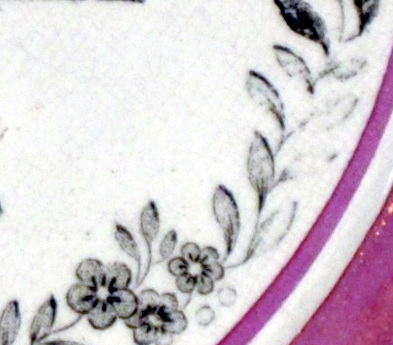 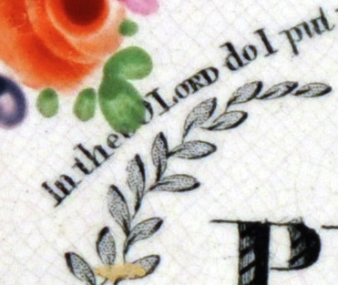  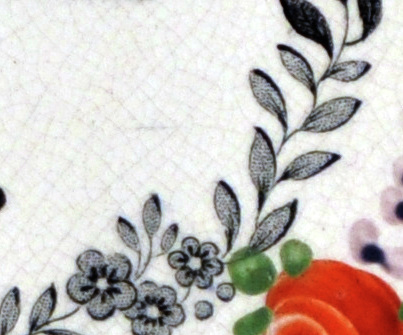
0 Comments
Leave a Reply. |
Proudly powered by Weebly